Stand on the Troutman Street sidewalk in Bushwick on a Saturday morning, coffee in hand, and look at the wall across from you. The Bushwick Collective is one of the densest concentrations of street art in North America, murals, paste-ups, tags, stencils, everything layered over everything else in a visual conversation that’s been going on for decades. You can feel, immediately and instinctively, which pieces belong there and which ones don’t.
The ones that belong have a quality that’s hard to articulate precisely but impossible to miss. They seem to understand the wall. The colors hold their own against the visual noise. The imagery has enough genuine content, something to look at beyond the brand name, that you pause. The brand, if there is one, is present but not domineering. The piece feels like a conversation rather than an interruption.
Readers who want the campaign side after the cultural context usually jump to what wheatpasting is and how to wheatpaste posters.
The ones that don’t belong are equally recognizable. Usually too much logo, too little image. The visual language is borrowed from the street art context but hasn’t been internalized, you can see the seams of the imitation. The placement makes no particular sense for the neighborhood. There’s nothing here for the pedestrian except the brand’s desire to be associated with this wall. You feel that transaction from across the street, and it’s not flattering.
This article is about the difference. Not the budget difference, brands of all sizes get this right and wrong. The understanding difference. What separates wheatpaste campaigns that enhance a brand from ones that subtly damage it, and how you brief and execute a campaign that ends up in the first category.
The Gap Between Brands That Belong and Brands That Don’t
The mistake most brands make when entering street art territory is approaching it primarily as a distribution question: where should we put posters, and in what quantity, to reach the right number of people? That’s the right question for a subway advertising campaign. It’s the wrong question for street art.
Street art isn’t primarily a distribution medium. It’s a culture, with its own history, its own aesthetic standards, its own gatekeepers, and its own mechanisms for accepting or rejecting outsiders. A brand that enters the wheatpaste space treating it as just another out-of-home placement will produce work that the culture reads as an outsider’s imitation, regardless of how much they spent on it.
For brand use cases, compare this with flyposting advertising and wheatpaste advertising in Miami.
The brands that belong are the ones that take the culture seriously enough to actually understand it before they try to participate in it. That means understanding the artists who defined the medium. The walls that carry cultural weight. The aesthetic traditions that give the context its meaning. And critically: what the culture is interested in, as opposed to what the brand is interested in, and finding the genuine intersection of those two things.
This isn’t mystical. It’s the same principle that applies to any attempt to enter a subculture as an outsider. Authenticity is legible. So is its absence.
A Brief History of Paste-Up as Art Form
Understanding why wheatpaste street art has the cultural weight it does requires understanding where it came from, not as a curiosity, but as context for what brands are attempting to access when they use the medium.
The contemporary paste-up tradition traces directly to the political and countercultural movements of the 1960s and 70s, which used pasted posters as a communication tool outside official channels. But the immediate predecessors of the street art movement are more specific: the downtown New York City scene of the late 1970s and early 80s, where Jean-Michel Basquiat, Keith Haring, and others were using the walls of the city as an extension of the art world, before the art world noticed or cared.
Paste-up as a distinct street art technique emerged in that period partly from practicality. Paper could be prepared in a studio, transported easily, and installed on a surface in a fraction of the time required for a spray-painted piece. It also allowed for visual complexity, photography, detailed drawing, typographic work, that spray paint alone couldn’t produce at speed. An artist with a bucket of paste and a backpack of rolled posters could cover more ground in a night than most other street art techniques allowed.
By the 1990s, paste-up had developed its own distinct tradition within street art, associated with artists who were thinking seriously about image-making as a craft and wanted to bring that craft to public walls. The technique was democratic in the sense that it required no expensive equipment, flour, water, paper, and the willingness to be on the street at 3 a.m. were sufficient. But it rewarded visual intelligence and artistic investment in ways that pure text-based graffiti or simple sticker work did not.
The 2000s brought the gallery crossover that changed the medium’s cultural status permanently. Artists who had built their reputations on city walls began appearing in galleries, museums, and eventually at major auction houses. The street credibility that defined the tradition didn’t evaporate in this transition, if anything, it intensified, because the gallery success was understood as a validation of the street practice rather than a replacement of it. The work’s value derived from the fact that it existed first on a wall in Williamsburg, not from the fact that it later appeared in a Chelsea gallery.
When brands started entering this space in earnest, and by the late 2000s, the entry was significant, they were attempting to access a cultural tradition that was already rich, already had its own standards, and already had an audience that was deeply fluent in distinguishing authentic participation from calculated appropriation.
The Artists Who Defined the Medium
Four artists above all others have shaped what wheatpaste street art means as a cultural form, and their work provides the direct context in which commercial campaigns are read by the audiences that matter most.
Shepard Fairey, OBEY Giant
Fairey’s OBEY campaign is the most direct lineage that connects contemporary commercial wheatpaste to the street art tradition. Starting with a single sticker of André the Giant in Providence in 1988, the campaign expanded through years of dedicated paste-up practice across American and then global cities. The visual language, bold flat graphic shapes, red and black palette, propaganda-inspired typography, became one of the most recognizable aesthetics in contemporary visual culture.
What’s important for brands to understand about Fairey’s work is that it built its authority through consistency and commitment over years, not through a single campaign. The OBEY brand exists because Fairey pasted thousands of walls over decades. The cultural weight the imagery carries today is the accumulated result of that practice. No brand can buy that history in a single campaign. What they can do is engage honestly with the aesthetic tradition Fairey helped establish, rather than superficially borrowing its visual signals.
Fairey’s work has appeared prominently on the Houston Street and Bowery wall in lower Manhattan, one of the most contested and culturally significant street art surfaces in America, and on walls throughout the Melrose Ave corridor in Los Angeles, between La Brea and Fairfax, which is the streetwear and sneaker culture corridor where his OBEY brand has genuine commercial as well as artistic presence.
Swoon, Caledonia Curry
Swoon is the artist who most clearly demonstrated that paste-up could carry the weight of serious fine art practice. Her large-format, hand-carved and hand-printed figures, always human, often feminine, executed with the visual precision of traditional printmaking, brought a labor-intensive craft rigor to a technique that could easily be executed sloppily. You cannot look at a Swoon piece and mistake it for something made in haste. The care is visible at a glance.
That commitment to craft is exactly what made her work earn gallery representation and museum collection, MoMA acquired her work, without losing the respect of the street art community. The quality standard her practice established is a useful benchmark for brands thinking about wheatpaste campaigns: work that reads as serious, that rewards close attention, that respects the medium and the viewer.
Her Brooklyn warehouse and building facade installations, concentrated in Williamsburg and the surrounding areas, remain reference points for what high-craft paste-up looks like in the neighborhood where many of the most valuable commercial wheatpaste surfaces exist.
JR
The French artist JR takes the wheatpaste technique to scales that redefine what’s possible with paper and paste. His “Inside Out” project has installed paste-up photographic portraits in 140 countries. His installation on the Houston Street and Bowery wall, enormous black-and-white portrait photography that covered the full surface in sections, was one of the most documented street art moments in that wall’s history. His work on building facades in cities globally operates at a scale that makes the “wheatpaste” label feel almost inadequate: these are architectural interventions executed with paper and flour.
What JR’s practice shows brands is that scale is available in the wheatpaste medium. The limitation isn’t technical. The limitation is whether the creative concept justifies the scale. JR’s enormous portraits justify their scale because the subject matter, the faces of communities that typically go unseen, gains meaning from being rendered at building size. Scale for its own sake produces a different effect. The lesson is about proportionality: the ambition of the execution should match the ambition of the idea.
Banksy
Banksy’s relationship with wheatpaste is more layered than his primary identification as a stencil artist suggests. Many of his most significant works incorporate wheatpasted elements alongside stenciled paint, the paper and paste components adding texture, compositional complexity, and a specific material quality that spray paint alone doesn’t produce. In London’s Shoreditch, in various New York appearances, and in other cities where he’s worked, Banksy’s use of paste-up contributes to the accumulated visual ecology of the neighborhoods he chooses.
The most important thing Banksy demonstrates for brands is the power of context. His work means what it means partly because of where it appears. The same image in a gallery would be a different thing, interesting, perhaps, but not the same. The meaning is produced in the relationship between the image and the wall and the neighborhood. This is the insight that separates brands who execute street campaigns with spatial and contextual intelligence from those who treat location as interchangeable.
The Walls That Matter: Houston/Bowery, Troutman St, Traction Ave, Wynwood
Specific walls carry specific cultural weight. The best wheatpaste campaigns understand this and place with intention. Here’s the context for the surfaces that matter most in the markets where street art culture is strongest.
Houston Street and the Bowery, Manhattan
The wall at the intersection of Houston Street and the Bowery in lower Manhattan is arguably the most culturally significant single street art surface in the United States. It’s been painted over and repainted continuously for decades, with work by artists ranging from Os Gemeos to KAWS to Revok to Keith Haring’s early years to corporate brand campaigns by companies that understood the value of the location. Local street art documentation accounts have tracked every iteration. Global art publications cover major new works when they go up.
The wall’s significance comes from its location, at the intersection of the Lower East Side, SoHo, and the Bowery, where multiple high-traffic pedestrian streams converge, and from its history. Every piece installed there enters a documented lineage that carries its own cultural context. A brand that places work on this wall is not just buying an advertising location. They’re entering a conversation that has been going on for decades, in front of an audience that has been paying attention to that conversation for just as long.
This is the part that most brands get wrong. They book the wall for the location. The audience reads the installation as a statement about who the brand is, and judges it against everything that’s come before. Work that matches the cultural register of the location lands well. Work that feels like a corporate appropriation of the space gets documented, captioned accurately, and shared by accounts that reach the exact demographic the brand was trying to impress. The captions are not flattering.
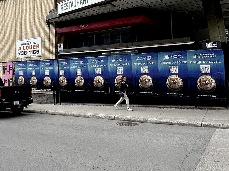
Troutman Street, Bushwick, The Bushwick Collective
The Bushwick Collective on Troutman Street operates as a curated outdoor gallery, the walls are managed by the organization, and artists apply or are invited to paint and paste there. This means it’s not available for standard commercial placement in the way that uncurated walls are. You can’t just show up with posters and a bucket of paste. But understanding Troutman Street matters for brands operating in the NYC wheatpaste space because it’s the cultural reference point for the neighborhood’s visual identity, and because the surrounding blocks carry the aesthetic influence of what happens on the main strip.
The Bushwick Collective has brought major international street artists to Troutman, the density and quality of the work there is genuinely outstanding, and the surrounding Bushwick neighborhood is saturated with independent paste-up and mural work that reflects that influence. Campaigns placing in Bushwick should understand the visual conversation they’re entering and think carefully about whether the creative work they’re bringing can hold its own in that context.
Traction Avenue, DTLA Arts District
In Los Angeles, the Arts District neighborhood in downtown, concentrated along Traction Ave between Alameda and 5th Street, is the closest equivalent to Brooklyn’s street art neighborhoods. Dense murals, paste-up work from local and international artists, and a pedestrian culture that includes both resident creatives and cultural tourists from across LA make this corridor a high-value placement zone. The area’s proximity to the LA art and fashion communities means that campaigns placed here get evaluated by an audience with cultural sophistication comparable to what you’d find in Williamsburg or the Lower East Side.
The visual competition on Traction Ave is intense. Strong creative that holds its own against museum-quality mural work and the paste-up of major international artists creates real brand impact here. Generic campaign creative, stock image plus logo plus tagline, reads as exactly that on a wall where everything around it has genuine artistic ambition.
Melrose Ave, Between La Brea and Fairfax
The Melrose Ave corridor in Los Angeles is a different cultural register from the Arts District, less fine art, more streetwear and sneaker culture. The brands that work this strip are Supreme, Palace, Off-White, the sneaker boutiques and vintage shops that define the corridor. Shepard Fairey’s OBEY brand has been present on these walls consistently for decades. The audience is specific: young, fashion-literate, brand-conscious in the sophisticated way that street culture breeds rather than in the aspirational luxury way that drives purchase decisions elsewhere.
A campaign that fits Melrose Ave is not the same campaign that fits Traction Ave. Melrose rewards brand fluency, campaigns that signal genuine understanding of street culture codes, that look like they belong alongside Supreme drops and BAPE campaigns. The bar is high. The audience is sophisticated. And when a campaign lands right here, the social amplification from fashion and streetwear accounts that document the corridor is significant.
NW 2nd Ave, Wynwood, Miami
Wynwood’s NW 2nd Ave Art Walk corridor is the most internationally amplified street art context in the United States. On a weekend, the people walking this block are from Miami, from São Paulo, from Buenos Aires, from Mexico City, from Madrid, from Toronto. They came to see the art. They are actively documenting it. A strong placement on NW 2nd Ave appears in social media feeds across the Western Hemisphere by Monday morning.
This international amplification makes Wynwood a uniquely powerful market for brands with global aspirations or a Latin American consumer base. The cost per local impression is high, Wynwood’s pedestrian density is lower than Bedford Ave or the Bowery. But the cost per total effective impression, once the international documentation and sharing is factored in, is extremely competitive. No other street advertising surface in the country reaches a comparably international audience from a single physical location.
What Right Looks Like on a Street Art Wall
There are some specific visual and conceptual characteristics that consistently separate wheatpaste campaigns that feel culturally appropriate from ones that don’t. These aren’t rules, there are no rules, but they’re patterns that hold up across markets and contexts.
The image carries the campaign. In every wheatpaste campaign that works as street art, the primary visual element is an image with genuine content, something interesting to look at independent of the brand context. It might be a photograph. A graphic composition. An illustration with visual complexity. Whatever it is, it rewards attention. The brand presence is there, but it’s subordinate to the image, not the other way around. The image is what causes a pedestrian to stop or to reach for their phone. The brand is what they notice after.
The palette belongs to the neighborhood. This is the kind of detail that experienced art directors working in street contexts understand intuitively and that marketers working from office conference rooms consistently miss. Different neighborhoods have different ambient color registers. The palette of Bushwick, saturated jewel tones on large-scale murals, heavy black line work, lots of graphic contrast, is different from the palette of Wynwood, which runs more toward Latin-influenced bright primaries and ornamental detail. A campaign that uses colors and a graphic sensibility aligned with its target neighborhood’s visual register reads as belonging there. One that doesn’t reads as having been designed without looking at where it was going to go.
The brand presence is proportionate. This is the most common error and the hardest to argue against in a brand environment where every stakeholder is asking “but is the logo big enough?” The logo does not need to be big. In street art contexts, brand identity is communicated through visual language, color, and association, not through logo scale. Supreme’s campaigns work because the visual DNA is recognizable, the font, the red and white, the cultural references, not because the logo is enormous. When brands scale the logo to compensate for a weak visual identity, the result is a large logo on a weak poster, which communicates nothing useful about the brand and reads as insecurity to the street art audience.
The placement is specific, not generic. The best campaigns are designed for specific walls in specific neighborhoods, not for “a wall” abstractly. When creative direction takes the placement seriously, asks where this is going, what the surface looks like, what surrounds it, who walks past it and when, the result has a quality of intention that generic placement doesn’t. You can feel whether the campaign was designed to go somewhere in particular or was designed to go anywhere.
Supreme vs. the Bank: A Case Study in Belonging
To make the distinction concrete: consider two hypothetical campaigns on the same Williamsburg block.
Campaign A: Supreme’s spring drop. Red and white, the box logo in the upper right. An artist collaboration image, work commissioned from someone with genuine street credibility whose visual language intersects with Supreme’s. No body copy. No product information. The association and the aesthetic are the message. People who understand Supreme’s history know what this campaign is before they know what it’s advertising. People who don’t know the brand encounter something visually confident and culturally specific that gives the brand a coherent identity.
Campaign B: A major national bank. “We believe in community.” Their logo. A photograph of what appears to be a young person in a creative space, stock photo quality, despite the custom shooting it required. Multiple lines of body copy explaining the bank’s commitment to creative neighborhoods. Color palette borrowed from their corporate identity guide, which was designed for financial institutions rather than street art contexts.
Both campaigns spent real money. Both physically exist on the same wall. The visual experience of one is of a brand that genuinely inhabits this cultural space. The experience of the other is of a brand that visited the cultural space and left a business card. The audience’s response to each is immediate and unambiguous, even among people who could not articulate why they feel the difference.
The bank’s campaign is not wrong because banks can’t advertise in street art contexts. Some financial brands have executed genuinely good street campaigns. It’s wrong because the creative work doesn’t take the context seriously. It uses the wall as a location rather than as a context. And in street art, location is inseparable from context. The wall tells the audience how to read what’s on it.
How to Brief an Agency for Authentic Street Art Presence
The brief is where authenticity is either established or abandoned. Most brand briefs for street advertising contain: target market, locations, quantities, timeline, and a creative spec that was developed without reference to the specific walls where the work will appear. That’s a brief for a poster campaign. It’s not a brief for street art presence.
Here’s what makes a brief that can produce work that genuinely belongs in its context:
Tell the agency the cultural DNA, not just the demographic. “We want to reach 18-35 urban males” is a demographic. “We want to feel like we belong in the same visual conversation as Shepard Fairey’s 2010 street work in Silver Lake” is a cultural brief. The second version gives the creative team something to work toward. It establishes an aesthetic aspiration, a cultural register, a standard of comparison. Demographics don’t do that.
Name the specific walls and neighborhoods that matter. Not because the agency doesn’t know them, a good agency knows them better than you do, but because naming specific walls forces you to think about the neighborhoods concretely. What’s the visual culture of those specific blocks? What does the foot traffic look like? What other campaigns have worked there? What’s the ambient aesthetic register? Knowing that you’re targeting the Traction Ave corridor in DTLA versus the Fairfax stretch of Melrose is not interchangeable. Each demands different creative thinking.
Tell the agency what you’re NOT trying to be. “We don’t want to feel like a corporate brand trying to be cool.” “We don’t want logo-forward work that reads as advertising rather than art.” “We don’t want to feel like the bank campaign next to Supreme.” These negative constraints are sometimes more useful than positive direction because they define the territory to avoid, which is often clearer than the territory to pursue.
Ask for the agency’s perspective on fit. A good street advertising agency will tell you if your creative brief isn’t right for the neighborhood. That’s expertise worth paying for. If you come with a creative direction that would feel corporate and incongruous on the walls you’re targeting, the agency should say so, not because they want to limit the campaign, but because they know that a campaign that doesn’t fit its context produces negative brand impressions rather than positive ones. Listen to that feedback. It’s informed by experience that’s hard to acquire any other way.
Street Art Culture by City: NYC, Miami, LA
The three most important wheatpaste street art markets in the United States have distinct cultural characters that should shape how campaigns are developed for each.
New York City
New York’s street art culture is the most dense, the most historically layered, and the most sophisticated of any American city. The audience, the pedestrians of Bushwick, Williamsburg, the Lower East Side, and Harlem, has been walking past street art for decades. They can read quality at a glance and they do. A strong campaign in New York earns real appreciation from a street-level audience that’s difficult to impress. A weak campaign gets catalogued and dismissed with equal speed.
The 125th Street corridor in Harlem, between Adam Clayton Powell Jr. Blvd and Malcolm X Blvd, carries a specific cultural weight: it’s the commercial and cultural center of one of the most historically significant African American communities in the country. Campaigns placed here are read through that lens. Work that engages genuinely with Harlem’s cultural identity, or at minimum, that doesn’t condescend to it, can be powerful. Work that ignores the context reads as tone-deaf regardless of creative quality.
The Orchard Street and Rivington area in the Lower East Side is the neighborhood where the history of immigrant and working-class New York culture runs closest to the surface. The LES has been a center of radical politics, independent music, and street art culture for over a century. Campaigns placed in this corridor exist in that context, whether they acknowledge it or not.
Miami, Wynwood and Beyond
Wynwood’s transformation from a light industrial district into the most photographed street art neighborhood in the United States is one of the more remarkable urban cultural stories of the past twenty years. The original Goldman Properties murals, the Wynwood Walls compound that now operates as a formal outdoor museum, established the neighborhood’s identity. The NW 2nd Ave Art Walk extended it across a broader commercial and gallery district. Art Basel Miami Beach, which draws the global art market to the city every December, intensified it into a global phenomenon.
Brands operating in Wynwood need to understand that the audience is genuinely global and genuinely sophisticated. The people photographing work on NW 2nd Ave include serious art collectors, gallerists, fashion editors, and cultural tastemakers from throughout the Americas and Europe. The bar for what reads as culturally credible in this context is set by that audience, not by the standards of a local community street art scene. Technically excellent, visually ambitious work lands well. Corporate aesthetic work lands badly, and the people who will document its badness are exactly the people you were trying to impress.
Los Angeles
LA’s street art culture is geographically dispersed in a way that reflects the city’s car-dependent, neighborhood-specific character. The Arts District is the fine art end of the spectrum. Melrose Ave is the streetwear and fashion end. Silver Lake on Sunset Blvd at Silver Lake Blvd is where the music and indie film culture congregates. Boyle Heights is where the muralist tradition of East LA Chicano culture has its deepest roots.
The mistake most non-LA brands make in the city is treating it as a single market. A campaign that’s right for the DTLA Arts District is not automatically right for Melrose, and neither is automatically right for Silver Lake. Each neighborhood has its own cultural identity, its own audience, and its own standards for what belongs on its walls. Campaign briefs for LA should specify not just the city but the specific neighborhoods, and the creative direction should be developed with those neighborhoods’ distinct characters in mind.
Creative Principles for Wheatpaste Campaigns That Belong
Synthesizing everything above into practical creative direction: here are the principles that consistently produce wheatpaste campaigns that feel like they belong in street art contexts.
Start with the wall, not the brand manual. The brief should begin with a serious look at the specific walls where the campaign will appear. What’s the visual culture of those surfaces? What has worked there before? What visual elements would add to the conversation versus interrupt it? Brand standards are important, but they should be interpreted through the lens of the specific context, not applied from outside it.
Invest in the image. The most important creative decision is what the primary image is. Not the logo. Not the tagline. The image that will make someone stop, or pause, or reach for their phone. Every dollar of creative investment in that image pays off more reliably than incremental location count or poster size.
Earn your placement. Work that’s genuinely good for the wall, that adds something visual or cultural to the block where it appears, earns the cultural credibility that the wheatpaste format promises. Work that treats the wall as a billboard location earns nothing. The difference is whether the creative process included asking: what does this neighborhood get from having this poster on its wall?
Commission artists with actual street art credentials. When a brand’s internal creative team produces “street art-inspired” work without ever having worked in street art contexts, the result usually shows. The visual grammar is slightly wrong. The references are slightly off. The execution betrays the fact that it was produced in an office rather than by someone who has pasted walls in the neighborhoods where the work will appear. Commissioning artists who actually work in those traditions, whose visual language is genuine rather than borrowed, produces work that earns its cultural position rather than borrowing it.
Know when not to. Sometimes the honest answer is that a brand shouldn’t try to do street art, because the brand’s identity doesn’t have a genuine connection to the cultural tradition and any attempt to manufacture one will read as exactly that. Financial services brands whose whole proposition is institutional stability, B2B software companies whose aesthetic is enterprise-grade UI, consumer products with no urban cultural footprint, some of these brands can make street advertising work, but it requires either a genuinely interesting creative concept that transcends the brand context, or a willingness to acknowledge that this format isn’t the right tool for this job.
Frequently Asked Questions
What’s the difference between wheatpaste street art and commercial advertising?
The distinction is narrower than most people assume, and the history of the medium is the reason. Wheatpaste has been used simultaneously as an art form and an advertising medium since Toulouse-Lautrec’s Moulin Rouge posters were pasted to Parisian walls in 1891. What distinguishes street art from commercial advertising is primarily intent and visual language, street art exists to create meaning, challenge assumptions, or express a point of view independent of a commercial transaction. Commercial advertising exists to drive behavior. The best commercial wheatpaste campaigns blur this distinction productively. The worst ones feel like they’re wearing street art as a costume.
Which U.S. cities have the strongest wheatpaste street art cultures?
New York City and Los Angeles have the richest wheatpaste traditions, with Brooklyn’s Bushwick and Williamsburg neighborhoods and LA’s Arts District and Silver Lake leading in both active paste-up practice and commercial campaign value. Miami’s Wynwood has become the most internationally photographed street art neighborhood in the United States, with the NW 2nd Ave Art Walk corridor drawing global visitors who amplify campaigns on social media. Chicago, Austin, and Philadelphia have strong local scenes with meaningful commercial campaign applications.
How can a brand participate in street art culture without feeling inauthentic?
The first principle is to bring something genuine to the wall. That means creative work developed with the medium and the neighborhood in mind, not adapted from a digital banner or a print ad. The second is to resist the urge to over-brand. The cultural power of street art comes from its visual independence. A campaign that’s 60% logo and 40% art reads as a corporate intrusion. One that’s 20% brand identity and 80% compelling image reads as something that belongs there. The third is to place with specificity, in neighborhoods and on walls that are genuinely relevant to the brand and the audience, not just wherever wall space exists.
Who are the most influential wheatpaste artists and how have they shaped the medium?
Shepard Fairey is the most globally recognized paste-up artist, his OBEY campaign having expanded from a single Providence sticker in 1988 to installations in 80+ countries over three decades. Swoon (Caledonia Curry) brought fine art credibility to paste-up with intricate hand-printed figures on building facades in Brooklyn and worldwide. JR’s massive black-and-white photographic paste-ups operate at building scale and have been installed across dozens of countries. Banksy’s use of wheatpaste elements alongside stenciled works in London, New York, and globally has made him the most recognized figure associated with the medium in popular culture. All four have shaped commercial campaigns by establishing a visual and cultural standard that brands reference when entering the space.
What makes a wheatpaste campaign look like art vs. just an advertisement?
Four things consistently separate wheatpaste campaigns that feel like they belong on a street art wall from ones that feel like they don’t: visual confidence (strong imagery that reads at a distance without requiring text to explain itself), cultural fluency (work that understands and references the visual language of the neighborhood without imitating it cynically), restraint (brand presence that’s present without dominating, the art carries the brand, not the reverse), and placement specificity (installed on walls and in neighborhoods where the brand genuinely fits, not wherever space is available). The last one is the most underrated. A good campaign on the wrong wall feels wrong immediately.
Ready to Launch Your Street Advertising Campaign?
American Guerrilla Marketing executes wheatpaste and street poster campaigns in every major U.S. market. From concept to installation, we handle it all, with the cultural knowledge to get it right.
Get a Campaign Quote →