Poster size is a decision most designers make by default, they reach for the format they’ve always used or the one their print shop suggests, without understanding the real-world implications at street level. That’s a problem, because the size you choose determines everything downstream: how the creative needs to be designed, what surfaces can accommodate it, whether it can be installed solo or requires a crew, what it costs to print at campaign volume, and whether it reads clearly at the viewing distances your audience actually encounters it from.
This is a technical reference, not a size chart. The goal is to give designers and campaign planners the specific knowledge they need to make size decisions correctly, not just “24×36 is the most common” but why that’s true, when it’s the wrong choice, and what the specific design and production implications are at each format.
Poster size decisions connect directly to our street poster campaign guide and wheatpaste installation guide.
The information here comes from planning and executing street campaigns across every major U.S. market, at every format size from 11×17 to multi-sheet 4-up configurations. The rules and recommendations are not theoretical.
Why 24×36 Became the Standard (and Why It Deserves To Be)
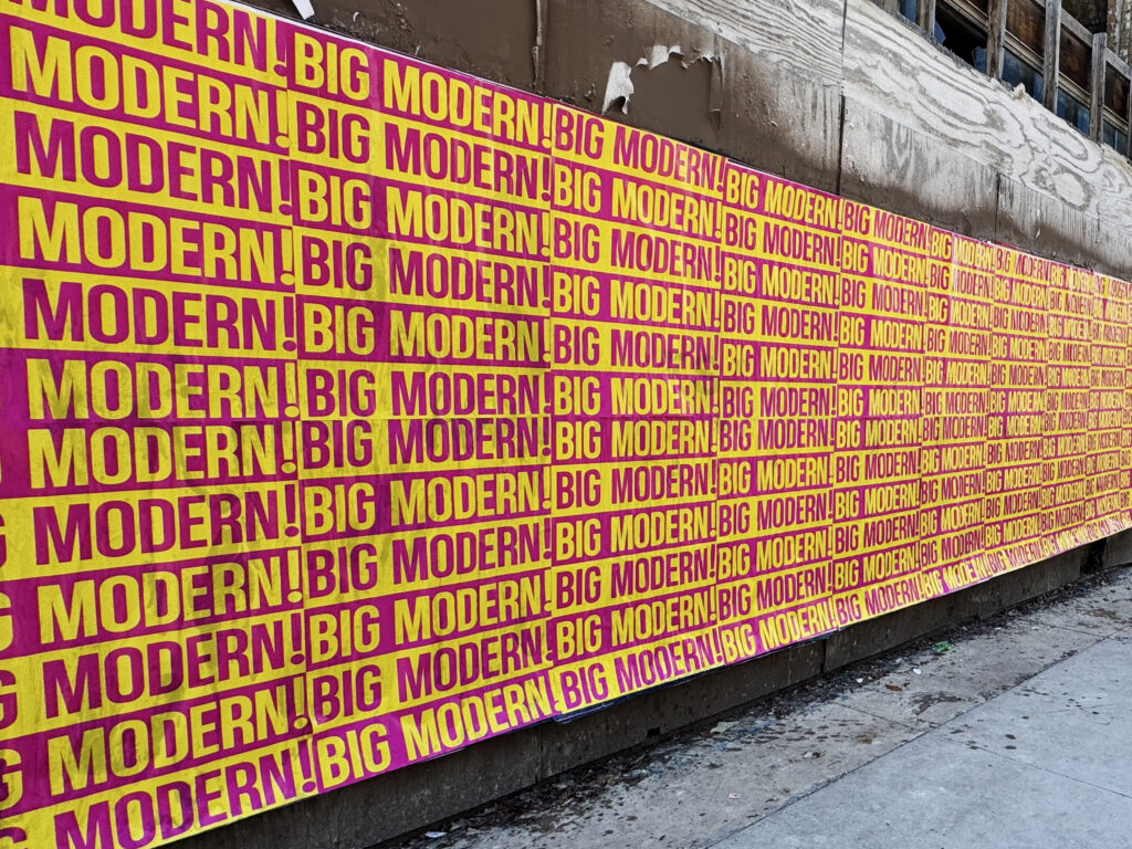
The 24×36 inch format is the dominant size in professional street wheatpaste campaigns, and it earned that status through practical logic rather than convention. Understanding why it works clarifies when other sizes are the better choice.
The logistics case for 24×36: a rolled 24×36 poster fits through a standard interior door (36 inch clearance) without turning sideways. It ships in standard 38-inch tubes without custom packaging. It can be transported in significant quantities in standard vehicles without specialized equipment. These aren’t trivial considerations when you’re running a campaign of 200 posters across multiple neighborhoods in a single night.
The installation case: a 24×36 poster can be applied by one person without assistance. You can grip both top corners simultaneously, with fingers spread, the 24-inch width is manageable in one hand-span, position the poster at the correct height on the wall, press the top edge to the pre-wet surface, and let the poster fall flat from top to bottom with both hands managing alignment. A 27×40 poster is possible solo but significantly harder; anything 48×72 (jumbo) and larger requires two people minimum.
If you want the format-specific reference page, see poster sizes for wheatpasting and our wheatpaste cost breakdown.
The visual case: at the standard viewing distance of 15 to 30 feet on a typical urban pedestrian corridor, a well-designed 24×36 is clearly legible and visually impactful. It’s large enough to command attention without being so large that it requires wall heights not commonly available. Most street-level walls in commercial neighborhoods, the brick facades between storefronts, the ends of building rows, the plywood-faced construction hoardings, accommodate 24×36 with clearance.
The economics case: 24×36 is the sweet spot between per-unit print cost and visual impact. Going to 27×40 increases cost per unit by roughly 25 to 30%. Going to 48×72 (jumbo) increases it by 200 to 400% or more depending on the printer. For a 300-poster campaign, those cost differences are significant. 24×36 delivers sufficient impact for most campaign objectives at the lowest cost that achieves that result.
None of this means 24×36 is always the right answer. It means it’s the right default, and deviations from it should be made deliberately for specific reasons.
11×17 (Tabloid Format)
The 11×17 has a long history in concert promotion and grassroots advertising, it’s the format that’s been stapled to telephone poles and taped in venue windows since before anyone had a name for street advertising. Its advantages are cost and ubiquity: it prints on standard tabloid printers, it’s cheap per unit, and it’s widely understood as the format for local events and underground promotion.
Its disadvantage is visibility. At any typical pedestrian viewing distance beyond 8 to 10 feet, 11×17 content shrinks to the point where headline text below 72 points becomes unreadable. In a visually competitive environment, a wall with multiple competing posters, or any surface with significant surrounding visual texture, 11×17 gets lost. Use it for truly local, grassroots campaigns where the audience will be within 5 feet of the wall, and where the DIY aesthetic is part of the intended effect.
18×24
The 18×24 is a workable size for campaigns targeting audiences in close proximity, retail windows, venue lobbies, interior corridor displays, and neighborhood applications where the audience is within 10 feet of the poster. At street scale, it’s too small to command attention in competitive visual environments and reads as undersized compared to professionally mounted campaigns at 24×36 and above.
One legitimate street application for 18×24: stair-stepped repetition campaigns, where a single wall carries a grid of 6 to 10 identical 18×24 posters to create a visual impact through quantity that individual large-format pieces create through size. This is a specific creative choice rather than a general-purpose size recommendation.
24×36: The Professional Standard
All the advantages outlined above. The 2:3 aspect ratio (portrait orientation in standard use) works naturally with most design compositions and is compatible with the proportions of album art, film posters, and brand imagery without awkward cropping. The size reads clearly at the standard street viewing distance of 15 to 30 feet when designed correctly, which means headline type at 100 points minimum and layout that prioritizes visual hierarchy over information density.
27×40: The One-Sheet
The 27×40 is Hollywood’s format, it’s been the standard theatrical movie poster size for decades, and the associations are cultural as much as practical. On the street, it works best in two contexts: entertainment campaigns where the one-sheet format is part of the creative vocabulary (films, albums, tours), and locations with wall heights that accommodate the extra 4 inches of vertical space without forcing the poster into territory the wall can’t hold.
The practical consideration most designers ignore about 27×40: it doesn’t fit through a standard 36-inch interior door in portrait orientation. You need at least 40 inches of horizontal clearance to move a rolled 27×40 poster through a doorway. This sounds trivial until you’re trying to move 200 of them through a building lobby at 5am. Roll them diagonally, or plan an exterior loading route. It’s not a dealbreaker, but it’s worth knowing before the night of the campaign.
Wall height requirements for 27×40: the base of the poster should sit 4 to 5 feet from the ground (eye-level centering), which places the top of the poster at 8.5 to 9 feet from the ground. Most commercial building walls clear this easily; lower residential storefront fascias may not. Scout the specific wall before committing to this size.
48×72: The Jumbo Format
Two people minimum to install. A larger bucket and a 12-inch roller for efficient paste coverage. Significantly higher print cost per unit, typically 3 to 5 times more expensive than 24×36 at the same printer and paper stock. The 48×72 jumbo is not a saturation campaign format; it’s an anchor format for specific high-visibility locations where you want a presence statement rather than volume.
The visual impact justification: at the same viewing distance, a 48×72 jumbo poster covers roughly 4 times the visual field of a 24×36. In a competitive wall environment where 24×36 is the standard size for everything else, 48×72 (jumbo) creates differentiation through scale that no amount of clever design at 24×36 can replicate. For campaigns that need a few key locations to stand out, a premier wall in Williamsburg, the NW 2nd Avenue corridor in Wynwood, 48×72 (jumbo) is worth the investment. For the volume placements in the same campaign, return to 24×36.
One caution specific to 48×72 (jumbo): at this scale, design errors that might be forgiven at 24×36 become unmissable. Typography that’s slightly too small still doesn’t read at distance. Color shifts between screen and print are more dramatically visible at 48×72 (jumbo). Layout issues that looked fine as a small file are physically obvious at 4 by 6 feet. Quality control on 48×72 (jumbo) designs requires more rigor than standard formats.
Multi-Sheet Campaigns: Billboard Scale from Standard Sheets
Multi-sheet wheatpaste configurations, assembling multiple standard-size posters side-by-side and top-to-bottom to create a larger composite image, are how street campaigns achieve billboard-scale presence without requiring custom large-format printing for every location.
The 4-Up Configuration: Jumbo Scale from Standard Sheets
Four 24×36 posters arranged in a 2×2 grid create an assembled image of 48×72 inches, 4 feet by 6 feet, matching the jumbo format size. This is the most common multi-sheet configuration for professional street campaigns. The assembled scale creates genuine billboard presence on large blank walls, construction hoarding, and warehouse facades where single-sheet formats would look undersized relative to the available space.
The design challenge: the seams. Where poster edges meet, there’s a visible seam of paste and overlapping paper that breaks the image. Design around this by placing seams in visually forgiving areas, in the sky of a space, in a dark background, in a solid color field, rather than through faces, text, or fine-line details where the seam disruption is most visible. Add a quarter inch of bleed into the seam area on each panel so the image continues past the paper edge and covers most of the seam when the panels overlap slightly during installation.
The installation challenge: the alignment. Each panel needs to land within a quarter inch of the target position for the composite image to read correctly. This requires a two-person crew minimum, one managing the paste application and panel positioning, one stepping back to sight-align each panel before it’s pressed down. Mark the wall with chalk or a light pencil line before installation to establish the grid position. Start with the bottom row and work upward; starting at the top means the upper panels might cover your alignment marks before you use them.
Larger Configurations
8-up configurations (4 panels across, 2 high) create roughly 8×6 foot composite images. Beyond 4 panels, seam management becomes increasingly complex and alignment requires careful pre-installation marking. Multi-sheet campaigns larger than 4-up are generally reserved for locations where a professional crew with multiple people can dedicate the time to precision alignment, they’re not compatible with the efficient multi-location overnight installation schedule of a standard campaign.
Design Specifications at Each Size
Street poster design follows different rules than editorial, digital, or packaging design. The viewing environment is hostile, outdoor light, visual competition, irregular surface textures, and an audience moving at walking pace rather than sitting still. Design for those conditions explicitly.
Typography: The Minimums That Actually Matter
These are the type size minimums for readability at standard street viewing distances, not comfortable reading at a desk, but legible recognition while walking past at 15 to 20 feet.
At 24×36: Headline and artist/brand name: 100 points minimum. Secondary information (album title, event date, supporting context): 60 points minimum. Tertiary elements like URLs or QR code labels: 36 points minimum. Body copy, paragraphs of information, has no place on a street poster at any size. If you find yourself trying to fit body copy into a 24×36 design, reconsider what information the poster actually needs to communicate.
At 27×40: Scale the 24×36 minimums proportionally upward by roughly 12%. Headline minimum becomes approximately 112 points. The extra height gives you more vertical space to work with, which is an invitation to scale up type rather than add more of it.
At 48×72 (jumbo): Minimum headline type scales to approximately 180 points. At this size, the instinct to fill the available space with additional information is very strong and almost always wrong. The most effective 48×72 jumbo posters are the most minimal, one dominant image, one short line of text, one brand or artist mark. The scale does the work; additional information dilutes the impact rather than adding to it.
High Contrast: Not Optional
Brick is warm red-brown. Concrete is grey. Old plywood is tan. These backgrounds eat low-contrast designs. At street level, your poster needs to read against a textured, colored surface, not the white background of your design file. Test your design by placing it against a photograph of a brick or concrete wall and evaluating contrast from 10 feet back. If the headline fades into the wall background, redesign the contrast before you print 300 copies.
Dark backgrounds with light type outperform light backgrounds with dark type for most outdoor applications. The surface color bleeds into light-background designs, reducing effective contrast. A dark background creates a hard visual boundary around the poster that helps it read as a distinct object against any wall texture.
Bleed: More Than You Think
Minimum bleed for street posters: one-half inch on all sides. One inch is better. The reason for more bleed than standard print specs: wheatpaste installation shifts posters slightly during application as the paste and paper conform to surface irregularities. A poster that was perfectly positioned when pressed can shift a half inch in any direction as the paste cures. If your critical design elements are right at the intended trim line, that shift puts them at the paper edge or slightly off. A full inch of bleed means the image extends safely past any installation shift.
Print File Technical Requirements
Getting your files to the printer correctly is as important as the design itself. The most beautiful design produces mediocre output if the file specifications are wrong. Here are the requirements that matter for street poster production specifically.
Street Poster Print Specifications
- Resolution: 100 DPI at final print size is acceptable for most street poster applications. 150 DPI minimum for photographic content. 300 DPI at print size is ideal but unnecessary for street viewing distances, it creates files that are 9x larger without meaningfully improving the visual result at 15+ feet.
- Color mode: CMYK from the start. Never design in RGB and convert at the end, the conversion shifts colors in ways that are difficult to predict and frequently dramatic, especially for saturated reds, vivid blues, and bright greens. Design in CMYK from file creation.
- Bleed: One-half inch minimum on all sides. One inch preferred for outdoor street applications.
- Safe zone: Keep all critical text and primary design elements at least three-eighths inch inside the trim edge. For larger formats (48×72 jumbo), extend the safe zone to one-half inch.
- File format: PDF/X-1a or PDF/X-4 for commercial print. High-resolution TIFF acceptable at most print shops. Never submit JPEG as a final print file, JPEG compression introduces artifacts that become visible at large-format scale even when the compression level appears acceptable at screen size.
- Fonts: Embed all fonts or convert all text to outlines before exporting your print file. Missing fonts are the single most common cause of print delays and reprints.
- Black specification: Use rich black (C:60 M:40 Y:40 K:100) for large solid black areas like backgrounds. Use pure K:100 for text. Rich black on text appears slightly blurry at small sizes because the CMYK plates are slightly misregistered; pure black for text keeps it sharp.
- Paper stock: 70–80 lb uncoated text stock for standard street campaigns. Matte uncoated surface is correct for wheatpasting, coated or glossy paper doesn’t accept paste well and produces a plasticky appearance that looks wrong on the street.
- Total ink coverage: Keep combined CMYK percentages below 280% to prevent slow-drying and ink transfer on press. Designs with heavy black backgrounds and saturated colors frequently exceed this limit without the designer realizing it.
Color Mode Deserves More Attention
The RGB-to-CMYK problem trips up more designers on street campaigns than anything else. Computer monitors use RGB, red, green, and blue light, to display color, and the gamut is wider than what offset or large-format inkjet printing can reproduce with CMYK inks. Colors that look vivid on screen can be noticeably duller in print.
The most affected colors are saturated reds (a bright RGB red becomes a noticeably orange-shifted CMYK red), vivid blues (can shift toward purple or navy), and bright greens (frequently shift toward yellow-green or become much more muted). If your campaign creative relies on a specific brand color, specify it as a CMYK value from the start rather than matching it to an RGB display value.
Brands with Pantone color standards should request that their printer match to the Pantone equivalent rather than relying on CMYK conversion, the CMYK equivalent of a Pantone color is an approximation, not a match, and the approximation error varies by printer and ink set.
Surface-Size Pairings by Market
The right size for a given location depends on wall height, visual competition, audience proximity, and the cultural register of the neighborhood. Here are the specific guidance points for the primary markets and locations we operate in most frequently.
Williamsburg, Brooklyn
Bedford Avenue at N 6th Street, the main commercial strip: 24×36 is standard and workable. The competition is heavy and the visual context is dense, so 24×36 campaigns need to be visually strong to differentiate. 48×72 (jumbo) at prime locations on this block creates meaningful scale differentiation. The Kent Avenue warehouse corridor between N 8th and N 9th has taller industrial walls that accommodate 27×40 well, and lower competition that makes any size more visible.
Wythe Avenue between N 6th and N 9th: 24×36 is appropriate for most surfaces. The hotel-corridor context here is slightly more controlled than Bedford Avenue, with wall surfaces that tend to be maintained and painted more recently, which means smooth-surface adhesion considerations apply (use higher PVA in paste formulation). The taller building facades on this stretch will accommodate 27×40 on the right walls.
Bushwick, Brooklyn
Troutman Street (Bushwick Collective): 24×36 standard. The murals dominating this block are massive, your campaign isn’t competing with those but with the poster layer on top of them, which is typically 24×36. Going to 48×72 (jumbo) on the right wall creates contrast with the surrounding poster scale. Jefferson Avenue between Wyckoff and St. Nicholas: 24×36 appropriate; walls are quieter and the single-poster format has more breathing room. Flushing Avenue warehouse corridor: if using this location for J train visibility, 48×72 (jumbo) or larger, the improved viewing distance and speed make smaller formats effectively invisible to train passengers.
Manhattan: SoHo and LES
SoHo around Spring Street between Thompson and Sullivan: 24×36 is the maximum practical size for most locations here. The storefront-adjacent walls are mostly under 12 feet in height, and the available blank surface between windows, signage, and building features limits effective poster height. 27×40 works in a few spots but should be scouted before committing. The Houston/Bowery wall in the Village accommodates large formats, 48×72 jumbo and multi-sheet configurations have both appeared there. Orchard/Rivington LES: 24×36 standard, with occasional 27×40 on the taller building facades.
Harlem: 125th Street
125th Street between Adam Clayton Powell Jr. Blvd and Malcolm X Blvd: the building scale here is significantly larger than in downtown Manhattan or Williamsburg. Multi-sheet 4-up configurations (assembled 48×72) work well on the wider wall surfaces available. Single-sheet campaigns at 24×36 are appropriate for standard saturation; anchor locations can accommodate 48×72 (jumbo) comfortably. The block’s visual density and scale favor larger formats more than most NYC locations.
Hell’s Kitchen
9th Avenue between W 43rd and W 51st: residential and commercial mix with varied wall heights. 24×36 standard. Some of the larger blank surfaces on this corridor accommodate 48×72 (jumbo) for statement placements.
Miami: Wynwood
NW 2nd Avenue between NW 20th and NW 29th: the warehouse walls on this corridor are among the tallest available for wheatpaste work in any major U.S. market, some exceed 20 feet of blank surface above the ground-level business signage. 27×40 is not only possible here but is frequently the better choice than 24×36 specifically because the wall height makes the extra inches visible and impactful. Multi-sheet configurations work particularly well here for major campaigns. The loading dock walls on NW 29th Street east of NW 2nd have similar height capacity and similar suitability for larger formats.
Collins Avenue South Beach (10th–14th Street): 24×36 standard. The density of signage and the shorter available surfaces limit practical size here.
| Location |
Recommended Primary Size |
Anchor Location Size |
Notes |
| Bedford Ave, Williamsburg (N 6th) |
24×36 |
48×72 (jumbo) |
High competition, go bigger to differentiate |
| Kent Ave corridor, Williamsburg |
24×36 or 27×40 |
48×72 (jumbo) |
Taller industrial walls, lower competition |
| Troutman St, Bushwick |
24×36 |
48×72 (jumbo) |
Competes with mural backdrop, needs visual strength |
| Flushing Ave warehouse corridor |
48×72 (jumbo) |
4-up multi-sheet |
Viewed from improved J train, smaller formats invisible |
| Houston/Bowery wall, NYC |
48×72 (jumbo) |
4-up multi-sheet |
Premium placement, premium size appropriate |
| SoHo (Spring St area) |
24×36 |
27×40 where wall height allows |
Most walls under 12ft, 48×72 jumbo often impractical |
| 125th St, Harlem |
24×36 |
4-up multi-sheet |
Building scale suits larger formats |
| NW 2nd Ave, Wynwood |
27×40 |
4-up multi-sheet |
Tall warehouse walls, use the height |
| Orchard/Rivington, LES |
24×36 |
27×40 |
Standard street scale, 24×36 correct |
Making the Right Size Decision
Here’s the decision framework, condensed to the key questions:
Start with 24×36 as your default for any standard street campaign. Deviate to 27×40 when you’re running an entertainment campaign where the one-sheet format carries inherent cultural associations, or when specific locations have wall heights that make the extra 4 inches of vertical presence meaningfully visible. Deviate to 48×72 (jumbo) for anchor placements only, the locations in your campaign where presence statement matters more than volume, usually one to three locations per market. Consider multi-sheet configurations when you have a specific large wall that would benefit from billboard-scale presence and you have a crew capable of precise alignment installation.
One decision the numbers often suggest but practical experience pushes back against: optimizing for cost-per-impression by running more 24×36 posters rather than fewer 48×72 (jumbo) ones. For saturation campaigns, this is correct, more locations at standard size outperform fewer locations at premium size. For anchor placements in high-competition environments, it’s wrong. A 48×72 (jumbo) on Bedford Avenue at N 6th Street in prime position, outscaling everything around it, delivers more per-impression value than three more 24×36 placements on secondary surfaces in the same neighborhood. Context determines which math applies.
If you’re not sure, ask the people who have been on those walls. American Guerrilla Marketing makes these decisions for every campaign we run, and we’re glad to walk through the specific size and location logic for your market and objectives before you print anything.
Frequently Asked Questions
What is the most common poster size for street wheatpasting?
24×36 inches is the industry standard for professional street wheatpaste campaigns. It hits the sweet spot between visual impact, practical handling, print cost, and universal surface compatibility. Almost every professional campaign we run uses 24×36 as the primary format, sometimes supplementing with 27×40 or 48×72 (jumbo) for specific anchor locations. If you’re designing your first street campaign and unsure which size to use, start with 24×36, it’s right for the vast majority of applications.
What resolution (DPI) should I use for street poster print files?
100 DPI at final output size is acceptable for most street poster applications. You’re designing for 10 to 30 foot viewing distances, not close-up inspection. At those distances, 100 DPI is visually indistinguishable from 300 DPI. For photographic content with fine detail, 150 DPI is a safer minimum. Working at 300 DPI at full print size creates files 9x larger without meaningfully improving the visual result at street viewing distances.
Should I design for 24×36 or 27×40 for a major market campaign?
For most campaigns, design for 24×36 and upgrade specific anchor locations to 27×40 if the wall height accommodates it. 27×40 makes the most sense for entertainment campaigns where the one-sheet format carries cultural associations, and for locations with tall warehouse or building walls where the extra height creates meaningful visual differentiation. In SoHo, where most storefront-adjacent walls are under 12 feet, 27×40 is often impossible. In Wynwood or Williamsburg’s warehouse corridors, the extra height is readily usable.
What’s the largest poster size I can apply by myself without a crew?
24×36 is the realistic maximum for solo wheatpaste installation. At this size, you can grip both top corners simultaneously, position the poster at the right height, press the top edge to the pre-wet surface, and let the poster fall flat from top to bottom with both hands managing alignment. 27×40 is possible solo but significantly harder to position correctly. Anything 48×72 (jumbo) and larger requires two people minimum, the extra size makes solo positioning essentially impossible while also managing paste application.
Why is my printed poster color different from what I designed on screen?
Almost certainly a color mode issue. Computer monitors display color in RGB with a wider gamut than commercial printing can reproduce in CMYK. If you design in RGB and submit for print, the printer converts your file and the conversion shifts colors, often significantly for saturated reds, bright blues, and vivid greens. Design in CMYK from the start, not RGB, and what you see in your design file will closely match the final printed output. Specify brand colors as CMYK values rather than RGB or hex codes in your print files.
Size is a starting decision, not a finishing one. The right size for a given campaign depends on the creative, the market, the walls, the budget, and the campaign objective, and those variables interact in ways that make blanket recommendations inadequate for most real planning situations. The framework here gives you the knowledge to evaluate each of those variables; applying it to a specific campaign requires someone who knows the walls.
Ready to Put Your Posters on the Street?
American Guerrilla Marketing handles full-service wheatpaste campaigns in every major U.S. market, from print production to professional installation and documentation.
Get a Campaign Quote →