Most guides to street poster campaigns are written for people who’ve never run one. They explain what wheatpasting is and tell you to “choose your target demographic” as if that’s a meaningful instruction. This guide is written for people who are actually planning a campaign and need to know which specific decisions matter, which ones don’t matter as much as they think, and what typically goes wrong.
We’ve executed campaigns for major labels, independent artists, consumer brands, fashion companies, entertainment studios, and startups across every major U.S. market. We’ve seen campaigns that got photographed five hundred times and campaigns that disappeared in four days. The difference almost never comes down to budget. It comes down to a small set of decisions that most clients either underplan or get wrong entirely.
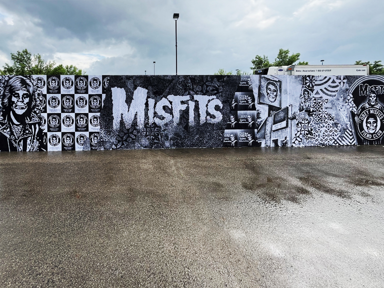
Before a team prints anything, it usually helps to pair this with our poster size guide and wheatpaste recipe and process walkthrough.
This is the guide we wish we could hand to every client before we start a new campaign relationship.
What Actually Fails in Street Poster Campaigns
Let’s start with the failure modes, because they’re more instructive than a clean seven-step process.
Under-scaling in competitive markets. This is number one by a significant margin. A client allocates enough budget for 10 placements in New York City, expecting those 10 placements to create meaningful impact in a city of 8 million people. It doesn’t work. Ten posters in Manhattan might generate two or three impressions per placement per day before getting buried. The whole logic of wheatpasting campaigns is frequency, seeing the campaign multiple times builds recall. Ten placements spread across even two neighborhoods can’t generate that frequency for more than a handful of people. If your budget only allows for 10 placements, concentrate them all in a single corridor so you’re getting real density somewhere, rather than phantom presence everywhere.
Generic creative that doesn’t own the wall. Your poster is competing with every other piece of visual information on that wall and on that block. Generic design, the kind that could be for any brand in any category, loses this competition every time. Arresting creative wins. Not complicated creative, not expensive creative. Bold, high-contrast, instantly readable creative that stops a moving person mid-stride. We’ve seen beautifully printed campaigns with exquisite typography disappear completely on a Bushwick wall and seen a simple high-contrast graphic with a single strong image get photographed by strangers for three weeks straight. The wall doesn’t care about your brand guidelines. It cares about what gets noticed.
For installation decisions in the field, see how to wheatpaste posters and what wheatpasting is.
Neighborhood selection based on name recognition rather than audience fit. “Williamsburg” is on every client’s request list because it’s famous. But if your campaign is for a health food brand targeting suburban parents who occasionally visit the neighborhood, Williamsburg is not your audience. The poster will go up, it will be seen, and none of the people who see it will be your target demographic. Neighborhood selection should start with audience demographics and work backward to geography, not start with familiar neighborhood names and hope the audience appears.
No documentation plan. This one kills us every time we see it. A campaign goes up in the right neighborhoods with great creative and nobody photographs it properly. The window for organic social amplification passes because the brand has no in-context imagery to seed. They end up with a campaign that performed well on the street and left almost no digital trace. Professional documentation of every placement is not optional, it’s half the campaign’s value.
Timing misalignment. Going up four weeks before an event means the poster peaks before the moment. Going up two days before means nobody has seen it enough times to register it. There is a specific optimal window for most campaign types, and missing it by a week in either direction meaningfully degrades campaign effectiveness.
The difference between a campaign that gets photographed 500 times and one that disappears in 48 hours is almost never budget. It’s creative quality, neighborhood fit, density, and timing.
The Brief That Actually Works
The brief is where campaigns get built or broken. A vague brief produces a vague campaign. Here’s what a brief that actually enables strong execution looks like:
Campaign objective in one sentence. Not “build brand awareness”, that’s a category. “Drive ticket sales for our NYC show on July 19th among hip-hop fans aged 22–35 in Brooklyn and the Lower East Side.” That sentence tells us the event, the date, the demographic, and the geography. Every placement decision flows from it.
Target demographic with specificity. Age range, location, cultural interests, lifestyle markers. “Young creatives in Brooklyn” is a starting point. “Music-focused 24–32 year olds who frequent independent venues and coffee shops in Williamsburg, Bushwick, and the Lower East Side” is actionable guidance for location selection.
Creative status. Do you have print-ready files? Final approved designs? Or are you in concept development? The creative status determines whether we’re planning a campaign around existing assets or building in time for creative development. These are very different timelines and budgets.
Hard deadline. When do you need posters on walls? Work backward from that date to set the timeline for creative finalization, print production, and installation. In our experience, 10–14 days from brief approval to installation is achievable for standard campaigns with ready creative. Rush timelines of 5–7 days are possible but require immediate action at every stage and leave no room for error.
Budget range. Not a specific number, but a range that tells us whether we’re planning a 10-location campaign or a 50-location campaign. These are different strategic exercises. Trying to get a useful proposal without a budget range just wastes everyone’s time.
Matching Neighborhood to Campaign Type
The most useful framework we have for neighborhood selection is campaign-type matching. Different campaign types belong in different neighborhoods, and the overlap between campaign type and neighborhood character is what determines whether your posters look like they belong or look like they’ve been dropped from a helicopter.
Music campaigns belong in Williamsburg (Bedford Ave, the Kent Avenue warehouse corridor), the Lower East Side (Ludlow, Orchard, Eldridge), Bushwick (Troutman Street, Jefferson Ave), and Harlem (125th Street corridor, near the Apollo). These neighborhoods have the deepest relationship with music culture, and the audiences walking these streets are actively embedded in that culture. A music campaign in these zones reads as native. A music campaign in midtown Manhattan reads as lost.
Fashion and streetwear belong in SoHo (Wooster between Spring and Broome, Spring between Thompson and Sullivan), Williamsburg (the Wythe Avenue hotel corridor, Bedford Ave), and for certain brands, the LES (Orchard/Rivington, the blocks that still have genuine fashion-forward character). Hell’s Kitchen works for fashion campaigns with broader appeal, the restaurant and entertainment district foot traffic skews more mixed-income and mixed-interest than SoHo or Williamsburg, but the volume is high.
CPG brands need to follow their consumer density. If you’re launching a beverage targeting young professionals in Brooklyn, your placement map should be built around where those professionals actually live, Williamsburg, Crown Heights Franklin Avenue corridor, Park Slope commercial strip. If you’re targeting a broader NYC consumer profile, 9th Avenue in Hell’s Kitchen, 125th Street in Harlem, and the commercial corridors of Astoria build city-wide presence without overpaying for the cultural cachet of markets that may not match your consumer.
Entertainment campaigns (film, TV, streaming) depend entirely on who the content is for. A prestige drama targeting educated adults belongs in SoHo, Chelsea, and the Upper West Side. A horror film targeting 18–25 thrill-seekers belongs in the LES and Bushwick. A comedy special for a Black audience primarily belongs in Harlem and Crown Heights. The content determines the neighborhood, and getting this wrong is how entertainment campaigns generate impressions from entirely the wrong audience.
NYC Campaign Architecture: The Specific Decisions That Matter
Most brands default to concentrating their entire campaign in one neighborhood. It’s the simpler brief, it’s easier to visualize, and it feels like you’re making a statement. But 50 posters concentrated on Bedford Avenue in Williamsburg is almost always a worse campaign than 50 posters distributed strategically across two or three neighborhoods.
Here’s why, and here’s how to do the distribution correctly.
Bedford Avenue Williamsburg at 50 posters means you’re fighting for visibility in the most competitive wheatpaste corridor in Brooklyn. Your campaign gets buried faster, your per-poster lifespan is shorter, and you’re paying (in competition, not dollars) for placement in a market where everyone else also wants to be. Your 50 posters are generating frequency for a relatively concentrated audience segment, the people who specifically walk the Bedford strip.
Now compare that to this distribution: 5 posters on Bedford Ave Williamsburg (your anchor presence on the main strip), 10 on Troutman Street Bushwick (the gallery crowd and arts-oriented demographic), 10 on Orchard/Rivington LES (the nightlife and independent music crowd), 10 on 125th Street Harlem (cultural authority and high foot traffic in upper Manhattan), and 15 on 9th Avenue Hell’s Kitchen (theater and entertainment district volume). Same 50 posters, five neighborhoods, completely different audience reach.
This architecture gives you: the prestige of the Williamsburg main strip, the arts credibility of Bushwick’s Collective corridor, the street authenticity of the Lower East Side, the cultural authority of Harlem, and the volume of Hell’s Kitchen. You’ve created a campaign that is genuinely present across New York City, not just on one famous block in Brooklyn.
The tradeoff is that you lose the saturation effect of 50 posters in a single corridor. For campaigns where frequency in a single neighborhood is the primary objective, a show at a specific Williamsburg venue, a pop-up in a specific location, concentrated placement still makes sense. For most brand campaigns, the distributed architecture delivers more total value.
Creative That Performs on the Street
Street creative has to do one thing that most creative briefs don’t specify: stop a person who is moving through a visually saturated environment and is not expecting to be stopped. This is different from stopping a person who is already looking at their phone and sees an ad between posts. The passive, scrolling engagement mode of digital advertising is gone. Your poster has to compete with everything on that block, storefronts, other posters, people, vehicles, the general visual noise of a busy city street.
High contrast wins. Not complicated design, contrast. Black on white. Red on black. White on deep blue. The colors that register immediately from fifteen feet away and don’t require the viewer to work to process them. We’ve seen beautifully designed campaigns with subtle color palettes and refined typography get completely lost on busy walls. We’ve seen simple, almost crude, high-contrast graphics generate documented social sharing for weeks.
The three-second rule is real. If someone walking at normal pace can’t absorb your primary message in three seconds, you’ve lost them. That means: one dominant visual element, one strong headline (five words or fewer), and one clear action (a date, a QR code, a name, a website). Everything else is noise. You can add secondary information for people who stop to look closer, but design for the three-second pass-by, not for the careful reader.
A QR code that links to a campaign-specific landing page is genuinely worth including in 2026. Scan rates on outdoor advertising QR codes are higher than most people expect, particularly among the younger demographics that these campaigns typically target. Make the QR code large enough to scan from arm’s length without effort, minimum 1.5 inches square, ideally 2 inches or larger. And make sure the destination page delivers on the promise the poster makes. A QR code that leads to a generic homepage wastes every scan.
Don’t over-logo the design. Your logo should be present and legible, but it doesn’t need to dominate. Heavy logoeing feels corporate on a street wall, it reads as “this brand is trying to own the wall” rather than “this brand belongs on the wall.” The visual impact of the campaign creates the brand association; the logo confirms it.
Print Production Details That Affect Campaign Performance
Most clients don’t think about print production at the strategic level. They should. The physical specifications of your poster affect how it applies, how long it lasts, and how it reads in the field.
Paper stock matters. Uncoated text-weight paper (60–80 lb) is the standard for wheatpaste campaigns because it absorbs paste adhesive effectively and bonds well to brick and concrete. Coated or glossy stocks resist adhesion, which creates paste application problems and reduces durability. Glossy paper also picks up visual glare that makes posters harder to read in direct sunlight. Don’t print your street campaign on glossy stock regardless of how good it looks on a proof sheet.
Ink coverage and color accuracy. Printing in high coverage (large areas of saturated color) on thin paper can cause dimensional instability, the paper warps slightly as it dries, which affects application quality and final appearance. If your design has large areas of solid color, specify at least 70 lb stock. Discuss with your printer if you’re doing large-format pieces on anything thinner.
Quantity planning. Order 15–20% more posters than your planned placement count. Surface conditions vary, some walls need two posters applied to cover texture unevenly, some placements get damaged during transport, some additional opportunities emerge during the installation run. Running short on print quantity mid-campaign is a logistics problem that delays installation and is entirely preventable with a buffer in your print order.
Lead time. Standard campaign print quantities (50–200 units) at a reputable printer are 48–72 hours from file approval to delivery. If you’re cutting it close to your installation date, confirm turnaround before you submit files, not after. Rush print can be arranged but adds cost and compression to an already tight timeline.
Installation: What Good Execution Looks Like
Professional wheatpaste installation is a skilled physical operation. It’s not complicated, but it requires training and experience to do well at scale. Here’s what separates good installation from bad:
Surface preparation. Good crews assess wall surfaces before applying paste. Surfaces that are dusty, loose, or coated with incompatible material get cleaned or the placement is moved to a better surface. Skipping this step produces bubbles, adhesion failures, and premature detachment.
Paste consistency and application. Paste that’s too thick doesn’t penetrate the paper evenly and creates bubbles. Paste that’s too thin doesn’t bond and the poster peels in weather. The right consistency is medium, fluid enough to apply smoothly, thick enough to hold. This gets learned through repetition.
Smoothing technique. Posters applied from top to bottom with a clean squeegee or roller, working out bubbles toward the edges, produce clean, flat results. Posters applied haphazardly bubble and peel faster.
Speed and route efficiency. A professional crew with local market knowledge can install 40–60 placements in a single night in a dense urban market. They know the route, they know the surfaces, they know which locations are worth the time and which should be skipped if conditions aren’t right. DIY campaigns in unfamiliar cities rarely approach this efficiency, which affects both cost and timeline.
Top coating. A layer of diluted paste applied over the installed poster seals the paper and significantly extends lifespan in weather. This adds time to the installation process but is worth it for any campaign where durability is important.
Timing Decisions That Separate Good Campaigns from Great Ones
Timing is the most underestimated variable in street campaign planning. Clients focus on creative, neighborhoods, and quantity, and then make timing decisions almost as an afterthought. That’s a mistake.
The 10–14 day rule for event campaigns. If your campaign is tied to a specific date, a show, a release, a launch event, you want posters on walls 10–14 days before that date. This window gives enough time for your target audience to encounter the campaign multiple times (the frequency required for actual recall to form), while keeping the urgency of the approaching date real and actionable. Earlier means your campaign peaks before the event. Later means you’ve wasted most of the impression window.
Day of week for installation. Thursday installation means posters are fresh for the high-traffic Friday-Sunday window, the period when your target demographic is out, moving through neighborhoods, and in discovery mode. Monday installation means your freshest, cleanest posters are going up during the lower-traffic early-week period. If you have flexibility on installation timing, Thursday is the optimal day for most entertainment and nightlife campaigns.
Seasonal considerations. Late spring and early fall are the strongest seasons for NYC campaigns. Summer loses a significant portion of the creative demographic to vacations, and heat + humidity accelerates poster degradation. Winter is viable but faces the application challenges of cold temperatures and the lifespan challenges of freeze-thaw cycles. September is genuinely the best single month in our experience, fall energy, Fashion Week press attention, high foot traffic from back-to-school activity, and favorable weather for poster longevity.
Planning refresh cycles for longer campaigns. Any campaign planned for more than three weeks should budget for at least one refresh installation in high-competition locations. The most valuable walls in Williamsburg and the LES turn over in 2–3 weeks. A campaign that starts strong and then degrades to a half-visible buried poster for weeks two through four isn’t maintaining its intended presence. Refresh placements in key locations extend the campaign’s visibility through its full intended window.
Documentation: The Part Everyone Underinvests In
Professional documentation of your street campaign is not a nice-to-have. It is half the campaign’s value, and we’d argue it’s often more than half.
Here’s the logic. Your physical placements reach the people who walk past those specific walls during the campaign’s active window. Professional documentation, high-quality, in-context street photography of each placement, reaches everyone who sees that content across social media, press coverage, and your own marketing channels. For a well-executed campaign with arresting creative in iconic locations, the documentation often reaches more people than the physical placements themselves.
We’ve seen campaigns where the installation photos posted to an artist’s Instagram account generated more engagement than any other post that month, and the “content” was just the campaign we’d already executed. The creative was done. The placement was done. The only incremental investment was the photographer who documented the walls and the fifteen minutes it took to post the images.
What good documentation looks like: wide-angle context shots that show the poster in its neighborhood environment (the wall, the surrounding street, the visual texture of the block), close-up detail shots of the poster itself, and where possible, photos with people passing by that demonstrate scale and real-world context. Installation video, time-lapse of a poster going up, or a clip of the crew working a wall, performs consistently well on short-form video platforms.
Don’t document for documentation’s sake. Document for content. Every campaign image should be usable as a social post, a press photo, or a campaign asset. Brief your photographer accordingly.
For brands working with American Guerrilla Marketing, professional campaign documentation is included with every campaign. We photograph every placement location and deliver a complete documentation package within 24–48 hours of installation. But it’s worth emphasizing: that package is only valuable if you use it. The brands who get the most from their street campaigns are the ones who seed the documentation aggressively across social, press, and digital channels immediately after the campaign goes live.
Measuring What You Can Measure
Street advertising measurement has improved significantly as QR codes and digital tracking tools have become standard. Here’s the honest accounting of what you can and can’t measure:
| Measurement Method |
What It Actually Tells You |
Limitations |
| QR code scans |
Direct actions taken by people who saw the poster |
Undercounts total impressions; only captures actively engaged viewers |
| Campaign-specific URL direct traffic |
Web sessions initiated from the campaign |
Requires typing in the URL; captures only highly motivated viewers |
| Branded search volume lift |
Overall brand awareness increase in targeted markets |
Requires baseline data; confounded by other simultaneous marketing |
| Social media mentions / tags |
Organic engagement and documentation by audience |
Only captures people who photograph and post; undercounts total reach |
| Geographic web traffic analysis |
Campaign market performance vs. control markets |
Requires clean comparison markets without other simultaneous activity |
| Sales/ticket/download lift in target markets |
Direct commercial impact in the geographic campaign footprint |
Attribution is difficult in multi-channel campaigns |
No single metric tells the whole story. The brands that evaluate street campaigns most effectively triangulate across two or three data points rather than relying on any single one. Branded search lift plus social documentation plus QR scan volume together give a much more complete picture of campaign impact than any one of them alone.
Build measurement into the campaign architecture from the beginning. Include QR codes in your design. Set up campaign-specific URLs before installation. Establish baseline metrics (social following, web traffic, branded search volume) before the campaign launches so you have clean comparison data after. This takes 30 minutes of setup and makes post-campaign evaluation significantly more meaningful.
The honest limitation: wheatpasting campaigns are not as precisely measurable as digital advertising, and they shouldn’t be evaluated by the same standards. They deliver things digital doesn’t, physical presence, cultural credibility, earned social documentation, and those things are genuinely harder to quantify. Build your evaluation framework around the specific objective of your campaign, and resist the temptation to apply digital attribution models to a fundamentally different medium.
Ready to put together a campaign that does all of this right? Start at americanguerrillamarketing.com, we’ll build a proposal around your specific markets, objectives, and timeline.
Ready to Launch Your Street Poster Campaign?
American Guerrilla Marketing executes wheatpaste and street poster campaigns in every major U.S. market. From concept to installation, we handle it all.
Get a Campaign Quote →
Frequently Asked Questions
How many posters does it take to make a street campaign feel real?
There’s no universal number, but there’s a threshold below which a campaign doesn’t register as a campaign, it registers as a few posters. In a single neighborhood, that threshold is roughly 20–25 concentrated placements on the main streets and key corners. For a multi-neighborhood campaign in a major market, we typically recommend a minimum of 15 total locations across 2–3 neighborhoods. If you want a campaign to genuinely feel everywhere in a specific neighborhood, think 25–50 concentrated placements in that zone. Below 10 placements in any given market, you have presence but not saturation, and saturation is what builds the frequency required for meaningful brand recall.
Should I concentrate in one neighborhood or spread across multiple?
Concentrate unless you have a genuine multi-audience reason to spread. The most common mistake in street campaigns is spreading too thin, 10 posters in five neighborhoods means 2 per neighborhood, which accomplishes essentially nothing in terms of frequency or recall. The exception: when your campaign has distinct audience segments in different neighborhoods. A music artist whose fans are genuinely split between Williamsburg, the LES, and Harlem should spread because those are different audience pockets that deserve separate presence. But if you’re spreading just to cover more ground, don’t. Two neighborhoods done right beats five neighborhoods done poorly, every time.
What’s the ideal timing, days before launch or weeks?
For event-tied campaigns, the optimal window is 10–14 days before the launch date. That’s long enough for the audience to encounter the campaign multiple times (the frequency required for recall), but close enough to the event that urgency is real when people see it. Going up 3–4 weeks out is too early: the campaign peaks before the moment and may be buried by new campaigns by the time your date arrives. Going up 2–3 days out is too late: the impression window is too short for frequency to accumulate. For sustained brand awareness campaigns without a specific event date, 2–4 week windows with refresh at the midpoint maintain visibility through the full intended run.
How do I document my campaign for social media amplification?
Document as a content production exercise, not an afterthought. In-context street photography of each placement (poster in its neighborhood environment with surroundings visible), close-up detail shots, and installation video all serve different content needs. Time-lapse installation video performs exceptionally well on Instagram and TikTok. Beyond brand-produced documentation, track organic social content from people photographing and sharing your campaign, reshare it, engage with it, and monitor location tags in your campaign markets. The organic documentation layer often reaches more people than the brand’s own content. Build documentation into the brief from the beginning: if no one is assigned to photograph the placements, it won’t happen at the quality level you need.
What size poster works best for street campaigns?
For standard wheatpaste campaigns, 24×36 inches is the workhorse format, large enough to command pedestrian attention, efficient to install in quantity, and fits the most commonly available wall surfaces. For anchor placements on premium surfaces (warehouse walls in Williamsburg’s Kent Avenue corridor, SoHo construction hoardings, Bushwick’s Flushing Avenue warehouses), multi-sheet large format creates dramatically more visual impact. The practical approach: plan the majority of placements in 24×36, identify 2–3 premium surfaces per campaign for large-format anchor pieces, and budget print production accordingly. Large format everywhere is expensive and requires surfaces that may not be available; standard format everywhere misses the visual impact of the marquee placements.