Poster with Pull Tabs: The Complete Guide to Design and Placement | AGM
A poster with pull tabs turns a single sheet of paper into a self-contained lead generation machine. No handout required. No salesperson needed. Just design it right, put it in the right location, and let the tabs do the work.
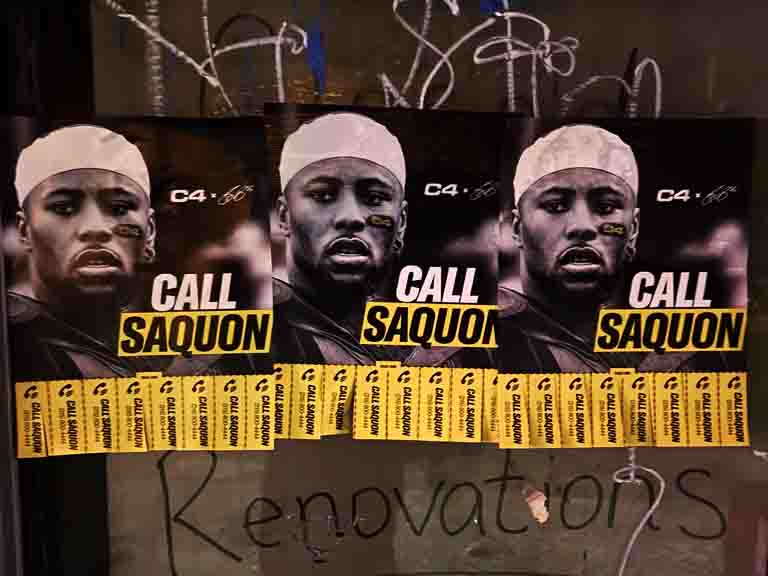
A poster with pull tabs is exactly what the name describes: a printed poster, typically letter-size, with the advertisement or message taking up most of the sheet and a row of narrow tear-off strips along the bottom. Each strip carries contact information. An interested reader tears one off and takes it with them. No pen. No phone needed in that moment. Just pull and go.
This format has been around for decades. Musicians posted them in record stores. Tutors posted them near universities. Dog walkers, housecleaners, handymen, landlords, and small business owners have all used it because the mechanics work. The pull tab is a physical response mechanism that requires an active decision from the reader. That active decision is what makes the lead valuable.
At American Guerrilla Marketing, we produce and place pull-tab posters across New York City neighborhoods as part of broader local distribution campaigns. We also help clients understand the design elements that drive actual tab pulls versus the design choices that get posters ignored. The difference between a pull-tab poster that generates ten leads per week and one that generates zero is almost entirely execution — not the medium itself.
This guide covers the full process: why the format works, how to design for maximum response, where to place posters in high-density urban markets, how to measure what is working, and how to integrate pull-tab posters into a larger neighborhood-level campaign. Everything here is based on what we have learned placing these in real New York City neighborhoods, not theory.
Why a Poster with Pull Tabs Generates Qualified Leads
The pull tab is a physical commitment. When someone walks up to a community board, reads a poster, and tears off a tab, they have made an active choice to engage. This is categorically different from passively walking past an ad or having content appear in a feed. The person pulling a tab stopped, read the offer, decided it was relevant to their current need, and acted on that decision by taking a physical piece of paper into their possession.
Every pull tab represents a person who chose to engage. Not someone who glanced at a poster in passing. Not someone who scrolled through a digital ad. Someone who made a deliberate physical gesture of interest. That is a fundamentally different quality of contact. The conversion rate from a pulled tab to a phone call or website visit is substantially higher than from a random digital exposure because the intent is already established before the follow-up even happens.
The format also creates passive social proof. A poster with six or eight tabs still attached looks untouched. A poster with only three tabs remaining looks like something people want. Incoming readers interpret the missing tabs as signal that others in the community found the offer credible and worth pursuing. This peer validation happens silently and automatically at every location where the poster has been up for more than a few days.
For local services with a defined geographic service area, this quality of lead is rare. Most advertising channels reach far beyond the geographic zone where a business actually operates, generating contact from people who cannot use the service. Pull-tab posters on community boards in specific neighborhoods generate leads from people who live and work in those exact neighborhoods. The geographic targeting is built into the placement.
AGM Field Note — The Intent Advantage: A tab pulled is proof of interest. The person who pulls it has already read your offer, judged it relevant, and made a physical decision to follow up. That is a higher-quality starting point than almost any passive advertising format. We consistently see pull-tab leads convert to clients at rates that make the cost per acquisition competitive with digital channels costing ten times as much per contact.
How to Design a Poster with Pull Tabs That Actually Gets Tabs Pulled
Design is where most pull-tab posters fail. The information is buried, the tabs are too narrow to read, or the headline does not communicate the offer in the first three seconds. Here is what the design needs to accomplish and how to execute each element.
The Headline
The headline is the most important element on the poster. It needs to communicate what you are offering, to whom, and why it matters, in one line. A strong headline is specific. “Guitar lessons in Astoria, beginners welcome, starting at $40” tells you exactly what is available, where, who it is for, and a rough price point. “Professional music education for aspiring instrumentalists” tells you very little. The test for a good headline: can someone standing three feet away understand your offer in under five seconds? If not, rewrite.
The headline should be the largest text on the poster, set in a bold weight at a size readable from at least three to four feet. High contrast between the text and background is non-negotiable. Black on white or white on a dark color field. Decorative scripts and low-contrast color combinations fail at community board distances.
Supporting Copy
Below the headline, include two to three short lines of detail. These lines answer the immediate follow-up questions that arise after the headline generates interest: What does it cost? Where is it located? What are the credentials or proof points? What are the hours or availability? These specifics are what move a reader from curious to committed. “Starting at $45 per session. Flexible weekday evenings. 10 years teaching experience in NYC.” That is three lines that answer three questions and build enough credibility to prompt a tab pull.
A QR Code
Add a QR code to the main body of the poster. Not every reader wants to tear off a paper tab. Some people prefer to scan and let their phone handle the follow-up. A QR code linking to a mobile-optimized landing page gives you a second response mechanism and a digital measurement point. Use a trackable QR code service with unique codes per location or per neighborhood batch so you can attribute digital engagement to specific placements.
The Pull Tabs
The tabs are a functional element, not a decorative one. Design them to work. Cut slits from the bottom edge of the poster upward to a horizontal guideline, leaving strips 0.75 to 1 inch wide. Print your contact information below the guideline, rotated 90 degrees, repeated across the full width. When the reader tears off a tab and holds it upright, the contact information reads naturally. Include phone number, website URL, or both. That is the maximum content that fits on a strip of that width while remaining legible.
Visual Hierarchy and Layout
The poster should be easy to scan in order of priority. Headline first, largest and most prominent. Supporting copy second, smaller but readable from a few feet away. QR code and any supporting graphic third. The pull tabs fourth, at the bottom, structured and functional. Everything on the poster should serve one of two purposes: drawing the reader in or giving them a way to respond. Decorative elements that do neither compete with the functional elements and reduce performance.
Paper Weight and Print Quality
Print on at least 24 lb paper for indoor locations. For any placement near a door, window, or outdoor-adjacent surface, use 32 lb stock or heavier with a light coating for moisture resistance. Thin paper tears unpredictably, wears out faster, looks unprofessional at close range, and signals to the reader that the person advertising does not take their own offering seriously. A poster on heavy stock that lasts three weeks outperforms two posters on thin stock that need replacing every five days. Print in color when possible. A color header band or border draws the eye significantly better than a black-and-white design competing on a board full of other black-and-white designs.
Where to Place Pull-Tab Posters for Maximum Results in New York City
Placement determines lead quality more than any other variable. The right poster in the wrong location generates nothing. A well-placed poster in the right location generates consistent weekly leads for months. The determining factor is dwell time combined with audience relevance. The best locations are places where your target audience stops, waits, and has time to read.
Laundromats
Laundromats are consistently the highest-converting community board location in New York City neighborhoods. People wait 30 to 60 minutes while their laundry runs. They are stationary, have nothing to do, and their attention naturally migrates to the bulletin board near the seating area. A well-designed pull-tab poster in the laundromat on a specific block in Greenpoint, Bushwick, or Woodside can generate four to eight tab pulls per week without any additional effort. Replace depleted posters weekly and the location continues producing indefinitely.
Independent Coffee Shops
Coffee shop community boards attract local, educated, community-invested readers. They are not in transit mode. They have paid for a drink and settled in. They are the kind of customer who reads the board out of genuine local interest rather than idle boredom. A pull-tab poster in an independent coffee shop in Park Slope, Astoria, or the East Village reaches an audience already predisposed to supporting local businesses and services.
Grocery Co-Ops and Natural Food Stores
Community-oriented grocery stores and food co-ops maintain well-trafficked community boards. Their customers return multiple times per week, which creates repeated exposure to the same poster. A reader who does not pull a tab on Monday may pull one on Thursday during their next shopping trip after having thought about the offer in the meantime. Repeat exposure on grocery store boards increases tab pull rates significantly over single-visit locations.
Libraries and Community Centers
Library and community center boards reach the broadest local demographic cross-section. They also carry implicit credibility. A poster displayed on a library board reads as community-sanctioned in a way that a random outdoor placement does not. For services with strong community relevance — tutoring, local events, fitness, health and wellness — library and community center boards are priority placements.
Gyms, Yoga Studios, and Fitness Spaces
Fitness space boards reach health-conscious, locally focused consumers who are actively working on improving their lives. For any service or offering in the fitness, nutrition, wellness, or lifestyle space, these boards are highly targeted placements. The people reading them are already in a mindset of seeking improvement and are receptive to relevant offers.
University and College Campus Boards
Campus bulletin boards generate high volume but lower dwell time than neighborhood boards. Students move quickly between classes. However, the sheer volume of board readers makes up for the shorter attention window. A campus board can generate significant tab pull volume for relevant offerings — tutoring, music lessons, local services, and events specifically relevant to students.
Pull-tab posters are more measurable than most people assume. The primary measurement is direct and simple: count how many tabs have been pulled on each weekly visit. Tabs pulled equals leads generated at that location during that period. This basic data tells you which locations are working, which are not, and how to adjust the campaign over time.
To go deeper, assign unique phone numbers or URLs to different batches of posters. If the Greenpoint batch has a different phone number than the Crown Heights batch, any call to each number is attributable to that specific neighborhood. Over time, this data shows you not just how many leads each area generates but which neighborhoods produce clients who convert and spend at the highest rates.
QR code tracking provides location-level granularity that phone number tracking cannot match. A unique QR code per location tells you exactly how many people scanned from each specific board. Comparing QR scan rates to tab pull rates at the same location gives you a read on whether people are preferring digital engagement over physical engagement at that spot, and whether the tab pull rate is underperforming relative to the engagement the poster is actually generating.
A high QR scan rate combined with a low tab pull rate is often a design problem. The poster is compelling enough to prompt a scan but the tabs are inaccessible, too small, or not clearly inviting. A high tab pull rate with a low QR scan rate suggests the physical mechanism is working but some readers are not engaging digitally. Both pieces of data together give you a more complete picture of campaign performance than either alone.
AGM Field Note — The Weekly Visit Discipline: Checking your boards weekly is non-negotiable for a serious pull-tab campaign. It is not just about replacing depleted posters — though that matters. The weekly visit is your data collection point. Counting tabs, photographing the board condition, noting competitor posters nearby, and observing the physical state of each location is how you build the intelligence to improve placement strategy over time. Skip the weekly visits and you are flying blind.
Campaign Scale: How Many Pull-Tab Posters Do You Need?
For a single New York City neighborhood, a coverage level of 30 to 60 posters across 20 to 40 board locations saturates the community board presence in that area. At that density, residents who regularly visit multiple board locations — laundromat, coffee shop, library — will encounter the poster in multiple locations during a normal week. Repeated exposure across different locations builds recognition and increases the likelihood of a tab pull on the second or third sighting.
For a multi-neighborhood campaign, multiply accordingly. Covering three neighborhoods in Brooklyn means 90 to 180 posters and 60 to 120 board placements. We manage the logistics of production, route planning, placement, and weekly maintenance for campaigns at any scale. Clients who try to manage this themselves typically find the placement and maintenance labor is more time-consuming than expected, particularly when covering multiple neighborhoods.
For individuals running their own campaign, start with 10 to 15 high-quality board locations in the immediate neighborhood. Post one or two posters per location. Visit weekly and build the data. Once you have identified which locations generate the most tab pulls, expand coverage around those locations first before moving to the next neighborhood. A compact, well-maintained campaign at 15 locations consistently outperforms a sprawling, poorly maintained campaign at 40 locations.
Integrating Pull-Tab Posters with Other Local Campaign Elements
Pull-tab posters work well as part of a coordinated local campaign. They are a lead-capture tool. Awareness-building tools — larger outdoor placements, street-level snipe advertising, and flyer distribution — drive recognition. Pull-tab posters on community boards then capture the interested individuals who have already been exposed to the brand or offer through other touchpoints and are ready to take action.
In practice, a coordinated campaign might combine snipe-format posters on high-traffic streets to create neighborhood-wide familiarity with the offer, and pull-tab posters on community boards to capture the people who stop, read, and decide they want to follow up. The snipes do the awareness work. The pull-tab posters do the conversion work. Together they produce better results than either alone because the pull-tab reader already has some familiarity with the offer before they encounter the board.
Hand-to-hand flyer distribution and pull-tab posters also complement each other. Distribution reaches people in transit mode, which generates a higher volume of contacts but lower intent. Pull-tab posters reach people in browse mode, which generates fewer contacts but higher intent. Combining both covers the full spectrum from mass contact to high-intent lead capture.
Common Mistakes That Kill Pull-Tab Poster Performance
The most common failure is a headline that does not communicate a specific offer. Generic headlines — “Services Available,” “Call Today,” “Professional Help” — give the reader no reason to stop or pull a tab. Be specific. Name the service, the location, and at least one differentiating detail in the headline.
The second most common failure is posting in the wrong locations. A poster for guitar lessons in a gym bathroom serves almost no one. A poster for nutrition consulting on a university campus board near the health sciences building is exactly right. Match the audience your offer serves to the audience the location attracts.
Poor tab design is the third common failure. Tabs that are too narrow to read, printed too small, or contain too much information are not pulled because the reader cannot quickly parse the contact detail. The tab needs to contain one clear piece of contact information in a font size large enough to read without squinting. That is the entire design brief for the tab itself.
Not monitoring and replacing is the fourth failure. A poster that ran out of tabs two weeks ago and is still on the board is not generating leads. It is occupying a prime location without producing results. Weekly monitoring and consistent replacement is the operational discipline that keeps the campaign working.
What Results to Expect from a Pull-Tab Poster Campaign
Setting accurate expectations before running a pull-tab poster campaign prevents disappointment and helps you evaluate performance correctly. A single pull-tab poster at one community board location is not a campaign. It is a test. A campaign is 20 to 40 board placements with weekly maintenance across a single neighborhood, run for four to six weeks minimum. At that scale and duration, here is what you can realistically expect.
In the first week, strip pulls are typically low. Some locations will not generate any pulls in week one. This is normal. Most community board regulars take two or three visits before they notice and engage with a new poster. The first week is about establishing presence, not generating volume. Resist the temptation to judge the campaign’s effectiveness based on week one data.
In weeks two and three, pull rates increase. Regulars at high-performing locations have now seen the poster two or three times and are more likely to stop, read, and pull a tab on subsequent visits. The social proof effect begins to compound as the first tabs pulled by early visitors make the poster look active to new board visitors. Week three typically represents the campaign’s peak pull-tab rate.
In weeks four and beyond, pull rates begin to normalize. Some locations run out of strips and need replacing. Others plateau at a steady weekly rate as the regular audience at that location has been saturated and the pull rate reflects only new visitors. At this stage, the campaign is functioning as intended: a steady, reliable lead generator from a fixed investment in board presence.
Across a 30-location, 60-poster campaign in a dense New York City neighborhood, a reasonable expectation is 80 to 150 total strip pulls over a six-week run. If strips pulled are converting to contacts at even a 30 percent rate, that is 24 to 45 new client contacts from a single six-week neighborhood campaign. For most local services with a reasonable average transaction value, the return on a campaign at this scale is positive within the first month of lead conversion.
Pull-Tab Posters for Different Business Types
Pull-tab posters are not universally effective for every business type. They work best for businesses that serve a defined geographic area, have an offer that is relevant to the community board audience at the placement locations, and have a service value high enough to justify the time investment of pulling a tab and following up. Understanding where the format fits best helps you decide whether it belongs in your campaign mix.
Service businesses with local coverage areas are the best fit. Tutoring, music lessons, pet care, cleaning services, personal training, nutrition consulting, and home repair services all have geographic coverage limitations that make community board audiences in specific neighborhoods a precise match to the target market. The people who read the community board at the laundromat on 5th Street in Park Slope are overwhelmingly people who live within a few blocks — exactly the geographic coverage area of a locally-operated service business.
Event promotion for neighborhood-relevant events is another strong use case. A recurring fitness class, a monthly community dinner, a weekly music night at a local bar, an ongoing workshop series — these are events whose audience lives in the neighborhood and discovers community events primarily through community boards, word of mouth, and street-level advertising. Pull-tab posters serve as a persistent reminder of the recurring offer, and tabs pulled are often kept as reminder cards until the reader is ready to attend.
Local food businesses, small retail shops, and neighborhood services also perform well. A bakery, a local yoga studio, a wine shop, a neighborhood book store — any local business whose customer lives within a mile or two is a candidate for pull-tab board campaigns in the immediate neighborhood.
Frequently Asked Questions
What is a poster with pull tabs?
A poster with pull tabs is a printed sheet, typically letter-size, with an advertisement or message in the main body and a row of small tear-off strips along the bottom edge. Each strip carries contact information that an interested reader can take with them. The format is widely used for local services, tutoring, event promotion, rentals, and community announcements.
How do you make the tabs on a pull-tab poster?
Design the poster with a horizontal line near the bottom, typically 1 to 1.5 inches from the bottom edge. Print your contact information below this line, rotated 90 degrees, repeated across the full width of the sheet. Then cut vertical slits from the bottom edge up to the horizontal line, leaving strips about 0.75 to 1 inch wide. Each strip becomes a pull tab a reader can tear off and carry.
How many tabs should a pull-tab poster have?
Standard pull-tab posters on 8.5-inch-wide paper typically have 8 to 10 tabs at 0.75 to 1 inch wide each, with small margins on both sides. For wider paper formats, more tabs can be added. More tabs extend the lifespan of each placement by allowing more leads before the poster needs to be replaced.
What information should go on each pull tab?
Each tab should carry your primary contact information: a phone number, website URL, or both. The text is rotated 90 degrees so the reader holds the torn strip upright to read it naturally. Keep the tab to one or two lines. There is very little space on a 0.75 to 1 inch strip and the text needs to be large enough to read without difficulty.
Where are the best places to post pull-tab posters?
The best locations are places where people dwell and have time to read: laundromats, coffee shops, community libraries, food co-ops, gyms, yoga studios, and university campus boards. Locations with longer dwell times generate more tab pulls than high-traffic pass-through locations where people do not stop. In New York City, neighborhood laundromats consistently produce the highest conversion rates for pull-tab campaigns.
Can I include a QR code on a pull-tab poster?
Yes, and we recommend it. A QR code on the main body of the poster gives readers a second way to engage if they prefer not to take a paper tab. It should link to a mobile-friendly landing page that mirrors the poster’s offer with a clear call to action. Using a unique QR code per location or poster batch allows you to track digital engagement by placement.
How often do pull-tab posters need to be replaced?
In active high-traffic locations, plan to replace posters every one to two weeks once all tabs are taken. In lower-traffic spots, the same poster may last three to four weeks. Check boards weekly during active campaigns and replace both depleted and visibly damaged posters on each visit. Fresh posters consistently outperform worn ones even when they contain the same information.
What paper stock should I use for pull-tab posters?
Use at least 24 lb paper for indoor-only placements. For any location near a door or with outdoor exposure, use 32 lb or heavier stock with a light coating for moisture resistance. Thin paper tears prematurely, wears out quickly, and looks unprofessional. Heavier stock makes tabs easier to tear cleanly and extends the lifespan of each placement.
How do I track results from a pull-tab poster campaign?
The most direct method is counting remaining tabs on weekly visits: tabs pulled equals leads generated. For deeper attribution, use unique phone numbers or landing page URLs per neighborhood batch, and unique QR codes per individual location. This lets you compare which areas and which boards generate the most engaged leads, not just the most tab pulls.
Does AGM handle pull-tab poster production and placement?
Yes. We handle design review, printing, placement across targeted community board locations, and ongoing maintenance including weekly checks and replacements. Clients can provide their own design or work with our team to develop one. Call (646) 776-2770 or email [email protected] to discuss campaign scope and coverage area.