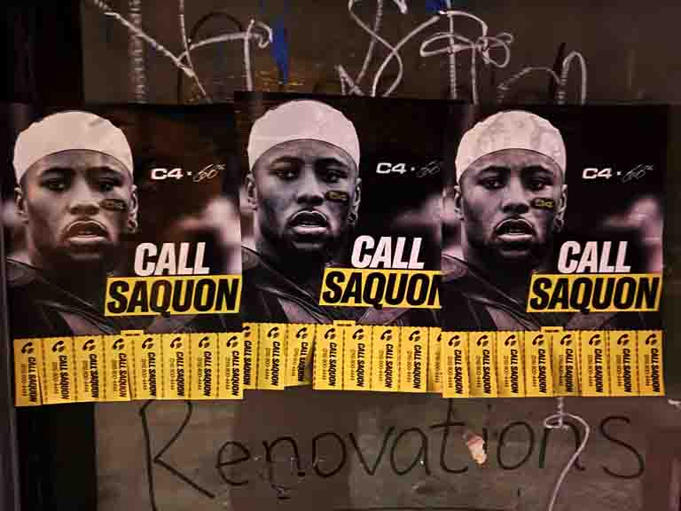
A business card-sized piece of printed material sitting in a dispenser at a coffee shop near your target customer’s office. They are waiting for their order. They see it. They reach out and take one. That moment — the voluntary act of picking up a piece of your brand — is what makes take-one card advertising different from every other form of print distribution.
Nobody forced them to take it. Nobody interrupted their day to push it into their hands. They chose it. And that choice — that small, deliberate gesture — is the beginning of a relationship between your brand and a person who has already demonstrated they are interested. The conversion mechanics that follow are dramatically better than anything you get from passive print distribution.
Take-one card advertising is one of the most cost-effective street-level formats available to local businesses, regional brands, and companies launching in specific neighborhoods. This guide covers how to design cards that get picked up and acted upon, where to place them for maximum impact, how to build and manage a network, and how to measure results with the precision most people assume print formats cannot deliver.
Why Take-One Card Advertising Works
The mechanism is simple. The results are consistent. And the explanation is psychological as much as tactical.
When someone picks up a take-one card, they have made a micro-commitment. They looked at it, decided it was relevant to them, and reached for it. That action primes them to engage with the content. They do not discard it immediately because they chose it — discarding it immediately would contradict the decision they just made. They carry it with them, often to a context where they have more time and attention: home, their desk, a waiting room. The card gets read at the moment they are ready to read it, not at the moment you decided to distribute it.
The Self-Selection Advantage
Mass print distribution — handouts, door hangers, direct mail — reaches a broad audience that includes your target customer plus many people who have no interest in your offer. The take-one mechanism filters for interest before the card reaches anyone’s hands. The audience that picks up your card has already demonstrated relevance by choosing it. That pre-filtering is the core reason take-one programs produce higher conversion rates per engaged contact than passive distribution.
Pocket and Wallet Placement
A card-sized piece of print fits in a pocket or wallet in a way that a full-sheet flyer does not. The person who takes your card and puts it in their wallet has effectively filed it — they can find it when they need it. That persistence is valuable. They may not call or scan the QR code for three days. But when they think of your category, the card is there. Take-one card advertising has a longer effective life than any other distribution format for exactly this reason.
Card Design That Gets Picked Up and Acted On
Take-one cards operate in a visually competitive environment. Your card sits in a dispenser alongside potentially other materials, in a space where the audience has many things competing for their attention. The design has to accomplish two things in sequence: first, attract attention and communicate relevance enough to prompt a pickup, and second, deliver a message clear and compelling enough to prompt the specific action you want.
Front Side: Stop, Attract, Qualify
The front of the card has one job: make the right person want to pick it up. The headline should communicate the offer or benefit directly — not a tagline, not the brand name, not a slogan. What does the person get? What problem does this solve? What is the reason to act? Three to six words that answer those questions will outperform any clever creative approach.
A strong visual element — a product image, a lifestyle photo, a bold graphic — communicates context in a fraction of a second and helps the right audience self-identify. A color scheme that stands out from standard white dispensers and surrounding materials increases visibility. The brand name and logo should be present but not dominant — the offer is the lead, not the brand.
Back Side: Inform, Direct, Track
The back of the card is where the conversion elements live. The offer in full. The specific call to action. The QR code. The phone number. The URL. The promo code if one exists. Keep it organized — one primary CTA at most, with secondary information supporting it. An expiration date creates urgency. A specific address creates local relevance. A direct phone number feels more personal than a website URL for service businesses.
Print Specifications for Take-One Cards
14-point coated cardstock is the standard spec. It holds up in high-humidity environments (coffee shops, gyms), photographs well for documentation, and feels premium in the hand — which subconsciously communicates that the brand behind it is worth engaging with. UV coating on the front protects the color and adds visual pop. Matte laminate on the back is easier to write on, which matters for cards where someone might want to note an appointment or contact information.
Building a Take-One Card Placement Network
The network is the campaign. A brilliant card design in a poorly chosen location produces nothing. A simple, clear card design in exactly the right location with the right audience produces consistent, measurable results. Location selection and placement quality are the most important variables in the entire program.
Audience Alignment as the Primary Selection Criterion
Every placement decision should start with one question: are the people who come to this location the same people I am trying to reach? Foot traffic volume matters, but audience quality matters more. A boutique fitness studio with 200 members who exactly match your target customer profile outperforms a chain laundromat with 2,000 weekly visitors who have no overlap with your audience. Our team evaluates audience alignment using neighborhood demographic data, location category research, and, when available, foot traffic data from our placement networks.
Physical Placement Within Location
Where the display is positioned within the space is as important as which location is chosen. Eye-level placement near the point of transaction — the register, the reception desk, the coffee pickup counter — produces significantly higher pickup rates than a display on a back wall or near the restrooms. Our installation team positions every display to maximize visibility and natural engagement. We confirm positioning at installation and on every restocking visit.
High-Performance Location Types
Coffee shops near professional office concentrations, fitness studios and gyms, hair salons and barbershops with long appointment times, nail salons, laundromats in target neighborhoods, co-working spaces, hotel lobbies in business districts, and transit-adjacent convenience stores all perform consistently across the programs we operate. Specialty retail — bookstores, kitchen stores, outdoor gear shops — can be extremely effective when the audience alignment is strong.
Network Size and Coverage Strategy
For a hyperlocal campaign targeting a single neighborhood or a tight geographic radius, 15 to 25 locations provides saturation — the regular pedestrian in that area will encounter your card at multiple locations across the campaign window. For a city-level campaign, 50 to 100 locations distributed across the distinct neighborhood clusters provides meaningful metro-wide coverage without over-concentrating in one area.
For multi-city programs, we coordinate placement partners in each market with centralized print production and consolidated reporting. A brand running a national promotion through take-one card networks can deploy in 10 to 20 cities simultaneously with a single brief and a unified reporting structure.
What Take-One Card Programs Cost
Print costs for 5,000 4×6 cards with UV coating on 14-point stock run $250 to $600 depending on printer and order volume. Placement fees run $50 to $150 per location per month — higher in premium neighborhoods and flagship locations. A 20-location program for 30 days costs $1,000 to $3,000 in placement fees plus print production.
Full-service programs — where our team handles location sourcing, negotiation, installation, restocking, and documentation — run $3,000 to $10,000 for a 30-day campaign depending on network size and market. The full-service model is more cost-effective than it appears when you factor in the time and access required to source and manage a placement network in a major metro where we already operate.
Tracking and Attribution
Take-one card campaigns are more trackable than their analog nature suggests. The right setup delivers per-location performance data and end-to-end conversion attribution.
QR Code Attribution
Print a unique QR code per location. Each code links to the same landing page but carries a location identifier in the URL parameter. When someone scans the QR code, you know which physical location the card came from. Aggregate scan data across the network tells you which locations are driving engagement and which are not. Location-level performance data is the most useful output from a take-one program — it tells you exactly where to double down in the next flight.
Landing Page Conversion Tracking
The landing page the QR code points to should be set up with standard conversion tracking — Google Analytics events, Meta Pixel, or whatever tracking infrastructure the brand uses. When someone scans the QR code and completes the desired action (signs up, calls, purchases), that conversion is attributed to the take-one program. The chain from card to scan to conversion is measurable with standard tools.
Take-One Cards vs. Business Cards: Understanding the Difference
Take-one card advertising and standard business card distribution are frequently confused because they share a physical format — a small-format printed card. The distinction is functional: a business card establishes a personal professional identity and facilitates contact; a take-one card is an advertising instrument with a specific offer, a clear audience, and a measurable call to action. The design principles, placement strategy, and measurement approach are entirely different.
A business card placed in a take-one display is almost always a misuse of the format. The business card format (3.5×2 inches, typically one-sided, dense contact information with minimal offer) does not create the motivation for pickup that a well-designed take-one advertising card does. A person who picks up a business card from a take-one display is typically looking for the business’s contact information for a transaction they have already decided to pursue. A person who picks up a take-one advertising card is being introduced to an offer they may not have known existed.
The take-one advertising card should function more like a miniature ad than a business card: offer first, identity second, contact mechanics in the supporting role. The business card functions as professional identity documentation where the person’s name and contact information are the primary content. These are different documents with different purposes, and designing one to do the other’s job produces poor results.
High-Volume Take-One Card Deployment: Managing Large Networks
Large take-one card networks — 50 to 150 locations across a metro area — require operational systems that small programs do not. The logistics of placement installation, inventory management, restocking scheduling, and documentation aggregation at this scale are beyond the capacity of most marketing teams to manage in-house, which is why professional program management from an agency like ours produces substantially better results than DIY at scale.
At 100 locations, a 30-day campaign requires approximately 10,000 to 20,000 cards in initial production plus restocking inventory. The installation of 100 dispensers across a major metro requires a full-day crew of 2 to 3 people with a vehicle. Restocking at the appropriate frequency — every 2 to 3 weeks for standard placements, more frequently for high-traffic locations — requires ongoing scheduled visits with a restocking crew carrying replacement inventory. Documentation of 100 placements requires a GPS photo at each location and an organized reporting system that the marketing team can review.
The operational overhead of a 100-location program is significant. The cost of outsourcing that overhead to a professional program manager is typically lower than the internal cost of trying to manage it with existing marketing team resources. We quote multi-location programs as full-service packages that include all of the above — location sourcing, installation, restocking, documentation, and reporting — because that is how large programs should be run.
What Happens After the Card is Taken: The Post-Pickup Journey
The moment of pickup is the beginning of the conversion journey, not the end. Most brands design take-one cards with significant attention to what happens up to the pickup moment and almost no attention to what happens in the 24 to 72 hours after. That gap is where most of the conversion opportunity is lost.
The Card’s Life in a Pocket or Wallet
A card that is pocketed at a coffee shop in the morning may not be looked at again until the person empties their pockets at home in the evening. At that moment, the card re-enters their attention in a different context — quieter, with more time, perhaps with their phone in hand. The design and copy should be as effective in that second encounter as it was in the first. The offer should still be clear. The QR code should be immediately scannable. The call to action should be as compelling at 9pm at home as it was at 8am in a coffee shop.
This means the card should not depend on contextual urgency to motivate action. A card that only works when read in the moment of discovery — because it includes a time of day or location reference that loses relevance — loses all those second-encounter conversions. Write the copy to be as compelling when read cold, at home, with no surrounding context, as it is at the moment of pickup.
Follow-Through Friction Reduction
Every step between “I picked up this card” and “I completed the desired action” is a drop-off point. QR codes that link directly to the conversion page — not to the homepage, not to a category page, but to the exact page where the person can complete the action — reduce friction at the critical conversion step. A QR code that takes someone to your homepage and requires them to navigate to the offer they saw on the card loses a meaningful percentage of motivated recipients who do not want to spend time finding the offer. One QR code, one landing page, one action. The fewer the clicks, the higher the conversion.
Professional Printing for Take-One Card Campaigns
The quality of the physical card signals the quality of the brand behind it. A card printed on thin stock that bends at the edges, with color that looks faded or off-register, communicates that the brand does not invest in its presentation. A card on 14-point coated stock with accurate color and a crisp UV coating communicates quality that the recipient extrapolates to the brand’s product or service. For service businesses and premium product brands, print quality is a brand signal that is worth investing in.
Production Specifications That Matter
14-point coated cardstock is the minimum acceptable for professional take-one programs. 16-point stock adds rigidity that resists bending in a pocket or wallet. UV coating on the front (or both sides for a fully laminated card) provides gloss protection and makes the color more vivid. Dull/matte coatings on the back make the card easier to write on if there is any scenario where the recipient might want to note information (an appointment, a phone number). For cards with a QR code, ensure the QR code area is printed with sufficient contrast — QR codes that are printed too lightly or that have a low-contrast background fail to scan.
Integrating Take-One Cards With Street Campaigns
Take-one cards work as standalone programs and as elements of coordinated street campaigns. When combined with wheatpaste poster campaigns, the posters provide broad visual awareness and the take-one cards provide the engagement mechanism for people who want to act. The two formats are designed for different moments in the same customer journey.
Our brand ambassador teams carry take-one cards as a leave-behind in street-level activations — after a conversation with a brand ambassador, the card gives the person something physical to take with them and a specific next step to act on. The combination of human conversation and physical leave-behind consistently outperforms either alone.
For campaigns running sidewalk stencils or snipe advertising in the same area, the take-one card provides a call to action for the person who saw the stencil or snipe and wanted to know more. We design the card and the outdoor element with visual consistency so the connection between the outdoor impression and the take-one card is immediately apparent.
Frequently Asked Questions
What is take-one card advertising?
Take-one card advertising uses small-format printed cards placed in branded dispensers at high-traffic locations. Passersby self-select to take a card, placing your brand message directly in their pocket or wallet. It is one of the few print formats where the audience has demonstrated explicit interest before seeing your full message.
What size cards work best for take-one programs?
4×6 postcards are the most versatile. Business card size works for referral programs and professional service businesses. Rack cards (4×9) work well in hotel lobbies and tourism contexts. The right size depends on how much information the offer requires and the physical dispenser being used.
Where are take-one cards most effective?
Take-one cards perform best in locations with high dwell time and strong audience-to-offer alignment. Top locations include gyms, coffee shops, salons, barbershops, laundromats, and co-working spaces. The best placements are eye-level, near points of transaction, and in locations where the audience matches the offer.
How do I track take-one card advertising ROI?
Use a unique QR code on the card linked to a campaign landing page. Track scans by location using individual QR codes per placement. Add a promo code for in-person redemptions. These tools together give you scan data, web traffic attribution, and redemption tracking that directly tie card pickups to conversions.
How much does a take-one card program cost?
Print costs for 5,000 4×6 cards run $250 to $600. Placement fees run $50 to $150 per location per month. A 20-location program for 30 days costs $1,000 to $3,000 in placement fees plus print. Full-service programs run $3,000 to $10,000 depending on network size and market.
Can I run a take-one card program in multiple cities?
Yes. We coordinate multi-city take-one programs with local placement partners in each market, centralized print production, and consolidated reporting. Multi-city programs are common for brands launching in several markets simultaneously.