
November 5, 2026
What Size Are Trends Posters: A Crew Field Guide
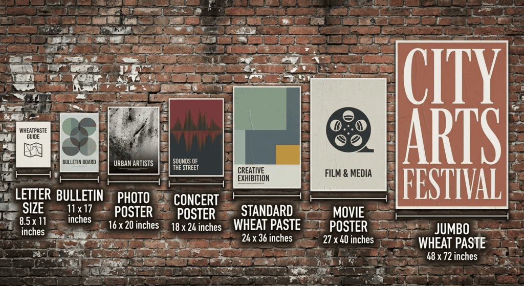
People searching for the size of trends posters are usually looking at the kind of printed wall poster sold in retail, the ones that go up in a bedroom or a dorm room with putty in the corners. The common retail wall poster in the United States runs about 22 by 34 inches. The common print-shop equivalent is 24 by 36 inches. Those two numbers cover most of what gets called a standard poster.
That is the short answer and it is probably why you are here.
The longer answer, and the reason I am writing this, is that a lot of people find those dimensions and then try to run a street campaign with them. I get those calls. Someone has a few hundred retail-dimension posters in a box, or they have artwork built to those proportions, and they want to know whether we can paste them on walls in three cities.
Sometimes yes. Often the honest answer is that the format is wrong for the job, and I would rather explain why up front than take the work and watch it fail.
I run install crews for American Guerrilla Marketing. Wheatpasting and Poster Campaigns, Snipe Advertising, sidewalk decals and stencils, Projection Advertising, LED Trucks and Mobile Billboards, nationwide. What follows is what those retail dimensions actually do once they leave a bedroom wall and go outside.
The dimensions people mean
When somebody asks about trends poster sizes, they are almost always asking about one of a small set of standard retail formats.
Around 22 by 34 inches. The dominant retail wall poster in American stores. Portrait. This is the size most commercial wall posters are printed at.
24 by 36 inches. The standard large print-shop poster, slightly bigger in both dimensions, and the one most custom printers will quote by default. Also portrait.
Around 12 by 36 inches. The tall narrow format, usually called a door poster. Long, skinny, built for the back of a door.
Mini formats around 11 by 17 inches. Sometimes called a tabloid or mini poster. Common for promotional runs.
The confusion between 22 by 34 and 24 by 36 causes real problems. They look identical in a thumbnail and they are not interchangeable. If artwork is built at one ratio and printed at the other, something gets cropped or something gets a white margin. I have had material arrive on site with a two-inch white band down one edge because of exactly this, and at night on a wall it reads as a printing error rather than a design choice.
So if you are ordering, confirm the number rather than the name. Names drift. Dimensions do not.
What those sizes do outdoors
Here is the part the retail answer does not cover.
A 22 by 34 or 24 by 36 poster is designed to be read from six to ten feet away, indoors, under even light, by someone who is standing still and interested. Every design decision in a retail poster assumes those conditions. Fine type works. Subtle colour works. Detail rewards attention.
Street conditions are the opposite of all of that. The viewer is moving. The light is dim, orange and comes from a harsh angle above. The viewing distance is often twenty feet or more, across a lane of traffic. The viewer is not interested and is probably looking at a phone.
At twenty feet at night, a 24 by 36 poster is small. Not useless, but small. It will register as a shape and a colour and maybe one large word. Anything subtler is gone.
This is the single most common misunderstanding I correct. People see a 24 by 36 print, hold it in their hands, and think it is big. On a wall at street scale it reads as modest.
That does not make it the wrong choice. It makes it a particular choice, and it should be a deliberate one.
When retail dimensions are actually right for the street
I am not telling you to throw the format away. There are jobs where it is the correct tool, and here they are.
Tight pedestrian corridors. On a narrow street where people walk within a few feet of the wall, 24 by 36 is plenty. Viewing distance is short, so the size is proportionate. Dense neighbourhoods in Brooklyn, older parts of Boston, narrow blocks in parts of Philadelphia, these all read well at this scale.
Repetition runs. Where the strategy is many impressions rather than one big one, smaller sheets are an advantage. They install fast, one person handles them easily, and you can place a lot of them along a route. A dozen 24 by 36 sheets down a corridor beats one large sheet on one block for most campaigns.
Narrow surfaces. Cities are full of vertical slots between hoarding posts, beside doorways, on utility cabinets, on the returns of brick. Those slots take a portrait sheet of roughly this size and nothing bigger.
Campus and venue environments. Where people are standing still, queueing, waiting for a door to open, reading distance is short and the format works.
Windy exposure. A smaller sheet is a smaller sail. On waterfront blocks in Chicago, or in the channelled wind between towers in downtown Dallas, I would rather install smaller sheets that stay up than large ones that peel.
When the campaign is about frequency rather than spectacle, this is the right size, and I will say so.
When I push back on it
One sheet on a big wall. A 24 by 36 poster alone on a twenty-foot expanse of hoarding looks like someone lost a bet. The surface swallows it. Either go bigger, or place several in a deliberate grid so the repetition becomes the composition.
Across a wide road. If the only viewing position is across four lanes, this format is too small to do work. That is a job for a larger sheet, a tiled panel wall, or a different medium entirely.
Retail artwork used unchanged. This is the one that fails most often. Artwork designed for indoor reading at six feet does not survive outdoors at twenty. The type is too small, the contrast is too gentle, the detail is wasted. The dimensions might be fine and the art still wrong.
Posters printed on retail stock. Retail wall posters are often printed on coated or semi-gloss stock because it looks good in a shop. Coated stock and wheat paste do not get along. The coating stops the paste soaking in, so the top coat dries as a film on the surface and flakes, and the bond underneath is weak. If a sheet is going outside under paste, it needs to be uncoated. I ask about the finish on every job.
Heavy stock. Thick paper feels like quality and behaves badly on a wall. It resists conforming to brick texture and it holds its own shape when wet, which produces tenting and lifted corners. Lighter uncoated paper drinks the paste and lies down flat. Counterintuitive, and true.
So the honest version is that the dimensions are often workable and the physical poster you bought at retail usually is not. Those are two different questions, and buyers collapse them constantly.
How we install this size
The technique is the same paste discipline we use on everything, and this format is the easiest version of it.
Paste the surface first. Lay the sheet. Then paste over the top of the sheet, working from the centre outward to push air toward the edges. The top coat is not optional. Skipping it is the single biggest reason self-installed posters curl at the corners and peel within a week.
At 24 by 36 a single installer handles the whole thing comfortably, including in moderate wind. Actual pasting time is well under a minute once the surface is ready. The cost of a campaign at this size is walking the route, not handling the sheets.
Crew is usually two people even though one could do the pasting, because the second person carries material, keeps the bucket moving and watches the street. Four people on a long corridor lets us split the route and roughly halve the night.
Our window is typically two in the morning until about six, adjusted by neighbourhood. Parts of Brooklyn stay busy later so we start later. Downtown Los Angeles quiets earlier. Around Broadway in Nashville we work the side streets, because the main strip does not really stop.
Height is where this size earns its keep. A sheet this size can be placed from the ground up to about reach height without a ladder, which keeps the crew moving. Ladder work slows everything down, so a format that avoids it covers far more ground per night.
Surfaces and weather
The surface rules do not change with size, but a smaller sheet is more forgiving of imperfection.
Good surfaces. Construction hoarding is the best thing we work with. Plywood is porous, flat, and usually has a site manager who can give permission. Smooth sound painted masonry is close behind, provided the paint is not chalking, because paste bonds to the paint and if the paint lets go the poster goes with it. Raw concrete is fine.
Acceptable. Rough brick and cinder block. The mortar lines create shallow channels and detail softens where the sheet crosses them. At this size a sheet crosses fewer lines than a large one, which is one place where smaller genuinely wins.
Failing. Gloss paint, vinyl wrap, powder-coated metal, glass, anything oily, anything with loose or flaking paint. Paste needs a surface that absorbs. We have watched sheets come off a glossy painted door within a couple of hours.
Weather is the honest variable. Rain in the first few hours, before the paste has cured, is the main killer, because water gets behind the sheet while the bond is still forming. Rain after full cure is mostly harmless and can tighten the paper. Hard freeze during cure is bad, which is why winter runs in Chicago or Boston use tighter routes and faster hands. Humid summer nights in Houston and Atlanta cure slowly, extending the vulnerable window. Relentless direct sun fades ink, and a four-colour image on a south-facing wall in Phoenix in July looks tired much sooner than the same image in Seattle.
Realistic life for a clean install on a good surface is roughly two weeks to a couple of months. The range is wide because the variables are wide, and anyone giving you one fixed number has not done enough nights.
Designing at this size for outdoor use
If you are keeping the retail dimensions and taking them outside, change the art.
Size the type for twenty feet, not six. I have asked for larger type on almost every campaign I have run and never once asked for smaller.
Push contrast hard. Street light is dim and orange and rakes across the surface from above. Dark on dark vanishes completely. Thin light type over a busy photograph vanishes.
Cut the detail. Whatever cannot be read at distance is decoration, not communication, and at this size you do not have room for both.
Avoid large flat gradients. They band when printed and go muddy under sodium light.
Give one idea the whole sheet. At 24 by 36 outdoors you get one image and a few words. Trying to fit a headline, a subhead, a date, a venue, a lineup and a sponsor row means nobody reads any of it.
Test it the way we test it. Print the art, put it on a wall, walk twenty paces back at night and see what survives. That walk settles more design arguments than any discussion.
And leave the scanning code off unless the sheet is at eye level somewhere people stand still. Nobody scans a code while walking past.
Permission, ordinance and removal
Buyers ask whether a modest poster size attracts less scrutiny than a large one. Somewhat, because it is less conspicuous, but the underlying situation is identical.
This is a grey area and I want to be straight rather than reassuring. Posting rules vary by municipality, enforcement is inconsistent, and in practice the answer usually turns on who owns the surface rather than on any blanket city rule. I run crews. I am not a lawyer and nothing here is legal advice.
What we control is risk, and that part is real work.
We favour private surfaces where an owner can genuinely give permission. Construction hoarding with a site manager, a vacant storefront with a landlord, a business that wants the foot traffic. A short conversation and a written yes changes the entire character of a campaign.
We document. Every install is photographed with enough context to identify the location, with the date.
We commit to removal. Sheets left curling on a wall for a year are why some property owners will never say yes again to anyone. Taking material down is what earns a second yes on the same block.
We stay off the obvious problems. Historic facades, active residential frontage, anything where the complaint will come from a neighbour rather than an owner.
If a client needs certainty rather than risk management, I say so plainly and we steer toward formats where permission is cleaner. Better to have that conversation before money moves.
Where LED trucks solve the size problem instead
Sometimes the real answer to "is this poster big enough" is that no pasted poster is going to be big enough for what the client wants, and the honest move is to change the instrument.
That is where LED Trucks and Mobile Billboards come in, and I recommend them specifically when the brief has one of two shapes.
The first is reach across distance. If the audience is in vehicles, or across a wide road, or spread over a large area with no single wall that everyone passes, a truck solves what a sheet cannot. The screen is large, it is bright enough to read in daylight, and it moves to where people are rather than waiting for people to come to it.
The second is a hard date. Posters build familiarity over weeks, so they want lead time. A truck works on a specific evening in a specific place. For a one-night event, a product launch, a game day or a conference, the truck delivers inside the window a poster campaign would still be warming up in.
There is a permission advantage too. A truck is on the public road under normal vehicle rules and leaves nothing behind, which removes most of the surface ownership conversation entirely.
The combination I recommend most often is both. Posters at retail scale running repetition along the corridors for a few weeks, then a truck on the night itself. Each does what the other cannot.
Frequently asked questions
What size are standard retail wall posters?
The common retail wall poster in the United States is around 22 by 34 inches in portrait orientation. The standard print-shop equivalent is 24 by 36 inches, which is slightly larger in both directions. Other common formats include roughly 12 by 36 inches for a tall door poster and around 11 by 17 inches for a mini or promotional poster.
Is 22 by 34 the same as 24 by 36?
No, and treating them as interchangeable causes real problems. They are different dimensions with slightly different proportions, so artwork built for one and printed at the other either gets cropped or ends up with an unwanted margin. Always confirm the actual measurements on a print order rather than relying on a format name.
Can retail-size posters be used for a street campaign?
Often yes, with two conditions. The paper has to be uncoated and reasonably light so wheat paste can soak in, since coated or heavy retail stock bonds poorly and lifts. And the artwork needs redesigning for distance, with much larger type and harder contrast. The dimensions are usually workable even when the physical retail print is not.
How big does a poster look on a street wall at this size?
Smaller than people expect. A 24 by 36 sheet held in your hands feels large and at twenty feet at night it reads as modest. It works well on narrow pedestrian corridors, in queues, on campus, and in repetition runs along a route. It gets swallowed by a large open wall or a wide road crossing.
Is pasting posters at this size allowed where I want to run?
It is a grey area. Rules vary by municipality, enforcement is inconsistent, and the practical answer usually depends on who owns the surface rather than a blanket city rule. We reduce risk by using private surfaces with owner permission, photographing every install with location and date, and committing to removal afterwards. This is not legal advice.
How long will this size of poster stay up outdoors?
Roughly two weeks to a couple of months on a sound surface with a clean install, including the all-important top coat of paste over the sheet. Construction hoarding and smooth masonry hold longest. The main risks are rain in the first few hours before cure, hard freeze while curing, and sustained direct sun fading the printed ink.
Get the format right before you print
If you are holding retail-dimension artwork and wondering whether it will work on the street, tell us the cities, the blocks and what the art looks like. We will tell you whether that size is right for those surfaces, what we would change about the stock and the design, and when a different format would serve you better.
Wheatpasting and poster campaigns, snipe advertising, sidewalk decals and stencils, projection advertising, LED trucks and mobile billboards, Street Teams and experiential, nationwide.
Request a campaign quote.

Ready to Run Your Campaign?
Call us or email us. We’ll tell you exactly what we can do in your market and what it costs.
Related Service
Explore similar advertising solutions offered by American Guerrilla Marketing.
American Guerrilla Marketing — Los Angeles
Street-level campaigns in Los Angeles and nationwide. Wheatpasting, LED trucks, street teams, and more.
(646) 776-2770
Related Articles
-
Wheatpasting & Poster Campaigns in Queens, New York
November 6, 2026
-
Wheatpasting in Rain and Humidity: What Works
November 5, 2026
-
Wheatpasting & Poster Campaigns in Bronx, New York
November 5, 2026
-
Wheatpasting & Poster Campaigns in Durham, NC
November 5, 2026
-
Wheatpasting & Poster Campaigns in Columbus, Ohio
November 5, 2026