
November 5, 2026
Reverse Graffiti Stencils Explained for Brand Marketers
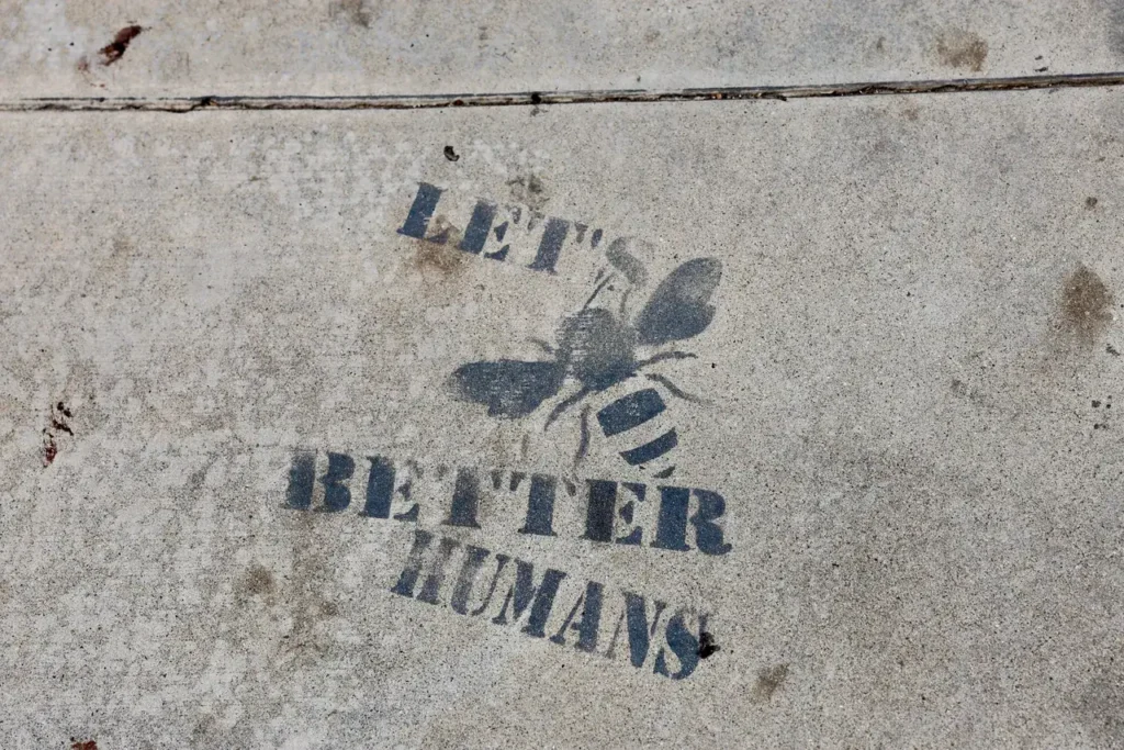
Reverse graffiti is the one street format where you make the image by taking something away.
You lay a stencil on a dirty surface, you clean through the openings, and the artwork appears as the clean areas against the grime that is still there. Nothing is applied. No ink, no paint, no adhesive, no paper.
I am Livy Phillips, and our crews run these jobs with a pressure washer at five in the morning while the sidewalk is still empty. I have also stood over a finished piece that came out as a grey smudge because the surface was not dirty enough, and that is the part the explainer articles leave out.
Most of what is written about this format online is either a definition, a story about an artist, or a tutorial for cleaning a picture onto your own garage wall. Very little of it tells a brand marketer what actually happens when you try to run it as a campaign across a city.
So this is that version. What the stencil is made of, what the surface has to be like, what the crew does, how long the image survives, where the real limits are, and what I tell clients not to do.
The short version before the detail. This format is beautiful when the surface cooperates and disappointing when it does not, the difference is almost entirely in the survey, and anybody who quotes you without looking at the actual ground first is guessing.
What the format actually is
The principle is simple. Horizontal and vertical surfaces in a city accumulate a layer of grime. Traffic film, dust, exhaust residue, organic growth in damp climates. That layer is remarkably even, which is exactly what makes it a usable medium.
Place a mask over it, remove the grime in the exposed areas, lift the mask, and you have an image in two tones. Clean and dirty.
The contrast you get is the difference between the original surface colour and the soiled surface colour. That is the entire palette. One tone, no colour, no halftones worth relying on.
This constraint is the format's strength and its ceiling. A bold silhouette, a wordmark, a simple icon, all of these sing. A photographic image, a gradient, a logo with hairline strokes, these turn to mush.
The second property that matters is that it is temporary by nature. Grime comes back. The image fades out on its own over weeks rather than needing removal. For some clients that is the entire appeal, and for others it is the thing they did not understand when they booked it.
Stencil construction, which is most of the job
The stencil is where campaigns succeed or fail, and it gets about one sentence in most articles.
Material needs to be stiff enough to lie flat and survive water pressure, and thin enough to sit tight against the surface so water does not creep underneath. Flexible plastic sheet in a reasonably heavy gauge is the usual answer. Thin film lifts and flutters under the washer. Rigid board does not conform to a surface with any camber, and sidewalks always have camber.
Cutting is done cleanly, with crisp edges, because every imperfection in the cut is reproduced at full size on the ground.
Bridging is the thing designers forget. Any enclosed counter in a letterform, the middle of an O, the hole in an A, is an island. Without bridges holding it to the surrounding material, that island is a loose piece of plastic that washes away on the first pass and leaves you with a solid blob where the letter should be. Every stencil design has to be redrawn for bridges before cutting, and that redraw is a design decision, not a production detail. It should be approved by whoever owns the brand.
Minimum stroke width is real. Below a certain thickness, overspray and bleed close the gap and the detail vanishes. We thicken strokes and open up tight interior spaces at the artwork stage rather than discovering the problem on the street.
Hold-down matters. Weights around the perimeter, sometimes along interior spans on a large piece. Any lift at an edge lets pressurised water run under the mask and produce a soft halo around the shape. A little softness looks organic. A lot looks like a mistake.
Large images come as sectioned stencils with registration marks, because one enormous mask is unmanageable in any wind at all. Sections mean seams, so the artwork is laid out so the seams fall somewhere forgiving.
Stencils degrade. Edges soften with repeated use and water pressure. On a multi-location campaign we cut spares, because the twentieth impression from a tired stencil does not match the first.
Surfaces, and the survey that decides everything
The surface decides whether you have a campaign.
Rough broom-finished concrete is the best surface in the format. It is porous, it holds grime evenly, it cleans up to a noticeably lighter tone, and the texture gives the edge a slightly organic quality that suits the medium.
Older poured concrete sidewalk with a good layer of accumulated traffic film is ideal. The dirtier it is, the stronger the contrast.
Smooth polished or power-trowelled concrete is poor. It does not hold grime in the same even way, it often cleans only slightly lighter, and the result is a faint ghost rather than an image.
Asphalt is largely a waste of effort. It is dark, cleaning it does not produce meaningful tonal change, and the aggregate surface breaks up fine detail.
Brick and masonry are variable. The brick faces and the mortar joints soil at different rates and clean to different tones, so an image laid across them reads as striped. On older or historic masonry we do not work at all, because pressurised water can damage soft mortar and aged brick, and that is a real risk, not a theoretical one.
Painted surfaces are a hard no in most cases. Pressure that lifts grime can also lift paint, and a job that strips a property owner's coating is a job that ends badly for everyone.
Vertical walls work but behave differently from horizontal ground. Rain washes vertical surfaces unevenly, so the grime layer is often patchy, with cleaner bands under overhangs and dirtier streaks below ledges. An image placed across that patchiness inherits it.
This is why we survey. Our crew goes to the actual location, looks at the surface in daylight, and does a small test clean in an inconspicuous spot to see what contrast is actually available. That test is the single most useful thing in the whole process. It takes a few minutes and it prevents the outcome where a client pays for a campaign and gets a grey smudge.
If the test shows weak contrast, I will tell you the location does not work. Usually the honest alternative is Sidewalk Decals & Stencils, which puts a printed or painted image on the same ground with full colour and a predictable life.
Equipment, water and crew reality
The tool is a pressure washer, and the operator skill is in restraint rather than power.
Too much pressure etches the surface, which means you are no longer cleaning, you are cutting, and the mark will outlast the campaign by a long way. That is the thing that turns a reversible format into a permanent one, and it is the mistake that makes property owners refuse this format forever.
Too little pressure and the grime stays. The operator finds the working range on a test patch at every location, because the right setting on one block is not the right setting on the next.
Nozzle choice and distance matter as much as the pressure setting. A fan tip held at a consistent distance, moving at a consistent speed, in overlapping passes, in one direction. Inconsistent speed shows up immediately as banding across the finished image.
Water supply is a logistics problem people forget. A crew either brings water or arranges access to a supply on site. In a dense downtown with no tap access, that means a tank, and the tank size sets how many pieces you can do before you have to go refill.
Runoff is the other one. The water that comes off carries the grime you just removed. On most jobs this is dirty water going where rainwater already goes, but responsible practice means not pushing debris into a doorway, a basement grate or a planting bed, and in some locations it means containment and collection. We agree this with the property owner in advance rather than finding out afterwards.
Crew size is two to three. One on the washer, one managing stencil placement, alignment and hold-down, and on larger pieces a third on water, cables and the public side.
Timing is early morning, typically from around four or five, for a practical reason rather than a secretive one. The ground has to be clear of people, you cannot work a wet sidewalk with pedestrians on it, and the surface needs to be reasonably dry when you start so the grime layer behaves predictably.
A straightforward piece on good concrete is quick once the stencil is down. Placement, alignment and hold-down take longer than the cleaning. Across a multi-location run, the time is in moving, resetting and refilling, not in washing.
Climate, season and how long it lasts
This is the question every client asks and the one most often answered dishonestly.
Reverse graffiti fades as the surface re-soils. How fast depends on how fast that particular location gets dirty again, which varies enormously.
A high-traffic sidewalk beside a busy road re-soils quickly, because that is exactly what put the grime there in the first place. A sheltered plaza with light foot traffic holds an image much longer.
Rain is complicated. Rain washes the whole surface somewhat, which reduces contrast by cleaning the dirty areas too. Persistent damp in cooler climates also encourages organic growth that fills the clean areas back in.
Broadly, expect a visible image for a period measured in weeks rather than months, with the strongest contrast in the first stretch and a gradual decline after. I will not give you a guaranteed number of days, because the honest answer is that it depends on that specific square of ground and the weather it gets, and I have seen the same artwork on two blocks in one city fade at clearly different rates.
Climate character by region is worth planning around.
Damp temperate cities like Seattle and Portland build a rich organic grime layer that gives excellent contrast, and then re-soil relatively fast. San Francisco's Mission and the Market Street corridor behave similarly, with fog keeping surfaces damp.
Dry dusty cities like Phoenix and Las Vegas have a fine mineral dust layer rather than an organic one. It cleans off beautifully and comes back quickly on a windy week.
Dense northeast cities like New York, Boston and Philadelphia have heavy traffic film, which gives strong contrast. Winter is the complication, because salt, slush and freezing temperatures make pressurised water on a sidewalk a bad idea for several months.
Chicago has the same winter constraint, with a good season from late spring through autumn.
Atlanta, Austin and Miami run most of the year, with summer humidity and afternoon storms affecting scheduling more than surface behaviour.
Freezing conditions are a hard stop. Spraying water onto a public walkway below freezing creates an ice hazard, and we do not do it.
Permission, ordinance and the grey area
Everyone asks the same question, and it has the same honest answer.
Whether cleaning an image onto a surface counts as advertising placement, as a sign requiring permission, or as something else entirely is a grey area. Different municipalities treat it differently, some address it under sign or handbill provisions and some have nothing specific at all, and enforcement is inconsistent. Much of it comes down to who owns the surface and whether they agreed.
I am not a lawyer and this is not legal advice. What I can describe is how we reduce the risk.
We work from the property owner's permission. Private plazas, forecourts, loading areas, building frontages and private walkways where a single identifiable owner can say yes are where this format is most comfortable.
We avoid historic fabric entirely.
We test at low pressure first and work at the lowest setting that produces the image, specifically so the surface is not altered.
We document the location before we start, so there is a record of its condition, and after we finish.
We take responsibility for the outcome. If an owner wants the image gone sooner than nature will take it, the resolution is cleaning the whole surface to an even tone, and we will do that.
We decline locations where nobody will put their name to a permission. A surface with no identifiable owner is not a surface we work on.
What we talk clients out of
I turn down a good proportion of the reverse graffiti enquiries we get, and almost always for the same handful of reasons.
I talk clients out of detailed artwork. A photographic portrait, a gradient, a logo with thin strokes and small registration marks. The medium gives you one tone on a textured surface. Simplify or choose a different format.
I talk clients out of long copy. A URL in small type on a sidewalk is unreadable before it has even started to fade. A short wordmark and a strong shape is what survives.
I talk clients out of asphalt locations, every time.
I talk clients out of booking this in deep winter in a northern city.
I talk clients out of expecting consistency across many locations. The grime layer is different on every block, so the same stencil produces visibly different contrast from site to site. If a brand needs every placement to look identical, this is the wrong medium and decals are the right one.
I talk clients out of treating it as a cheap alternative to decals. It is a different product with different behaviour, and choosing it for the wrong reason leads to disappointment.
I talk clients out of promising a specific end date for the image. It fades when it fades.
And I talk clients out of locations where the owner is lukewarm. This format depends on goodwill, and a reluctant yes becomes a complaint.
When decals are the better answer
Since I have just spent a section saying no, here is the yes.
Sidewalk Decals & Stencils solves most of the problems above. A printed decal gives you full colour, exact brand reproduction, fine detail, legible small type, consistent appearance across every location and a predictable life with a clean removal at the end.
What it does not give you is the quality that makes reverse graffiti worth doing, which is that the image appears to have emerged from the city rather than been stuck onto it. People stop and look at a clean image in the dirt in a way they do not stop for a printed sticker, partly because they cannot immediately work out how it got there.
So the honest division is this. If the campaign needs brand-exact reproduction, detail, colour or guaranteed consistency, use decals. If the campaign wants a small number of striking placements in high-dwell spots where the surface is right and the goal is to make people look twice, reverse graffiti earns its place.
A lot of our better campaigns use both. Decals for the coverage and consistency, a handful of clean-image pieces at the locations where the ground is good and people linger.
Frequently asked questions
Is reverse graffiti legal?
It is a grey area. Whether cleaning an image onto a surface is treated as advertising placement, as a sign needing permission, or as nothing in particular differs between municipalities, and enforcement is inconsistent. A great deal depends on who owns the surface and whether they agreed. We work from property owner permission, favour private surfaces, document conditions and avoid historic masonry entirely.
How long does a reverse graffiti image last?
Weeks rather than months, with the sharpest contrast early and a gradual fade as grime returns. Speed depends on the specific location, its traffic, and the weather it receives. A sheltered low-traffic plaza holds much longer than a sidewalk beside a busy road. I will not quote a guaranteed number of days, because the honest answer varies block to block.
Which surfaces work best?
Rough broom-finished or older poured concrete with a good even layer of accumulated grime. That combination gives the strongest contrast and the cleanest edge. Smooth polished concrete cleans only slightly lighter and reads faint. Asphalt gives almost no tonal change. Brick and mortar clean to different tones and look striped, and historic masonry we will not touch.
Can you reproduce a detailed logo?
Not reliably. The medium gives one tone on a textured surface, and enclosed shapes in letterforms need bridges cut into the stencil to hold them in place, which alters the artwork. Thin strokes close up and fine detail disappears. Bold silhouettes, simple icons and heavy wordmarks work well. We redraw artwork for the format and get that redraw approved before cutting.
Does pressure washing damage the surface?
It can if done badly, which is why the operator works at the lowest pressure that produces the image and tests on an inconspicuous patch first. Excessive pressure etches rather than cleans, which leaves a permanent mark and is the main reason property owners refuse the format. We avoid painted surfaces and aged masonry for the same reason.
How does it compare with sidewalk decals?
Decals give exact colour, fine detail, legible small type, consistent appearance everywhere and a predictable life with clean removal. Reverse graffiti gives something decals cannot, an image that looks like it came out of the street rather than being applied to it. Many campaigns run both, decals for coverage and consistency, clean images at a few high-dwell locations.
Request a campaign quote
If you are considering this format, the useful first step is telling us the locations you have in mind, or the kind of location, and what the artwork is. We will look at the surfaces in person, run a test clean to see what contrast is genuinely available, and tell you plainly whether the ground will carry the image.
If it will not, we will say so and show you what the same idea looks like as a decal or stencil campaign instead. I would rather lose the booking than hand you a grey smudge on a sidewalk.
Request a campaign quote and we will test the surface before we quote it.

Ready to Run Your Campaign?
Call us or email us. We’ll tell you exactly what we can do in your market and what it costs.
Related Services
Explore similar advertising solutions offered by American Guerrilla Marketing.
American Guerrilla Marketing — Los Angeles
Street-level campaigns in Los Angeles and nationwide. Wheatpasting, LED trucks, street teams, and more.
(646) 776-2770
Related Articles
-
How Sidewalk Decals & Stencils Runs in Sacramento
November 5, 2026
-
Sidewalk Decal Material Options: An Honest Breakdown
November 5, 2026
-
Sidewalk Decals and Stencils in Miami: How It Works
November 4, 2026
-
Removing Sidewalk Decals Without Damage
November 4, 2026
-
Sidewalk Decals & Stencils in Brooklyn: How It Runs
November 4, 2026