What Is the Most Eye-Catching Color for Advertising? (2026 Guide)
Research points to red, yellow, and orange as the highest-attention colors in advertising. But the right color depends on the environment, the brand, and what is already competing for visual space around it. Here is how we think about color in outdoor campaigns.
Color is the first decision a viewer’s eye makes about any piece of outdoor advertising. Before the headline is read, before the logo is recognized, before any conscious evaluation happens, the brain has already processed the color palette of the creative and made a judgment about whether to pay attention. That pre-conscious color response is why color selection in outdoor advertising is one of the highest-use creative decisions a brand can make, and why it deserves more careful thought than most brands give it.
The question of which color is most eye-catching for advertising has a research answer and a field answer. The research answer points consistently to the warm end of the color spectrum: red, orange, and yellow register more quickly in peripheral vision and generate more attention-capturing responses than cool colors like blue and green. The field answer is more nuanced: the most eye-catching color in any specific outdoor advertising context is the color that provides the greatest contrast with its surrounding visual environment.
At American Guerrilla Marketing, we think about color in terms of the specific surfaces our campaigns go on and the specific visual environments those surfaces exist in. A bright yellow poster on a construction hoarding in Midtown Manhattan competes with thousands of other visual stimuli. The same yellow on a relatively quiet wall in a residential neighborhood in Austin stands out dramatically. Context determines contrast, and contrast determines attention capture.
What Research Says About Eye-Catching Colors in Advertising
Color psychology research consistently identifies certain colors as generating faster and stronger attention responses than others. The following is what the major bodies of research have running about color attention in advertising contexts.
Red: The Fastest Attention-Capturing Color
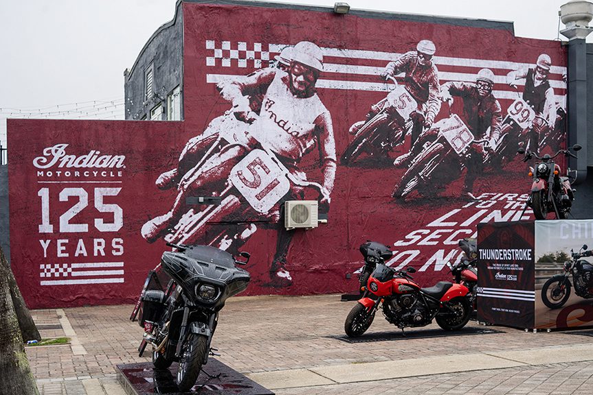
Red activates the strongest and fastest attention response of any color in the visible spectrum, according to multiple studies from the University of Rochester, the Journal of Experimental Psychology, and marketing research from the University of British Columbia. The human visual system processes red with exceptional speed, a trait that researchers attribute to the evolutionary significance of red signals in the natural environment. Danger, ripeness, blood, and fire are all red, and the brain is wired to notice red first.
In advertising, this translates to high visibility in high-clutter environments. Red outdoor advertising cuts through visual noise better than almost any other color. It creates urgency and immediacy that other colors do not convey. Red sale signage drives faster purchase decisions than blue or green sale signage at equivalent prominence. The limitation of red in advertising is that overuse reduces its impact. In markets saturated with red advertising, the color loses its differentiation and blends into the clutter it was designed to cut through.
Yellow: The Highest Visibility Color at Distance
Yellow, particularly high-saturation yellow, has the highest light reflectance value of any color in common advertising use. It is the first color the human eye detects in peripheral vision. That is why emergency vehicles, construction equipment, school buses, and safety signage all use yellow prominently. The color is designed to be seen before the viewer is consciously looking at it.
In outdoor advertising, yellow backgrounds with high-contrast black or dark text are among the most legible and most visible combinations available. The yellow-on-black combination is used in taxi markings, hazard signage, and some of the most recognizable brand identities in the world precisely because it performs so well in terms of visibility and legibility across a wide range of environmental lighting conditions.
Orange: The High-Energy Middle Ground
Orange combines the high-attention properties of red with the high-visibility properties of yellow. It activates a strong attention response, particularly in adults, while carrying a slightly warmer, more approachable emotional tone than red. Orange is commonly associated with enthusiasm, affordability, and action. In outdoor advertising, it performs strongly in high-clutter urban environments where pure red faces heavy competition.
High-Contrast Black and White
Black and white advertising with no color is one of the most effective attention-capturing approaches in high-color-saturation environments. When every other brand on a block is using bright colors, black and white stops the viewer’s eye through sheer differentiation. The visual austerity communicates confidence and premium quality. Some of the most effective outdoor campaigns we have run used black and white creative in color-saturated environments specifically because it stood out from the visual noise rather than competing with it.
Field note: When a client submits creative for a street poster campaign in New York, we look at what the existing visual environment looks like in the target locations. If the scaffolding and walls around the target area are already running primarily warm-toned colorful posters, we recommend either going black and white for contrast or choosing a color that is underrepresented in the existing environment. The goal is always differentiation from the surrounding visual noise, not conformity with it.
The Role of Contrast in Color Attention Capture
Contrast matters more than any single color in outdoor advertising visibility. A color that provides strong contrast with its background will outperform a “more eye-catching” color that does not contrast with its surroundings. A red poster on a brick wall has less contrast than a yellow poster on the same wall because the wall’s warm tone reduces the differentiation of the red. A blue poster on a red brick wall has more contrast than either because it is the complementary color to the warm tones of the surrounding surface.
We evaluate color choices in the context of the specific surfaces our campaigns will run on. A concrete construction hoarding is gray. A high-contrast yellow or red poster on gray creates strong visual differentiation. A beige or light tan poster on the same gray surface creates almost no differentiation and reads poorly at any distance. The relationship between the poster color palette and the surface it is mounted on determines a significant portion of its visual impact.
Color Contrast and Environmental Competition
In urban environments, the visual competition around any outdoor advertisement includes street signage, building facades, vehicles, clothing on pedestrians, and the colors of other advertising. A street poster campaign that chooses a color palette based solely on the poster’s design rather than on the competitive visual environment around it is leaving a significant portion of its potential attention-capture on the table.
We scout locations partly to assess the visual environment. What colors are dominant on the specific blocks where the campaign will run? What is the surface tone of the available posting areas? What is the lighting quality at the hours when the target audience is most likely to be in the area? Those answers inform color recommendations that go back to the creative team before anything goes to print.
Color
Attention Rating
Best Use Context
Emotional Association
Red
Highest in clutter
Sales, urgency, high-energy brands
Urgency, excitement, strength
Yellow
Highest at distance
Safety, visibility, approachable brands
Energy, warmth, optimism
Orange
High in warm-tone deficient environments
Consumer goods, action brands, food
Enthusiasm, affordability, fun
Black and White
Highest in color-saturated environments
Premium brands, high clutter markets
Authority, premium quality, clarity
Blue
Moderate (lower in outdoor)
Trust-based brands, tech, finance
Trust, calm, reliability
Green
Moderate to low outdoors
Health, nature, sustainability brands
Natural, health, growth
Neon / Fluorescent
Very high in any environment
Youth brands, events, music
Energy, youth, irreverence
Color and Brand Identity: The Constraint Most Campaigns Work Within
The most eye-catching color in the abstract is rarely the most eye-catching color for any specific brand’s campaign. Most brands have running color identities that their audience associates with them. Changing the color palette to optimize for raw attention capture undermines that recognition. A consumer who has learned to associate a specific brand with a specific color palette will not recognize the brand if the campaign suddenly uses a completely different color scheme, even if the new colors are technically more attention-capturing.
The right approach for most brands is to maximize contrast and visibility within their running color palette rather than abandoning the palette for abstract optimization. A brand that uses blue and white can maximize outdoor visibility by using deep, saturated blue against white or by adding a single high-contrast accent color that amplifies rather than conflicts with the brand palette. A brand that uses black and yellow already has one of the highest-contrast color combinations available and should prioritize using those colors at maximum saturation rather than introducing additional colors.
Color Performance by Outdoor Format
Color performs differently across different outdoor advertising formats. The lighting conditions, viewing distances, and physical properties of each format create different color performance realities. Here is how color choices should be calibrated for the most common outdoor formats we work with.
Street-Level Poster Campaigns
At pedestrian viewing distances of five to twenty-five feet, full-color posters with high contrast perform best. The audience is close enough to appreciate color complexity but moving fast enough that the primary color impression needs to happen in the first glance. High-saturation colors with strong contrast between foreground and background are the priority. Avoid gradients and subtle tonal variations that read beautifully in print but disappear at street-viewing distance.
Large-Scale Outdoor and Scaffolding Campaigns
At longer viewing distances of fifty feet or more, simplified color palettes perform better than complex ones. Two or three colors with clear differentiation read at distance. Six colors with subtle relationships between them become an indistinct blur. The complexity of the design should decrease as the viewing distance increases.
Projected images add light to a surface rather than reflecting it, which fundamentally changes color dynamics. Projected advertising tends to work best with warm, high-saturation colors on the background and lighter or more translucent elements for detail. Cool colors, particularly blues and greens, can project beautifully and carry emotional associations that are harder to achieve in print formats. The darkness of the surrounding urban environment at night creates a natural high-contrast frame around the projected image.
Field note: Neon and fluorescent colors in print campaigns have become significantly more common in street-level advertising in the past several years, driven partly by the influence of rave and festival visual culture on mainstream brand aesthetics. They perform extremely well in terms of attention capture, particularly in the late afternoon and evening when ambient light is lower and fluorescent colors hold their vibrancy while other colors flatten. If the brand context supports it, they are worth considering for street campaigns.
How Color Choices Differ by Market and Neighborhood
Color performance varies by city and by specific neighborhood within a city. New York’s SoHo has a distinct visual palette dominated by white building facades and heavy scaffolding coverage. A campaign running there should account for that environment when choosing colors. The Lower East Side has a more varied, grittier visual texture with a lot of existing colorful murals and street art. A campaign in that neighborhood that uses subdued or pastel colors will disappear into the background.
Los Angeles outdoor advertising often runs in bright Southern California sunlight that bleaches out low-saturation colors and washes out gradients. Deep, fully-saturated colors hold up better in that high-ambient-light environment than they do in shadier urban canyons. A yellow that looks vibrant in a print proof can go almost white under direct LA sun if the ink density is not high enough. We spec color differently for different markets based on these environmental realities.
Chicago’s West Loop has a predominantly industrial-gray visual environment: concrete, steel, dark brick. High-saturation warm colors pop dramatically there. The same colors in Miami’s Wynwood, where every wall competes with murals painted in every color of the spectrum, may not stand out at all. We do pre-campaign location scouting partly for this reason. Knowing the specific visual environment of each placement location lets us confirm that the creative color palette will achieve the desired visibility in that exact context.
Seasonal lighting also changes the color calculation. Winter light in northern cities is flat and gray. Colors that need warm ambient light to read correctly can look muddy in that environment. Neon and fluorescent colors hold their vibrancy in any ambient light condition, which is part of why they have become so common in winter street campaigns in cities like Chicago, Boston, and New York.
Frequently Asked Questions
Is there research on color and outdoor advertising effectiveness?
Yes. Research in advertising and consumer psychology has examined how color, contrast, and visual attention affect advertising response. In outdoor environments, designs with strong contrast and clear visual hierarchy can be easier to notice and process quickly, particularly when people encounter advertisements while walking, driving, or moving through public spaces.
What colors attract the most attention in outdoor advertising?
High-contrast color combinations generally attract attention more effectively than combinations with little visual contrast. Bright or saturated colors can also stand out against many outdoor backgrounds. However, the effectiveness of a color depends on the surrounding environment, viewing distance, lighting conditions, brand identity, and the amount of competing visual information.
Are warm colors better for outdoor advertising?
Warm colors such as red, orange, and yellow can create strong visual prominence and may be noticeable quickly in many outdoor environments. However, there is no single color that is universally most effective. The surrounding background, contrast, message, audience, and campaign placement all influence how a color performs.
Why is contrast important in outdoor advertising?
Contrast helps separate important elements from the surrounding environment and makes advertising easier to recognize at a distance. Strong contrast between the background and headline, logo, or call to action can improve readability and allow people to understand the main message more quickly while moving past the advertisement.
Does brand color affect outdoor advertising performance?
Yes. Brand colors can help outdoor advertising remain recognizable and consistent across different placements. The key is to maintain sufficient contrast and readability while using the established brand palette. When brand colors have limited contrast against the environment, designers can adjust the background, typography, borders, or supporting elements to improve visibility.