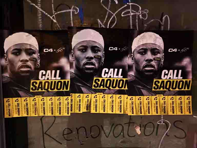
A pull tab poster is the original physical call to action. No app. No screen. No middleman. Just a piece of paper on a board and a strip a motivated reader takes with them. Here is how to make one that actually works.
A pull tab poster is a printed advertisement with a row of narrow tear-off strips along the bottom edge. Each strip carries contact information — a phone number, website, or both — that an interested reader tears off and keeps. The main body of the poster makes the offer. The tabs at the bottom give the reader a physical mechanism to act on their interest immediately, without a pen, without unlocking a phone, without any friction at all.
The format is older than most of the digital tools that have tried to replace it. Musicians used it in the 1980s to promote local shows. Tutors used it near universities. Landlords used it to fill apartments. Housecleaners, dog walkers, personal trainers, and photographers have all used it for decades because the mechanics are sound. The person who pulls a tab made an intentional choice. That choice is what separates a pull tab lead from a passive contact.
At American Guerrilla Marketing, we have placed pull tab posters on community boards across New York City as part of neighborhood-level campaigns for local businesses, service providers, and events. We have learned what drives tab pulls and what kills them. This guide covers the full picture: layout and design, print specifications, placement strategy, campaign measurement, and how to integrate pull tab posters into a broader local marketing program. Every point here is grounded in field experience, not theory.
The Pull Tab Mechanism: Why Physical Response Works
The pull tab is not just a delivery mechanism for contact information. It is a commitment device. When a reader reaches out and tears a strip off a poster, they are making a physical gesture of interest. That gesture requires intention. You do not accidentally pull a pull tab. You stop, read, assess the offer, decide it is relevant to your current situation, and act. The tab is evidence of that entire sequence.
This is the fundamental difference between pull tab leads and most other advertising contacts. A person who sees a digital ad and scrolls past it has not committed to anything. A person who sees a digital ad and clicks through has shown some interest. A person who pulls a tab off a poster has physically engaged with the advertisement in a way that is impossible to do passively. That engagement quality shows up in the conversion rates that follow.
The secondary effect of the pull tab mechanism is social proof. A board visitor who sees a poster with several tabs already removed reads the missing tabs as evidence of community validation. Other people stopped here, read this, and took a tab. That means the offer is credible enough that multiple strangers acted on it. A poster with all its tabs intact reads as untouched. The social proof dynamic is automatic and happens without any additional effort from the advertiser.
The format also tolerates latency well. Someone who is not ready to call or visit a website today can pull a tab, put it in their wallet, and follow up three days later when the need is more urgent. The tab functions as a physical bookmark for future intent. This is categorically different from a digital ad that disappears from view and requires the viewer to recall it and search for it later, which most people never do.
Pull Tab Poster Layout: What Goes Where
The layout of a pull tab poster follows a clear hierarchy. There is not much room for creative deviation if you want the poster to perform. Every element serves a specific function, and the order of those elements from top to bottom matches the sequence of the reader’s decision process.
Header Zone: Headline and Visual Hook
The top 40 to 50 percent of the poster is the header zone. This is where you put the headline, any supporting graphic, and the single most important selling point. The headline does the most critical work. It must communicate the specific offer, to whom, and why it matters, in one sentence. “Affordable pet sitting in Astoria — dog walks, overnights, daily check-ins” is a strong headline. “Professional pet care services available” is not. The reader needs to understand the offer before they invest any more attention.
The visual element in the header zone — if you use one — should support the headline rather than compete with it. A single clear image that reinforces the offer (a dog, a guitar, a food photo) adds visual interest and communicates quickly. A decorative graphic that has no direct relationship to the offer is wasted space.
Body Zone: Detail and Credibility
The middle 30 to 40 percent of the poster carries the supporting copy. This zone answers the questions a curious reader has after the headline grabs them. What does it cost? Where do you serve? What are your credentials or experience? What are the hours or availability? These specifics are what move a reader from interested to committed. Two to four lines of tight copy in a readable font at a size legible from three feet covers everything needed in the body zone.
The QR code belongs in the body zone, positioned where it does not interrupt the text flow but is clearly visible. Near the lower portion of the body zone, before the tab line, is the natural position. Include a one-line call to action near the QR code: “Scan for details” or “Scan to book.”
Tab Zone: Contact Information
The bottom 15 to 20 percent of the poster is the tab zone. A horizontal cut line separates the body zone from the tab zone. Below this line, print your contact information rotated 90 degrees and repeated across the full width of the sheet. Each tab should carry one phone number, one website URL, or both if they fit in readable type at the tab width.
Cut slits from the bottom edge up to the cut line to create individual tabs. Tab width of 0.75 to 1 inch is the functional range. Below 0.75 inches, tabs are too narrow to carry readable information and too small to tear cleanly. Above 1.25 inches, you are giving up tabs without adding meaningful improvement to each individual tab.
AGM Field Note — Hierarchy Discipline: Every design choice on a pull tab poster should serve the hierarchy: headline draws attention, body copy builds credibility, tabs enable response. When clients bring us designs that put decorative elements in competition with functional elements, we always pare back. A poster that converts is more valuable than a poster that looks impressive on a desk. At the community board, function wins every time.
Print Specifications for Pull Tab Posters
Getting the print specifications right affects both the visual quality of the poster and its physical durability in the field. These decisions are worth making deliberately before sending files to print.
Paper Weight
60 lb text weight (equivalent to 24 lb bond) is the minimum for indoor community board placements. At this weight, the poster holds flat on the board, the tabs tear cleanly, and the material survives a few weeks in a typical interior environment. For placements near entryways, windows with condensation, or any environment with variable humidity, move to 80 lb text weight or heavier. The extra cost per sheet is negligible relative to the cost of replacing posters that fail prematurely.
Print Resolution
Design files for print should be at 300 DPI at the final poster size. This ensures that text, especially the small rotated contact information on the tabs, prints cleanly without jagged edges that make reading difficult. Do not upscale a 72 DPI screen-resolution design to print size. The result is blurry text at the tab level that makes the tabs useless.
Color Mode
Design in CMYK color mode for print. RGB designs converted at the print shop may shift noticeably, especially in yellows and oranges, which are common in local business designs. If you are printing in true black and white, use a high-contrast design with bold headline type and clean tab formatting. Black on white at good contrast is more legible at community board distances than most color combinations attempted on a budget.
Bleed and Margin
For professionally printed pull tab posters, add a 0.125-inch bleed around all edges if the design includes a color background that extends to the edge. Leave a 0.25-inch safety margin on all sides for important content. The tab zone does not require bleed at the top cut line, but the bottom edge should include bleed if the design has a color that runs to the bottom of each tab.
Placement Strategy: Where Pull Tab Posters Perform
The placement strategy for a pull tab poster campaign is fundamentally about matching the audience to the location. Every location has a demographic. The question is whether your offer is relevant to that demographic. A mismatch between offer and audience produces zero tab pulls no matter how well the poster is designed.
Primary Placement Targets
Laundromats are the highest-producing location type in New York City neighborhoods for almost any local service. The dwell time is long — typically 30 to 60 minutes — and readers have nothing else to do. The board in a neighborhood laundromat in Sunnyside, Flatbush, or Bay Ridge gets consistent attention from the same residents on a weekly cycle. A pull tab poster there runs until the tabs are exhausted, then gets replaced and runs again.
Independent coffee shops with community boards are the second most productive location type. The audience is typically local, community-oriented, and comfortable with local business offerings. Coffee shop readers are in a settled, attentive state and willing to read more than three lines of copy if the headline pulls them in.
Libraries and community centers reach broad local demographics and carry an implicit credibility that commercial locations do not. These boards are worth securing even if the management process takes more effort because the audience quality and placement tenure are both high.
Secondary Placement Targets
Gyms, yoga studios, and fitness centers are strong secondary placements for health-adjacent services and lifestyle offerings. Pet stores and veterinary waiting rooms are highly effective for pet care businesses. Music stores, arts supply shops, and instrument repair shops are natural fits for creative and instructional services. The common thread is relevance — place where your audience already is.
Location Type
Dwell Time
Weekly Tab Pull Range
Best Offer Match
Laundromat
30–60 min
4–8 tabs
Any local service
Coffee shop
20–45 min
3–6 tabs
Local services, events, classes
Library
15–60 min
2–5 tabs
Education, tutoring, community
Gym or yoga studio
5–15 min
1–4 tabs
Health, fitness, wellness
Pet store or vet waiting room
10–30 min
2–5 tabs
Pet care services
Campus board
Under 60 sec
3–10 tabs
Student services, local deals
Running the Campaign: Operations and Maintenance
A pull tab poster campaign is not a set-it-and-forget-it execution. The ongoing operations determine how much of the campaign’s potential it actually delivers. Poor maintenance — infrequent board visits, failure to replace depleted posters, neglecting damaged placements — is the most common reason pull tab campaigns underperform.
The Weekly Visit Discipline
Visit every board location once per week. On each visit, photograph the current poster, count the remaining tabs, note any competing posters nearby, and assess the physical condition of the placement. Replace posters that are depleted, damaged, or covered by competitor materials. A location without a functional poster is a dark location that is not generating any leads.
The weekly visit data builds over time into a performance map. After four to six weeks, you have reliable data on which locations generate the most tab pulls per week, which locations have strong poster survival rates, and which locations are low-performing and not worth the ongoing maintenance cost. This data drives campaign optimization: double down on high-producing locations, rotate or abandon low-producers.
Tracking and Attribution
Assign unique phone numbers to different geographic clusters of posters. If Williamsburg posters have one number and Ridgewood posters have another, inbound calls tell you which neighborhood is producing leads. Layer on unique QR codes per individual location for more granular digital engagement data. The combination of tab count, phone number attribution, and QR scan data gives you a multi-dimensional view of campaign performance that identifies both volume and quality by location.
AGM Field Note — Replace Before It’s Empty: We have found that replacing posters before the last two tabs are gone maintains better social proof dynamics. A board visitor who sees a poster with two tabs remaining pulls one immediately because scarcity cues suggest the offer is in demand. But leaving a poster on the board after all tabs are gone reduces the visual quality of the placement and signals abandonment. We replace when four or fewer tabs remain — it keeps the social proof signal active and ensures continuity without letting the board go dark.
Pull Tab Poster Campaign Sizing
Sizing a campaign correctly from the start avoids both under-coverage, which limits reach, and over-extension, which strains maintenance capacity. For a single NYC neighborhood, 30 to 60 posters covering 20 to 40 board locations is the standard working range. This density ensures most regular community members encounter the poster at multiple locations they visit during a normal week.
Print 20 to 30 percent more than the initial deployment quantity as replacement stock. Active locations deplete posters faster than expected in the first few weeks, especially if the design is effective and the location is well-matched. Running out of replacements mid-campaign leaves locations dark during the highest-momentum period.
For multi-neighborhood campaigns, each neighborhood is treated as a separate deployment unit with its own location map, replacement schedule, and tracking identifiers. We manage multi-neighborhood campaigns as a single coordinated operation rather than separate campaigns, which keeps the logistics overhead manageable and allows for cross-neighborhood data comparison that informs ongoing optimization.
Getting the Most from Each Board Position
Not all board space at a given location performs equally. The best position on a laundromat board is at eye level, facing the primary seating area, unobstructed by other posters, within the natural visual field of someone seated in the waiting area. The worst position is at the corner of the board, partially covered by another poster, or at a height that requires looking up or crouching down. When posting at a new location for the first time, choose the best available position on the board rather than placing wherever space happens to be open.
At high-value locations that consistently generate strong strip pull rates, consider posting two pull-tab posters side by side. Two adjacent posters create a larger visual footprint on the board, are harder to overlook, and double the total number of strips available before the location needs a replacement visit. The social proof effect is also stronger with two adjacent posters showing strip depletion — the volume of missing strips signals even higher demand than a single partially depleted poster.
Maintain board position over time. When a depleted poster is replaced, place the fresh one in the same spot. If a competitor poster has been placed over yours, replace yours on top. The position that produced strip pulls is the position worth defending. Moving to a less desirable spot to avoid competition reduces performance at that location.
Pull Tab Posters Alongside Other Neighborhood Formats
Pull tab posters are a lead-capture format. They work best as part of a campaign that combines awareness-building elements with conversion-capture elements. The awareness formats — larger outdoor placements and street-level small-format poster distribution — create neighborhood familiarity with the offer. When readers encounter the pull tab poster at the community board after having seen the larger outdoor presence, the pull tab converts at higher rates because there is pre-existing familiarity rather than a cold introduction.
Hand-to-hand flyer distribution generates different behavior than pull tab posters. Distribution reaches people in transit mode, which produces high contact volume at lower intent per contact. Pull tab posters reach people in browse mode at a community board, which produces lower volume at significantly higher intent per contact. A campaign that includes both elements reaches across the intent spectrum: high-volume passive contacts from distribution and high-intent active leads from pull tab boards.
The two formats also serve different timing functions. Distribution happens on a specific day and produces a contact surge. Pull tab boards produce a steady weekly flow of leads that continues as long as the posters are maintained. Combining a distribution push with an active pull tab board network gives you an initial volume spike followed by a sustained flow, which is a better-balanced lead pipeline than either format alone.
What Determines Pull Tab Performance: The Four Variables
Pull tab performance at any given location comes down to four variables: foot traffic volume, dwell time, audience relevance, and design quality. Understanding how each variable affects performance helps you predict which locations will produce and which will not before you invest maintenance time in them.
Foot traffic volume is how many people walk past or through a location during a typical week. More foot traffic creates more potential board viewers. But volume alone does not predict performance. A transit hub with 10,000 daily commuters rushing through has high volume but almost no board viewership because no one stops. A laundromat with 300 weekly visitors who each wait 45 minutes produces far more board engagement per square foot of board space than the transit hub.
Dwell time is the amount of time the average visitor spends in the location during a visit. This is the variable most correlated with pull tab performance. Locations with long average dwell times consistently outperform high-traffic short-dwell locations. The reader who waits for their laundry has 45 minutes with nothing competing for their attention. The reader in a transit corridor has two seconds. These are not comparable audiences even if the raw foot traffic counts are similar.
Audience relevance is how well the board’s regular readership matches the target customer profile for the advertised offer. A tutoring service pull tab poster performs best at university campus boards and library boards where the audience skews toward education-seekers. A pet grooming service performs best at pet store boards and veterinary waiting rooms. The match between offer and audience multiplies the baseline performance of any location significantly.
Design quality is the final variable and the one within the advertiser’s direct control. A strong headline that communicates the offer in five words or fewer, specific supporting copy that answers the qualified reader’s key questions, clear contact information on legible tabs — these design elements determine whether a reader who stops at the board pulls a tab or keeps moving. Design quality interacts with all three of the other variables: good design makes the most of whatever foot traffic, dwell time, and audience relevance the location provides.
Seasonal and Timing Considerations for Pull Tab Campaigns
Pull tab campaigns are not immune to seasonal variation. Board readership, tab pull rates, and the relevance of specific offers all shift across the calendar year. Understanding these patterns helps you time campaigns for maximum impact and manage expectations during lower-performing periods.
September through November is the strongest general-purpose period for pull tab campaigns in New York City. Residents are returning from summer travel, routines are re-establishing, and there is a general resumption of local life that increases the community board engagement that had slowed during the summer months. Campaigns launched in September for fall programming, classes, services, and local events typically outperform campaigns with identical placements launched in July or August.
January through March is the second-strongest period. New Year intentions drive action in the first quarter, and residents who have been inside more during the holiday period return to community spaces and read boards they may have missed during the December rush. Services with health, fitness, learning, and self-improvement angles perform particularly well in this window.
June through August is the lowest-performing period for most pull tab campaigns. Foot traffic at indoor dwell locations drops as residents spend more time outdoors. Laundromats see lower winter-season traffic than summer traffic, but the specific board readership of the seated waiting area decreases as people bring fewer heavy winter items and run shorter laundry cycles. Campaigns that need to run in summer should plan for slightly lower strip pull rates and schedule board visits more frequently to ensure depleted posters are replaced quickly so the social proof signal does not go dark during the lower-traffic window.
Written by Livy Phillips, American Guerrilla Marketing — Field Notes.
Frequently Asked Questions
What is a pull tab poster?
A pull tab poster is a printed sheet — typically letter-size or slightly larger — with an offer, announcement, or advertisement taking up the main body, and a row of narrow tear-off strips along the bottom. Each strip carries contact information. Readers tear off a strip and keep it for follow-up. The format has been used for local service advertising and community announcements for decades.
Standard letter size, 8.5 by 11 inches, is the most common format. It fits most community board frames and is easy to produce at any print shop or home printer. Larger sizes, up to 11 by 17 inches, are used when more body copy is needed or when the placement environment allows a larger footprint on the board.
How wide should the pull tabs be?
Pull tabs should be 0.75 to 1 inch wide. At 0.75 inches, an 8.5-inch sheet with small margins can fit 8 to 9 tabs. Tabs narrower than 0.75 inches are difficult to tear cleanly and too small to hold readable contact information. Tabs wider than 1.25 inches reduce the total number of tabs without meaningful improvement to each individual tab.
What font size should I use on the pull tabs?
The rotated contact information on each tab should be set at 8 to 10 points minimum when printed at standard resolution. Test the printed tab by holding it at arm’s length and reading it without squinting. If it requires effort, increase the font size or reduce the amount of text on the tab to the single most important contact detail.
Should I laminate or coat a pull tab poster?
Full lamination is not recommended because it prevents the tabs from tearing cleanly. A light matte or satin coating on the body of the poster above the tab line improves durability and appearance. Some print shops offer a coating that stops at the perforation or tab line, giving you moisture protection on the main body without affecting tab tearability.
How many pull tab posters should I print for one neighborhood?
For a focused single-neighborhood campaign, print 30 to 60 posters to cover 20 to 40 board locations with one to two posters per location. Print 20 to 30 percent extra as replacement stock. Running out of replacement inventory mid-campaign leaves locations dark during the most active periods of the campaign run.
Can I use a pull tab poster for event promotion?
Yes, and it works particularly well for recurring events, classes, and workshops. The tab serves as a reminder card. Someone not ready to commit immediately can pull a tab and look up details when planning their schedule later. Pull tab posters for events perform well on library, coffee shop, and community center boards where community-minded audiences are the natural readership.
How do I know if a pull tab poster placement is working?
Count the tabs remaining on weekly visits. Track how many tabs were pulled in the past seven days at each location. Compare locations over time to identify which boards generate the most activity. Augment tab counts with unique phone numbers or QR codes per location for conversion tracking that goes beyond the raw tab pull count.
What are the most common pull tab poster design mistakes?
The most common mistakes are: a headline that does not specify the offer clearly, tabs that are too narrow or printed too small to read, decorative fonts that reduce legibility at board viewing distances, and printing on thin stock that tears prematurely or looks unprofessional up close. Each of these problems directly reduces tab pull rates and can be corrected before going to print.
Yes. We handle design consultation, printing, placement at targeted community board locations, and ongoing maintenance including weekly checks and poster replacements. Campaigns can be scoped for a single neighborhood or multiple neighborhoods across New York City. Reach us at (646) 776-2770 or [email protected] to discuss your target area and timeline.