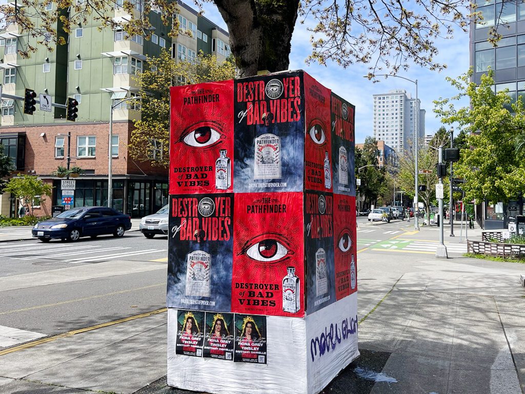
Poster sizing is not a single decision. It is a series of connected choices that determine whether a print marketing campaign succeeds or fails before the first poster goes up. Choose the right size and your message reaches your audience. Choose wrong and you are printing money down the drain. We have done this for hundreds of campaigns. Here is everything we know about poster sizing.
Most clients think about design before they think about size. This is backwards. Size determines what design is possible. Size determines where the poster can go. Size determines how much the campaign costs to produce. Size determines how many people see your message and how well they read it.
The best design in the world on the wrong size poster is a failed campaign. An 11 x 17 poster on a construction wall in Midtown Manhattan gets zero exposures. A 24 x 36 poster in a small bar bathroom where viewers are 18 inches away is too large for the space. The size has to match the environment. Everything else follows from there.
We have rescued campaigns where clients designed first and asked about sizing later. It costs time and money to reprint at the right size. Design to the correct size from the beginning. Make sizing your first decision, not your last.
The Standard Poster Sizes You Need to Know
Size
Dimensions
Area
Primary Use
Small
11 x 17 in
187 sq in
Bars, campus, small venues
Medium
18 x 24 in
432 sq in
Retail windows, indoor venues
Large
24 x 36 in
864 sq in
Street campaigns, outdoor
One-Sheet
27 x 40 in
1,080 sq in
Entertainment, music, film
Quad Sheet
30 x 40 in
1,200 sq in
Transit, outdoor venues
Extra Large
36 x 48 in
1,728 sq in
Conference, large venue walls
Jumbo
48 x 72 in
3,456 sq in
Building panels, installations
The Poster Sizing Decision Framework
Every campaign goes through the same sizing decision process. Four factors shape the answer:
Factor 1: Placement Environment
This is the starting point. Where is the poster going? Outdoor construction walls, indoor venue walls, retail windows, bulletin boards, transit displays. Each environment has physical constraints that set hard limits on viable poster sizes.
Survey your placement locations before you design. Walk the route. Look at the walls. Measure the available space. Note the viewing distances. Identify any display hardware that constrains dimensions. Then, and only then, decide on your poster size.
In New York City, construction walls in SoHo and the Lower East Side typically accommodate 24 x 36 or 27 x 40 without issue. Small bar walls in Williamsburg often max out at 18 x 24 before they start to feel cramped. Retail windows on the Upper East Side can usually take 24 x 36 in a floor-standing frame or mounted on the window directly.
Factor 2: Viewing Distance
The relationship between poster size and viewing distance is mechanical and predictable. For every 10 feet of viewing distance, you need roughly 6 to 8 additional inches in each poster dimension to maintain legibility at headline scale.
Here is the practical guide:
Viewing Distance
Minimum Effective Size
Ideal Size
Under 5 feet
11 x 17 in
11 x 17 or 18 x 24 in
5-10 feet
18 x 24 in
18 x 24 in
10-15 feet
18 x 24 in
24 x 36 in
15-25 feet
24 x 36 in
24 x 36 or 27 x 40 in
25-40 feet
27 x 40 in
36 x 48 in
Over 40 feet
36 x 48 in
48 x 72 in or larger
Factor 3: Budget and Print Quantity
Budget is a real constraint. Here is the fundamental trade-off in poster sizing: larger posters cost more per unit. More units cover more ground. For a fixed budget, you are always choosing between size (impact per location) and quantity (number of locations).
For awareness campaigns trying to saturate a neighborhood, quantity often wins. More smaller posters across more locations creates a frequency of exposure that a few large posters cannot match. For brand launch campaigns trying to create a premium first impression in a specific market, quality and size often win. Fewer, larger, more impactfully placed posters generate a different kind of impression.
Calculate your per-unit cost at each standard size before making your final sizing decision. Know exactly how many posters your budget buys at each size. Then make a strategic decision based on your campaign objectives, more than habit or aesthetics.
Factor 4: Design Content Complexity
Your design content determines the minimum size that works aesthetically. A bold, simple, single-image design works at any size from 11 x 17 to 48 x 72. A design with multiple elements, detailed typography, event schedule information, or complex visual hierarchy needs more space to breathe.
The mistake most designers make is trying to fit too much content into a small poster. The result is a poster with tiny, unreadable type, cluttered visual hierarchy, and no clear entry point for the viewer. If your content demands a certain amount of space to communicate clearly, your poster size needs to accommodate that demand.
Do not try to shrink your design to fit a smaller poster. Either simplify the design or increase the size. One or the other. Never try to squeeze a 24 x 36 design into an 18 x 24 format without simplifying the content.
The Single Most Important Poster Sizing Rule
Choose your size before you design. Not after. Size is a constraint that shapes design decisions. Design is an expression of content within size constraints. Get the constraint right first. Everything else is possible from there.
Poster Sizing for Different Campaign Types
Concert and Music Campaigns
Music campaigns typically use three sizes. An 11 x 17 for bar and record store distribution, where high volume and wide coverage matter most. An 18 x 24 for venue interior placement at the event location and partner venues nearby. A 24 x 36 or 27 x 40 for street-facing outdoor placement in the neighborhoods where the target audience lives and socializes.
Music campaigns that run all three sizes at the same time get the widest possible footprint. The 11 x 17 gets the name out everywhere. The 18 x 24 creates indoor presence in the right spaces. The 24 x 36 or 27 x 40 creates the street-level visual statement that makes the campaign feel significant.
Brand and Product Launch Campaigns
Brand launches benefit from concentrated large-format presence. Rather than spreading a budget thin across many small placements, a brand launch campaign typically invests in fewer, larger placements at the highest-visibility locations in the target market. A 24 x 36 on key construction walls in target neighborhoods, combined with 18 x 24 in retail partner windows, creates a premium impression that small-format distribution cannot match.
For major brand launches with significant budgets, stepping up to 27 x 40 or 30 x 40 at flagship locations adds visual weight and cultural signal value that 24 x 36 does not quite achieve.
Event and Venue Campaigns
Event campaigns work like music campaigns: multiple sizes serving multiple placement environments. The outdoor street presence should be at 24 x 36 minimum. Indoor venue and retail should be at 18 x 24. Bar and coffee shop distribution at 11 x 17. Design all three as a visual family. Run them at the same time in the weeks leading up to the event.
Poster Sizing for Print File Setup
Getting your sizing right in the physical world is only half of the poster sizing challenge. The other half is getting your digital file set up correctly for each size. Here are the technical requirements for each standard size:
Resolution by Size
Resolution requirements change with size. Close-viewing formats need high resolution. Large outdoor formats need less because viewers stand further back:
11 x 17 (close viewing at 2-5 feet): 300 DPI. A 300 DPI file for 11 x 17 is 3,300 x 5,100 pixels.
18 x 24 (medium viewing at 5-12 feet): 200 to 300 DPI. At 200 DPI, that is 3,600 x 4,800 pixels.
24 x 36 (street viewing at 10-20 feet): 150 to 200 DPI. At 150 DPI, that is 3,600 x 5,400 pixels.
27 x 40 (outdoor viewing at 15-25 feet): 150 DPI. That is 4,050 x 6,000 pixels at 150 DPI.
36 x 48 (large format, variable distance): 100 to 150 DPI. At 100 DPI, that is 3,600 x 4,800 pixels.
48 x 72 (jumbo outdoor): 72 to 100 DPI. At 72 DPI, that is 3,456 x 5,184 pixels.
Bleed and Safe Zone
Every poster file needs bleed. Standard bleed is 0.125 inches per edge, added to all four sides. A 24 x 36 poster file with bleed is 24.25 x 36.25 inches. All critical content, text, logos, key images, must stay at least 0.25 inches inside the trim edge (the safe zone). Content between the safe zone and the trim may be cut during production.
Color Mode
All print files should be in CMYK color mode. If you design in RGB and convert at the end, colors may shift. Design in CMYK from the start. Use Pantone spot colors for brand-critical colors that need precise reproduction. Always request a color proof before approving a large print run.
Get a Press Proof
For any campaign where color accuracy matters, request a press proof before the full print run. A proof shows you exactly how the poster will look when printed, including any color shift from your screen. Approving a proof before the full run saves you from discovering color problems after 1,000 posters have been printed.
Transit advertising has its own sizing standards, and they do not map neatly onto standard consumer poster formats. If your campaign includes any transit placements, subway stations, bus shelters, commuter rail platforms, you need to know the transit-specific size standards before you go anywhere near a design file.
In New York City, the MTA uses standardized car card and platform poster sizes that are distinct from commercial print poster standards. The standard subway car card is 11 x 28 inches in portrait. Platform posters use 22 x 45 and 22 x 66 formats, among others. Station dominations and branded station packages use custom dimensions that vary by station and by the specific panel locations included in the buy. None of these are close to the 18 x 24, 24 x 36, or 27 x 40 formats that most print vendors stock.
Bus shelter advertising in major US markets uses 47.5 x 68.5 inch panels as the standard for full-panel placements. This format is close to, but not identical with, standard wide-format print dimensions. Always get the exact panel dimensions from the media vendor before designing transit creative.
The practical rule for transit: get the vendor spec sheet first, design second. Transit formats are defined by the physical display hardware installed at each transit property. They do not adapt to your preferred poster size. You adapt to them. One size does not work across multiple transit systems. Always verify the specific size standard for each transit property you are buying.
For street-level campaigns that complement transit buys, the most natural pairing is 24 x 36 street posters with transit placements. The street posters reinforce the transit creative with street-level frequency. The transit placements extend the campaign into the commuter captive-audience environment. Together, they create a multi-environment coverage that neither format achieves alone.
Common Poster Sizing Mistakes and How to Avoid Them
Designing at the wrong size and scaling up: Never design at 50% and expect to scale up cleanly. Work at the final trim size from the start. Scaling up reduces effective resolution and often reveals design elements that look fine small but fail at full size.
Choosing size based on budget alone: Budget matters, but environment and viewing distance matter more. A cheap 11 x 17 campaign in an outdoor context wastes more money than it saves. Choose the minimum effective size for your environment, then optimize quantity within budget.
Using RGB files for print: RGB files produce unpredictable color results when converted to CMYK for printing. Design in CMYK from the beginning. Check all colors in CMYK preview mode before sending to print.
Skipping bleed: A poster file without bleed will have white edges after trimming if the print shifts even slightly. Always include bleed. Always. No exceptions.
Putting critical content in the danger zone: The 0.25-inch margin inside the trim edge is the safe zone. Content outside the safe zone risks being cut off. Headlines, logos, phone numbers, and URLs must be inside the safe zone. Decorative elements can extend into the trim area but critical information cannot.
Poster Sizing for the Street Marketing Context
In street marketing, poster sizing choices have consequences that extend beyond the visual. The right size affects how many people see your campaign, how much the campaign costs, and how the campaign is perceived by the audiences it reaches.
In dense urban environments like SoHo, Williamsburg, or the Meatpacking District, your poster is competing with dozens of other visual elements at the same time. A poster that is too small disappears. A poster that is too large for its placement location looks awkward or cannot be placed at all. The right size is one that fits naturally in the placement environment and dominates that environment’s visual hierarchy.
We plan every street campaign around size before we plan around design. We look at the placement walls, estimate the viewing distances, calculate the print quantities, and then specify the sizes before any design work begins. This sequence consistently produces better outcomes than the design-first approach that many clients default to.
Is there a poster sizing standard for different industries?
Yes. Street marketing defaults to 24 x 36. Entertainment and film use 27 x 40 one-sheet. Retail uses 18 x 24. Bars and small venues use 11 x 17. Academic conferences use 36 x 48. Each industry has developed its own sizing norm based on the specific display environments and audience behaviors it works with.
Frequently Asked Questions
What is the best poster size for street marketing?
24 x 36 inches is the standard for street marketing. It provides the scale needed for outdoor pedestrian visibility while remaining cost-effective to produce in meaningful quantities. For higher-impact placements, 27 x 40 or 30 x 40 are the next steps up.
How do I choose a poster size?
Start with your placement environment. Survey your locations. Note viewing distances and physical space constraints. Match your minimum effective size to the viewing distance. Set your budget. Calculate how many posters your budget supports at each viable size. Choose based on whether coverage or impact better serves your campaign objective.
What poster size do I need for a 20-foot viewing distance?
At 20 feet, 24 x 36 inches is the minimum effective size for a poster with readable headline text. For comfortable reading of any supporting information, consider stepping up to 27 x 40 or 30 x 40.
Can I use multiple poster sizes in one campaign?
Yes, and most effective campaigns do. Running 24 x 36 for outdoor placements and 18 x 24 for indoor placements in the same campaign is standard practice. Design both sizes as a visual family to maintain campaign cohesion across placement environments.
What resolution should my poster file be?
For 11 x 17 and 18 x 24: 300 DPI. For 24 x 36 and 27 x 40: 150 to 200 DPI. For 36 x 48: 100 to 150 DPI. For 48 x 72: 72 to 100 DPI. Resolution requirements decrease as poster size increases because viewing distance increases proportionally.
Should I add bleed to my poster file?
Always. Standard bleed is 0.125 inches per edge. Add it to every poster file regardless of size. Without bleed, trimming errors create white edges on the finished poster. With bleed, trimming is clean regardless of minor press variation.
Larger sizes cost more per unit. Moving from 18 x 24 to 24 x 36 typically increases per-unit cost by 40 to 60 percent. Moving from 24 x 36 to 27 x 40 adds another 20 to 30 percent. Volume pricing reduces per-unit cost at all sizes. The relative cost difference between sizes narrows at higher quantities.