Poster Sizes Comparison: Every Format Ranked by Real-World Use
We compare every major poster size side by side. Dimensions, area, visibility, cost, and what each format is best suited for in the real world.
Comparing poster sizes is more than about listing numbers. It is about understanding what each format does and does not do well in the environment where it will live. A 24×36 poster on a wall twenty feet away reads clearly. That same poster in a narrow hallway is overwhelming. An 11×17 on a utility pole on Bedford Avenue in Brooklyn gets seen by hundreds of people per hour. That same 11×17 on a blank wall in an industrial area gets lost.
Our team has executed campaigns across New York, Los Angeles, Chicago, and Miami. We have used every standard format in real-world conditions. This comparison guide is built from that field experience, not from paper spec sheets alone.
Here is every major poster format side by side. Area is calculated in square inches to give you a concrete sense of scale difference. The area numbers are more revealing than raw dimensions because they show you exactly how much more visual real estate you get when you go up a size.
Size (inches)
Area (sq in)
Common Name
Typical Viewing Distance
Best Application
8.5 x 11
93.5
Letter / Flyer
Under 3 ft
Handouts, interior bulletin boards
11 x 14
154
Small Poster
3-6 ft
POS displays, stairwells, close placement
11 x 17
187
Tabloid / Half-Sheet
3-8 ft
Street poles, community boards, volume campaigns
18 x 24
432
Small Large-Format
6-15 ft
Street campaigns, retail, outdoor display
22 x 28
616
Retail Two-Sheet
8-15 ft
Retail POP, pharmacy, grocery
24 x 36
864
Standard Large Poster
10-25 ft
Outdoor, event, street campaigns
27 x 40
1,080
Movie One-Sheet
10-30 ft
Entertainment marketing, large retail
40 x 60
2,400
Large Format
15-50 ft
Wall takeovers, domination campaigns
Small Format Comparison: 8.5×11 vs. 11×14 vs. 11×17
These three small formats are often lumped together. They are not interchangeable.
8.5×11 is a flyer, not a poster. It can be printed on any desktop printer. It has roughly half the area of an 11×17. For street-level work, 8.5×11 disappears. The only outdoor context where it works is tight cluster placements on bulletin boards at eye level.
11×14 lands in a useful middle zone. Larger than a letter page but smaller than tabloid. Print shops can run it without special equipment. It fits inside most retail display frames. For POS (point of sale) work in stores, restaurants, and lobbies, 11×14 is a practical choice. It is also the size used in many professional photo prints, which is why framing options are widely available.
11×17 is the volume workhorse. It matches standard tabloid paper, which means almost any office-grade printer can produce it. Commercial printers run it on standard offset presses. The cost per piece is low. For campaigns that need hundreds or thousands of pieces in multiple neighborhoods, 11×17 is where we start the conversation.
The Jump from 11×17 to 18×24
The area difference between 11×17 (187 sq in) and 18×24 (432 sq in) is 131%. You get more than double the visual real estate. The visibility improvement at distances over 10 feet is significant. If your campaign needs street-level impact, this is usually the right upgrade to make.
Mid-Format Comparison: 18×24 vs. 22×28 vs. 24×36
These three sizes define the mainstream poster range for most advertising campaigns.
18×24 is the entry point for genuine large-format street work. It is visible from across a sidewalk. It fits most paste surfaces without covering adjacent placards or notices. Print costs are reasonable. Our crews can transport and hang 18×24 posters with one person per placement. In neighborhoods with lots of available wall space, like Bushwick in Brooklyn or the Arts District in LA, 18×24 grids create strong visual presence.
22×28 is the retail standard. Consumer product brands, grocery chains, and pharmacy retailers build their display systems around this size. If your campaign includes any in-store components, specify 22×28 to match existing display hardware. For street work, 22×28 is slightly awkward. It is larger than 18×24 but not quite a full large poster. We mostly encounter 22×28 in retail contexts, not street campaigns.
24×36 is the format that tips from large to dominating. At 24 inches wide and 36 inches tall, this poster fills the visual field at normal urban walking distances. Our campaigns consistently produce stronger engagement data for 24×36 placements compared to smaller formats in the same neighborhoods. The downside is cost. Wide-format printing for 24×36 runs significantly higher per piece than 11×17 or 18×24. For campaigns where every placement needs to count, 24×36 earns its cost.
Large Format Comparison: 24×36 vs. 27×40 vs. 40×60
At these sizes, we are talking about serious production budgets and specific surface requirements.
27×40 is the entertainment industry standard. Movie studios and concert promoters built their marketing infrastructure around this size. The extra three inches of width and four inches of height versus a 24×36 are not dramatic in isolation. But 27×40 fills a theater lobby display case, a subway kiosk, or a record store window in a way that 24×36 does not quite achieve. For entertainment clients, we always confirm whether the standard is 24×36 or 27×40 before printing a single piece.
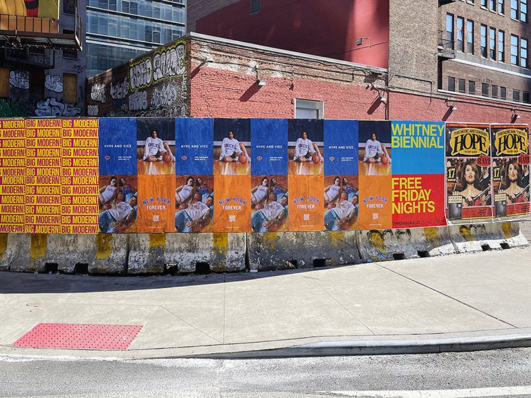
40×60 is where campaigns shift from “poster” to “installation.” A 40×60 print is three and a third feet wide and five feet tall. It commands a full wall section. At this size, viewers can read body copy from 20 feet away. The production cost is substantial. The impact is proportional. Our most memorable New York campaigns have used 40×60 formats on Bowery walls and construction hoardings in the Meatpacking District.
Area Comparison: 11×17 to 40×60
An 11×17 poster has 187 square inches of area. A 40×60 has 2,400 square inches. That is nearly 13 times more visual real estate. The 40×60 is visible from distances where an 11×17 does not register at all.
International Size Comparison: US vs. ISO
US poster sizes are not the same as international ISO sizes. If you are working with European partners or printing internationally, you need to know the ISO equivalents.
The ISO A series runs from A0 down to A10. For poster work, A0 through A3 are the relevant sizes. A0 is 841 x 1189 mm (33.1 x 46.8 inches). A1 is 594 x 841 mm (23.4 x 33.1 inches). A2 is 420 x 594 mm (16.5 x 23.4 inches). A3 is 297 x 420 mm (11.7 x 16.5 inches).
None of these perfectly match US standard poster sizes. A1 at 23.4 x 33.1 inches is close to 24×36 but not identical. A2 at 16.5 x 23.4 is close to 18×24 but again not a match. When working across markets, always confirm which system is being used before approving print specs.
ISO Size
mm
Inches (approx)
Closest US Size
A0
841 x 1189
33.1 x 46.8
33 x 47 (no direct match)
A1
594 x 841
23.4 x 33.1
Close to 24×36
A2
420 x 594
16.5 x 23.4
Close to 18×24
A3
297 x 420
11.7 x 16.5
Close to 11×17
A4
210 x 297
8.3 x 11.7
Close to 8.5×11 (letter)
How Print Cost Scales With Size
Print cost for wide-format digital printing is calculated per square foot. The larger the poster, the higher the unit cost. But the cost-per-square-foot can actually decrease at higher quantities because setup costs spread across more pieces.
For reference, here are approximate cost relationships between common sizes. These are ratios, not specific prices, because actual costs vary by market and shop.
11×17: baseline (call this 1.0x)
18×24: approximately 2.3x the 11×17 unit cost
24×36: approximately 4.6x the 11×17 unit cost
27×40: approximately 5.8x the 11×17 unit cost
40×60: approximately 12.8x the 11×17 unit cost
These ratios hold roughly consistent across most commercial print shops. The implication is clear: moving from 11×17 to 24×36 multiplies your print cost by nearly five. But you also get nearly five times the visual area. The cost per square inch of visibility is actually comparable across sizes.
Choosing the Right Size for Your Specific Campaign
The comparison data is useful. The real question is which size fits your specific situation. Here is how we frame the decision for our clients.
Start with the viewing environment. Where will people see this poster, and from how far away? That single factor eliminates most size options immediately.
Next, look at surface constraints. The available wall, board, or display space sets a ceiling. You cannot hang a 40×60 on a wall that is 36 inches wide.
Then look at budget. Be honest about per-piece cost and total quantity. A campaign of 1,000 pieces at 11×17 may outperform a campaign of 100 pieces at 24×36 in terms of total coverage and exposures. Volume and size trade off against each other.
Finally, look at the design. Some creative concepts only work at scale. Some are perfectly effective at small formats. The design team should weigh in on the minimum size needed for the concept to land.
Poster Size Comparison in Real Campaign Environments
Abstract size comparisons only go so far. Here is how different sizes actually compare when deployed in real urban campaign environments.
High Street Retail Corridor (e.g., Prince Street SoHo, Abbot Kinney Venice)
Foot traffic moves slowly here. Shoppers browse. Viewing distances range from 5 to 20 feet. In this environment, the 18×24 and 24×36 compete closely. The 18×24 works in windows. The 24×36 works on building surfaces and larger windows. At close viewing distances, the larger size is not necessary to achieve legibility, but it does create more visual presence and commands more peripheral attention from passersby on the opposite sidewalk.
Transit Hub Approach (e.g., 14th Street and Eighth Avenue NYC, Atlantic Terminal Brooklyn)
At transit hubs, people move quickly and often look down at their phones. Visual cues need to be large enough to enter peripheral vision without requiring the viewer to consciously look at the surface. The 24×36 is the practical minimum here. The 36×48 performs significantly better in this environment because it enters peripheral vision at greater angles and distances. A transit hub is exactly where stepping up from 24×36 to 36×48 delivers a measurable improvement in impression quality.
Residential blocks have slower pedestrian movement and lower foot traffic per hour than commercial corridors. The audience is locals who walk the same blocks repeatedly. In this environment, the 11×17 and 18×24 perform well at lower cost because multiple exposures over days or weeks build the same awareness as a single large-format impression. Saturation at smaller size beats a single large piece in low-traffic residential zones.
Event Zone Perimeter (e.g., outside a music venue, near a sports stadium)
Event zones concentrate high-density foot traffic for predictable windows. Before a show at Barclays Center in Brooklyn or the United Center in Chicago, the approach blocks see extraordinary foot traffic. In these zones, the 24×36 placed at eye level on walls and fences catches the arriving crowd effectively. The 36×48 is worth considering on large blank walls within two blocks of the entrance where the surface supports it.
Design Tips for Comparing and Switching Between Poster Sizes
When you design a campaign across multiple poster sizes, or when you need to adapt creative from one size to another, a few principles keep the work manageable and the brand impression consistent.
Design at the Largest Size First
Always design at the largest format first. Scaling down from 24×36 to 18×24 is straightforward. Scaling up from 18×24 to 24×36 often reveals that headlines are too small, imagery is too tight, and the breathing room built into the smaller format is not sufficient for the larger canvas. Start big and reduce. The downscaled version will always be cleaner than the upscaled one.
Maintain Headline Hierarchy Across Sizes
When adapting creative from a large format to a small format, the headline font size needs to be relatively larger in proportion to the total poster area than it was on the large piece. A 3-inch headline on a 24×36 poster reads well from 25 feet. That same headline reproduced at proportionally the same point size on an 11×17 poster becomes only about 1.4 inches tall, and it stops reading from 25 feet away. Respec the headline for legibility at the expected viewing distance for each size, do more than scale everything proportionally.
Check Logos at All Sizes
Logo minimum size requirements vary by brand, but a good rule of thumb is that a logo should read clearly from the expected primary viewing distance at the minimum size you plan to run. A logo that reads at 25 feet on a 24×36 needs to be checked for legibility at 10 feet on the 11×17 version. This is particularly important for logos with fine detail: thin letterforms, small sub-brand text, or intricate mark elements that disappear below a certain physical size. Check the logo at each size on a physical print before approving the full run.
Use Bleed Consistently
Every poster format needs bleed: typically 0.125 to 0.25 inches of artwork extending beyond the trim line. When adapting from one size to another, confirm that the bleed is set correctly for the new format. A file adapted from 24×36 to 40×60 may need bleed extended beyond what the original file provided. Missing bleed results in white edges on printed posters that ruin an otherwise clean installation.
Frequently Asked Questions
What is the most popular poster size for outdoor advertising?
24×36 inches is the most used single-piece outdoor poster size for street-level advertising campaigns in the US. It offers strong visibility, manageable production costs, and fits the majority of available outdoor surfaces.
How much bigger is a 24×36 poster than an 18×24 poster?
A 24×36 has 864 square inches of area. An 18×24 has 432 square inches. The 24×36 is exactly twice the area of the 18×24. In visual terms, it is noticeably larger and more commanding at distances over 10 feet.
Is a 27×40 poster much bigger than a 24×36?
A 27×40 (1,080 sq in) is about 25% larger in area than a 24×36 (864 sq in). The height difference of four inches adds meaningful visual presence, especially in tall, narrow display contexts like cinema lobbies and retail kiosks.
What is the smallest poster size worth using outdoors?
For outdoor placements, 11×17 is the practical minimum. Smaller posters do not read well at typical outdoor viewing distances. In high-foot-traffic areas where viewers are close, 11×14 can work, but 11×17 is the floor for most street campaigns.
How do US poster sizes compare to international sizes?
US poster sizes are based on the inch system and do not directly correspond to ISO A-series sizes used internationally. A1 (23.4×33.1 inches) is the closest international equivalent to the US 24×36 standard, but they are not identical. Always specify the measurement system when ordering internationally.
Which poster size is best for concert and event promotion?
11×17 and 18×24 are the traditional concert poster sizes for street distribution. 24×36 is used for high-visibility venue placements. The choice depends on budget, distribution method, and viewing environment. Many campaigns use two sizes: a smaller high-volume format for streets and a larger size for key wall placements.
Does a larger poster always perform better than a smaller one?
No. Larger posters are more visible from distance but cost more per piece, which reduces total campaign reach at any fixed budget. A campaign with 500 pieces at 18×24 often covers more ground than 150 pieces at 40×60. The right size depends on where you need reach and where you need impact.