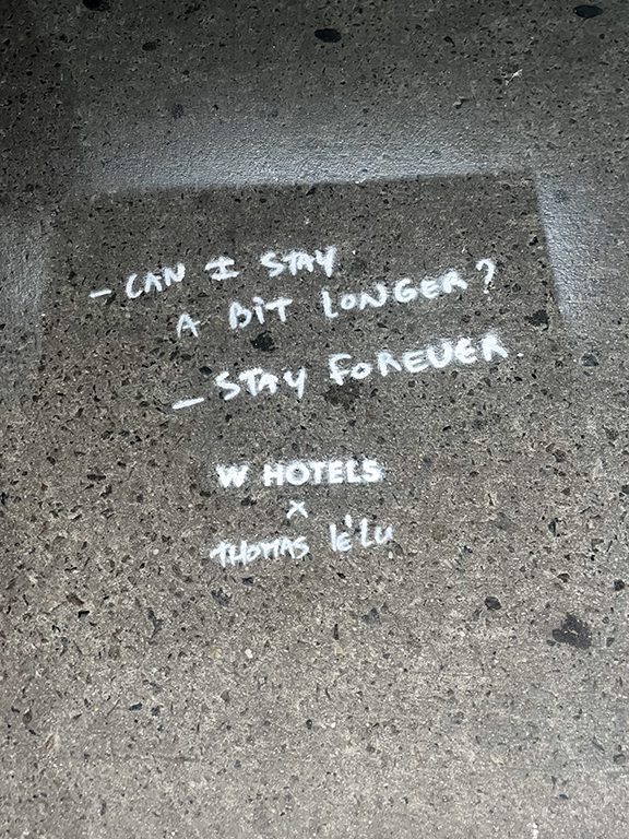
Chalk art stencils sit in a sweet spot between spectacle and speed. A brand gets something large enough to stop pedestrians, fast enough to deploy across multiple neighborhoods, and flexible enough to support launches, sampling, retail openings, festivals, and street team pushes. We use them when a client wants a hand-done look with repeatable brand control.
In practice, the best chalk art stencil campaigns do not behave like gallery pieces. They behave like field assets. Each placement should support a nearby objective such as driving people toward a pop-up, supporting a retail corridor, reinforcing a branded event, or surrounding a venue where the audience is already moving with purpose. We think about the campaign the same way we think about a flyer route or a poster route: block by block, entry point by entry point, and time window by time window.
The other reason chalk stencils hold up is that they photograph well. Even when the art is temporary, the campaign creates a useful trail of visuals for recap decks, client updates, team documentation, and social distribution. That matters because street work only pays off if the brand can show what actually happened on the ground.
We have run stencil-based chalk programs near SoHo retail launches, around Bushwick warehouse events, outside Brooklyn venue runs, and across downtown corridors in Miami and Austin where a full mural would have been too slow or too rigid. The tactic stays relevant because it is operationally nimble.
How We Choose the Right Blocks
Location selection is where most stencil campaigns are won or lost. A pretty design on the wrong block is just decoration. We start by mapping the audience path: where people exit transit, where they queue, where they pause for coffee, where they cross into shopping strips, and where they slow down near entertainment zones.
In New York, that can mean different things in different boroughs. In Williamsburg we may prioritize corners near Bedford Avenue where weekend shoppers drift between cafes and boutiques. In the Lower East Side we may focus on nightlife crossover routes and late afternoon foot buildup. In Midtown, the route might be tighter and more directional, with workday traffic moving toward one specific venue or activation.
We also study surface quality, cleaning patterns, shadow lines, and the amount of visual clutter already fighting for attention. A stencil on a cracked, busy, littered section of sidewalk loses crispness immediately. A stencil near a clean storefront line, plaza edge, or high-contrast patch of pavement tends to read better from distance and in photos.
The route is never random. We build anchor placements, secondary placements, and directional placements. Anchor placements carry the strongest art and messaging. Secondary placements extend frequency. Directional placements help move the audience toward the next physical point in the campaign.
AGM Field Note: The strongest chalk stencil routes usually start one block farther out than the client expects. That extra block catches people before they commit to another direction.
What Makes a Strong Chalk Stencil Design
A good chalk stencil design reads in two seconds. That means bold shapes, short language, and graphic contrast that survives uneven pavement. We usually advise clients to keep the core message to a brand name, an event title, a short phrase, or a simple action such as Scan Here, This Weekend, or Three Blocks Ahead.
Detailed illustration can work, but only if it supports a simple read from ten to fifteen feet away. Fine linework tends to get lost. Overly clever copy also gets lost. The field reality is simple: people are walking, carrying bags, holding coffee, checking maps, or moving in groups. They are not standing still to decode a paragraph.
Color choices matter too. Neon yellows, hot pinks, bright blues, and white highlights perform well when the pavement is dark or slightly weathered. When the sidewalk is pale or dusty, we shift to stronger outlines and bolder fills. The stencil itself has to survive repeated use, so we think about bridge points, registration, layer order, and how quickly the crew can reset between placements.
We also design for the photo. If a piece will likely be shot from above, we open up spacing and create a centered composition. If it will mostly be seen from the approach path, we stretch the composition so it reads along the walking direction.
Operational Flow on Campaign Day
Our crew workflow is boring in the best possible way: prepped stencils, staged supplies, route sheets, timing windows, and proof standards. The smoother the operation, the more placements we can complete before weather, crowding, or street conditions change.
A typical city route starts with a lead who checks surfaces, confirms sequence, and keeps the team moving. Artists or field techs handle stencil placement and chalk application. A photo lead documents every placement with wide shots, detail shots, and context shots that show the surrounding block. If the campaign includes QR or event-direction language, we document readability from a natural approach angle, not just from directly overhead.
We batch similar surfaces together where possible. Smooth plaza concrete behaves differently than older utility-cut sidewalks, so a route that jumps between them too often slows the crew down. By grouping surfaces, we keep output consistent and reduce setup tweaks. This becomes especially important in dense zones like SoHo, Downtown Brooklyn, or the Arts District in Los Angeles.
Timing matters. Morning installs can buy clean surfaces and clearer photos. Late afternoon routes may catch stronger pre-event traffic. Weekend timing can outperform weekdays in lifestyle corridors, while weekday commuter timing is better near office-heavy districts. The choice depends on what the brand needs from the activation.
What Brands Usually Ask For
Most client briefs fall into a few buckets. Some want awareness around a short event window. Some want directional support for a launch or pop-up. Some want a content-friendly street treatment that feels handmade rather than overproduced. The tactic can solve all three, but the route and message change depending on the goal.
For an event push, we usually compress the geography and increase repetition. The audience should encounter the message several times on the way in. For a retail opening, we extend the route outward and use placements to draw people toward the store from multiple entry points. For sampling or touring programs, we may use chalk stencils to frame the broader neighborhood presence around a truck, cart, or team.
Common Mistakes We Fix Early
The most common mistake is trying to squeeze too much brand language into the artwork. Street creative is not a brochure. We strip it down until the concept survives a fast glance. Another common mistake is overestimating how many blocks need coverage. Nine strong placements on the right route beat thirty scattered ones every time.
We also see teams ignore maintenance realities. Chalk is temporary by nature. Wind, shoes, cleaning, and weather all work against it. That is not a flaw. It just means the campaign should be timed to the audience cycle that matters most. If the key window is a Friday evening launch, the route should be fresh for that exact window, not treated like a static installation.
Finally, some briefs forget documentation. If nobody is assigned to capture proof properly, the brand leaves value on the table. We build reporting into the plan from the start because recap assets matter almost as much as the live placements themselves.
How We Report the Campaign Back
Every stencil route should end with a clean packet of evidence: mapped placements, timestamped photos, neighborhood notes, crew notes, and a concise summary of what happened during the run. We keep that reporting simple and useful. Clients need to know which blocks were covered, what the artwork looked like in context, and whether any route adjustments were made on the fly.
That reporting also helps future runs. If a particular corner delivered the strongest photo set or the cleanest surface, we note it. If one corridor was too crowded for consistent application at a certain hour, we note that too. Good street marketing compounds because each campaign teaches us something about pace, surface, and audience movement.
Chalk Art Stencil Planning Framework
Campaign Goal
Route Style
Design Priority
Best Timing
Retail opening
Tight radius around storefront
Directional message plus logo
Late morning to early evening
Event promotion
Repeated placements toward venue
Event name and date
Same-day pre-event window
Sampling support
Corridor coverage near team footprint
Short callout and visual icon
Peak foot traffic period
Festival presence
Multi-entry route around festival edges
Large graphic shapes
Early setup before crowd density rises
AGM Field Note: If the creative only looks good from directly above, it is not ready. Most pedestrians see the piece on approach, at an angle, with motion around it.
How We Match Neighborhoods to Audience Intent
We do not treat every busy block the same. A corridor filled with destination retail behaves differently than a nightlife strip, and both behave differently than a commuter-heavy transit edge. The route should match what the audience is already trying to do. In Williamsburg, people drift and browse. In Midtown, they move with more urgency. In the Arts District, they stop more often for texture, storefronts, and photos. Those behaviors shape how far apart we space placements and how direct the message needs to be.
Audience intent also changes by hour. The same block can feel transactional at 8:30 in the morning and exploratory at 6:00 in the evening. We plan around that. A route meant to support a launch party may be timed to catch pre-dinner foot traffic and then again near venue arrival. A route meant to support weekend shopping may lean into late morning and early afternoon when people are open to wandering.
This is why local knowledge matters. Street campaigns are not just about density. They are about behavior. We build better routes because we know how different neighborhoods move when the weather changes, when schools let out, when the bars start filling, or when a market weekend shifts people two blocks east.
Production Details Clients Usually Overlook
Clients tend to focus on the hero visual, which makes sense, but production details shape whether the campaign feels clean in the field. Material strength, stencil durability, registration marks, packing order, surface prep tools, backup supplies, and proof instructions all matter once the crew is moving through a city.
We keep duplicate essentials on hand so one damaged component does not slow the route. We also plan for neighborhood-specific constraints like longer walks between anchor points, limited staging space, or blocks where the crowd density makes it smarter to hit one side of the street first and loop back later. Those small decisions are invisible when the campaign goes smoothly, which is exactly the point.
Another overlooked detail is how the campaign will be photographed. We define which placements need hero shots, which need contextual block shots, and which simply need clean proof. That shot hierarchy prevents the recap from turning into a random camera roll.
Why Recap Assets Matter After the Street Work Ends
Street campaigns are fleeting by nature, so the recap package carries real weight. Internal decision-makers want proof of execution. Marketing teams want assets they can circulate. Agencies need materials they can use in decks, case studies, and retrospective planning. If the reporting is weak, the campaign feels smaller than it was.
We build recap assets to show three things clearly: where the work happened, what the creative looked like in the real environment, and how the route supported the brand objective. A clean map and strong photo set make those points quickly. That is much more useful than dumping a folder of unorganized images on a client the next day.
Good reporting also helps justify the next move. When a team can see which blocks delivered the best visuals or the clearest route logic, it becomes easier to plan a stronger follow-up rather than starting from scratch.
The brands that get the most out of pavement work are usually the ones that understand it as part of a larger street system. A stencil or sidewalk piece should not have to do everything by itself. It should support the store opening, the pop-up, the venue, the sampling team, the launch party, or the content plan already in motion. When that alignment is clear, the route feels purposeful and the creative lands harder.
We also plan with the surrounding visual environment in mind. A block lined with glossy storefront windows and clean facades calls for a different art balance than a rougher corridor filled with flyers, tags, and construction barriers. The street is never a blank canvas. It is a live environment full of competing signals. Our job is to make the campaign readable inside that chaos without overcomplicating the message.
Another reason we favor disciplined route planning is that it protects crew energy. Street work can slow down fast when the route is not organized. Long gaps between useful placements, inconsistent surfaces, and unclear proof expectations all drain time. A tight route keeps the crew efficient, keeps the client deliverables clean, and keeps the campaign looking intentional from the first block to the last.
On recap calls, clients often mention details they would have missed without strong documentation: how the route related to a specific coffee line, how one corner framed the store entrance, or how the artwork sat next to the exact type of street activity they wanted to be associated with. That is the practical value of field reporting. It turns a temporary street treatment into something the broader team can review and learn from.
Because we execute in multiple major markets, we are constantly comparing how the same tactic behaves in different city contexts. New York rewards tight route logic and density. Los Angeles often rewards destination clusters and cleaner visual backdrops. Miami can reward bright contrast and tourism-heavy timing. Austin can reward event-driven pacing and neighborhood spillover. Those differences shape how we build each run.
Brands also underestimate how much small route edits can improve the finished campaign. Moving one anchor a half block to the south might improve light, surface quality, and pedestrian approach all at once. Shifting a directional placement closer to a crosswalk can increase how many people actually notice it. These are not dramatic changes, but they are the difference between a route that merely exists and a route that works.
We think a lot about what pedestrians are doing with their attention in the second before they notice the artwork. Are they looking down because they are checking the curb? Are they looking ahead toward a queue, a storefront, or a venue line? Are they moving alone or in groups? The answer affects placement angle, message length, and how aggressively the artwork needs to announce itself.
Finally, the best street campaigns leave behind operating knowledge. After a run, we know more about which blocks gave us the best context photos, which times produced the cleanest execution window, and which neighborhoods rewarded repetition versus one hero placement. That knowledge compounds. It makes the next pavement campaign sharper before we even start design.
Budgeting and Scope Conversations We Have Early
One of the most useful early conversations is scope discipline. Clients often begin with a rough desire to be everywhere, but pavement campaigns work better when the footprint is aligned to one business goal and one realistic crew plan. We talk through whether the priority is depth around one location, breadth across several neighborhood anchors, or a sequence that connects transit flow to a single destination. That conversation shapes every later decision.
Budgeting also becomes easier once the route has structure. Instead of arguing in abstract about how much street presence is enough, we can tie production and execution to a defined number of anchors, support placements, crew hours, and documentation needs. Clients appreciate that because it turns a fuzzy guerrilla brief into a practical operating plan.
We also explain where not to cut corners. The cheapest version of a pavement campaign is rarely the most efficient version. Weak scouting, sloppy proof capture, and overextended routes create waste even when the upfront spend looks smaller. A cleaner plan almost always produces better field assets and a stronger final recap.
How We Think About Creative Restraint
Creative restraint is one of the hardest things for brands to embrace because everyone wants to fit one more selling point into the street asset. We resist that impulse hard. The street rewards clarity, not completeness. If the message can be reduced to a strong brand phrase, a short event hook, or a directional cue, it will perform better and photograph better.
Restraint also improves consistency across multiple placements. When the artwork is simpler, the output stays tighter from block to block, even as surfaces change. That matters because the campaign should feel like one coordinated street program, not a set of loosely related experiments.
We have found that clients almost always like the cleaner version more once they see it in context. On a screen, extra copy can feel harmless. On pavement, it creates hesitation. The right design gives people the message before they realize they are reading an ad.
Field Adjustments That Separate Good Crews From Great Crews
No matter how strong the preproduction is, real streets force adjustments. A delivery truck sits on the best curb line. A crowd forms around a cafe. A cleaning crew hits one of the planned anchors before the install team arrives. Strong crews do not freeze when that happens. They shift calmly and keep the route logic intact.
We train for that by treating the route as a system with priorities, not a fragile checklist. If anchor A is temporarily compromised, we know which alternate block keeps the same audience path alive. If timing shifts in one zone, we can compress support placements and preserve the most valuable work. Adaptability matters because city streets are live environments, not closed sets.
These adjustments are also why local operating knowledge matters so much. When you know the rhythm of a neighborhood, you can make smarter substitutions without overthinking them. That confidence keeps the campaign moving and protects the output quality.
Using Pavement Media Alongside Other Street Tactics
Pavement media is often strongest when it works alongside other field assets. A stencil route can extend the footprint of a retail opening. A sidewalk ad can reinforce the path to a branded installation. A sticker system can create visual residue around a launch that already includes in-person promotion or event support. The street feels bigger when the elements reinforce each other.
What matters is not layering tactics for the sake of complexity. It is making sure each one has a clear role. Pavement placements usually handle route visibility and local repetition especially well. They live low in the visual field where pedestrians naturally glance while moving. That makes them useful companions to taller assets or face-to-face street team activity.
We talk clients through that mix early so the campaign does not feel fragmented. If multiple tactics are on the street at once, they should share geography, timing, and a coherent visual story.
Why Neighborhood Specificity Improves Results
Generic street plans produce generic street outcomes. The closer we can tie the campaign to actual neighborhood behavior, the sharper it becomes. A route around a Bushwick gallery opening should not be planned like a route around a SoHo retail launch. The audience expectations, visual surroundings, and walking patterns are different from the first block onward.
Neighborhood specificity also gives the campaign more texture. Referencing the right corridor, choosing the right side of the street, and timing the route to the real pulse of the area make the work feel native instead of dropped in. That is one reason our campaigns tend to document well. They are built around how the city actually behaves.
For national brands, this matters even more. A campaign can still feel cohesive across cities while adapting to local block logic. The best multi-market street work preserves the brand system but respects the neighborhood reality in each location.
What Clients Remember After a Strong Run
Clients usually remember three things after a strong pavement campaign: the route made sense, the creative looked better on the street than expected, and the proof package was easy to share. Those three outcomes reinforce each other. A coherent route makes the visuals stronger. Strong visuals make the recap more persuasive. A persuasive recap makes the campaign easier to build on.
That is why we treat execution and reporting as part of the same job. The campaign is not finished when the last placement is done. It is finished when the brand has a clear record of what happened and enough insight to plan the next move with confidence.
When that happens, street marketing stops feeling like a gamble and starts feeling like an operating channel. That is the standard we aim for on every AGM field program.
Campaign Scenarios We See Repeatedly
Across categories, a few pavement scenarios come up again and again. A brand is opening a store and needs the surrounding blocks to feel activated before the doors open. A promoter needs a nightlife route that starts influencing people several blocks from the venue. A product team wants a temporary street treatment that can be photographed heavily during a launch week. A touring brand wants a repeatable field format that can be adapted from one city to the next without losing its identity.
Each scenario benefits from the same core discipline: decide exactly what the street asset is supposed to do, then build the route around that job. If the job is directional, repetition and sequence matter most. If the job is neighborhood presence, the anchor placements matter most. If the job is recap-friendly spectacle, the photo angles and environmental context matter just as much as the artwork itself.
We bring that framework into kickoff conversations because it helps clients simplify faster. Once everybody agrees on the real purpose of the route, the campaign becomes easier to design, easier to execute, and easier to evaluate afterward.
This is also where operator experience shows up. People who spend time in the field know that two routes with the same number of placements can perform very differently depending on how those placements relate to decision points, pauses, and destination energy. That is why we obsess over sequence rather than chasing raw quantity.
When a pavement campaign works, it feels inevitable. People encounter it where they were already going to look, it reinforces where they were already headed, and it adds just enough surprise to make the brand feel present in the neighborhood. That is the balance we chase on every run.
Frequently Asked Questions
How long does a chalk art stencil campaign take to deploy?
Most single-neighborhood routes can be completed in a few focused hours once the stencil system, route order, and proof standards are locked.
Can chalk stencils work for national brands?
Yes. We adapt the design and route logic to each market while keeping the brand language consistent from city to city.
What kind of artwork performs best?
Bold shapes, short copy, and strong contrast perform best because they hold up on uneven pavement and read quickly.
Do you help with route mapping?
Yes. We build the route around audience movement, entry points, and the nearby action the brand wants to support.
Can chalk stencils include QR codes?
They can, but only when the placement and scale allow a clear scan path. We test readability from normal walking angles.
What does AGM deliver after the campaign?
We provide photos, mapped placements, route notes, and a concise field summary for internal recap and client reporting.
Are chalk stencil campaigns useful for pop-ups?
Very. They help pull people toward a temporary location and create a more visible neighborhood footprint around the opening.
Can you run these campaigns in multiple cities?
Yes. We execute street campaigns in major markets and adapt the route strategy to each city block by block.