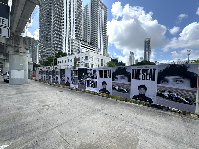
Before any wheatpaste poster goes to print, the mockup stage is where size decisions get confirmed, artwork problems get caught, and the visual identity of a campaign gets locked in at real-world dimensions.
A wheatpaste poster mockup is a scaled or full-dimension preview of how a poster design will appear on a wall in a real street environment. It shows the poster at actual output dimensions, on a representative surface, from a representative viewing angle. For any professional poster campaign, the mockup is the last opportunity to catch problems before they become expensive mistakes on paper and paste.
We produce and review wheatpaste poster mockups for every campaign we run. Over the years, the mockup process has caught resolution failures that would have wasted full print runs, revealed type legibility problems invisible at screen size, identified seam placement issues in multi-panel builds, and surfaced color mode mismatches that would have shifted brand colors significantly in the final output. This guide walks through the size options, panel configurations, file specs, and the artwork submission process from end to end.
Standard Wheatpaste Poster Sizes and Panel Configurations
Wheatpaste posters are produced in panel-based formats. The standard campaign panel is 24″ x 36″, which is a manageable output size for wide-format inkjet production, rolls cleanly for transport, and tiles into any of the common campaign formats without waste. From this base panel, all standard campaign formats are built.
Panel Configuration Reference Guide
Format
Finished Size (W x H)
Panel Count
Grid Layout
Typical Use
Single Panel
24″ x 36″
1
1 x 1
Column wraps, narrow walls, test placements
Double Width
48″ x 36″
2
2 x 1
Horizontal banner, door surrounds
Double Height
24″ x 72″
2
1 x 2
Tall narrow wall sections, pillar wraps
Four-Panel (Standard)
48″ x 72″
4
2 x 2
Standard campaign placement, most wall types
Six-Panel Wide
72″ x 72″
6
3 x 2
Wide wall sections, corner wraps
Eight-Panel
96″ x 72″
8
4 x 2
Large wall faces, hoarding panels
Twelve-Panel Build
96″ x 108″
12
4 x 3
Anchor placements, building side features
Custom Build
Variable
12-40+
Variable
Full building sides, scaffolding takeovers
Choosing the Right Format for Your Campaign
The format decision depends on three factors: the available wall inventory in the target market, the viewing distance at typical placement locations, and the budget for print production. For most brand campaigns, the four-panel standard build at 48″ x 72″ hits the best balance across all three factors. It is large enough to read clearly from across a standard street, small enough to fit in most available wall sections, and produces at a cost-efficient per-unit rate at any volume from 50 to 500 copies.
Anchor placements, those key locations that serve as the visual centerpiece of a campaign, warrant a larger format. A twelve-panel build on a prominent corner in Bushwick or along Melrose Ave creates a presence that reads as a genuine installation rather than just a poster. Combining large-format anchors with standard four-panel distribution across surrounding blocks is a strategy we use frequently for campaigns that need both visual impact and geographic coverage.
Wheatpaste Poster Mockup Production
The mockup for a wheatpaste poster campaign serves multiple purposes. It confirms that the design reads correctly at actual installed dimensions. It shows the client what the campaign will look like in a real street context. It allows the production team to verify artwork file quality before committing to a print run. And it serves as a presentation asset for internal approval processes.
Mockup from the Design File
Mockup production starts with the design file at output dimensions. We place the artwork into a wall photograph taken at or representative of the target market, with perspective correction applied so the poster reads at the correct angle and scale. The final mockup image is typically 2000 to 4000 pixels wide, sufficient resolution to review at both full-composition viewing distance and at 100% zoom for detail inspection.
Multi-Panel Assembly Preview
For multi-panel builds, the mockup shows the complete assembled image with seam lines visible. This is critical because seam placement relative to image content can create significant visual problems in the field that are not visible when reviewing individual panels separately. A seam through the primary subject of the image, a face, a product, a logo, creates a distracting split that weakens the visual impact of the installation.
In the mockup review, we check seam placement against image content and flag any problematic intersections. If a seam is running through critical content, we recommend a compositional adjustment that shifts the image position relative to the panel grid, which is usually a small change that has a significant impact on the final installed appearance.
Perspective and Viewing Angle Mockups
Beyond the flat wall-mounted view, we also produce perspective mockups for key anchor locations where the viewing angle is an important design consideration. A poster on a wall that faces a diagonal intersection is read at an oblique angle by the majority of approaching pedestrians. The design needs to read from that angle, not just from a head-on position. Perspective mockups reveal these viewing angle effects before installation.
AGM Field Note: The most useful mockup we can give a client is a street-level perspective view from the dominant pedestrian approach direction. This is the angle at which the campaign will actually be seen by the majority of people passing it. If the design reads well in this view, it will read well in the field. If it does not read well here, fixing it before print is the correct next step, not hoping for the best on execution night.
Artwork File Requirements for Wheatpaste Poster Production
The file requirements for wheatpaste poster production are specific and non-negotiable from a quality standpoint. Meeting these specifications is what separates a poster that holds up on the wall from one that embarrasses the brand.
Resolution
Minimum 150 DPI at final output dimensions. This is the threshold at which wide-format inkjet printing produces results that read as sharp and professional at street viewing distances. Below this threshold, pixel structure becomes visible in areas of fine detail, and the overall print reads as low-quality at normal viewing distances.
To verify resolution in a submitted file: in Adobe Illustrator, link-placed raster images report their actual embedded resolution. In Photoshop, Image Size (with Resample unchecked) shows the file’s native resolution at the current document dimensions. If the native resolution at output dimensions is below 150 DPI, the file needs to be rebuilt from higher-resolution source material.
Color Mode and Profile
CMYK with an industry-standard print profile (US Web Coated SWOP v2 or GRACoL 2013 Coated for offset litho production). Wide-format inkjet production from an RIP can accept RGB input and convert internally, but submitting in CMYK with a specified profile gives the production team more control and produces more predictable color output.
Bleed and Safe Zone
Each panel in a multi-panel build should include bleed on all four edges, even edges that will abut another panel. This gives the production team flexibility to adjust panel trim lines during production without losing image coverage. The minimum bleed on any edge is 0.25 inches. The safe zone for critical content is 0.5 inches inside the trim line on all non-abutting edges.
Format and File Organization
Print-ready PDFs are the preferred submission format. Multi-panel builds should be submitted as separate PDF files for each panel, clearly named with the panel position (e.g., Top-Left, Bottom-Right, or Panel-01 through Panel-12). Including a flat composite preview of the assembled design as a reference PDF helps the production team verify panel organization before printing begins.
The Artwork Submission Workflow at AGM
Once a campaign is confirmed and the format has been established through mockup review, the artwork submission workflow proceeds through a defined sequence designed to minimize errors and keep the production timeline on track.
Step One: Template Distribution
We provide the client’s creative team with dimension templates for each panel format in the campaign. These are PDF or AI format guides showing the output dimensions, bleed area, safe zone, and any campaign-specific notes (such as preferred seam placement zones for multi-panel builds). The templates are the definitive dimension reference for production artwork.
Step Two: Artwork Submission
The creative team submits print-ready files through our designated file transfer channel. For large files (over 200 MB per panel), we use a direct-upload link rather than email. Submissions should include: all panel files named per the template, a composite reference image of the assembled design, and any separate vector files for logos or wordmarks that appear in the design.
Step Three: Technical Review
We review submitted files within one business day against the technical checklist: resolution, color mode, bleed, safe zone, font embedding, and panel naming. Technically compliant files proceed immediately to visual review. Files with technical issues receive a correction request with specific annotations showing the problem and the required fix.
Step Four: Visual Review and Mockup Confirmation
Files that pass technical review are placed into the mockup for visual confirmation. This stage reviews type legibility, contrast, seam placement, and overall design coherence at installed scale. If the visual review confirms the design is ready, we communicate production approval and print begins. If there are visual issues, these are documented and returned to the creative team for correction.
Step Five: Production Approval
Once artwork is technically and visually approved, the client receives a production approval confirmation and the print timeline begins. We do not start printing until we have explicit approval on the visual proof. This protects both the campaign and the production budget from errors that could otherwise only be caught after paper is already printed.
AGM Field Note: The most common cause of timeline delays is not the production process. It is artwork that arrives incomplete or below spec. A creative team that submits a clean, complete, print-ready file on the first submission can get from approval to printed panels in three to five business days. A file that requires two rounds of corrections can push that timeline by four to six business days, which creates real risk for time-sensitive launches.
Using Poster Mockups for Pre-Campaign Marketing
Beyond their production utility, wheatpaste poster mockups have genuine value as pre-campaign marketing assets. A well-produced mockup showing the poster in context in a recognizable neighborhood, Williamsburg, Melrose, Wynwood, can be used as social content before the campaign executes to build anticipation, and as comparison content after execution to show the real placement alongside the preview.
For brands doing simultaneous physical and digital campaign launches, pre-release mockup content drives engagement on social channels and generates conversation before the physical campaign is in the streets. The mockup becomes a teaser, and the post-execution photography confirms it. This sequence, tease with mockup, deliver with execution photography, is a content strategy that extends the campaign’s social footprint at minimal additional cost.
Creative Direction for Wheatpaste Poster Formats
Design decisions that look good at screen scale often fail at street scale. The mockup stage is where these problems are caught, but the cleaner path is building the creative correctly from the start. Here is what to consider at the design stage for each primary poster format.
Four-Panel Build (48 x 72 inches)
The standard four-panel build is the workhorse of commercial wheatpaste campaigns. At 48 inches wide and 72 inches tall, it reads clearly from across a standard street and from a passing vehicle in the adjacent lane at low speed. The design hierarchy for this format should be compressed: one dominant visual element, one primary message, and a brand identifier. Secondary information is a distraction at this scale. The layout should be designed to read first at twenty feet, then to reward closer inspection at six to ten feet.
The seam in a four-panel build runs both horizontally and vertically through the center of the image, creating a plus-sign intersection at the center of the composition. Designs that place the primary visual subject at the exact center of the layout put that subject directly at the seam intersection, which creates a four-way split through the most important part of the image. Moving the primary subject slightly off-center, or designing the composition to accommodate the seam as a visual element, eliminates this problem.
Six-Panel Build (72 x 72 inches)
The six-panel square format is used for wider wall sections and for compositions that benefit from a more panoramic horizontal aspect ratio. At six feet wide and six feet tall, it is the smallest format that begins to feel like a mural rather than a poster from street viewing distance. The design for this format benefits from a stronger horizontal visual flow, with the primary read happening left to right rather than top to bottom as in the taller four-panel portrait format.
Twelve-Panel Anchor Build
Twelve-panel builds at eight feet wide by nine feet tall are anchor installation formats. At this scale, the poster competes visually with architecture rather than with other posters. The creative for a twelve-panel build needs to hold at twenty to fifty feet viewing distance, which means even bolder compositional simplicity and higher contrast than a standard four-panel. Twelve-panel builds are the right format for campaign anchor locations where the brand wants a visual landmark, not just a placement.
Surface Adaptation in Mockup Design
A mockup that shows the poster on a generic flat wall surface does not fully represent how the campaign will look across the variety of surfaces it will actually land on. Professional mockup production accounts for surface variation and communicates it clearly so brands can make informed decisions before committing to production.
Brick Surface Rendering
When the mockup target is a brick wall, the surface texture overlay applied to the poster image in the mockup gives the design team a realistic preview of how the brick face will interact with the print. On rough brick, mortar joint lines will be visible through the paper at close range. On painted brick, the texture is subtler but still present. For designs with large areas of flat solid color, the brick texture adds visual complexity that can either enhance or detract from the design depending on how the color areas are composed. The mockup reveals this interaction before production.
Smooth Concrete and Painted Surface Rendering
On smooth surfaces, the mockup presents the design in its clearest form, without the additional visual complexity that brick texture introduces. For brands whose creative is detailed and legibility-dependent, smooth surface mockups are the most optimistic preview of how the design will read in the field. The same design on brick will read slightly differently due to texture, and the mockup sequence for multi-surface campaigns should show both to give the full picture.
Construction Hoarding Rendering
Plywood hoarding is a flat surface with a grain direction that adds a subtle horizontal or vertical linear texture to the installed poster. In the mockup, this grain is applied as a low-opacity overlay that reveals how the design reads with this additional texture. For designs that already have strong horizontal or vertical line content, the hoarding grain can either reinforce or compete with those lines, and the mockup reveals which is happening before installation.
Timeline Management for Mockup and Approval Cycles
The mockup and approval cycle has a direct impact on the campaign production timeline. Understanding how the timeline works helps brands build a realistic schedule that does not compress the production window at the cost of campaign quality.
The total time from artwork submission to print production start depends on: the number of review cycles needed (one for clean submissions, two or three for files with issues), the speed of the client approval process after the mockup is delivered, and any additional rounds of creative revision that the mockup review generates. In our experience, the most common source of timeline delay is not the technical review, which we complete quickly, but the internal client approval process that follows the mockup delivery.
For campaigns with multi-decision-maker approval chains, we recommend building a formal approval deadline into the campaign schedule, specifically a date by which the mockup must be approved in order to hit the print production window that supports the execution date. When the approval deadline is explicit and acknowledged by all decision-makers before the campaign starts, the approval cycle runs more efficiently than when it is treated as an open-ended process.
Rush approval cycles are possible but carry risk. A decision-maker who is rushing through a mockup approval to hit a deadline may approve a design that would have generated a revision request under a less compressed timeline. The revision then surfaces in the field after production, which is the most expensive and most inconvenient moment to discover it. The investment in a deliberate, unhurried approval cycle for the mockup is always justified by what it prevents.
How We Build Poster Mockups That Clients Can Actually Approve
A good poster mockup is not just a nice presentation image. It is an approval tool that closes the gap between the creative deck and the field execution. Clients need to see enough realism to understand scale, but they also need enough technical clarity to catch issues before paper is printed. We structure our mockups to do both jobs at once.
The base file is always the production artwork at output dimensions. We place that file onto a wall image that reflects the campaign environment, then produce at least two views: a straight-on scale view and a street-perspective view. For larger builds, we add a third assembled-panel review that shows the seam grid clearly. These versions work together. One gives confidence in the design. One gives confidence in the installation read. One protects the production process from panel mistakes.
Client Review Without Guesswork
Clients should never be left guessing about dimensions. We label mockups with final installed size and, when helpful, compare the poster to a doorway, a person, or a storefront in the scene. This keeps approvals grounded. A lot of confusion disappears once someone can see that a four-panel build is not an oversized flyer but a six-foot-tall street object.
Creative Review at Actual Scale
We also push clients to review the artwork at actual scale on a calibrated screen before signing off. That is when hidden problems surface: thin serif copy, low-contrast release dates, subtle gradients that die on uncoated stock, or brand marks buried against dark photography. The mockup is the forcing function for a realistic creative conversation, which is why rushed approvals almost always create avoidable production pain.
Panel Logic for Multi-Sheet Builds
Any build above a single sheet needs panel logic that is easy for the crew to follow. We label panels consistently, keep assembly orientation obvious, and supply a flat composite reference with the production package. The mockup is where we confirm that this system works visually and operationally. If the panel order is confusing in the office, it will be worse on the sidewalk in the middle of the night.
AGM Field Note: The mockup should make the next decision easy. If it leaves the client saying “I think this is right,” we have not done enough yet.
Poster Mockups as a Planning Tool for Print and Installation
Mockups also help us plan beyond the artwork itself. They reveal where we need alternate crops for narrower walls, where we may want a simplified version for a smaller format, and whether an anchor wall deserves a special build that is not used elsewhere in the campaign. That planning value is why mockups belong early in the workflow, not five minutes before files go to the printer.
Format Variations Across the Same Campaign
Many campaigns run more than one format: a standard four-panel for broad coverage, an oversized build for anchors, and sometimes a single-sheet variant for tighter Manhattan or downtown corridors. Rather than forcing one design to do every job equally, we use the mockup process to decide which elements stay consistent and which should adapt. The client ends up with a campaign family that feels cohesive instead of a one-size-fits-all compromise.
Installation Efficiency
Crews work faster when the build plan is obvious. Mockups show where seams land, which matters for how we brief the installation team. If a critical face or logo lands directly on a seam intersection, we fix it before production. That is a creative decision with direct operational consequences. Poster mockups are where those two worlds meet.
Documentation Planning
We also use poster mockups to think ahead about documentation. A mockup can tell us which walls are likely to produce the strongest day-after photography, where the neighborhood background adds value, and which anchor installations should be prioritized for sunrise or late-afternoon shooting. When the campaign goes live, that planning gives us better photos, faster.
Frequently Asked Questions
What is a wheatpaste poster mockup?
A wheatpaste poster mockup is a digital preview of how a poster design will look installed on a wall at actual campaign dimensions, in a real street context. It is used to confirm design quality, verify artwork file specs, and provide a visual reference for internal approval and client presentation before committing to full print production.
What is the standard size for a wheatpaste poster campaign?
The most common campaign format is a four-panel build producing a 48″ x 72″ finished face, assembled from four standard 24″ x 36″ panels. This size is large enough to read from across a standard street and small enough to fit in most available wall sections. Larger builds from six to twelve panels or more are used for anchor placements.
How do I set up artwork for a multi-panel poster build?
Design the complete assembled image at full output dimensions (for example, 48″ x 72″ for a four-panel build at 150 DPI minimum resolution). We will then provide panel split guides showing how the full image divides into individual 24″ x 36″ production files. The panel split should be reviewed in the mockup stage to confirm seam placement relative to image content before production begins.
Can I use my existing brand materials for the poster artwork?
Existing brand materials can be used if they meet the resolution and color mode requirements for large-format print production. Many digital brand assets (website images, social graphics, screen-resolution logos) do not meet the 150 DPI at output size threshold. We review all submitted materials and advise specifically on which elements meet print requirements and which need to be replaced with higher-resolution versions.
How long does the mockup and artwork approval process take?
For complete and technically correct artwork submissions, the review and mockup production process takes one business day. Files requiring corrections typically add one to two additional business days depending on turnaround from the creative team. We prioritize the review process to keep it off the critical path of the campaign production timeline wherever possible.
Do you provide mockups for multiple market formats?
Yes. For multi-market campaigns where different surface types are involved, we produce representative mockups for each major surface category: brick, painted concrete, plywood hoarding. This gives the client a realistic range of visual references covering the variety of surfaces the campaign will actually appear on.
What file format should I submit for the poster artwork?
Print-ready PDF is the preferred format. TIFF and high-resolution AI files are also accepted for review. Multi-panel builds should be submitted as separate PDF files per panel, named clearly with panel position references, plus a flat composite reference showing the complete assembled design. Vector logo and wordmark files should be included separately.
Can the mockup be used for internal presentations before the campaign is approved?
Yes. We produce presentation-quality mockups for campaigns that need to move through internal approval chains before production is confirmed. This is a standard part of the pre-production process for brands with multiple decision-makers in the campaign approval process. The mockup can be produced from a design that is still in development, as long as the composition and scale are defined.
What happens if we discover a problem in the mockup?
If the mockup reveals an artwork problem, we document the specific issue with visual annotations and return it to the creative team with clear guidance on the required correction. Once a corrected file is submitted, we run it through the same review process and confirm resolution before approving for production. This back-and-forth is a normal part of the process for complex campaigns and is far less costly than discovering problems after printing.