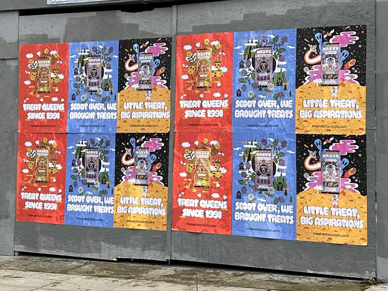
Getting the mockup right before a single sheet goes to print is the step that separates campaigns that look exactly as intended on the wall from ones that lose detail, contrast, or legibility under real street conditions.
A wheatpaste mockup is the visualization of how a poster design will look applied to a wall at actual installed scale. It serves two purposes: it helps the client confirm the design reads correctly at street dimensions before committing to a full print run, and it helps the production team verify that the file specifications are correct before paper goes through the printer. For any serious campaign, a mockup review is not optional. It is the checkpoint that eliminates the most expensive and embarrassing class of campaign errors.
We have been reviewing and producing wheatpaste mockups for brand campaigns for over a decade. In that time, we have caught resolution problems, color mode mismatches, type legibility failures, and multi-panel alignment issues that would have produced unusable prints at full production cost. This guide covers the mockup and artwork preparation process in full, from what files we need, how mockups are produced, what we look for in review, and how the AGM artwork submission process works before any campaign goes to print.
Why Mockup Review Matters for Street Poster Production
The gap between what a design looks like on a 15-inch screen and what it looks like on a 48″ x 72″ wall is substantial and consistently underestimated. Several specific failure modes show up repeatedly in artwork submissions that have not gone through a proper mockup review.
Resolution Failure
The most common and most damaging problem. A design file that is 72 DPI at web dimensions looks sharp on a monitor but turns into visible pixel blocks when scaled to print at full output size. The threshold for acceptable wide-format print quality is 150 DPI at final output dimensions. For a standard 24″ x 36″ panel at 150 DPI, the minimum required file resolution is 3,600 x 5,400 pixels. Many design files created for digital-first workflows do not meet this threshold, and the problem is not visible until the print is already on paper.
Color Mode Mismatch
Design files built in RGB color mode will shift when converted to CMYK for print. Vibrant digital blue colors in particular often shift noticeably, and certain bright digital greens and oranges are outside the CMYK gamut entirely, meaning they print significantly darker or more muted than the screen version. Files submitted in RGB mode require a conversion and soft-proof review before print production can be confirmed.
Type Legibility at Scale
Body copy and small supporting text that looks fine at screen viewing distance often disappears or becomes unreadable at street-level viewing distance. The minimum readable type size for a poster viewed from fifteen feet is approximately 1.5 inches tall at final output, equivalent to approximately 108 point type at standard print scaling. Any text smaller than this in the design should be questioned during mockup review.
Multi-Panel Seam Issues
For designs that tile across multiple panels, the seam placement relative to image content matters. A seam that runs through a face, a logo, or the most critical part of the design creates visual disruption on the installed poster. Seams need to fall in areas of the image that can tolerate slight alignment variation, whether from surface texture, minor panel shift during installation, or paste thickness variation.
File Specifications for Wheatpaste Mockups and Print-Ready Artwork
Here are the specifications we use for all wheatpaste poster print production. These apply both to the final print files and to the mockup files that go through review before production is approved.
Specification
Requirement
Notes
File Format
Print-ready PDF or high-resolution TIFF
AI and PSD files accepted for review but converted for production
Resolution
150 DPI minimum at final output size
200 DPI preferred for fine detail; raster images must meet this at embedded size
Color Mode
CMYK
RGB files require conversion and color review before print approval
Bleed
0.25 inches minimum all edges
0.5 inches preferred for large-format output
Live Area
0.5 inches inside trim on all sides
No critical text or imagery outside live area boundary
Fonts
Embedded or outlined
Active font links are a production risk; outline all type before export
Vector Elements
Vector preferred for logos, wordmarks, geometric shapes
Raster logos below 300 DPI at embedded size will show degradation
File Naming
Panel number and version in filename
e.g., CampaignName_Panel01_v2.pdf
The Mockup Production Process
A wheatpaste mockup is typically produced as a digital composite: the poster design is placed onto a photograph of an actual wall or a representative wall surface at the correct scale and perspective. This is not a perfunctory step. A properly produced mockup communicates how the poster will read in context, at viewing distance, in a real street environment.
Single-Panel Mockups
For single-panel installations, the mockup places the poster artwork at actual output dimensions on a representative wall photograph. Perspective correction is applied so that the poster appears at the correct angle relative to the viewing plane. The mockup is reviewed at two scales: full composition view from across the room, and zoomed in to 100% pixel review for resolution and type legibility verification.
Multi-Panel Mockups
Multi-panel mockups show the full assembled poster at final scale, including the seam lines between panels. These are reviewed for panel alignment, seam placement relative to image content, and overall composition coherence. For large builds (six-panel and above), we also produce a perspective view that shows how the assembled installation will read from the dominant street approach angle at the intended viewing distance.
Surface Texture Overlay
For campaigns where the wall texture is a significant factor in the final aesthetic, we apply a texture overlay to the mockup that simulates how the poster will look applied to rough brick versus smooth painted concrete. This is particularly useful for campaigns where the artistic direction calls for a weathered or embedded-in-the-wall look, as opposed to a clean billboard aesthetic.
AGM Field Note: We do not soft-proof on-screen only. For any campaign where color fidelity is critical, we produce a physical test print at reduced scale (typically 12″ x 18″ or 18″ x 27″) and review it under both daylight-balanced and warm incandescent lighting before approving the full production run. This catches color shifts and ink behavior issues that cannot be reliably assessed on even a well-calibrated monitor.
Common Mockup Feedback and How to Address It
When we review a mockup and find issues, we document specific corrections and communicate them to the client’s creative team. Here are the most common feedback categories and what they mean.
Resolution Too Low
If the source file is low resolution, the only fix is to return to the original source material and re-export at a higher resolution. There is no software fix that genuinely recovers lost resolution. AI upscaling can improve the appearance of low-resolution raster images in some cases, but it is not a substitute for a properly prepared source file. This is why we ask for resolution confirmation early in the production process.
Type Too Small or Too Thin
Type that disappears at street viewing distance needs to either be increased in size, increased in weight, or eliminated from the design. A wheatpaste poster is not a detail-rich medium. The hierarchy should be: primary visual, primary message, call to action or logo. Everything else should be secondary enough that its legibility is not critical to the campaign’s communication.
Low Contrast Background/Foreground
Designs that use light text on a light background or similar value colors for background and foreground elements lose legibility under real street lighting conditions. We flag these in mockup review with a simulated evening lighting overlay that shows how the contrast relationship holds up at dusk and under warm streetlight. The fix is usually straightforward: darken the background, increase type weight, or add a drop shadow or outline treatment that maintains legibility across lighting conditions.
Seam Placement Through Critical Content
When a seam in a multi-panel build runs through a face, a logo, or primary display type, we flag it and provide a visual showing the seam position relative to the image. The fix is usually a slight repositioning of the design composition relative to the panel grid, which can be accomplished without a complete redesign in most cases.
AGM Artwork Submission Process
When a campaign is confirmed, we send the client a production brief that includes the exact file specifications, the format dimensions for each panel type in the campaign, the delivery deadline relative to the print production timeline, and submission instructions.
Submission Checklist
Before submitting artwork, creative teams should verify:
File is at correct output dimensions (not scaled-down for file size)
Resolution is 150 DPI minimum at those output dimensions
Color mode is CMYK
All fonts are embedded or outlined
Bleed is present and sized to at least 0.25 inches
Live area margin of 0.5 inches is maintained inside trim
Vector logos and wordmarks are included as separate files or embedded as vector
File is named with panel number and version indicator
What Happens After Submission
We review submitted files within one business day of receipt. If files pass review, production is approved and we move to print. If files require corrections, we communicate specific issues with visual annotations so the creative team understands exactly what needs to change. A revised file is reviewed the same day it is resubmitted. Our goal is to move from final file approval to production start within 24 hours.
Rush Production Timelines
For campaigns with compressed timelines, we can sometimes expedite the mockup review and production timeline, but the artwork quality threshold does not change. A file that fails the resolution check will not print acceptably regardless of how urgent the campaign is. Getting artwork right the first time is always faster than producing a print run and discovering the problem on the wall.
AGM Field Note: The most expensive artwork problem we see is a client who submits a finished design that looks perfect on screen, gets printed at full production volume, and then falls apart at 48 inches wide because the source file was built at 72 DPI. The cost is not just the wasted print run. It is also the execution crew time and the campaign delay while corrected files are produced and printed. Mockup review eliminates this risk entirely.
Mockup Formats for Different Campaign Types
The type of mockup needed depends on the campaign’s scale and complexity.
Single-City, Single-Format Campaign
A straightforward single-city campaign using one poster format needs one mockup: the poster placed on a representative wall surface from that market. This is the minimum viable mockup for review purposes and typically takes four to eight hours to produce from a complete and approved design file.
Multi-Format Campaign
When a campaign uses multiple poster formats (for example, a four-panel build for standard locations and a twelve-panel build for anchor locations), each format requires its own mockup. The anchor format mockup is particularly important because large builds have greater visual complexity and more potential for composition problems at scale.
Multi-Market Campaign
For multi-market campaigns where the poster will be placed on different surface types across different cities, we produce representative mockups from each major surface type: brick, concrete, painted surface, and plywood hoarding. This gives the client a realistic view of the range of appearances the campaign will have across different placement conditions.
Using Mockups for Internal Approval and Client Presentation
Beyond production review, mockups serve as valuable internal approval tools. A photorealistic mockup showing the poster in a recognizable neighborhood context is far more persuasive in an internal approval meeting than a flat design file viewed on a laptop. We produce presentation-quality mockups for campaigns where the creative needs to move through a multi-step approval chain before production can begin.
For brands with agency relationships, we can produce mockup files that the agency uses in client presentations before the campaign is confirmed. This is a service we offer as part of campaign consultation and is particularly useful for clients who are new to the wheatpaste format and need a concrete visual reference to anchor their decision-making.
Mockup Standards by Campaign Type
Not every campaign requires the same depth of mockup review. The appropriate review process scales with the complexity of the campaign and the stakes of any print errors.
Single-Market, Single-Format Campaigns
For a straightforward single-market campaign using one poster format and established artwork that has gone through previous reviews, the mockup process may be a file check plus a flat review of the design placed on a representative wall surface. This is the minimum viable review. It catches file specification problems and confirms the design reads correctly at scale, but it does not produce a full perspective mockup or surface-specific overlays. For time-sensitive campaigns with experienced creative teams submitting clean files, this level of review is often sufficient.
Multi-Panel and Anchor Placement Campaigns
Campaigns that include large-format anchor placements, six-panel builds or larger, require a more thorough mockup process. The assembled multi-panel design needs to be reviewed at full scale, with seam lines visible, and evaluated from the dominant viewing angle at the anchor location. For anchor placements where the visual is meant to function as a landmark, the mockup review needs to confirm that the design achieves that effect from the actual approach angle, not just from a head-on front view.
Multi-Market Campaigns with Variable Surfaces
Multi-market campaigns that will land on different surface types across different cities need mockups representing each major surface category. A design that reads perfectly on smooth painted concrete in the Arts District in LA may look significantly different on rough brick in Bushwick. Reviewing the design on representative surfaces from each major market type prevents surprises in the field. We produce surface-specific mockups for multi-market campaigns as a standard part of the pre-production review.
Color Proofing for Wheatpaste Poster Production
Color is one of the most frequently underestimated variables in wheatpaste poster production. The gap between what a design looks like on a calibrated monitor and what it looks like as a large-format inkjet print on uncoated stock, under outdoor lighting conditions, is significant enough that campaigns with critical color requirements should not go to full production without a physical color proof.
Why Screen Color and Print Color Differ
Monitors display color additively using light (RGB). Printing produces color subtractively using ink on paper (CMYK). The gamut of colors achievable in CMYK on uncoated paper is substantially smaller than the gamut of an RGB monitor display. Colors that appear in digital artwork, particularly saturated electric blues, vivid greens, and bright oranges, frequently fall outside the printable CMYK gamut and will print darker and less saturated than the screen version.
Uncoated paper, which is the standard substrate for wheatpaste poster production, has a lower ink density ceiling than coated paper. This means colors print less saturated on uncoated stock than the same files would on a glossy coated substrate. Brands accustomed to reviewing color against proofs made on coated stock will find that uncoated wheatpaste poster prints read slightly differently, which can be a surprise if it is not managed through a pre-production proof review.
Physical Proof Review Protocol
For campaigns where brand color accuracy is critical, we produce a reduced-scale physical proof at 18 inches by 27 inches or comparable proportional size before approving the full production run. This proof is reviewed under both daylight-balanced lighting and warm incandescent lighting to simulate the range of conditions under which the installed poster will be viewed. Any color adjustments identified during the proof review are made to the production file before the full run begins. This step adds one to two business days to the production timeline but eliminates color disputes after production that are far more disruptive and costly.
Outdoor Lighting Simulation
Beyond color accuracy, the physical proof review includes a lighting simulation assessment. A poster installed on a Bushwick brick wall at 7 PM in October is lit very differently than the same poster at noon on a June day in Los Angeles. The physical proof review under warm incandescent simulates the sodium vapor or warm LED streetlight conditions under which many outdoor installations are read in the evening, and this review frequently reveals contrast issues that are not visible under daylight-balanced monitor light or natural daylight. Designs that depend on subtle hue differentiation rather than value contrast often lose legibility in warm streetlight conditions. The proof review is the point at which these issues are caught and corrected before they affect the installed campaign.
Mockup Review Checklist Before Print Approval
Every wheatpaste mockup should go through the same disciplined review sequence before anyone says the file is ready. We do not rely on a quick glance at a PDF and a guess that it will probably work on the wall. The file gets checked for scale, contrast, seam logic, logo placement, and call-to-action visibility because those are the decisions that determine whether a poster feels clean and intentional after installation.
First, we review the design at actual output dimensions on screen, not fit-to-window. That tells us whether the typography hierarchy is doing its job. Second, we review the poster inside a wall-context mockup that shows realistic street scale. Third, we check each raster asset independently so hidden low-resolution problems are caught before print. Fourth, we compare the creative to the neighborhood strategy. A Bushwick launch piece may need a more aggressive visual read than a cleaner retail-oriented wall in Williamsburg. The mockup is where that mismatch becomes obvious enough to correct.
Messaging Priority
The message on a street poster has to land in two seconds. If the mockup reveals that the product name, release date, logo, or call to action competes equally with five other elements, the design is overloaded. We advise brands to pick a single primary message and support it with one secondary layer at most. Anything beyond that belongs on the landing page, not the wall. The mockup stage makes these hierarchy problems easy to see because the wall context forces a realistic viewing distance into the conversation.
Logo Position and Edge Safety
Brand marks placed too close to the trim edge or too close to a seam are a recurring problem in submitted files. A mockup catches this early. Even when the print itself is technically correct, a logo placed in a visually cramped corner can read as an afterthought. We usually want the logo locked into a position that survives slight surface irregularity and still reads confidently from across the sidewalk. That means respecting the safe area and treating the outer edges of the poster as active design space, not leftover space.
Call to Action Visibility
If the creative includes a URL, QR code, product date, or venue information, the mockup tells us whether that information is truly usable. A QR code that scans on a desktop proof may still fail when viewed on a wall at an angle, under glare, or at a smaller-than-practical size. We regularly advise removing or enlarging utility elements when the mockup shows they are serving more as clutter than as working communication.
AGM Field Note: When a client wants to cram every campaign detail into one poster, we ask one simple question: what do you want someone to remember after walking past it once? The mockup usually answers that question faster than the meeting does.
How Mockups Change by Neighborhood and Placement Type
A strong wheatpaste mockup is not just a technical proof. It is a location-aware planning tool. The same artwork can feel sharp and intentional in one neighborhood and flat in another because the surrounding visual environment changes the read. We account for that by building mockups around the type of walls and blocks where the campaign is actually going to live.
Dense Creative Corridors
In places like Bushwick, the Lower East Side, or parts of Melrose, the visual environment is crowded. Murals, tags, layered posters, storefront graphics, and traffic signage all compete with the campaign. Mockups for these corridors need to test whether the design still pops when the background is noisy. High contrast and clear silhouette matter more than subtle gradients or delicate line work in these settings.
Retail-Led Streets
Retail-heavy corridors like Bedford Avenue or South Congress have a cleaner visual rhythm. A poster there does not need to shout as hard, but it does need to look deliberate and polished next to storefront signage and curated windows. Mockups for retail-led placements often reveal whether the design has the finish level to hold its own in that environment. Sloppy margin balance or muddy color becomes much more obvious there.
Large Anchor Walls
Anchor walls deserve their own mockup treatment. At large scale, the design is no longer just a poster. It becomes part of the block. We want to know how it reads from across the street, from a moving car, and from an oblique approach. Large anchor mockups also help confirm whether the design can carry dead space without feeling empty. What looks balanced at laptop scale sometimes feels thin when stretched across a nine-foot installation.
Frequently Asked Questions
What is a wheatpaste mockup?
A wheatpaste mockup is a digital visualization of how a poster design will look applied to a wall at actual installed scale and in a real street context. It is used to verify that the design reads correctly at street dimensions before committing to full print production, and to identify any artwork file issues that would affect print quality.
Do I need a mockup before my campaign can print?
We review all artwork before any campaign goes to print. For campaigns where design confirmation is critical, especially large-format builds or multi-panel assemblies, we produce a formal mockup as part of the production review process. For smaller campaigns with straightforward artwork, the review may be a file check rather than a full visual mockup, but artwork quality requirements are the same regardless.
What resolution do print files need to be?
150 DPI minimum at final output size. 200 DPI is preferred for designs with fine detail. Raster image elements embedded within the design need to meet this threshold at their embedded dimensions, not just at a theoretical scale. The most reliable way to check is to open the file in the design application and review the actual embedded resolution of each raster element.
What is the correct color mode for wheatpaste poster artwork?
CMYK. RGB files can be submitted for review but will require a color conversion and soft-proof review before production is approved. Certain colors that appear in RGB, particularly saturated blues, greens, and oranges, shift significantly when converted to CMYK. It is better to build the design in CMYK from the start than to convert a finished RGB file and deal with unexpected color shifts late in the process.
What bleed is required on print files?
Minimum 0.25 inches on all edges. We prefer 0.5 inches for large-format output. The live area, meaning the zone where no critical content should appear, extends 0.5 inches inside the trim on all sides. Text and logos should be kept well inside this live area boundary to prevent any risk of being clipped during production.
How do you handle multi-panel builds in the mockup?
Multi-panel mockups show the full assembled image at final scale with visible seam lines between panels. We review seam placement relative to image content, check panel alignment, and confirm that the assembled composition reads correctly from the dominant street viewing angle. We also flag any seams that fall through critical image content and recommend compositional adjustments to move them.
Can I submit a design built in Canva or another online tool?
Files from online tools can be submitted for review, but they often do not meet the resolution requirements for large-format print production because these tools typically generate files optimized for screen viewing rather than print. We will flag any resolution issues in the review and advise on the best path to a print-ready file, which in some cases means working with the original assets in a print-capable application.
How long does the mockup and artwork review process take?
For files submitted complete and to spec, the review and production approval process takes one business day. If corrections are needed, a revised file submitted the same day can typically be approved and moved to print that day. The production timeline from approved artwork to printed panels ready for field crew depends on quantity and print method, but typically runs three to five business days for wide-format inkjet production.
Do you provide mockups we can use for client or internal presentations?
Yes. We produce presentation-quality mockups showing the poster in context on a representative wall from the target market. These are useful for internal approval chains, agency client presentations, and social content previews. For campaigns going through a multi-step approval process, we recommend initiating mockup production early so the approval cycle does not delay the print production timeline.