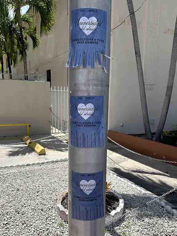
Take-one flyers are one of the most underrated formats in street-level marketing. The format is simple — printed materials in a dispenser at a location where your target customer already goes — but the behavior it captures is fundamentally different from any other print distribution method. The person who takes a flyer from a take-one display has chosen to take it. That choice distinguishes them from the thousands of people who receive handouts they did not ask for and discard them within seconds.
That self-selection mechanism is the core value proposition of the take-one format. A 2% conversion rate from a take-one program represents genuine, pre-qualified interest. The same 2% conversion on a mass handout would be a remarkable result from an audience with no demonstrated intent. The intent signals are different, and that difference shows up in downstream metrics — website visits, phone calls, in-store visits, and sales.
This guide covers the design specifications, placement strategy, network management, and measurement approach that make take-one flyer programs perform. We run these programs as a standalone format and as part of integrated guerrilla marketing campaigns across more than 50 U.S. markets. Industry City, Brooklyn, NY is where our operations team is based. Call us at (646) 776-2770.
Why Take-One Flyers Work When Other Print Formats Struggle
Print distribution has a fundamental problem: most of it is unwanted. Door hangers are left on handles. Handouts are taken and dropped within a block. Direct mail gets sorted into the recycling before the envelope is opened. The waste rate on passive print distribution is staggering, and the resulting CPM calculation looks terrible when measured against actual engagement.
Take-one changes that dynamic by inverting the distribution model. Instead of pushing material at a broad audience, you place material in a location where a specific audience is already present and allow them to self-select. The cost per engaged pickup is higher than the cost per impression on mass distribution, but the downstream conversion rate is proportionally higher — often enough to make the total cost of conversion lower.
The Psychology of Voluntary Pickup
When someone reaches for a flyer from a take-one display, they have made a micro-decision. They evaluated whether the content was relevant to them and decided it was worth their hand motion. That decision primes them to engage with the content rather than discard it. They carry it with them, often to a context where they have more time to read — home, their desk, a waiting room. The content gets attention at the moment the person is ready to give it, not at the moment the distribution team decided to push it.
Take-One Flyer Design: What Actually Works
The design of a take-one flyer is constrained by the format’s context in a way that most print design is not. The flyer sits in a display alongside other materials, often at eye level in a busy space. It needs to stop someone mid-stride, communicate relevance in under three seconds, and give them a clear reason to pick it up. That context demands a specific design approach.
Size and Format Specifications
4×6 inch cards are the standard take-one size for a reason. They fit standard dispensers, display cleanly, are easy to pocket, and force the design to be focused. With a 4×6 card, you have space for a headline, a brief value proposition, a visual element, and a call to action. That constraint is a feature, not a limitation — it prevents the over-communication that kills most print pieces.
Half-sheet (5.5×8.5) flyers are appropriate when the offer genuinely requires more explanation — a menu, a class schedule, an event program. Full-sheet flyers (8.5×11) are rarely appropriate for take-one contexts. They are bulky in dispensers, most people will not carry them, and the extra space typically gets filled with content that reduces focus rather than adding value.
Print Specifications
14-point coated stock with UV coating on the front is the right spec for cards. It looks and feels premium, holds up in high-humidity environments (coffee shops, gyms), and photographs well for documentation. For half-sheet flyers, 100# gloss text works well and is less expensive. Matte finishes photograph better under fluorescent lighting if the flyer will be in contexts where natural light is limited.
Headline and Copy Principles
The headline should answer “why would I take this” in five words or fewer. It should speak directly to the audience’s situation or desire — not the brand’s. “Free month at the gym next door” outperforms “Introducing FitLife Williamsburg” on every metric because it leads with what the reader gets, not who the brand is.
The body copy should be limited to the essential information needed to motivate the specific action you want. Phone number, QR code, address, offer expiration. Cut everything else. Every additional sentence competes with the call to action and reduces conversion.
Location Selection: Where to Place Take-One Flyers
Location selection is the most important variable in a take-one program. A perfectly designed flyer in a low-traffic or demographically misaligned location will produce minimal results. A simple, well-designed flyer in a high-traffic location where the audience exactly matches your target customer profile will outperform sophisticated campaigns run poorly.
High-Performance Location Categories
Gyms and fitness studios offer a health-conscious, action-oriented audience with above-average disposable income. Coffee shops attract professionals, students, and remote workers with high dwell time — they have time to read and act on what they pick up. Salons and barbershops have the highest dwell time of any retail category — clients sit for 30 to 90 minutes with nothing to do but look around, read, and talk.
Laundromats serve neighborhood regulars — the people who use a laundromat once a week are defining the geographic radius of their daily life. That makes laundromats particularly effective for neighborhood-specific businesses. Co-working spaces concentrate a specific professional demographic (founders, freelancers, early-stage employees) in a single physical location — valuable when that demographic is your target.
Transit-Adjacent Placements
Coffee shops, delis, and convenience stores near subway entrances or bus stops capture the commuter moment — when someone has just exited transit, has a minute before they reach their destination, and is often looking for something to engage with. A take-one display in a coffee shop at a subway exit in a neighborhood where your target customer commutes is one of the highest-value placements available at this price point.
Placement Quality Within Location
Where the display is positioned within the location matters as much as which location you choose. Eye-level placement near the entrance or the point of sale produces significantly higher pickup rates than a display tucked in a corner or near the restrooms. Our team negotiates placement position as part of every location agreement and conducts a brief site check on each installation to confirm the display is correctly positioned.
Network Scale: How Many Locations Do You Need
The right network size depends on your campaign objective, target geography, and budget. For a hyperlocal campaign (a single neighborhood, a three-mile radius), 15 to 30 locations typically provides saturation — multiple touchpoints for anyone moving through that neighborhood regularly. For a city-level campaign, 50 to 150 locations provides meaningful coverage across the distinct neighborhood clusters that make up a major metro.
Print Volume Planning
Budget 100 to 200 pieces per location per month for standard programs. A 30-location network for 30 days needs 3,000 to 6,000 pieces minimum plus restocking inventory. The most common execution mistake is under-printing — when a location runs out of material, it stops working entirely. Print more than you think you need and plan restocking proactively.
High-traffic locations in busy neighborhoods can deplete 200 pieces in two weeks. Low-traffic or less-aligned locations may take the full month to move 50 pieces. Depletion data tells you which locations are performing — our reporting tracks pickup rate by location so you can reallocate material toward the highest-performing placements on the next run.
Managing and Monitoring the Program
A take-one program that is not actively managed degrades over time. Dispensers run empty. Displays get moved or covered by other materials. Host businesses change. Managing these variables is operational work that requires a team with access to the locations and a defined restocking schedule.
Our Restocking Process
Our team checks each location on a schedule calibrated to the expected depletion rate — typically every 2 to 3 weeks for standard placements, weekly for high-traffic locations. Each visit confirms the display is properly positioned, the material is fresh and not damaged, and the placement agreement with the host business is still intact. If a location has changed its policy or the display has been relocated, we address it immediately.
Location Swaps and Mid-Campaign Optimization
If a location consistently under-performs on pickup rate after two restocking cycles, we recommend replacing it with a higher-performing alternative. Our network of placement partners in each market means we can typically source a replacement within a few days. This mid-campaign optimization is standard practice — the goal is total pickup volume across the network, and underperforming locations should be replaced, not tolerated.
Measuring Take-One Flyer Performance
Take-one flyers are more measurable than many print formats when the right attribution elements are built into the piece. The key is to design for measurement from the start, not try to retrofit attribution after launch.
QR Codes
A QR code linked to a campaign-specific landing page is the most reliable tracking method. Every scan is logged with a timestamp and basic device data. When the landing page has conversion tracking installed, you can follow the path from QR scan through to purchase, signup, or phone call. Use a unique QR code for each location to get location-level performance data — which placements are driving scans and which are not.
Vanity URLs and Promo Codes
A short, memorable URL (example: yourbrand.com/brooklyn) drives measurable web traffic that is attributable to the take-one program. Promo codes that are only on the flyer create a hard link between the print piece and the redemption — every code redemption is a confirmed conversion from the program. Both methods work. Use whichever is more natural given your business type and offer structure.
Competitive Context: When Take-One Outperforms Other Formats
Take-one flyers are not the right format for every campaign or every audience. Understanding the competitive landscape of street-level print formats helps marketing teams choose correctly between take-one, direct distribution, direct mail, door hangers, and other print channels.
Take-one outperforms direct distribution when the quality of engagement matters more than raw reach volume. If your campaign needs to reach 50,000 people with a general awareness message, direct distribution of flyers in high-traffic pedestrian zones will reach more people at lower cost per impression than a take-one network. If your campaign needs to reach 2,000 people who are genuinely interested in your offer and are likely to act on it, a take-one network covering the right locations reaches a higher-quality audience even at lower total reach.
Take-one outperforms direct mail when geographic hyper-specificity and audience self-selection are more valuable than the ability to target by name and address. Direct mail reaches defined individuals at known addresses. Take-one reaches a behaviorally defined audience at a location — the people who use a specific gym, the people who frequent a specific coffee shop — whose relationship with that location is the targeting criterion. For hyperlocal businesses where the three-block radius matters more than any demographic characteristic, take-one location targeting is often more precise than mailing list targeting.
Take-one underperforms digital retargeting for campaigns that need to reach people who have already expressed digital intent — who have visited a website, interacted with a social ad, or searched a specific keyword. For these intent-based audiences, digital retargeting can reach them precisely at moments of active decision-making. Take-one reaches whoever walks through a location, regardless of prior digital behavior. The two formats serve different moments in the marketing funnel and are better understood as complementary than competitive.
Take-One Flyer Design Mistakes That Kill Conversion
Most take-one flyer programs underperform not because of poor location selection or inadequate network size, but because the flyer itself fails at the design level. The mistakes are consistent and correctable. Understanding them before production saves both the print budget and the campaign window.
Headline That Leads With the Brand Instead of the Benefit
The most common take-one flyer design error: the brand name as the headline. “Welcome to FitLife Williamsburg” stops no one who does not already know FitLife. “First month free at the new gym on Bedford” stops every person walking past who has thought about joining a gym in the past six months. The headline serves the audience, not the brand. Lead with what the person gets, not who you are.
Too Much Information
A take-one flyer is not a website. It is not a brochure. It is a single-action invitation. Every sentence that is not the offer, the CTA, and the tracking element is competing with those things for the reader’s attention. A full-sheet flyer crammed with feature lists, testimonials, a brand history paragraph, and six different calls to action produces one reliable outcome: no action. Strip the design to its essential elements and trust the person to follow through on one clear invitation.
No Clear Next Step
A flyer that communicates the brand and the offer but does not tell the reader exactly what to do next loses the conversion at the last step. “Visit our website” is not a call to action. “Scan to book your free trial this week” is. The next step should be immediate, specific, and easy to execute in the moment of reading. The easier the action, the higher the conversion rate from pickup to follow-through.
Seasonal and Event-Adjacent Take-One Programs
Take-one programs perform particularly well when the offer is time-sensitive or event-relevant. A take-one card in a neighborhood coffee shop in the week before a local festival, offering a special promotion tied to the event, reaches an audience that is already in an elevated discovery mode — looking for things to do, open to trying new things, planning their weekend schedule. That behavioral context makes them significantly more responsive to a relevant offer than the same audience on a routine weekday.
Holiday and Seasonal Timing
January take-one programs for fitness businesses benefit from the seasonal resolution-making behavior that makes the new year the highest-conversion period for gym memberships. Restaurant take-one programs in November and December perform well in neighborhoods with high foot traffic from holiday shopping. Summer programs for outdoor-adjacent brands (sports, beverages, outdoor dining) align with warm-weather behavior changes that increase receptivity to relevant offers.
Seasonal timing does not require running a new campaign — it requires updating the creative on an existing placement network to reflect the seasonal offer. A take-one program that has been running for three months with the same creative benefits from a refresh that ties the message to a seasonal moment, creating a new reason to pick up the card for people who have already seen the previous version.
Integrating Take-One Flyers With Other Street-Level Formats
Take-one flyers work as a standalone program and as a component of a coordinated campaign. Combined with poster campaigns in the same neighborhood, the mural or poster provides the awareness impression and the take-one display provides the engagement mechanism for people who want to act on what they saw. The two formats are complementary in function — one is seen at distance, the other is picked up and carried.
Our brand ambassador programs regularly integrate with take-one networks: ambassadors in the neighborhood direct interested people to take-one locations, or carry a small supply of the same materials for on-the-spot distribution. The consistency between the ambassador conversation and the take-one piece reinforces the message and increases recall.
For campaigns targeting specific neighborhoods at high frequency, we combine take-one with sidewalk stencils and snipe advertising to create multiple touchpoints across a small geographic area. That density of exposure over a campaign window drives the kind of recall that single-format campaigns rarely achieve.
Frequently Asked Questions
What are take-one flyers?
Take-one flyers are printed materials placed in dispensers or holders at high-traffic locations for voluntary pickup. Unlike handouts, they are not pushed at people — the audience self-selects by choosing to take one, which signals genuine interest and produces higher downstream conversion than passive distribution.
What size should take-one flyers be?
4×6 inch cards are the most effective take-one flyer size. They are easy to pocket, display well in standard dispensers, and force the design to be focused and scannable. Half-sheet (5.5×8.5) flyers work when more information is required. Full-sheet flyers are rarely appropriate for take-one programs.
Where should take-one flyers be placed?
The best locations are where your target audience spends dwell time: gyms, coffee shops, salons, laundromats, co-working spaces, and transit waiting areas. Placement quality — eye-level positioning, clean display, regular restocking — matters as much as location quality.
How many flyers do I need for a take-one campaign?
Budget 100 to 200 pieces per location per month for standard programs. A 30-location network running for 30 days needs 3,000 to 6,000 pieces minimum, plus restocking inventory. Under-printing is the most common mistake — running out of material ends the campaign for that location.
How do take-one flyers compare to direct flyer distribution?
Take-one programs produce lower pickup volume than direct distribution but higher intent per pickup. The person who voluntarily takes a flyer has already expressed interest; the person who receives a handout may discard it immediately. For campaigns where the quality of engagement matters more than raw reach, take-one consistently outperforms.
Can American Guerrilla Marketing manage a take-one flyer program?
Yes. We source locations, negotiate placement agreements, install dispensers, manage restocking, and provide photo documentation of every placement. We operate programs across 50+ U.S. markets and can coordinate multi-city campaigns from a single point of contact.