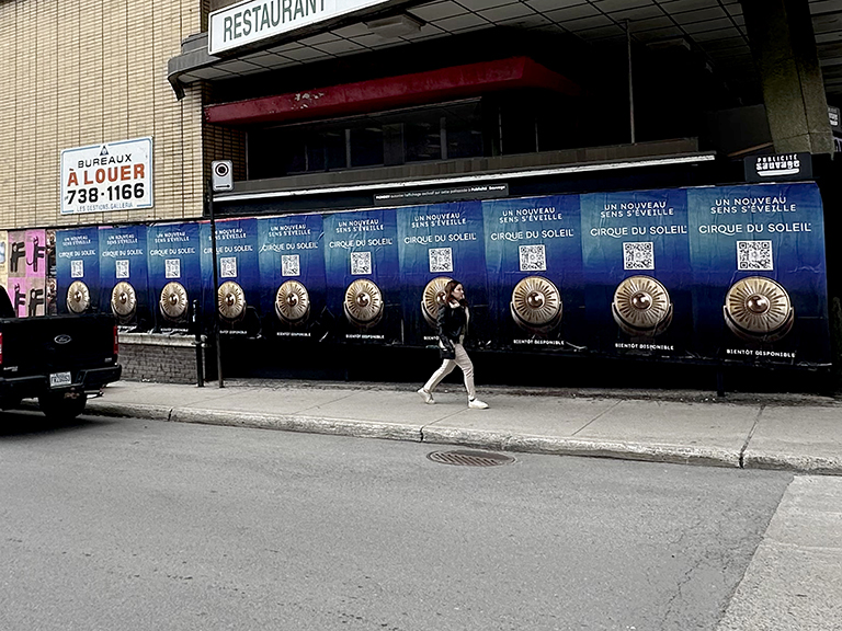
Outdoor advertising creative succeeds in under three seconds or it fails entirely. That’s the window, from the moment an eye lands on a billboard at highway speed, a poster at eye level, or a bus wrap in traffic. We’ve reviewed hundreds of client creative submissions before installation and seen the patterns clearly: campaigns that communicate one clear thing with extreme visual contrast consistently drive recall and response. Campaigns that try to communicate five things drive nothing. This guide covers the design principles that actually work in outdoor advertising, the common mistakes that waste budget, and how to brief creative teams for the environment where the work will actually live.
The Fundamental Rule: Design for the Environment, Not the Screen
The single most common outdoor advertising creative failure is designing in a studio environment for how an ad looks on a monitor, not how it reads at 65 mph from 400 feet, or at eye level through passing traffic, or on a 27×40-inch poster seen for three seconds from across a sidewalk.
The test: print your billboard creative at 3 inches wide on a sheet of paper and look at it from across the room for two seconds. That’s roughly how your audience will experience it. If the headline isn’t instantly readable, if the brand name doesn’t register immediately, if the visual hierarchy isn’t obvious from the thumbnail version, it will fail in the real world regardless of how good it looks on a 27-inch monitor at full size.
The Seven Design Principles for Effective Outdoor Advertising
1. One Message Only
A billboard communicates one thing or it communicates nothing. A campaign trying to deliver three messages (“New location now open! Plus our award-winning service. And our new menu, download the app!”) delivers zero messages because the audience doesn’t have time to process competing claims. Choose the single most compelling thing you want your audience to take away from this placement. Everything else is noise.
2. Maximum Visual Contrast
Outdoor advertising competes with the entire visual environment around it, other buildings, signage, vehicles, sky, street. High contrast against the surrounding environment is how you win that competition. White text on yellow backgrounds, black text on white, bright color blocks against neutral urban backdrops. The worst outdoor creative uses colors that blend into the visual environment: beige on gray, dark blue on black, medium-contrast combinations that look sophisticated in a design presentation and invisible in the real world.
3. Type Size and Weight
Outdoor advertising type must be significantly heavier and larger than you think. At highway speed viewing distances, type smaller than 18 inches tall on a standard 14×48 bulletin is rarely readable. Use heavy weights (bold, extrabold, black) of high-legibility sans-serif typefaces, not decorative fonts, script faces, or condensed weights that require careful reading. The test: every word of your headline should be readable in a single glance from your simulation thumbnail.
4. Seven Words or Fewer for Highway Formats
The seven-word rule for highway billboard headlines is consistent with viewing duration data across outdoor advertising formats. At 65 mph with a standard viewing angle, most drivers have under three seconds of clear sightline on a bulletin. Adults read roughly seven words in three seconds under normal conditions. Every word beyond seven that you put in a headline reduces the probability that the complete message is read and retained. For street-level formats viewed by pedestrians, you have slightly more latitude, but ten to twelve words is still the practical ceiling for a headline that registers clearly on first encounter.
5. Brand Identity Must Be Unmissable
Your logo, brand name, or primary brand visual element must occupy a dominant position in the layout, not tucked in a corner in small type where “it feels more refined.” Outdoor advertising isn’t a print editorial context where restraint signals quality. If your brand name isn’t easily readable from the thumbnail test, your campaign is building awareness for an unnamed visual and generating zero measurable brand recall. The logo should be the second thing the eye lands on after the primary visual or headline, every time.
6. One Clear Call to Action
Highway formats: the call to action should be simple enough to remember, a brand name, a memorable URL (under 20 characters is the rule), or a phone number with a vanity format. Nobody reads a QR code at 65 mph. Street-level formats (bus shelters, poster boards, transit stations with stationary audiences) can support QR codes, specific URLs, and slightly more detailed CTAs because dwell time is longer. Match the CTA complexity to the viewing format and audience speed.
7. Test at Actual Scale in the Actual Environment
Before finalizing creative for a major outdoor buy, visit the physical location of your placement and visualize the ad in context. How does the surrounding environment affect the visual hierarchy? What colors and elements in the background compete with your design? Is there a traffic signal, lamppost, or architectural element that will partially block the sightline? This reconnaissance step costs nothing and prevents creative revisions that happen after installation, revisions that typically cost the same as new production.
Format-Specific Design Considerations
Highway Bulletins (14×48 ft)
The dominant horizontal format demands horizontal composition. The highest-impact bulletins use a single dominant image (occupying 50–70% of the face), a short headline in heavy type (occupying 20–30%), and brand identity in the remaining 10–20%. Copy beyond the headline is virtually never retained from highway speed. If you have important secondary information (address, phone, social handle), include it in smaller type for close-range viewing, but design for the person who will only see the dominant visual and headline.
Urban Poster Formats (27×40, 24×36 inches)
Pedestrian-speed viewing allows more creative complexity than highway formats, but “more” still means limited. Body copy on wildposted and street-level posters works if it’s short (2–3 sentences maximum), large enough to read at arm’s length without squinting, and positioned in the bottom third where a stationary viewer’s eye travels after processing the dominant visual and headline. The strongest street poster advertising creative we’ve installed uses bold photography or illustration with a minimal headline, the format is visual medium, not a text medium.
Digital (DOOH) Formats
Digital billboard creative has the same copy discipline as static formats, brevity and contrast remain the rules, but adds animation possibilities. Effective DOOH animation draws the eye immediately (motion captures attention faster than static imagery) while remaining simple enough to communicate the full message in a 6–8 second spot. The most common DOOH creative mistake: overcomplicated animation sequences that require 20+ seconds to complete a communication arc, when the ad rotation gives you 6–8 seconds and the audience’s attention span gives you 3.
Bus Wraps
Bus wraps have an unusual design challenge: the creative is seen from multiple angles, at multiple distances, and in motion. Design that uses the bus’s physical shape creatively, integrating the windows into the design, using the wheel wells as design elements, creating a continuous image across the entire length, consistently generates more social photography and earned media than layouts that treat the bus as a flat rectangle. The most memorable bus wraps we’ve installed made the bus itself part of the creative concept, not just a surface to print on.
What Creative Agencies Get Wrong in Outdoor Briefing
Creative briefs that don’t specify the outdoor environment produce creative that doesn’t work in the outdoor environment. A brief that says “design a billboard” without specifying the viewing speed, viewing distance, competitive visual environment, format size, and intended placement gives the designer no basis for making the right constraints-driven decisions. Good outdoor creative briefs include:
- Format dimensions and actual installed size
- Viewing speed and estimated viewing duration (walking vs. driving)
- Primary viewing distance
- Surrounding visual environment (urban dense vs. highway open vs. transit interior)
- Number of ads in rotation if DOOH
- Bleed and safety guidelines from the specific operator
Creative Testing in the Real World
Before a big OOH buy goes live, we like to test creative in the actual field conditions it will face. That means reviewing a printout outdoors in daylight, checking how the colors behave against sky and concrete, and simulating the speed and distance at which drivers or pedestrians will actually see it. A design can look excellent in Keynote and still disappear visually on a gray overcast morning against a cluttered streetscape.
Street-level formats need a different test than highway boards. Posters should be checked from 15–30 feet away. Bus shelter creative should be reviewed at eye level with glare on the glass. Side panels on buses need to be evaluated for how the copy holds up when the bus is partially blocked by parked cars or traffic. Those real-world checks catch problems that desktop review misses every time.
Production Details Designers Ignore at Their Own Risk
Bleed, safe area, mounting hardware, panel splits, door seams, window perforation, pole or tree obstruction, and local lighting conditions all affect the final outcome. Bus wraps in particular break apart over windows, wheel wells, and emergency hatches. If the most important phrase lands over a panel seam or a perforated window, readability collapses. The best outdoor designers think like installers before they think like artists.
Extended FAQ
Should outdoor creatives include QR codes?
Only when the audience is stationary or moving slowly enough to use them safely, bus shelters, transit interiors, events, and some posters. Highway boards should not rely on QR codes.
What is the biggest outdoor creative mistake?
Too much copy. Most outdoor underperformance is a message-density problem, not a media problem.
Can AGM review outdoor creative before production?
Yes. We routinely review layouts against real-world placement conditions and operator specs before production begins.
Creative by Format: Not Every Outdoor Surface Reads the Same
A board on I-95 approaching downtown Miami is a speed-read problem. A poster on Bedford Avenue in Williamsburg is a cultural-fit problem. A shelter panel at a transit stop in Chicago is a dwell-time problem. Great outdoor creative changes with the surface and the viewing context. The strongest campaigns respect that difference rather than forcing one design system onto every format.
That also means production files should be built separately rather than auto-resized. The best shelter creative is often more information-rich than the best highway board. The best street poster advertising creative can be moodier and more editorial than the best bus-side panel. Designing by format is not optional if the goal is performance.
Creative Review Questions We Ask Before Approval
Can the audience understand the message in one pass? Is the visual hierarchy obvious? Does the logo read quickly? Is the CTA realistic for the environment? Is anything important likely to be blocked by poles, seams, windows, railings, or glare? These are simple questions, but they catch most expensive mistakes before production starts.
Extended FAQ Continued
Should the website always be included?
No. If it makes the layout weaker, remove it. In many cases the brand name alone is enough, especially if search behavior will do the rest.
How many concepts should be tested?
Usually two or three strong routes are enough. More than that often creates noise rather than better decision-making.
What makes outdoor creative memorable?
Clarity plus tension. A clean message and a visual idea that creates curiosity or emotional contrast are what stick.
Frequently Asked Questions
Crafting Outdoor Visuals That Grab Attention: Design Strategies That Win in the Real World generates better results when placement, timing, creative, and local execution all work together. These questions cover the details brands usually need before launch, during rollout, and while evaluating performance.
For ar, the strongest campaigns usually come from tight geographic targeting, message discipline, and enough repetition to be remembered. Market conditions, neighborhood flow, event calendars, commuter behavior, and production logistics all change how the tactic performs, so the planning details matter as much as the idea.
How many words should a billboard headline have?
Seven words or fewer for highway formats. Up to twelve for street-level and pedestrian-speed formats. These limits are based on average reading speed at the relevant viewing duration, not arbitrary style guidelines.
What colors work best for outdoor advertising?
High-contrast combinations against the expected background environment. Yellow on black, white on dark colors, and pure primary colors in high-saturation tend to perform best because they create maximum contrast against neutral urban environments. Colors that blend with common building materials (gray, beige, taupe, dark green) consistently underperform in outdoor effectiveness studies.
Can AGM review our outdoor creative before installation?
Yes. Creative review is part of our standard process for campaigns we manage. We evaluate creative against the specific format, viewing environment, and operator specifications for each placement before submitting for operator approval. Contact us at americanguerrillamarketing.com/contact.
Should I hire a designer who specializes in outdoor advertising?
For significant outdoor campaigns, yes. Outdoor advertising design requires specific expertise in viewing-environment constraints that most graphic designers, who are primarily trained for print, screen, and editorial contexts, don’t bring by default. A designer who understands outdoor viewing physics and has executed successful campaigns in the format will produce better work faster than adapting a general designer’s output for outdoor specifications. Crafting Outdoor Visuals That Grab Attention: Design Strategies That Win in the Real World becomes much stronger when the article moves past surface level advice and into route logic, timing, crew decisions, and what buyers should expect before launch. That is where most campaigns win or lose. Good ideas are common. Clean execution in the right place at the right time is not. In practice, the first move is narrowing the audience into a physical map. That means identifying the streets, retail corridors, campus edges, transit entrances, event approaches, or nightlife clusters where attention piles up. Once that map is clear, the next step is deciding which format fits the movement pattern. Posters work best where people have a second to read. Snipes work when repetition matters. Stencils and decals are strongest where pedestrians slow down, wait, or make a decision about where to go next. Teams that skip that planning step usually spend money on visibility without building enough repetition to create recall. Teams that plan carefully can get more from the same budget because they are buying concentration, not just volume. That is the real difference between activity and impact. Every market has its own map of useful surfaces and high value foot traffic. In downtown cores, the best routes are usually the blocks between transit stops and the place people are actually trying to reach. Around campuses, it is the edge streets, dorm approaches, coffee runs, late night food corridors, and the walk between parking and class. Around events, it is the window from arrival through line formation, then the exit path where people are still talking about what they just saw. That is why local detail matters so much. A good plan names corners, not just cities. It names venue approaches, not just districts. It defines morning traffic, lunch traffic, post game traffic, and late night traffic as separate moments because they behave differently. When brands treat all movement as one audience, the campaign gets blunt. When they map those flows correctly, the same media spend starts to feel much larger. AGM usually builds this out with a route first, then layers creative on top of it. That order protects the campaign from a common mistake: falling in love with the visual before making sure the audience can actually encounter it often enough to remember it. When a page like this feels light, the missing pieces are almost always the same. Add named locations, examples of which formats fit those locations, the quantity needed to make the campaign visible, and the operational limits that buyers should know before launch. Add a realistic budget section. Add a stronger FAQ that answers the practical objections a client will raise on the phone. Those additions do not pad the page. They make it useful. That is also where trust is built. Readers can tell when a page only gestures at a topic. They can also tell when the writer understands the field side of the job. Specifics about route density, production timing, weather risk, crew count, proof photos, QR tracking, and refresh windows make the content stronger because they come from real execution questions. If a brand is using this topic to compare partners, those specifics matter even more. They make it easier to judge whether a vendor is selling a real plan or just a good sounding idea. Pricing depends on format, timing, print specs, route length, and how many placements a campaign needs to make a real impression. For street level media, brands usually do better when they fund enough placements to own a specific route instead of buying a thin layer across too much ground. A small run can look busy in a deck and still disappear on the street. AGM publishes fixed pricing for several core services. 24×36 wheatpaste posters are $4,500 for 100 and $5,500 for 200. 48×72 wheatpaste posters are $10,500 for 100 and $13,500 for 200. 9×12 snipes are $4,500 for 400 and $5,500 for 800. 11×14 jumbo snipes are $6,500 for 400 and $7,500 for 800. Sidewalk stencils are $2,855 for 5, $3,231 for 10, $3,989 for 20, $6,982 for 50, and $11,999 for 100. Sidewalk decals are $2,904 for 5, $3,404 for 10, $4,998 for 20, $8,709 for 50, and $14,466 for 100. LED billboard trucks are $250 to $300 per hour with an 8-hour minimum. For any other quantity, market, or setup, contact AGM for pricing. If the project needs a custom mix, AGM usually points brands to the RFP Builder so scope, city count, and production details line up before pricing is locked. That matters because the wrong quantity is often more expensive than the right format. A cheap campaign that is too small to be seen is not efficient. It is just forgettable.
How do I know if this topic is worth turning into a real campaign?
Start with audience location, not creative ideas. If you can name the blocks, venues, campus gates, stations, or event windows where attention is concentrated, the campaign can usually be built into something measurable. If the audience is vague, the spend drifts and results get fuzzy fast.
What usually makes a street campaign feel too small?
The most common issue is spread. Brands buy a handful of placements across too many neighborhoods instead of owning one route. A tighter footprint with stronger repetition beats a scattered footprint almost every time, especially for event promotion, launches, and local service awareness.
Should the message focus on awareness or action?
That depends on the traffic environment. Fast moving traffic calls for a short awareness message with one visual anchor. Slow pedestrian traffic can support a QR code, a stronger offer, and more direct response copy. The format should match the pace of the audience, not the other way around.
How long should a campaign stay up?
For event driven pushes, the best window is often the 7 to 14 days before the date. For evergreen brand building, two to four weeks works better because repetition does the heavy lifting. Weather, removals, and local conditions still matter, so timing should always be part of the plan.
What should be tracked besides impressions?
Use QR scans, coupon redemptions, landing page traffic, geofenced audience lift, survey responses, and direct field photos. Street work is easier to defend when the campaign is built with proof from day one instead of trying to backfill measurement after the fact.
Does creative matter more than placement?
Both matter, but placement usually wins the argument. A decent design in the right corridor will outperform a beautiful design placed where the right people never see it. Street media is a placement game first and a design game second.
Related Pages and Articles