American Guerrilla Marketing
Nationwide Service
Media planning, media buying, billboard advertising, & guerrilla marketing
Case Study:
Coral Care’s audience does not need to be found. They are already at specific addresses on specific blocks throughout Chicago — sitting in waiting rooms, walking between appointments, moving through the neighborhoods where pediatric practices are concentrated. A parent who is already engaged with their child’s healthcare is exactly the audience a care-focused brand needs to reach, and they are reachable at street level in the vicinity of the medical offices they visit regularly. The challenge is not identifying who they are. It is placing the brand where they already are.
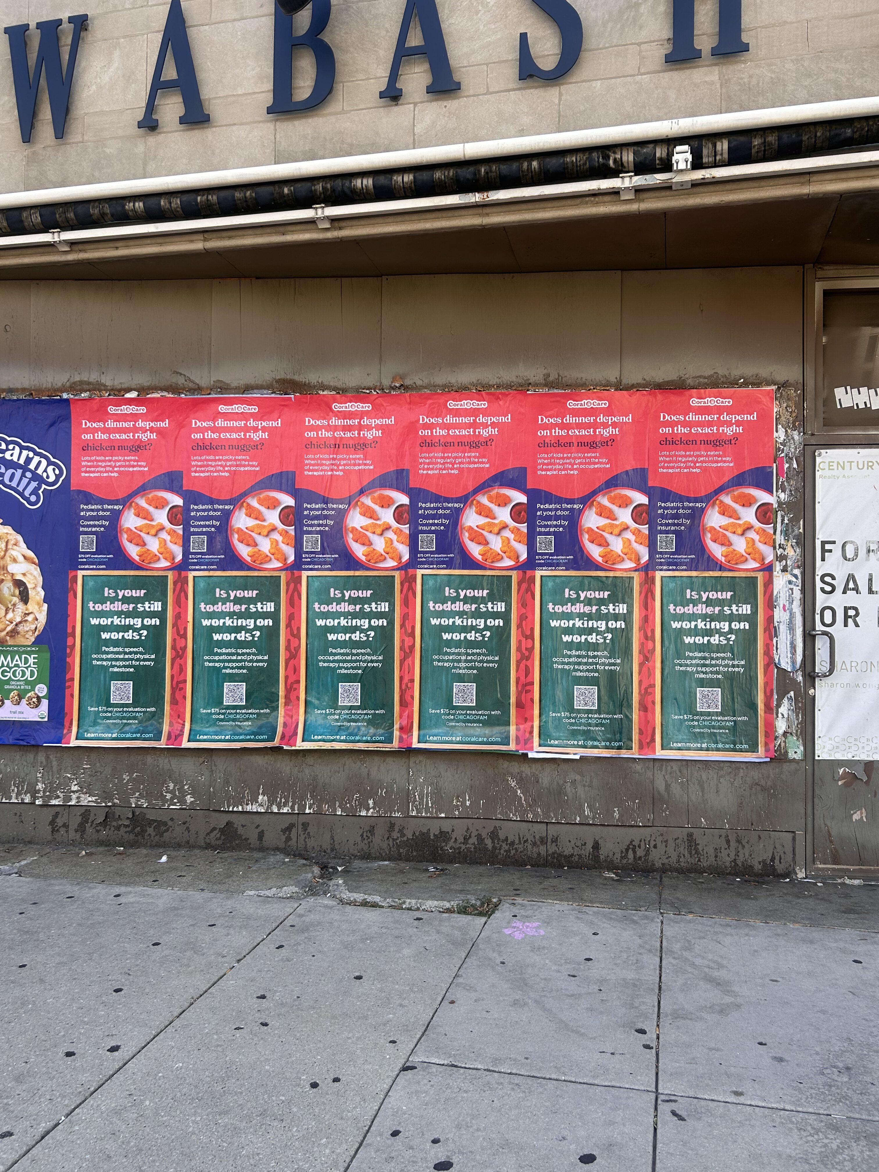
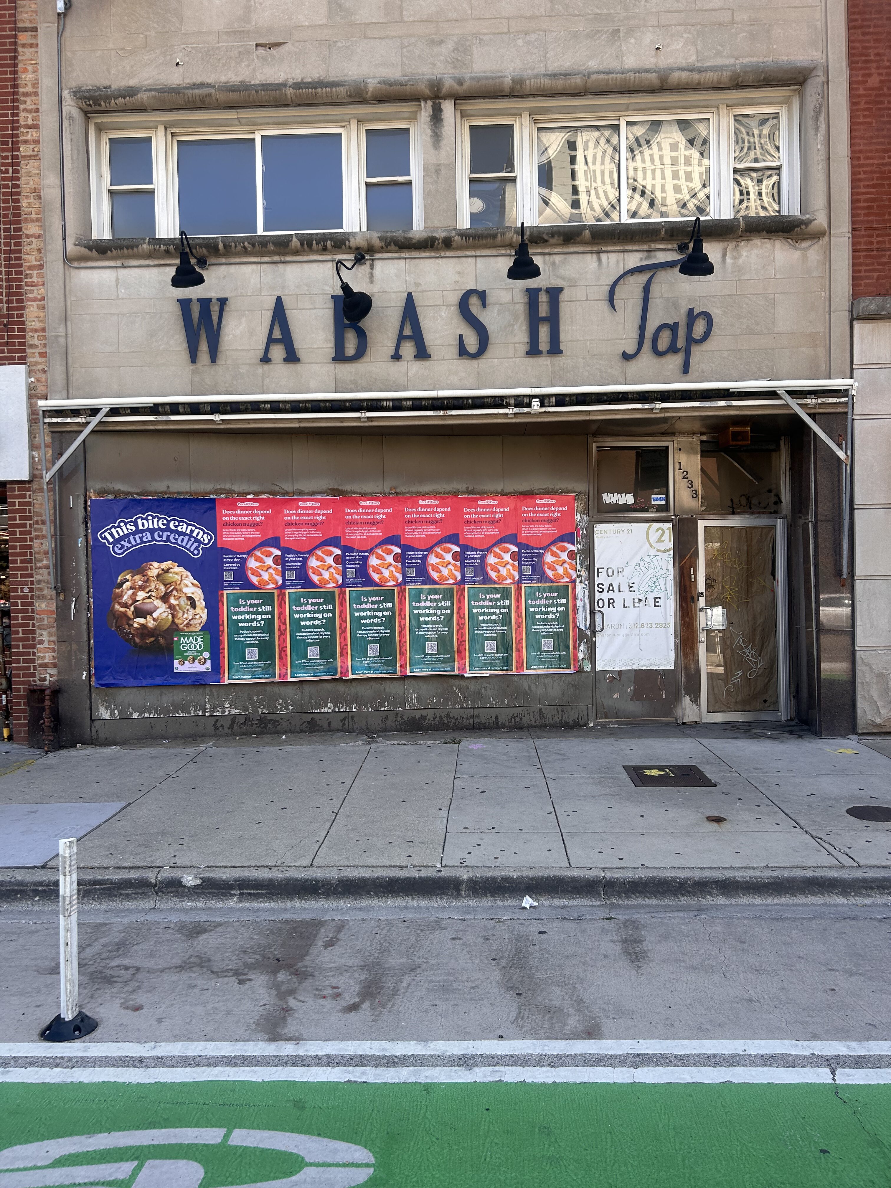
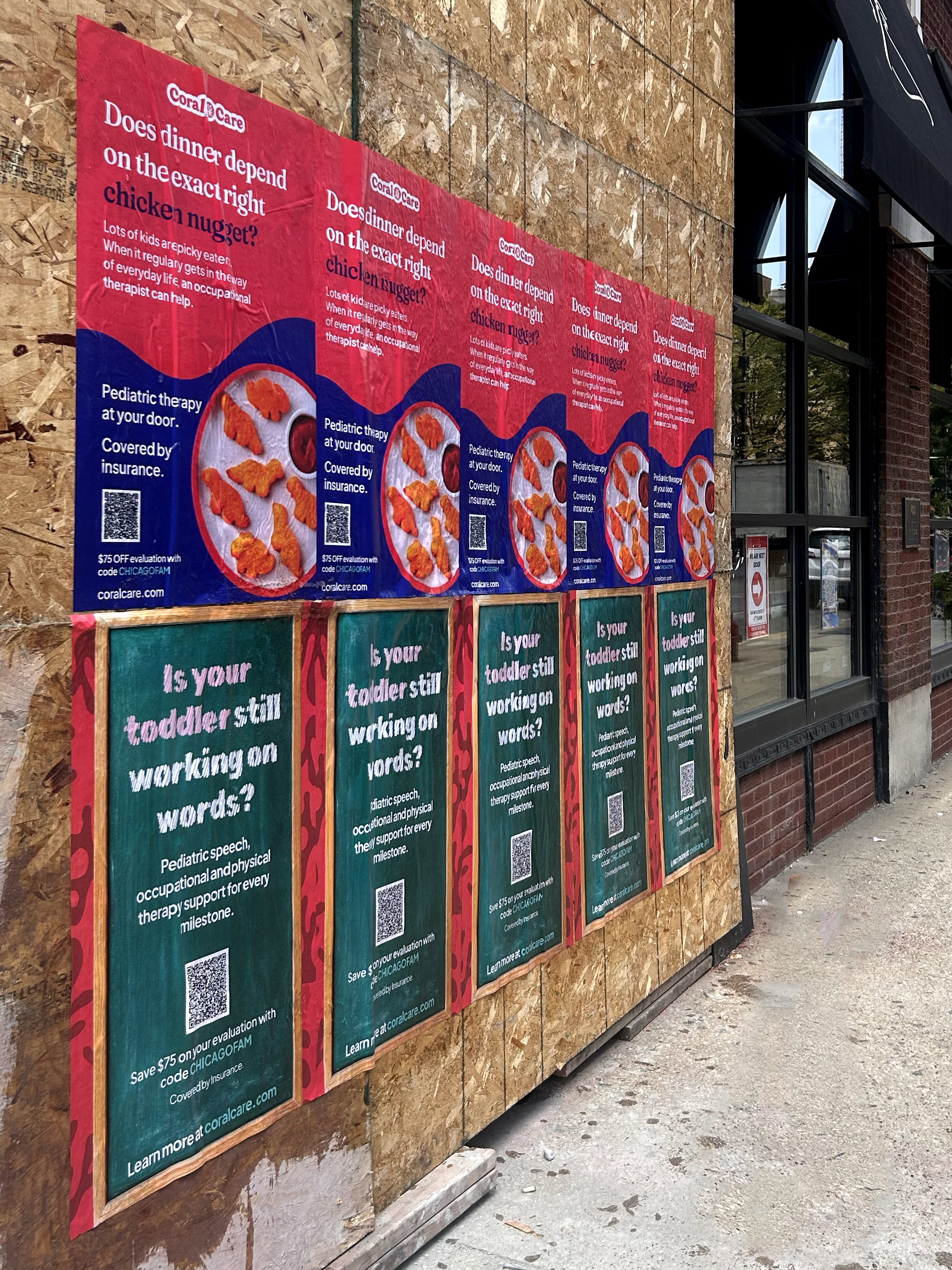
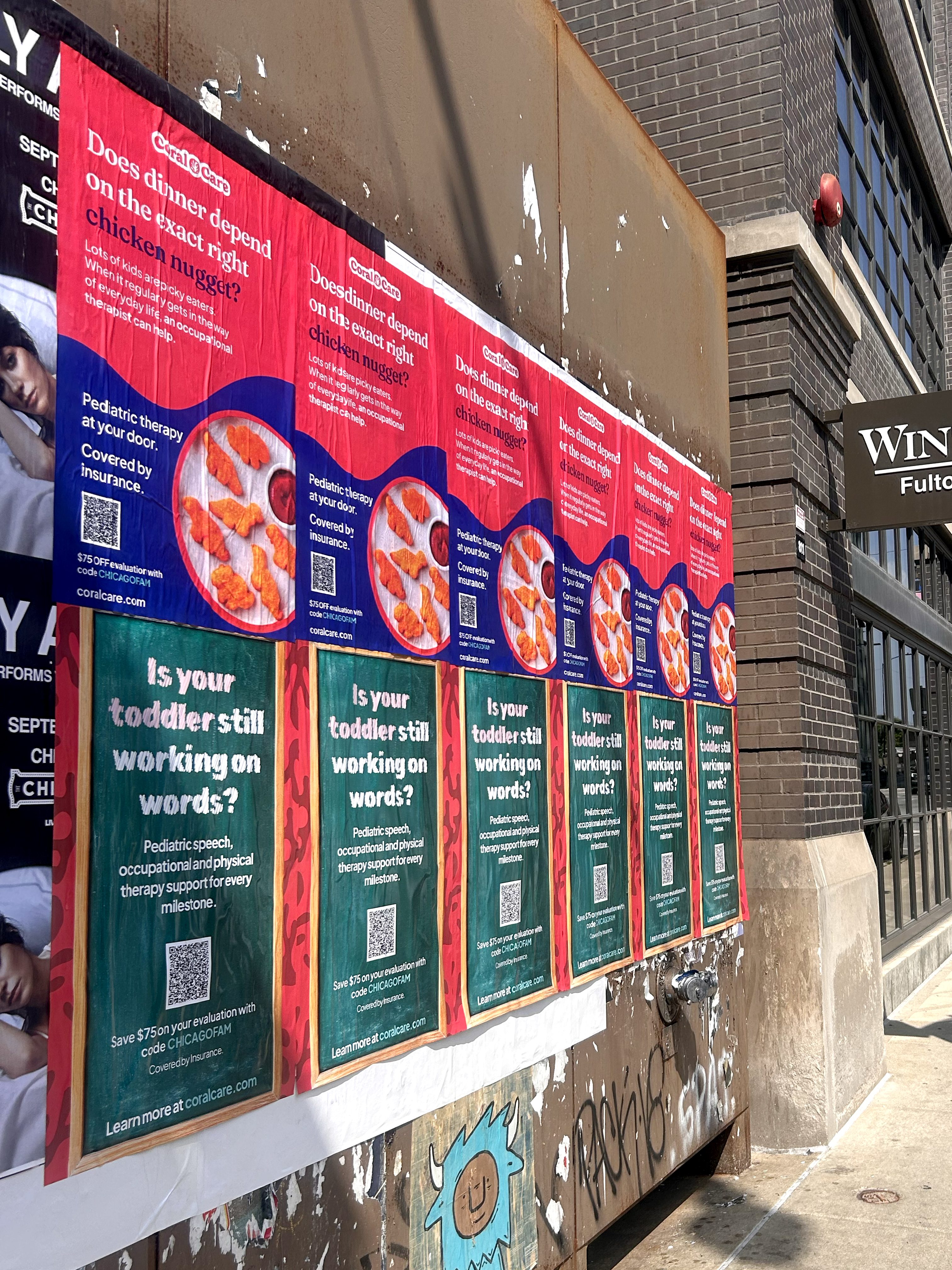
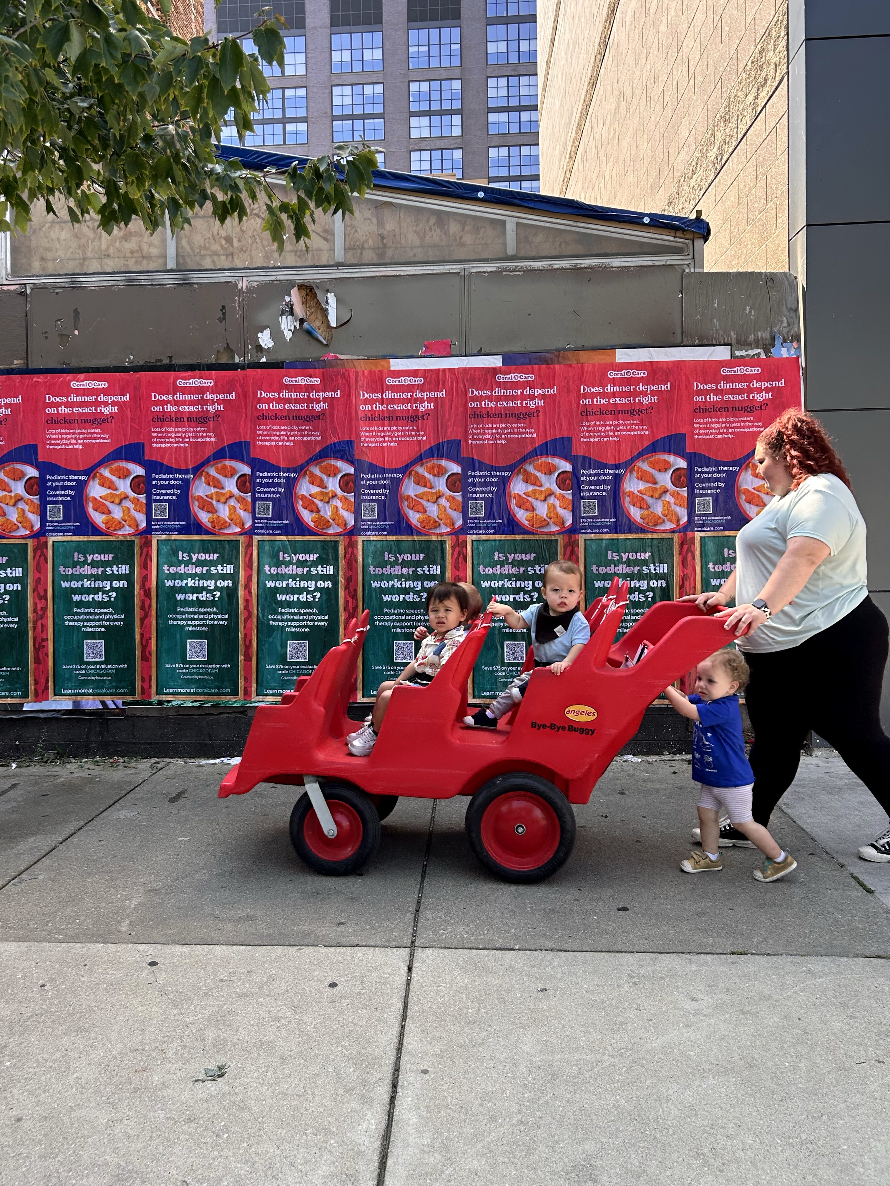
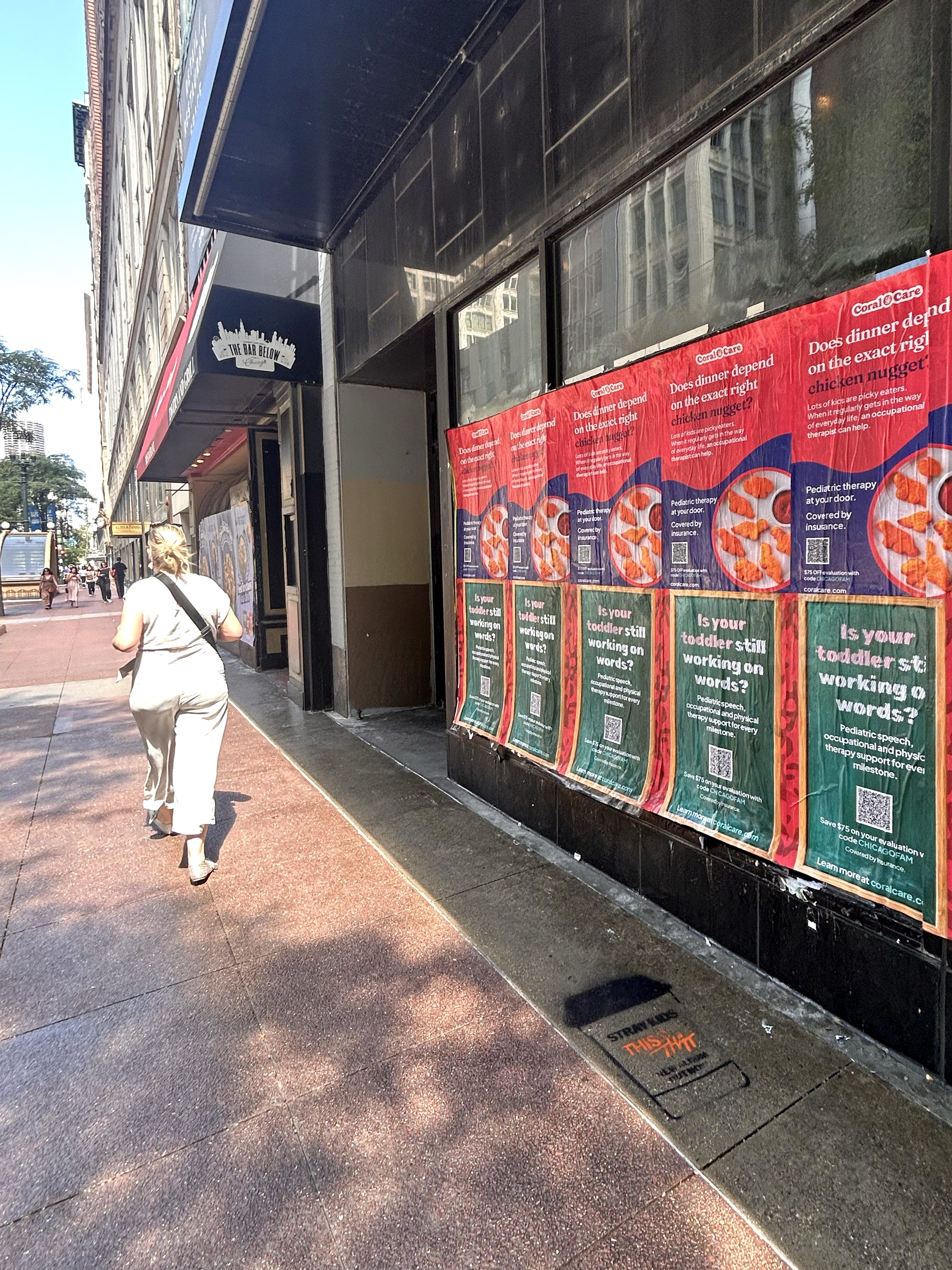
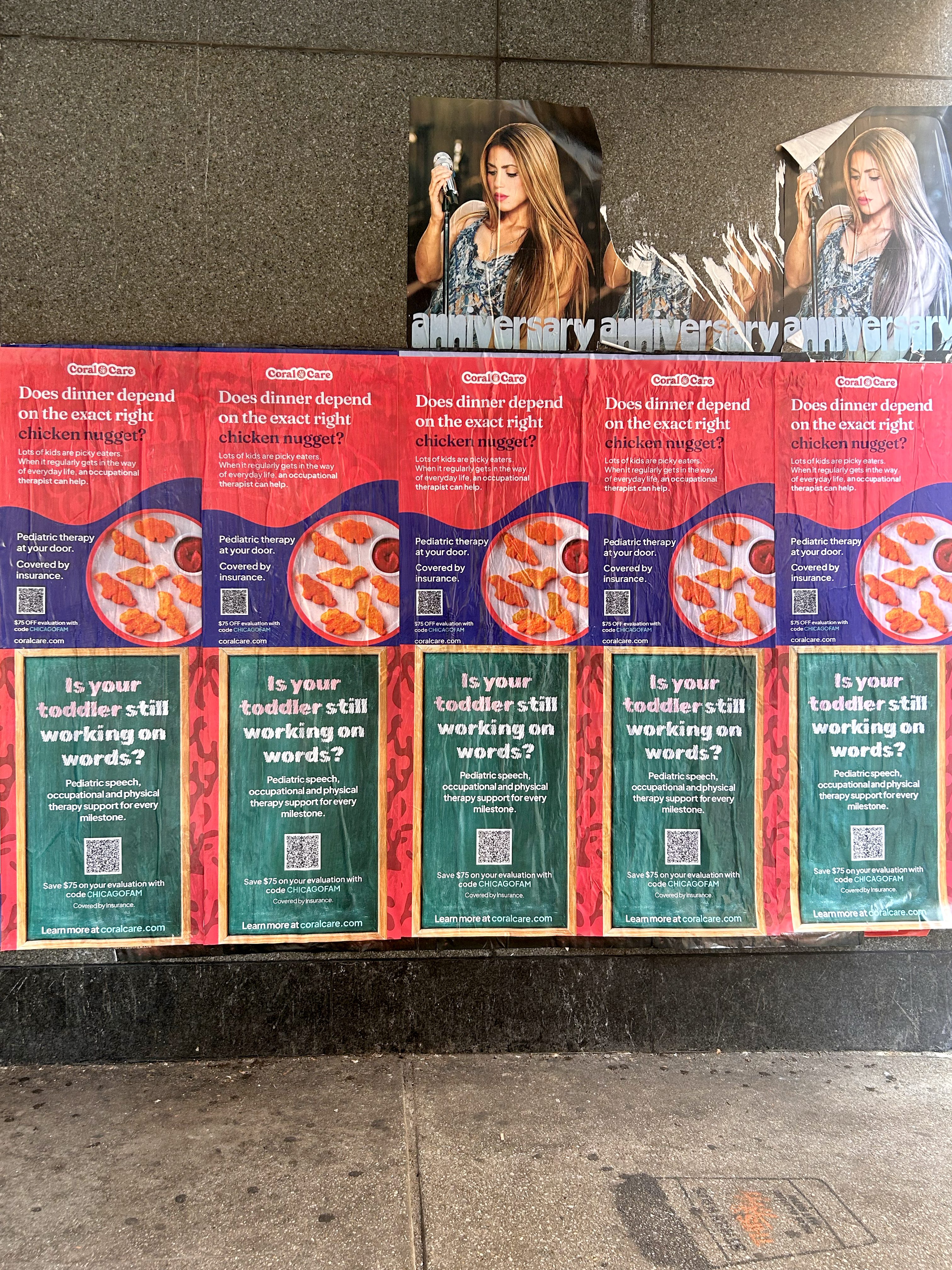
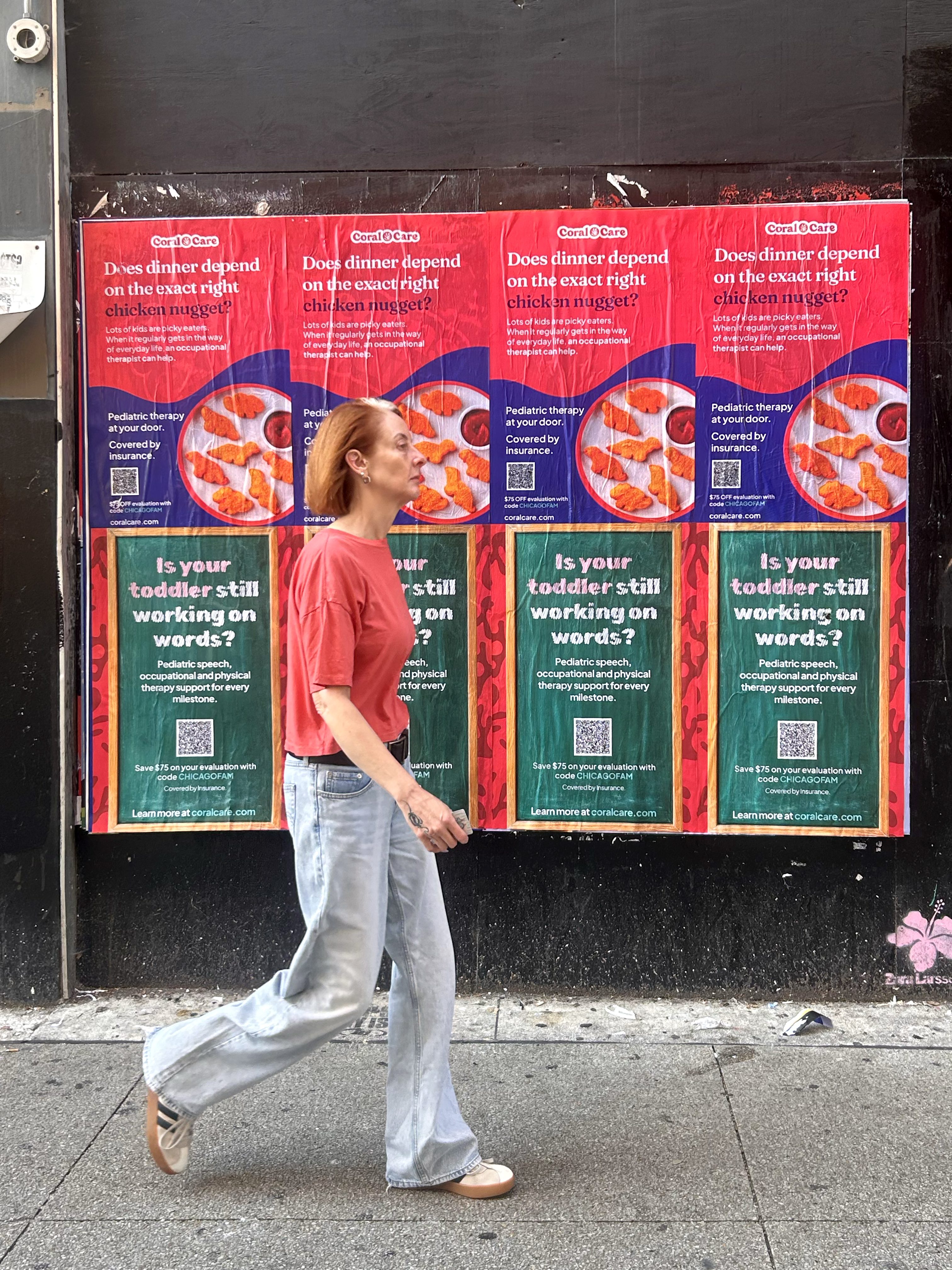
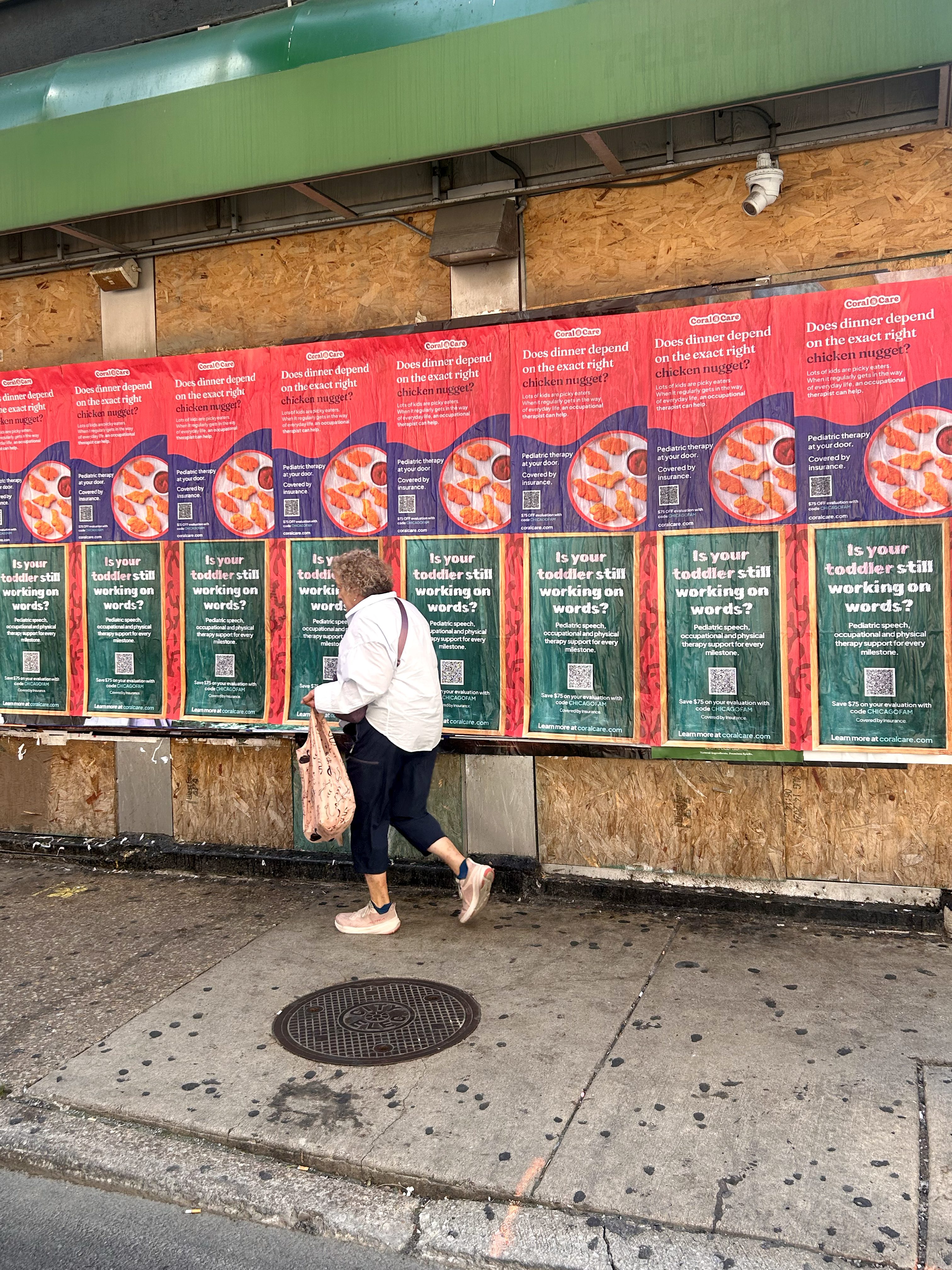
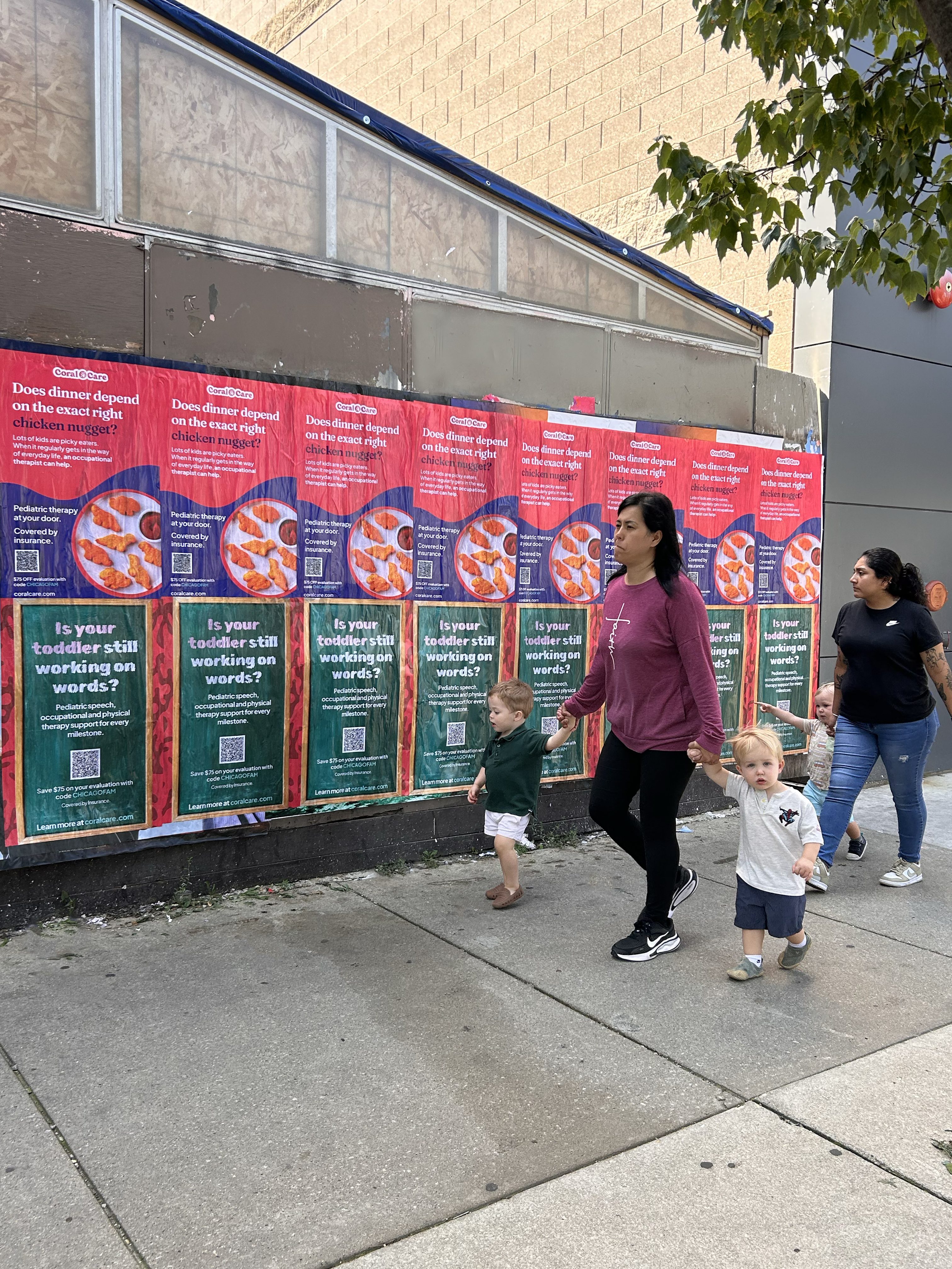
American Guerrilla Marketing executed a targeted wheatpaste campaign across Downtown Chicago, scouting locations as close as possible to pediatric doctors’ offices across the campaign geography. Two hundred 24×36 wheatpaste posters in two creative designs went up on August 26, 2026, placed on the highest-visibility surfaces within reach of the medical office concentrations that defined the campaign’s targeting logic. The installation was designed around proximity — not the densest foot traffic in the city, but the most relevant foot traffic for a brand whose audience is parents already embedded in the pediatric healthcare system.
When the right audience is already walking specific blocks for a specific reason, the right campaign meets them on those blocks. That is what this one did.
The Coral Care Chicago wheatpaste campaign ran as a two-week installation across Downtown Chicago beginning August 26, 2026. Two hundred 24×36 wheatpaste posters were deployed in two creative designs, with placement concentrated in the blocks proximate to pediatric medical offices throughout the campaign geography. Design was finalized by August 20, 2026, with installation launching six days later.
The campaign scouted target locations in advance — identifying the specific walls, construction surfaces, and high-visibility street-level real estate closest to the pediatric office locations that defined the audience targeting. Placement decisions were made based on both proximity to the target medical locations and sight line quality from the pedestrian routes connecting those offices to the surrounding blocks, transit access points, and neighborhood corridors where the target audience moves.
Two creative designs rotated across the 200-poster footprint, giving the campaign visual variety throughout the two-week window while maintaining consistent brand identity across every placement.
Healthcare marketing has a targeting problem that most consumer categories do not face: the audience is not defined by demographics alone but by behavior — specifically, by the healthcare decisions they are actively making. A parent who is engaged with pediatric care for their child is identifiable not by their age bracket or income level but by the fact that they are walking into and out of a pediatric practice on a regular basis. That behavioral signal is most reliably captured not through digital tracking but through physical geography: the streets and blocks where pediatric offices are located, the walking routes between those offices and the transit and parking that serves them, and the corridors where that specific parent population moves in the context of their healthcare routine.
Placing wheatpaste posters as close as possible to pediatric doctors’ offices is the street-level equivalent of behavioral targeting. The audience has already self-selected by being there. They are in a headspace oriented around their child’s health and wellbeing — the precise mindset in which a healthcare brand is most relevant and most likely to generate a real response. A 24×36 poster on the construction hoarding across the street from a pediatric practice, or on the wall at the corner of the block where the office is located, reaches that audience at exactly the moment and in exactly the context where Coral Care’s message lands with the highest possible relevance.
The scout-first approach AGM used for this campaign — identifying specific target locations before installation rather than applying a general Downtown Chicago distribution — reflects the same logic. Generic downtown placement reaches the general pedestrian population. Scouted placement around pediatric office concentrations reaches the specific subset of that population who are already in Coral Care’s target behavioral profile. The scout confirmed which surfaces, which intersections, and which approaches to each target location offered the best combination of proximity and visibility — and the installation was built around those findings.
Two creative designs gave the campaign visual range across a concentrated geography. A parent who passes two different Coral Care designs in the vicinity of their child’s doctor’s office registers both the brand and the creative investment — a combination that reads as an established presence rather than a one-time placement.
Award Winning Personalized Service
You will get thoughtful, devoted, and individualized attention from our experienced, qualified, and professional personnel. Being one of the most illustrious agencies in Brooklyn, New York, American Guerrilla Marketing has been awarded the Best of Brooklyn title.
Nationwide
Industry City, Brooklyn, New York 11232
American Guerrilla Marketing
Hours
Mon - Fri: 9 AM - 5 PM
Sat & Sun: Closed
Automate your campaign with AGM’s Request for Proposal Builder. Simply answer a few quick questions about your campaign goals, markets, and timeline, and the system will generate a tailored presentation with recommended strategies, quantities, and pricing. Click the RFP Builder to instantly receive your customized proposal.
The 24×36 wheatpaste format works at the scale of the sidewalk encounter. At two feet wide and three feet tall, a well-placed poster is readable while walking, visible from across the street, and sized for the kinds of surfaces most accessible in the immediate vicinity of medical office buildings — construction hoarding, building transition panels, the flat wall sections of ground-floor retail adjacent to healthcare practices. In a geography where the placement objective is proximity to a specific kind of building rather than maximum wall real estate, the 24×36 format’s versatility across surface types is an asset.
For a healthcare brand reaching parents in a pediatric office context, the creative standard is clarity and trust. The visual environment of a medical district is different from a nightlife corridor or a retail neighborhood — the audience moving through it is in a different mode, and creative that communicates clearly and earnestly in that mode outperforms creative calibrated for a more competitive visual environment. Two designs allowed Coral Care to address different dimensions of their offer across the same campaign footprint — giving the brand more conversational surface area in a geography where the same parents might encounter the campaign more than once during the two-week window.
AGM’s pre-installation scout identified the specific surfaces most proximate to the pediatric office locations that anchored the campaign’s targeting geography across Downtown Chicago. The scout assessed each potential location for three criteria: distance from the nearest target medical office, sight line quality from the pedestrian approach routes serving that office, and surface suitability for a two-week wheatpaste installation. The result was a placement map built around the highest-value locations within reach of the campaign’s target geography rather than the highest-general-traffic locations in the broader downtown area.
In Downtown Chicago, the building fabric adjacent to medical office concentrations includes the kinds of surfaces that support quality wheatpaste installations: street-level commercial transitions, construction hoarding on active development sites, and flat building sections that face the pedestrian routes connecting medical offices to transit. The scout confirmed which of those surfaces, across which blocks, offered the best combination of proximity to target locations and pedestrian visibility from the approach routes that Coral Care’s audience uses.
The two-design rotation was distributed across the placement footprint to ensure visual variety throughout the geography rather than concentrating one design in one zone and the other elsewhere. A parent who passes multiple locations in the vicinity of their child’s practice encounters both designs, reinforcing the brand across multiple touchpoints within the same small geography.
The Coral Care wheatpaste campaign placed 200 posters across Downtown Chicago’s pediatric office geography — scouted, proximity-targeted, and installed in the specific blocks and corridors where the brand’s audience is most concentrated and most behaviorally relevant. For two weeks beginning August 26, Coral Care’s creative was present on the walls of the streets those parents walked to and from their children’s doctors’ offices, in the immediate context of the healthcare engagement that defines them as Coral Care’s audience.
The scout-first approach ensured that every placement decision was made around the campaign’s targeting logic rather than around surface availability alone. The 200-poster footprint concentrated in proximity to pediatric practices throughout the downtown geography produced a brand presence calibrated to its audience — not the broadest possible reach, but the most relevant possible reach for a healthcare brand whose audience is defined by the specific streets they walk for a specific reason.
In healthcare marketing, context is everything. A brand encountered on the block outside a pediatric doctor’s office, by a parent who just had an appointment, lands differently than the same brand encountered in an unrelated context. The Coral Care Chicago campaign was built around that contextual alignment — and that alignment is what distinguishes a targeted street campaign from a general awareness play.
A parent engaged with pediatric care is not simply a demographic category — they are a behavioral audience, identifiable by the fact that they are visiting specific offices on specific blocks. Placing posters in the immediate vicinity of pediatric practices reaches that audience in the context of their healthcare routine, at the moment when a care-focused brand is most relevant to their current mindset. General downtown placement reaches the broader population; proximity-targeted placement near pediatric offices reaches the specific subset of that population who are already in Coral Care’s core audience profile.
The scout is an on-the-ground assessment of specific target locations before installation — evaluating each potential surface for proximity to the target medical offices, sight line quality from the pedestrian routes patients use, and surface suitability for a two-week wheatpaste installation. The scout converts a general placement brief into a specific installation map that reflects actual on-the-ground conditions rather than assumptions about which surfaces would be available and visible. The result is a placement footprint built around the highest-value locations relative to the campaign’s targeting logic.
Two designs rotating across 200 placements in a concentrated geography give the campaign visual variety without fragmenting brand identity. A parent who encounters Coral Care multiple times within the vicinity of their child’s doctor’s office — which is likely for a two-week campaign in a walkable downtown market — sees different creative each time, reinforcing the brand while preventing any single design from becoming visually habituated through repeated exposure. Both designs maintain the same brand identity, so the effect is cumulative brand recognition rather than competing messages.
The 24×36 format’s versatility across surface types makes it appropriate for a proximity-first targeting strategy. Medical office geographies often include construction hoarding, ground-floor commercial transitions, and building facade sections that are accessible for wheatpasting but sized for a compact format rather than a large-scale installation. At 24 inches wide and 36 inches tall, the poster fits those surfaces reliably while remaining large enough to read clearly from across the street at normal walking pace. The format also allows for higher location density within a defined geographic target area than larger formats, which matters when the objective is saturation within a specific radius.
Healthcare brands face the same challenge across all marketing channels: reaching an audience defined more by behavior than by demographic profile, in a context where the message is relevant rather than incidental. Wheatpaste placement near pediatric practices solves that challenge by positioning the brand at the intersection of the right geography and the right behavioral moment. The audience is already there for a reason that makes Coral Care relevant to them. The poster does not need to create the context — it finds the audience in a context that already exists. That is the specific value of proximity-targeted street advertising for a healthcare brand: contextual alignment that digital and broadcast cannot replicate at the block level.
Wheatpaste posters in active urban environments typically remain in strong visual condition for two weeks.