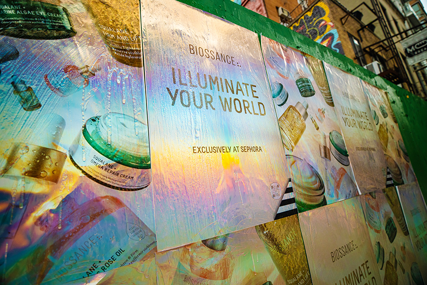
A wheatpasted wall tells a story that no brief or mockup fully prepares you for, and understanding what campaigns look like once they are up is what separates brands that use the format well from those that are disappointed with what they get.
When a wall gets wheatpasted, the change is immediate and substantial. A blank brick surface that defined the end of a block becomes an image that pedestrians have to look at. There is no avoiding it in the way you avert your eyes from a phone screen or skip past a digital ad. The wall is there. The poster is on the wall. The people walking past are in its visual field whether they want to be or not.
We have been documenting wheatpasted installations across American cities for over a decade. What we have learned from that documentation is that what a campaign looks like in the field, and what it delivers for the brand, depends on decisions made long before the paste bucket is opened. This guide is about those decisions and what their consequences look like when the campaign is live in the streets.
What a Freshly Wheatpasted Installation Looks Like
A well-executed wheatpaste installation, freshly applied and cured, looks like this: the paper is flat against the wall, conforming to the surface texture without visible air pockets or bubbles. The paste has dried clear, so the print surface reads the same as it would off the press, not clouded or yellowed. The edges are cleanly bonded, not curling, and the paste sealing coat has dried to a slight sheen across the face of the poster.
On a painted brick wall, the texture of the brick shows through the paper at a subtle level, which gives the installation a quality that is difficult to describe but immediately recognizable: it looks embedded in the wall rather than stuck to it. On a smooth painted surface, the installation reads more cleanly and the print quality is closer to what you would see on an in-store display or a transit shelter back panel. Both aesthetics are valid and have their own contexts where they read best.
The Street Context Effect
One thing that no mockup prepared on a laptop screen fully captures is how a wheatpasted poster reads in street context. The surrounding environment, other posters from other campaigns in the layers beneath, graffiti, building materials, street signs, the physical activity of pedestrians, all of this creates a context that changes how your poster is perceived. A graphic that looks bold in isolation looks different when it is framed by the visual texture of an active street environment. This is generally an advantage: the street context makes the installation feel like it belongs, which is exactly the signal a brand running a street-level campaign wants to send.
Layering and the Palimpsest Effect
In actively used wheatpaste neighborhoods, walls build up layers of paste and paper over months and years. A freshly wheatpasted installation on a wall that has been used before will sit on a substrate of old paste and paper that creates a slightly raised surface compared to a virgin wall. This layering is visible at the edges of the installation, where the new poster meets the old substrate. In the aesthetic context of street-level art and advertising, this layering reads as authenticity. It signals that this wall is a living part of the city’s visual culture, not a sanitized advertising panel.
What Wheatpasted Campaigns Look Like Across Different Surfaces
Surface type is one of the most significant variables in the visual character of a wheatpasted installation. Understanding what each surface produces helps brands and creative teams design appropriately for where their campaign will actually land.
Rough Brick
On raw unpainted brick with significant texture, the paste fills the mortar joints and the paper conforms to the brick face. At close range, the texture of the brick is visible through the paper, particularly in any solid color areas where the surface variation in the paper creates a grain that the print shows through. From a normal street viewing distance of ten to twenty feet, the installation reads as a solid, clean image. The texture is more of an aesthetic quality than a legibility problem, and for campaigns where the street-art register is desirable, rough brick can produce the best visual result.
Painted Brick
Painted brick is the sweet spot for most commercial wheatpaste campaigns. The paint fill evens out the brick texture enough that the paper lies flatter and the print reads more cleanly, while the substrate is still porous enough to create a strong paste bond. Installations on painted brick look polished from the street while still having the unmistakable character of a wall-bonded poster.
Smooth Concrete
On smooth concrete, wheatpasted installations have the cleanest print appearance of any outdoor substrate. The paper bonds flatly, the print reads precisely, and the installation from a distance is almost indistinguishable from a printed panel in a frame. This is the right surface for campaigns where the design is detailed and legibility of fine elements matters. It is less common than brick in most US city markets, but in the Arts District in LA and in certain Manhattan and Chicago corridors, smooth concrete is the dominant available surface.
Plywood Hoarding
Construction site hoarding produces a clean installation with an aesthetic that is specific to this substrate: the grain of the plywood shows through the paper slightly, the surface is flat but not as rigid as concrete, and there is often a slight give to the hoarding panels that means the installation can flex slightly in wind. This is not a problem for typical poster-size installations, but for very large multi-panel builds on hoarding that is not braced at close intervals, some flex at the seams can become visible in strong wind. We account for this in how we plan large installations on hoarding panels.
Metal Surfaces
Metal shutters, loading dock doors, and corrugated steel panels produce installations with a distinct industrial character. The metal surface reflects light differently than paper over brick, so in certain lighting conditions the wheatpasted surface catches light at angles that brick does not. For campaigns where this aesthetic is desirable, metal surfaces can produce visually striking results. The adhesion challenge on smooth metal is real, but with correct paste technique and extra edge pressure, installations on metal surfaces can hold well.
What Wheatpasted Installations Look Like Over Time
Understanding the aging trajectory of a wheatpasted campaign is important for managing expectations and for planning campaign duration. The change over time follows a consistent pattern.
Days One Through Seven
The installation is at peak quality. The paste is fully cured, the paper is flat, the print is clean. The installation looks exactly as intended. If the site selection was good, this is when the campaign is generating the highest rate of visual contact with the target audience in the neighborhood.
Weeks Two and Three
In most market conditions, the installation remains visually sound but the first signs of aging begin to appear. Exposed edges, particularly at the bottom where pedestrian contact is highest and at corners where wind creates a lever, may begin to show slight lifting. On high-competition walls in Bushwick or the LES, a new poster from a different campaign may have been applied partially over the installation, which creates a layered appearance that is part of the street culture but reduces the graphic clarity of the original design.
Weeks Four Through Eight
This is the typical middle-to-late campaign window for most markets. Installations at well-bonded locations with minimal weather exposure remain substantially intact. Installations in high-wear locations (bottom edges at pedestrian contact height, corners, locations with heavy rain exposure) show visible degradation. The center of the poster typically holds longer than the edges. The design may still be clearly readable from distance even when edges are visibly lifted or damaged.
Beyond Eight Weeks
At this point, installation quality varies widely by site. Some locations, particularly painted brick surfaces in sheltered positions in dry markets, still look nearly intact. Others have been reduced to a patchwork of remaining paper fragments over an accumulation of dried paste. We typically design campaigns with a four to six week active window in mind and plan refresh cycles for campaigns intended to run longer.
Campaign Stage
Installation Appearance
Brand Impact
Action Recommended
Days 1-7
Peak condition, clean and flat
Maximum visual clarity
Document thoroughly
Days 8-14
Strong, minor edge movement beginning
High visual impact
Social content publication
Days 15-28
Solid core, possible edge wear
Good brand presence
Monitor key anchor sites
Days 29-56
Variable by site; core holds
Reducing but still present
Plan refresh if continuing
Beyond 56 days
Significant aging; site-dependent
Diminishing
Refresh or close campaign
What Wheatpasted Campaigns Look Like Across Different Markets
The character of a wheatpasted campaign changes by market, not just because the wall surfaces differ, but because the visual environment into which the campaign lands is different. A poster in Bushwick sits in a dense field of other street art, layers of paste history, and aggressive visual competition from surrounding content. The same poster on Melrose Ave sits in a different context, more retail-oriented, slightly cleaner visually, with a different rhythm of pedestrian movement and viewing. And on a construction hoarding in Wynwood, it sits in an environment that is almost explicitly curated for this kind of visual content.
New York: Dense and Layered
New York wheatpasted campaigns have a specific visual character that comes from the density of the environment and the history of street-level poster culture in the city. There is a richness to the wall surfaces in Bushwick and the LES that comes from accumulated layers of campaigns, art, and paste that has built up over years. A fresh wheatpasted installation in this context reads as a new entry in an ongoing visual conversation. The campaign does not dominate the wall so much as it participates in it, which is part of what gives NYC wheatpaste campaigns their specific credibility.
Los Angeles: Clean and Focused
Los Angeles wheatpasted campaigns have a cleaner visual presentation on average than New York ones, partly because the surfaces available in LA corridors (Melrose, Fairfax, Arts District) tend to be smoother and less layered with history than the brick walls of Bushwick. A poster on a smooth painted wall in the Arts District reads with graphic clarity that approaches a print studio installation. The LA aesthetic rewards bold, high-contrast design that takes advantage of the cleaner surface quality and the strong natural light that illuminates campaigns for much of the day.
Chicago: Architectural and Industrial
Chicago’s wheatpasted campaigns in Wicker Park and Logan Square often land on brick walls that have their own strong architectural character, built before the turn of the twentieth century and weathered in ways that give them a visual weight that newer construction does not have. A wheatpasted campaign on a century-old brick building in Wicker Park looks different from the same campaign on a 1980s concrete structure. The older brick buildings produce a visual context that amplifies the authenticity signal of the street poster format.
AGM Field Note: We shoot documentation of wheatpasted installations at multiple times of day when the campaign schedule allows. The same poster at 9 AM under diffuse morning light, at 1 PM under direct sun, and at 8 PM under street lighting looks significantly different in each condition. Brands that understand this range can use documentation from different times of day to create social content that shows the campaign in multiple moods, which is genuinely more interesting than twelve identical installation shots taken at the same angle under the same light.
What Good Campaign Documentation of Wheatpasted Installations Includes
Campaign documentation is the tangible deliverable that translates a wheatpasted campaign into material a brand can use internally and externally. Good documentation of wheatpasted installations captures more than just a compliance record of what went up where.
Wide Environmental Context Shots
These shots show the installation in its street environment, pulled back far enough that the surrounding block, street activity, and neighborhood character are visible. A wheatpasted poster on a Bushwick corner photographed with the street life in the frame tells a much richer story than a close-up of the same poster on a blank wall. For any campaign where social content use is planned, environmental context shots are the most useful documentation format.
Close Detail Shots
Detail shots document the print quality, the texture interaction with the surface, and the execution quality of the installation. For internal reporting and proof of delivery purposes, close shots confirm that the artwork is printing correctly and the execution is meeting quality standards. These shots are also the ones that work best as single-image posts on social media, where the texture of the wheatpaste medium and the print detail are visible at the viewing dimensions of a phone screen.
Crowd and Interaction Documentation
When possible, we document pedestrian interaction with installations: people stopping to photograph the poster, people using it as a backdrop, people in animated conversation about something on the block where the poster is visible. This type of documentation is opportunistic and cannot be planned, but when it happens it produces the most compelling campaign evidence available. It shows real audience engagement in a way that no other documentation format can.
Geo-Tagged Placement Maps
For larger campaigns, we produce geo-tagged placement maps that show the geographic distribution of the campaign across the target neighborhoods. These maps allow clients to visualize the campaign’s footprint in relation to their target locations, event venues, retail sites, and competitor locations. They are particularly useful for internal presentations and for decision-makers who were not on the ground during the campaign but want to understand its geographic scope.
How Wheatpasted Campaigns Read in Different Lighting Conditions
Street lighting is one of the most significant and least discussed variables in how wheatpasted campaigns perform visually. A poster that is striking at noon under direct sun reads differently at dusk, under streetlight, and at midday on an overcast winter day. Understanding these differences helps brands make better creative decisions and helps campaign teams make better documentation decisions.
Direct Sunlight
In direct sunlight, wheatpasted posters reveal their full print color range. Saturated colors appear at maximum vibrancy. The texture of the wall surface, visible through the paper, is most pronounced in raking sidelight. For documentation purposes, direct afternoon light on west-facing walls and morning light on east-facing walls produces the most dramatic and visually rich photography. The challenge with direct sunlight is harsh shadows from any surface irregularities, including other posters in the surrounding area, building features, and light fixtures.
Overcast Daylight
Overcast conditions produce the most flattering and evenly lit documentation of wheatpasted installations. The even, diffuse light eliminates harsh shadows, reveals true print colors without the blue shift that can occur in open-sky daylight, and produces the most consistent results across different wall orientations. For campaigns where documentation quality is a priority, overcast days are often better for photography than bright sunny days despite the less dramatic light character.
Sodium Vapor Streetlight (Warm Orange)
Traditional sodium vapor streetlights, still common in older urban infrastructure in many American cities, produce a warm orange light that shifts all colors on the poster toward yellow and eliminates cool blues entirely. In sodium vapor light, a poster with a blue background appears almost brown, and cool color palettes wash out. Designs with warm color palettes, red, orange, yellow, and earth tones, hold their read much better under sodium light than cool-palette designs. This is a relevant consideration in neighborhoods where older streetlight infrastructure is still in use.
LED Streetlight (Neutral to Cool White)
Modern LED streetlights produce a much whiter light than sodium vapor, which preserves a wider range of poster colors after dark. Blue tones remain visible. Cool color palettes hold their character. LED-lit environments produce the most accurate night documentation of wheatpasted campaigns and are progressively more common as cities upgrade their street lighting infrastructure. Campaigns in markets that have heavily converted to LED streetlights, which now includes much of NYC’s major commercial corridors, perform more predictably in evening light than campaigns in older-infrastructure neighborhoods.
What Wheatpasted Campaigns Look Like When They Are Competing for Space
In active wheatpaste neighborhoods, walls are contested. A surface that carries one brand’s campaign this week may have another brand’s campaign partially overlapping it next week. This is part of the visual ecology of street-level poster culture, and how a brand’s campaign responds to competition from other campaigns matters for how the brand’s presence reads in the neighborhood.
Being Covered
When a new campaign goes over an existing one, the older campaign is partially or fully obscured. This is normal in active poster neighborhoods. From a brand’s perspective, the relevant question is: how does the campaign look in the first days after installation, before competition from other campaigns becomes a factor? This is the window where the documentation photography happens and where the visual impact is at its peak. A campaign designed for the first week of visibility and documented thoroughly in that window delivers its value regardless of what happens to the poster in subsequent weeks.
Being the Campaign on Top
When a campaign is applied over existing poster layers, the new poster reads against a substrate that may be slightly uneven due to the accumulated thickness of previous paste and paper. On very thick substrate accumulations, the new poster may show slight undulations from the surface below, which is visible as a subtle non-flatness across the face of the installation. Proper paste technique compensates for most of this: the first coat fills the irregularities to a degree, and good smoothing pressure during paper application pushes the paper into conformity with whatever surface is below. The visual result is not affected enough to matter at normal street viewing distance.
Why Some Wheatpasted Campaigns Feel Stronger Than Others
Two campaigns can use the same poster size, the same paper, and the same city, yet one feels commanding in the field while the other feels forgettable. The difference usually comes down to planning decisions that only become visible after the wall is live. Once you have seen enough installations in person, the pattern is obvious.
Height and Sightline
A wheatpasted installation placed at the wrong height loses power fast. Too low, and it gets visually chopped up by parked cars, sidewalk clutter, and pedestrian traffic. Too high, and the detail that mattered in the artwork disappears. The best placements sit where the center of the composition lands naturally in the sightline of someone walking the block. That sounds simple, but it is one of the most important reasons some campaigns photograph and perform better than others.
Wall Character
A campaign that is technically well installed can still feel weak if the wall character fights the artwork. Busy graffiti underlayers, uneven patchwork surfaces, or an awkward mix of old paint colors can flatten a design that needed cleaner context. In other cases, those same surface qualities give the installation exactly the edge and embedded feel the brand wanted. The wall is part of the final design whether the creative team planned for that or not.
Density of Repetition
One installation can be beautiful. Several installations across the same walking corridor create memory. When people see the same visual language on multiple blocks, the campaign stops feeling accidental and starts feeling intentional. That is why a wheatpasted campaign with decent creative and strong repetition often outperforms a single beautiful hero placement with no supporting spread.
AGM Field Note: If a client asks why one wall looked amazing on Instagram but the overall campaign did not feel big enough, the answer is usually that they bought a hero image instead of a route. Streets are experienced in sequence.
What Wheatpasted Installations Teach You About the Artwork
The wall is an honest critic. It tells you quickly whether the artwork was designed for the medium or just resized into it. Once the posters are up, you can see which creative choices were smart and which were optimistic.
Good Artwork Gets Simpler in the Field
Designs that seemed almost too simple in the studio often look exactly right after installation. The street adds complexity for free. Brick texture, neighboring posters, street signs, shadow patterns, and motion all increase the visual load around the poster. The creative that leaves breathing room and commits to a single dominant idea nearly always wins once it is wheatpasted.
Bad Artwork Gets Smaller
Overdesigned posters shrink visually when they hit the wall. Too many text blocks, low-contrast overlays, multiple focal points, or generic stock imagery all collapse into visual mud outdoors. The field reveals that problem instantly. From twenty feet away, the campaign just looks busy. That is why we push so hard on hierarchy and clarity during artwork review.
Street Context Can Improve the Right Creative
When the design has a strong image and a clear message, the city actually helps it. A bold monochrome portrait on a painted brick wall in Brooklyn, or a vivid product image against a concrete face in the Arts District, gains texture and relevance from the environment. The field can elevate good artwork in a way studio mockups only hint at.
Planning the Campaign After You See the First Walls
One of the best reasons to study what a campaign looks like once it is wheatpasted is that the first execution teaches you how to improve the next one. Brands that use documentation well get smarter with every cycle.
Refining Formats
Sometimes the lesson is that the artwork needs a bigger build for anchor walls. Sometimes it is the opposite, and the campaign needs more smaller formats spread across the highest-footfall corridors instead of a few oversized placements. Documentation from live walls makes those decisions easier because you are no longer arguing in the abstract. You can see exactly what the scale did on the block.
Refining Neighborhood Mix
The first campaign often clarifies which neighborhoods gave the strongest context and which felt merely acceptable. A wall that looked promising during scouting may produce weak documentation because the traffic patterns or adjacent visual clutter were not as favorable as expected. Another zone may overdeliver. We use that feedback to sharpen the neighborhood mix on the next round.
Refining the Documentation Plan
The first wheatpasted run also teaches the content team what kinds of shots they actually want more of. Maybe the wide environmental photos are driving the strongest engagement. Maybe close texture shots are the ones the brand keeps reposting. Once we know that, the next campaign can be documented with better intention instead of generic coverage.
Frequently Asked Questions
What does a wheatpasted installation look like?
A freshly wheatpasted installation looks like a large-format paper print bonded flat to a wall surface, conforming to the texture of the substrate. The paper is smooth across the face, the paste dries clear so the print color is unaffected, and the edges are cleanly bonded. On textured surfaces like rough brick, the surface grain shows through the paper subtly, giving the installation a wall-embedded quality. On smooth surfaces, the installation reads more like a flat print panel.
How quickly do wheatpasted installations degrade?
The first seven to fourteen days are peak condition. From two to four weeks, installations remain largely intact with possible minor edge movement. From four to eight weeks, condition is variable by site depending on surface adhesion quality, weather exposure, and foot traffic wear. Beyond eight weeks, some sites remain substantially intact while others show significant aging. The campaign active window most brands plan for is four to six weeks.
Does a wheatpasted poster look the same on all surfaces?
No. Surface character significantly affects how a wheatpasted installation reads. Rough brick produces a textured, embedded appearance. Painted brick is the most balanced option for most commercial campaigns. Smooth concrete produces the cleanest print reading. Plywood hoarding produces a flat installation with a slight wood grain quality. Metal surfaces create an installation with unique light reflection characteristics.
How long after installation can you photograph the campaign?
We photograph every installation immediately after it goes up, during the execution window. For campaigns where we want additional documentation at peak condition in daylight, we return to key sites within the first 24 to 48 hours for supplemental photography. Environmental context shots and social content photography work best in daylight conditions. We plan documentation timing based on the campaign’s content needs.
What is the best time to photograph wheatpasted campaigns?
Morning light on east-facing walls and evening light on west-facing walls produce the most dramatic and warm-toned documentation. Midday direct sun creates harsh shadows and highlights that can reduce the visual appeal of documentation photography. Overcast light is the most flattering and even condition for capturing print detail and color accuracy. Each site and market has its own optimal documentation timing based on orientation and ambient light character.
What do wheatpasted installations look like in bad weather?
During active rain, a wheatpasted installation appears darker in color as the paper surface absorbs moisture and the paste re-softens slightly at the surface. Edges may appear slightly lifted. Once rain stops and the installation dries, it typically returns to near its prior condition if the initial paste bond was strong. Installations that have been repeatedly rained on show accelerated edge wear compared to those in sheltered positions.
Do wheatpasted campaigns get photographed by passersby?
Yes, regularly in active poster neighborhoods. In Bushwick, Williamsburg, Melrose Ave, and Wynwood, street art and brand installations are regularly photographed by local residents, street style photographers, and out-of-neighborhood visitors who document the visual culture of these areas. A visually distinctive campaign in a high-traffic location in these neighborhoods will generate organic photo documentation from people who have no connection to the brand or the campaign.
What should I tell my team to expect from a wheatpasted campaign?
Set expectations around three things: the quality at launch will be strong and the campaign will look exactly as intended from a well-prepared mockup; the campaign will age gracefully and that aging is part of the medium’s character, not a failure; and the documentation we deliver will be useful as ongoing social content material beyond the campaign’s active window. Managing these three expectations creates a positive experience with the format for first-time clients.