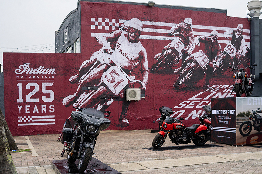
Wheatpaste art has moved from underground street practice to a legitimate brand medium, and understanding how it works is the first step toward using it effectively.
Wheatpaste art occupies a specific position in the visual culture of cities. It is neither traditional street art nor conventional advertising, but it borrows from both and has developed its own distinct identity as a medium. At its core, wheatpaste art is the practice of adhering printed or hand-rendered paper imagery to public and semi-public surfaces using a paste adhesive, usually wheat-starch based, creating large-scale visual statements that interact directly with the built environment.
We have been executing wheatpaste art campaigns commercially for over a decade. In that time, the medium has moved significantly into brand marketing, with record labels, film studios, fashion houses, beverage companies, footwear brands, and cultural institutions all using paste-up as a deliberate marketing vehicle. The reason is straightforward: wheatpaste art carries a visual register and a cultural credibility that conventional outdoor advertising cannot manufacture.
This guide covers the full picture, including the origins and culture of the medium, the technical process, how brands can commission paste-up campaigns, what distinguishes a credible wheatpaste art execution from a campaign that misses the mark, and the specific logistics of running paste-up art at scale across American cities.
Paste-up as an art form has roots that run back through political broadside printing, Soviet constructivist posters, and the hand-bills and street placards that have papered cities since typography existed. The contemporary practice that most people would recognize as wheatpaste art emerged prominently in the 1980s and accelerated through the 1990s in cities like New York, Paris, Berlin, and São Paulo, where street artists began using paste as a way to install imagery at scale without the permanence or skill requirement of spray paint.
The format has always carried a DIY logic. Paste and paper are cheap. The skill requirement for paste-up is lower than for spray-can work, which allowed artists with strong graphic sensibilities but limited spray technique to produce large, visually coherent work in the public environment. Over time, paste-up developed its own aesthetic: layered images, torn edges, weathered surfaces, work that acknowledged and incorporated its own degradation as part of the visual language.
Key Figures and Movements
Artists like Shepard Fairey, whose OBEY campaign began with simple repetitive paste-up across American cities in the early 1990s, demonstrated the communicative reach of the medium at a time when the internet did not yet exist to amplify street-level work. Bast, Swoon, JR, and dozens of others developed distinct visual languages within the paste-up medium, many of them eventually transitioning into gallery and commercial work while continuing to use the street as a primary installation context. The medium’s movement from underground practice to recognized art form happened in parallel with its adoption by commercial campaigns, a development that some artists embrace and others resist.
Why Paste-Up Resonates in Urban Environments
Cities are dense visual fields. Advertising, architecture, signage, and personal expression compete for attention at every scale. Wheatpaste art works within this field in a way that does not read like conventional advertising, even when it is. The paper quality, the scale, the wall-level installation, and the slight imperfection of an applied paper surface all signal something hand-made, intentional, and culturally grounded. That signal is what gives paste-up art its persistent relevance in brand marketing.
The Technical Process of Wheatpaste Art
Understanding the physical process of paste-up helps brands make better decisions about artwork preparation, scale, and execution logistics.
Paste Formulation
Traditional wheatpaste is made by cooking wheat flour or starch in water until it thickens into a smooth, lump-free adhesive. The ratio is typically one part flour or starch to four to six parts water, adjusted based on ambient temperature and desired viscosity. Professional crews often add a small amount of sugar to the cooked base, which increases initial tack. Some formulas add methyl cellulose to extend working time and improve adhesion on smooth surfaces.
The paste needs to be smooth enough to brush evenly but thick enough to hold paper without running. Too thin and the paper slides before it can be positioned. Too thick and it does not penetrate the paper surface, which weakens the bond. Getting the consistency right is a practical skill that comes from doing it repeatedly across different surface types and weather conditions.
Paper and Print Preparation
Wheatpaste art prints are typically produced on uncoated stock between 60 lb and 100 lb weight. Heavier paper is more durable and holds its shape better during application, but it requires more paste volume to bond and takes longer to cure. Lighter paper conforms more easily to irregular surfaces like rough brick, which can be an aesthetic advantage when the texture of the wall is meant to show through the image.
Prints are rolled for transport to avoid crease lines that show on the final installation. Tubes or rolled cores are standard for single-panel prints. Multi-panel sets are organized by panel number and labeled clearly so crew members can work through a large installation without confusion about panel order.
Application Technique
The wall receives a first coat of paste applied with a wide brush or roller in the area where the print will go. The paste is worked into any texture or seams in the surface. Before the paste fully dries, the print is positioned from the top down, smoothed with a flat brush or squeegee from center to edges to push out air, and then sealed with a finish coat over the entire surface. The finish coat is brushed outward from the center at the same time as smoothing to avoid pushing air into pockets that produce bubbles.
For large multi-panel installations, panels are typically applied from bottom to top so that the top edge of each lower panel overlaps slightly under the bottom edge of the upper panel. This prevents the seam from catching wind or pedestrian contact. The overlap is minimal, typically a quarter to half inch, and does not affect the visual read of the assembled image from viewing distance.
Surface Considerations
Different surfaces require different paste application approaches:
Fresh painted brick: Best substrate. Porous enough to absorb paste, smooth enough to produce a clean bond. Two-coat application works well.
Raw brick: Requires heavier paste volume to fill texture. Apply a thick first coat, allow to tack, apply poster, finish coat with extra material at edges.
Smooth concrete: Clean application surface. Less porous, so allow the first paste coat to tack before applying paper.
Painted metal (smooth): Requires surface scoring or a paste primer coat left to become slightly tacky before paper goes down. Bond quality depends heavily on technique.
Plywood hoarding: Porous and receptive. Fast and reliable substrate. Often the best available surface in construction-heavy urban corridors.
Wheatpaste Art as a Brand Medium
The commercial use of wheatpaste art has expanded significantly over the past decade and a half. Brands across entertainment, fashion, food and beverage, technology, and lifestyle sectors have used paste-up campaigns as a deliberate marketing tool. Understanding what makes a brand paste-up campaign credible, and what makes one land wrong, is essential before commissioning one.
What Credibility Looks Like
A credible wheatpaste art campaign respects the visual language of the medium. That means: large scale imagery, bold visual composition that reads at street level, placement in neighborhoods where paste-up is a recognizable and accepted visual form, and execution quality that does not apologize for being commercial while also not pretending to be something it is not.
Brands that have done this well include Supreme, whose consistent use of paste-up in New York and globally has become part of their brand identity. Record labels running album release campaigns in music-concentrated neighborhoods like Bushwick and Williamsburg. Film studios running poster campaigns in creative districts around major release dates. In each case the brand fits the medium because the medium fits the audience the brand is talking to.
Where Brand Paste-Up Goes Wrong
The failures usually come from one of three directions. The first is creative that is designed for digital screens and not for walls, meaning small type, low contrast, and imagery that depends on screen brightness to read. Translated to paper and paste on a brick wall, this kind of creative becomes muddy and unreadable at ten feet. The second is placement in neighborhoods where the brand’s presence feels incongruous with the local visual culture, which creates friction rather than the authenticity the campaign is meant to generate. The third is execution quality problems: bubbles, misaligned panels, peeling edges, or sloppy paste handling that makes the installation look amateur.
AGM Field Note: When we review client artwork for a paste-up campaign, we are specifically looking at how the design reads at the actual installed scale, not on a screen. We use a large-format soft proof at real dimensions before anything goes to print. This one step eliminates the majority of artwork problems we would otherwise discover in the field, where there is nothing to be done about it.
The Artist Commission Model
Some brands want more than a print applied to a wall. They want work that has genuine artistic identity, executed by an artist with an established visual language. This is the commissioned paste-up art model, where a brand engages an artist to produce original work that is then installed at scale as both an art installation and a campaign element.
We have facilitated this kind of work, connecting brands with paste-up artists whose aesthetic aligns with the brand’s positioning, managing the production and installation, and ensuring the final work reads correctly in the city contexts it is placed in. When it is done well, this type of campaign generates both cultural credibility and organic media coverage that a conventional poster campaign does not produce.
Designing for Wheatpaste Art Campaigns
The visual demands of the medium are specific and worth understanding before creative development begins.
Scale and Legibility
The minimum readable type size for a poster viewed from fifteen feet is approximately 1.5 inches at final output size, which corresponds to roughly 108 point type at print resolution. Body copy does not work on a wheatpaste poster. The visual hierarchy needs to be compressed: one primary message, one secondary element, and possibly a call to action. Everything else should be in the imagery itself.
Color Strategy for Street Conditions
Street lighting is inconsistent. At dusk and in the evening, posters are read under a combination of natural fadeout, streetlight (often sodium vapor or LED at varying color temperatures), and ambient commercial signage. High contrast between figure and ground is essential. Black and white imagery reads under almost all lighting conditions. Saturated color combinations that rely on hue differentiation can collapse in warm sodium light. We advise clients to review final proofs under warm incandescent and warm LED lighting conditions before approving for print.
Aesthetic Register and Neighborhood Fit
Wheatpaste art carries a specific visual register. Work that acknowledges the medium’s street context tends to land better than work that ignores it. This does not mean every campaign needs to look like underground art, but it does mean that the visual sensibility should match the environment it is going into. A clean, typographically sophisticated design lands well in Arts District LA. A high-energy, photo-heavy design works in Bushwick. A minimalist brand campaign works in Williamsburg’s retail corridors. These are not hard rules, but they are useful calibration points.
Neighborhood / Market
Dominant Aesthetic
Best Fit Campaign Types
Surface Character
Bushwick, Brooklyn
Layered, graphic, high-energy
Music, streetwear, events, food/bev
Rough brick, painted walls, loading doors
Williamsburg, Brooklyn
Refined, fashion-forward
Fashion, lifestyle, retail launches
Painted brick, hoarding, storefronts
Melrose Ave, LA
Bold, graphic, commercial art
Streetwear, footwear, music, film
Painted concrete, retail frontage
Arts District, LA
Gallery-adjacent, typographic
Brand activations, premium launches
Smooth concrete, painted brick
Wicker Park, Chicago
Eclectic, locally grounded
Music, food/bev, local brands
Mixed brick and hoarding
Wynwood, Miami
Vibrant, mural-adjacent
Events, tourism, lifestyle brands
Painted concrete, purpose-built walls
Scaling Wheatpaste Art Across Multiple Locations
A single paste-up installation, no matter how striking, is a local event. A coordinated wheatpaste art campaign across 50 to 200 locations in one or multiple cities is something different: it is a market presence, a signal that the brand is genuinely in the city and not just renting space in it.
Production Volumes and Print Logistics
Scaling paste-up art campaigns requires thinking through print production as a logistics problem, not just a creative one. Panels need to be organized by site, rolled correctly, labeled, and transported to crew without damage. A 100-location campaign with four-panel builds requires 400 individual printed sheets plus a production buffer of 10 to 15 percent for damaged panels and placement changes. Organization at the production end saves significant time in the field.
Crew Structure for Large-Scale Campaigns
We organize large campaign crews into teams of two or three, each responsible for a specific zone or set of sites. Each team has a driver, a primary installer, and a documentation person. Teams work from a printed site list with addresses and surface notes from the pre-execution scout. Communication runs through a shared reporting channel so we know when each location is confirmed complete. By the end of the execution window, we have a live log of every site.
Multi-City Simultaneous Execution
When a campaign needs to land in multiple cities on the same date, which is common for album releases, film premieres, and national brand launches, we coordinate with trusted crews in each market to execute concurrently. The creative ships to each market in advance, briefing calls cover site specifics and execution protocols, and reporting is consolidated centrally. We have run campaigns across six cities on a single night. The logistics are manageable when the preparation is thorough.
AGM Field Note: For multi-city campaigns, we run a pre-execution briefing with each market crew that covers: site list review, paste formula for local weather conditions, documentation requirements, and contact escalation if there is a field problem. This takes about twenty minutes per market and eliminates the majority of execution errors we would otherwise be dealing with at 2 AM.
Documentation and Campaign Reporting
Wheatpaste art campaigns generate visual documentation that has value beyond the physical placements themselves. A well-documented campaign provides content for social channels, internal presentation materials, and post-campaign analysis.
Photography Protocol
We shoot every placement from two angles: a wide shot that includes street context and shows the scale of the installation in its environment, and a close shot that captures the detail quality of the print and the execution. For aesthetically significant installations, we also shoot during different light conditions when the campaign is planned for a location that has strong morning or evening light character. Sunset light in Los Angeles and morning light in Brooklyn’s eastern-facing walls can produce dramatically different reads of the same poster and are worth capturing.
What the Campaign Report Includes
After execution, we compile and deliver a campaign report that includes placement photos organized by location, geo-tagged placement maps for larger campaigns, and execution notes. The photo set is high-resolution and provided in a format suitable for immediate use in social, press, and internal marketing materials. The report is typically delivered within 48 to 72 hours of campaign completion.
Wheatpaste Art and Social Media Amplification
The relationship between wheatpaste art installations and social media is genuinely symbiotic. Physical installations generate organic social content from passersby. Owned social channels can amplify that content. The combination creates a feedback loop where the physical and digital presence of the campaign reinforce each other.
We have seen paste-up campaigns in high-traffic locations generate significant organic documentation from local photographers, street style accounts, and neighborhood-focused social channels within hours of installation. This is a real and measurable effect of placing quality work in the right environment. It does not happen from every placement, and it cannot be guaranteed, but it is a consistent phenomenon that campaigns should be designed to take advantage of.
Building a social content strategy around the campaign documentation, including behind-the-scenes installation content, before-and-after wall transformations, and time-lapse sequences where conditions allow, turns the physical campaign into a multi-channel content engine that extends well beyond the original placement duration.
Wheatpaste Art Across American Cities: What Distinguishes Each Market
Every city has a distinct character as a wheatpaste art environment, and understanding those distinctions is essential for brands commissioning campaigns that are meant to feel genuinely rooted in a specific place rather than generically urban.
New York City
New York is the deepest and most historically layered wheatpaste art market in the country. The walls of Bushwick carry decades of accumulated paste history, and the best installations in that neighborhood interact with what is already there rather than trying to erase it. For brands commissioning wheatpaste art in New York, the challenge is making work that earns its place in that environment. Minimally considered creative gets ignored or covered quickly. Bold, well-crafted work that engages with the neighborhood’s visual culture can hold its position and generate organic documentation that extends its reach well beyond the original placement.
The Lower East Side adds a different character: tighter spaces, more eclectic aesthetic territory, and a nightlife and music audience with high aesthetic sensitivity. Williamsburg’s north end, along and near the Bedford Ave L stop, is more fashion-oriented and rewards sophisticated graphic design over layered street-art references. Each zone requires a slightly different creative approach to land correctly.
Los Angeles
Los Angeles has a wheatpaste art culture that is distinct from New York’s in its relationship to the commercial and the artistic. The Melrose Ave corridor operates almost explicitly as a street-level creative gallery, with brand campaigns and artist-commissioned work coexisting on adjacent walls without the hierarchy that a New York audience might impose on the same pairing. The Arts District near downtown LA brings a more gallery-adjacent audience and a slightly more restrained aesthetic vocabulary. Silver Lake and Echo Park carry a creative community whose sensibility bridges music, visual art, and the outdoors culture specific to Southern California.
The light in Los Angeles is one of the most underappreciated factors in wheatpaste art campaign planning there. The quality of Southern California sunlight, particularly the golden hour light in late afternoon, can make a well-designed paste-up installation look dramatically more powerful than the same installation photographed under flat overcast. For campaigns where the documentation photography matters as much as the physical placement, we plan LA shoot timing to capture the best natural light conditions at each site.
Chicago
Chicago’s wheatpaste art environment is anchored in Wicker Park and Logan Square, with a community character that is more resistant to overt commercialization than either New York or LA. Campaigns that feel authentically engaged with Chicago’s specific creative culture land better here than those that are transparently transplanted from national campaigns. Pilsen’s strong community identity as a center of Chicago’s Latino artistic culture makes it a specific and careful territory for brand campaigns, where genuine connection to the community matters more than visual production values alone.
Miami and Austin
Miami’s Wynwood is the most infrastructure-ready wheatpaste art district in the country. The property environment there has been configured to support large-scale visual installations, which means that brands executing in Wynwood can access better wall inventory with more reliable permission structures than in most other markets. Austin’s East 6th Street and South Congress corridors have developed a street-level creative culture that reflects the city’s position at the intersection of music, technology, and outdoor culture, which creates opportunities for brands in those spaces to connect with a distinctive and growing audience.
Commissioning Original Wheatpaste Art: The Full Process
When a brand wants more than a printed campaign and decides to commission original wheatpaste art, the process involves more parties, more creative iteration, and more logistical coordination than a standard poster production and installation campaign. Here is how we manage the process from start to finish.
Artist Selection
The first step is matching the brand’s aesthetic direction with an artist whose visual language aligns. We maintain relationships with paste-up artists across all major markets. The selection process considers: the artist’s established visual vocabulary, their geographic market expertise, their experience executing work at commercial campaign scale (which is different from solo street art practice), and the compatibility between their creative identity and the brand’s positioning. We present a selection of artist candidates with work samples and brief descriptions of why each is or is not a strong match for the specific brief.
Brief Development and Creative Review
Once an artist is selected, the creative brief defines the parameters: campaign locations, scale, any brand visual requirements (logo placement, color requirements, any elements that must appear), and the degree of creative latitude the brand is extending to the artist. More creative latitude typically produces better art and better organic reception in the neighborhood. Tighter creative constraints produce work that is more on-brand but sometimes reads as less authentic in the street context. Finding the right balance is the central creative negotiation in any commissioned wheatpaste art campaign.
The artist develops a concept direction, typically in the form of sketches or digital comps, that is reviewed by both the agency team and the brand. Revisions are managed through this review cycle until the direction is confirmed. For complex commissions with multiple locations or multiple scale formats, we may run a small-format test print before committing to full production.
Production, Installation, and Documentation
Once the final artwork is confirmed, production proceeds through the same print review and quality control process as a standard campaign. Installation is managed by the artist or by our crew with the artist directing. Documentation is produced to capture both the quality of the finished work and its context in the neighborhood environment. For artist commissions that have a press angle, we produce documentation specifically designed for editorial use alongside the standard campaign report photography.
Frequently Asked Questions
What is wheatpaste art?
Wheatpaste art is the practice of adhering printed or hand-rendered paper imagery to walls and surfaces using a wheat-starch or flour-based paste adhesive. It originated as a street art medium and has developed into a recognized commercial and artistic format used by brands, artists, and cultural institutions to create large-scale visual statements in urban environments.
How is wheatpaste art different from regular poster advertising?
Wheatpaste art is installed directly onto wall surfaces using paste rather than placed in rented advertising frames or panels. The scale, surface interaction, and visual character of paste-up work differs significantly from conventional outdoor advertising. The medium carries cultural associations with street art and urban creative culture that conventional advertising formats do not have.
Can brands commission original wheatpaste art from artists?
Yes. We facilitate artist commissions where brands engage paste-up artists to produce original work that is then installed at scale as a campaign element. This approach produces work with genuine artistic identity and cultural credibility beyond what a standard branded poster campaign achieves. We manage the artist relationship, production, and installation logistics end-to-end.
What neighborhoods in NYC are best for wheatpaste art campaigns?
Bushwick and Williamsburg are the strongest markets for paste-up art campaigns in Brooklyn, with dense pedestrian traffic in the creative and nightlife corridors and an audience that responds well to street-level art and brand work. The Lower East Side and Crown Heights provide additional reach into different demographic concentrations.
What are the artwork requirements for a paste-up campaign?
Print-ready PDF or TIFF files at 150 to 200 DPI at final output size, CMYK color, with bleed. High contrast between figure and ground is critical for street readability. Vector type and logos are preferred. We review all artwork before sending to print and will flag resolution, contrast, or composition issues that would reduce quality in the field.
How long does a wheatpaste art installation last?
Duration depends on surface, weather, and location wear. Most installations remain visually intact for four to eight weeks. Installations in sheltered locations with high-quality paste bonds can last considerably longer. Active pedestrian locations at lower heights see more wear at the bottom edge than installations higher up on walls.
Do you provide photography of the installations?
Yes. We photograph every placement after execution, including wide context shots and close detail shots. For larger campaigns we produce geo-tagged placement maps. These are compiled into a campaign report delivered within 48 to 72 hours of completion. The photos are provided in high resolution suitable for social, press, and internal use.
What markets do you operate in?
We execute wheatpaste art campaigns in every major US market. Our primary markets with established crews and pre-scouted inventory include New York, Los Angeles, Chicago, Miami, Austin, and several other cities. Multi-city campaigns can be coordinated to run simultaneously across all active markets.
What types of brands use wheatpaste art campaigns?
Record labels, film studios, footwear and streetwear brands, fashion houses, beverage companies, technology brands, and cultural institutions have all used paste-up campaigns effectively. The format works best when the brand’s audience has an urban, culturally engaged profile and when the creative is designed specifically for the medium.
How do I start a wheatpaste art campaign with AGM?
Call us at (646) 776-2770 or email [email protected] with your market targets, campaign objective, and any creative you have. We will scope the campaign and provide a proposal covering locations, production, execution timeline, and deliverables.