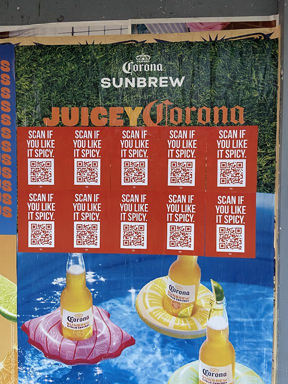
Wheat paste graffiti built the visual language of American street culture, and the same technique that defined that culture now drives commercial campaigns for brands trying to reach the audiences it shaped.
Wheat paste graffiti occupies a specific and contested position in the visual culture of American cities. It sits between fine art and advertising, between street culture and commercial communication, between the temporary and the intentionally permanent. Large printed or hand-created images bonded to urban surfaces with wheat starch paste: that is the technical description. But the cultural description is more complicated and more interesting.
At American Guerrilla Marketing, we run commercial paste-up campaigns, which puts us at the commercial end of the spectrum that wheat paste graffiti defines. We come out of the same tradition, we understand the culture, and we are transparent about what we do: we run advertising campaigns that use the techniques and, intentionally, some of the cultural positioning of paste-up street art to reach audiences who spend time in the neighborhoods where that culture is active.
This piece covers the full territory of wheat paste graffiti: where it came from, what it is technically, how it relates to spray paint graffiti and other street art forms, and how commercial brands use the format today in ways that can be authentic rather than extractive.
The term “wheat paste graffiti” covers a range of practices united by the adhesive and application method. At its core, wheat paste graffiti means: printed or drawn imagery affixed to outdoor urban surfaces using wheatpaste as the bonding agent, without explicit authorization from the surface owner, as a form of visual communication, art, or advertising.
The graffiti designation comes from the unauthorized nature of the placement rather than from the content of the imagery. A professionally created commercial poster campaign placed on walls with the surface owner’s permission is not graffiti in the traditional sense, even if it uses the same paste-up technique. A street artist placing large figurative works on a Bushwick building facade without asking is wheat paste graffiti in the traditional sense, even if the artwork is critically celebrated.
The distinction between authorized and unauthorized placements matters in a commercial context. Professional paste-up advertising campaigns operate with appropriate arrangements in place. The cultural associations of the format, including its graffiti roots, remain present in how audiences read the work regardless of the legal status of the placement. This is part of what gives wheatpaste advertising its cultural credibility: the format carries connotations of street authenticity that more sanctioned advertising formats do not.
The Technical Distinction: Paste-Up vs. Spray Paint Graffiti
Wheat paste graffiti and spray paint graffiti share cultural space but are technically quite different practices. Understanding the distinction helps explain why each has developed its own community, aesthetics, and commercial applications.
Spray paint graffiti is applied directly to the surface in the field. Letters, pieces, throw-ups, and tags are created on location using aerosol paint. The skill is in the execution on the surface itself: letter structure, color blending, cap technique, and compositional decisions made in real time on the wall. The work exists only as it was created in the field. There is no “studio” version that can be prepared in advance.
Paste-up graffiti is prepared off-site. The image is created in advance, whether digitally and then printed, drawn by hand and then photocopied or printed, or created directly on paper in a studio context. The field work is the application of the pre-made piece to the surface using paste. The skill in the field is installation quality: surface assessment, paste preparation, positioning, pressing technique, edge sealing. The creative work happened before the artist arrived at the wall.
This difference in production process means paste-up graffiti is accessible to different creative traditions than spray paint graffiti. Graphic designers, photographers, printmakers, and digital artists can create paste-up work using skills they already have. Spray paint graffiti requires mastery of a specific technique that takes years to develop. Paste-up is more democratically accessible, which is part of why it spread beyond the communities where spray paint graffiti originated.
Factor
Spray Paint Graffiti
Wheat Paste Graffiti
Where work is created
On the surface in the field
Off-site, then applied in the field
Required skill set
Spray can technique, letter form
Graphic/print skills + paste application
Reproducibility
Each piece is unique
Same image can be printed in quantity
Scale potential
Limited by can range and time on surface
Effectively unlimited with multi-sheet panels
Weather sensitivity during application
Less sensitive (paint dries fast)
More sensitive (paste needs cure time)
Commercial adaptation
Mural commissions, design collaborations
Direct adoption as advertising medium
The Cultural History of Wheat Paste Graffiti in America
The cultural history of wheat paste graffiti in American cities runs parallel to the history of spray paint graffiti but through different communities and traditions. Understanding this history helps explain the format’s current cultural position and what it means for brands trying to operate within it.
Political and Activist Origins
Paste-up as a form of political communication predates its use as street art. Labor unions in the early 20th century used paste-up notices and flyers to communicate with workers in industrial neighborhoods. Political campaigns used paste-up broadsides in urban areas long before digital communication existed. The practice of communicating through images and text applied to walls has a long history as a form of mass communication for movements that did not have access to commercial media channels.
This political and activist history gives paste-up graffiti a layer of meaning that spray paint tagging does not share. Paste-up has always been used as a medium of public communication, not just personal expression. That communicative function is part of what made it attractive to artists who wanted to reach audiences outside the gallery system and to brands who wanted to reach audiences outside conventional advertising channels.
New York City in the 1970s and 1980s
New York City during the fiscal crisis and its aftermath in the 1970s was the environment in which both spray paint and paste-up graffiti developed into distinct cultural forms. The city’s physical deterioration, the abundance of abandoned and neglected surfaces, and the concentration of young, creative people without access to institutional support for their work created conditions for street art to flourish in multiple forms simultaneously.
Artists associated with the East Village and Lower East Side art scenes in the late 1970s and 1980s used paste-up as one tool among many for placing work in public space. Jenny Holzer’s Truisms, Keith Haring’s subway chalk drawings and paste-up work, and the output of artist collectives like Colab all established the idea that paste-up was a legitimate medium for artists with serious intentions rather than just a vandalism-adjacent subcultural practice.
The OBEY Campaign and Systematic Distribution
Shepard Fairey’s OBEY campaign, which began in 1989 and continued for decades, systematized paste-up graffiti in a way that had clear implications for commercial use of the format. The campaign used an advertising-logic approach: repetition, broad geographic distribution, and a consistent visual identity to create what Fairey called “phenomenological” impact, the sense that the imagery was everywhere. The explicit influence of advertising theory on street art practice created a direct line from paste-up graffiti to paste-up advertising.
Fairey’s campaign also demonstrated that paste-up work could be both genuine street culture and a business. By the 2000s, he was running commercial projects for major brands using the same distribution infrastructure and visual approach he had developed through OBEY. The precedent was set: paste-up graffiti and commercial brand communication could occupy the same distribution channel using the same technique.
What Wheat Paste Graffiti Looks Like in Active Urban Environments
Active wheat paste graffiti environments in American cities are visually dense and layered in ways that other advertising environments are not. Understanding what these environments look and feel like is important context for planning campaigns that work within them rather than against them.
The Layered Accumulation
In neighborhoods with long histories of paste-up activity, surfaces develop thick accumulations of layered paper from years or decades of campaigns placed on top of each other. The Bowery in Manhattan, the stretch of Wyckoff Avenue in Bushwick, the construction barriers along Bedford Avenue in Williamsburg: these surfaces are archaeological records of visual culture, with each new campaign placed on top of everything that came before.
This layering creates a specific visual texture. The torn edges of older campaigns visible at the margins of newer ones. Fragments of typography and imagery from past campaigns peeking through tears in more recent work. The cumulative thickness of paper creating a dimensional surface quality that flat, bare walls do not have. Many artists and brands deliberately seek out these heavily layered surfaces because the context itself communicates participation in an ongoing cultural conversation.
Competition for Space
Active postering corridors involve constant competition for wall space. A piece placed today will have something placed over it within days or weeks. This turnover is part of the ecology of the medium. The campaign that gets covered is not a failure; that is simply how the format works. Planning for reasonable campaign duration and scheduling refreshes when needed is standard practice in high-turnover postering environments.
AGM Field Note: High-Turnover Locations Are Still Worth Targeting
Some clients look at a high-turnover postering corridor like a section of the lower East Side and worry that their campaign will get covered in a week. Our advice: worry less about duration and more about placement quality and documentation. A well-placed, well-documented campaign that lasts 10 days in a high-visibility corridor reaches more of the right audience in those 10 days than a campaign that lasts six weeks on a lower-traffic surface. We plan refreshes for critical campaigns in high-turnover zones.
How Commercial Brands Use Wheat Paste Graffiti Aesthetics
Commercial brands have adopted the aesthetic vocabulary of wheat paste graffiti in several ways, ranging from direct use of the technique to design references that recall the format’s visual qualities without using the technique itself.
Direct Format Use: Campaign Execution
The most direct approach is to actually run a paste-up campaign in neighborhoods where the target audience is present. This is what we do. We execute campaigns that use the exact technique, materials, and installation process of wheat paste graffiti, in the exact neighborhoods where that culture is active, for brands whose target audiences spend time in those places.
Done well, this approach puts the brand in genuine physical contact with the audience in a format that communicates cultural relevance. Done poorly, or with weak creative direction, it produces a campaign that feels out of place and generates little response beyond the occasional photo from a puzzled passerby.
Artist Collaboration
Brands hire recognized paste-up artists to create original work for commercial campaigns. The artist’s cultural credibility transfers to the brand. The brand’s resources allow the artist to execute work at a scale or in locations they would not access independently. When the relationship is genuine and the creative freedom given to the artist is real, these collaborations produce some of the most culturally embedded brand campaigns in street marketing.
Design Aesthetic Reference
Some campaigns use the visual aesthetic of paste-up graffiti (the layered texture, the print-on-paper look, the torn-edge visual vocabulary) in digital advertising, packaging, or other media without actually running paste-up campaigns. This approach can work for brand positioning but does not produce the street-level presence and organic social amplification that actual paste-up campaigns generate.
Planning a Wheat Paste Campaign: Operational Specifics
When brands commission paste-up campaigns from us, the process follows a consistent sequence regardless of campaign scale or brand category. Here is how the operational side works.
Brief and Objective Setting
We start with a clear brief. What is the campaign trying to accomplish? Who is the target audience? What neighborhoods carry that audience? What timeline constraints exist? What format and quantity are in scope? What does the client need to see in the documentation? These questions shape every subsequent decision.
Scout and Map
We walk the target neighborhoods and identify available surfaces that match the campaign profile. This means physically visiting streets and assessing wall inventory, foot traffic patterns, surface conditions, and existing visual context. The scout output is an installation map that drives the installation day route.
Print Production
We advise on paper spec and print production based on campaign requirements. Typically 70 to 80 pound uncoated cover stock for standard outdoor campaigns. Our vendor network includes printers who understand the specific requirements of outdoor wheatpaste applications.
Install
Installation follows the professional paste application sequence: surface prep, pre-wet, base coat, position, press, top coat, edge seal, photograph. Every placement. The route is executed in the sequence determined by the pre-campaign scout.
Report
Campaign reports with placement photos from every installation are delivered within a few days of installation completion. Larger campaigns include geo-tagged placement maps. The report serves as campaign accountability and client content asset.
AGM Field Note: Cultural Fluency Shows Up in Placement Discipline
The fastest way for a commercial paste-up campaign to feel fake is sloppy neighborhood selection. If the artwork is tuned for music culture, nightlife, or fashion, we place it where those audiences already spend time and where paste-up history is visible on the block. That could mean Bushwick warehouse corridors, Lower East Side retail side streets, or Melrose-adjacent cut-throughs in LA. The wall, the block, and the surrounding visual noise all shape how the audience reads the piece.
Creative Direction That Respects the Medium
Good wheat paste graffiti style campaigns are designed for the street first, not adapted from a banner ad after the fact. The medium rewards bold contrast, short lines of copy, strong portraiture, and visual ideas that can read from 20 feet away while still rewarding a closer look. Posters overloaded with product claims, tiny type, or a dozen logos look dead on the wall even if they looked polished in the pitch deck.
We usually advise clients to build the art around one core idea. That may be a single striking image, a blunt headline, or a repeated graphic motif that creates rhythm across a route. The campaign should still make sense when one poster is seen alone, but it should become stronger when the audience sees the second, third, and fourth placement in the same neighborhood. That repeated exposure is how the format builds familiarity.
What Reads Best on the Street
Large faces, high-contrast photography, hand-drawn type, and limited palettes translate well to wheat paste surfaces because they survive wrinkles, tears, overlapping layers, and inconsistent light. Dense copy blocks do not. Street audiences are moving, often fast, and they are processing the wall context at the same time as the poster. The work has to cut through visual clutter without losing character.
Neighborhood context matters too. A luxury fashion concept might use restrained typography and crisp negative space in SoHo, while a nightlife campaign in East Hollywood may benefit from louder color, repeated iconography, and a more aggressive rhythm. We do not treat every city wall like a blank canvas. We treat it like a live environment with its own rules, pace, and audience expectations.
Why Repetition Matters
One of the lessons commercial teams can learn directly from wheat paste graffiti culture is that repetition is not laziness. It is strategy. When the same visual appears across multiple blocks, the city starts to hold the campaign together as one idea. People notice the recurrence. They photograph the poster after seeing it twice. They mention it to friends. The campaign begins to feel larger than any individual placement.
This is why we often encourage clients to think in sets rather than single hero posters. Two or three coordinated designs can create a much richer route than one design repeated endlessly, but the family resemblance still needs to be obvious. Shared type treatment, recurring colors, or a consistent photo style makes the system legible in motion.
What Brands Get Wrong When They Borrow Street Art Codes
The biggest mistake is confusing aesthetic reference with cultural understanding. Tearing an edge in Photoshop or distressing a font does not automatically make a campaign feel grounded in street culture. Audiences who live around active paste-up environments notice immediately when a poster is imitating the look without understanding the scale, attitude, or placement logic of the medium.
Another common problem is over-branding. Some clients want the street credibility of the format but are uncomfortable letting the artwork breathe. So they add product shots, extra copy, and campaign hashtags until the poster stops feeling like public visual culture and starts feeling like a shrunken billboard. The best street campaigns usually show restraint. They trust the audience to connect the dots.
The last issue is forgetting that the install itself communicates quality. A beautifully designed poster with bubbles, folded corners, and weak edge sealing looks amateur in a day. A simpler design installed cleanly on the right wall usually performs better. Street-level credibility is not just an art direction choice. It is an execution standard.
Frequently Asked Questions
What is wheat paste graffiti?
Wheat paste graffiti is imagery applied to outdoor urban surfaces using wheatpaste as the adhesive, typically without authorization from the surface owner. The term covers a wide range from fine art paste-up work by recognized artists to political communication to commercial advertising campaigns using the same technique. The common thread is the material: paper bonded to an outdoor surface with a wheat-starch-based adhesive.
How is paste-up graffiti different from spray paint graffiti?
Spray paint graffiti is created directly on the surface in the field using aerosol paint. Paste-up graffiti is created off-site (digitally or on paper) and then applied to the surface using wheatpaste adhesive. The two forms share urban space and some cultural history but require different skill sets, attract different creative communities, and have distinct visual aesthetics. Paste-up is directly reproducible and scalable; each spray paint piece is unique.
Does using wheat paste graffiti techniques make a brand campaign more authentic?
Using the technique is necessary but not sufficient for authenticity. A brand campaign using paste-up technique in the right neighborhoods, with strong creative direction, placed in genuine cultural context earns authenticity through the quality of the execution. A campaign using paste-up technique with generic creative in inappropriate locations does not earn that reading regardless of the adhesive used. The technique opens the door; the creative and placement strategy determines whether the campaign walks through it credibly.
Which cities have the most active wheat paste graffiti cultures?
New York City, Los Angeles, Chicago, Miami, and Austin are the major US markets with the most active paste-up cultures. Within those cities, specific neighborhoods carry the highest concentrations of activity: Bushwick and Williamsburg in Brooklyn, the Lower East Side in Manhattan, Fairfax and the Arts District in LA, Wicker Park in Chicago, Wynwood in Miami, and the 6th Street and East Side corridors in Austin.
How long does wheat paste graffiti typically last on a wall?
Duration depends on surface quality, weather exposure, and local poster turnover rate. On a stable, well-prepared surface in moderate weather, a professionally applied paste-up piece lasts two to six weeks. In high-turnover neighborhoods where new work is constantly being applied, a piece may be covered or weathered significantly within one to two weeks. Locations with overhead protection or less active postering competition tend to see longer lasting pieces.
Can wheat paste graffiti be removed from surfaces?
Wheatpaste is removable with water and mechanical action. Fresh paste washes off easily with water. Fully cured paste requires soaking with hot water to re-activate the adhesive, then scraping with a putty knife or stiff brush. Thick accumulations of multiple layers require multiple soak-and-scrape cycles. Steam cleaning accelerates removal on thick builds. The paste does not contain solvents or chemically aggressive components and is considered one of the most surface-friendly outdoor adhesives available.
What paper weight is best for outdoor paste-up graffiti?
70 to 80 pound uncoated text or cover stock is the standard recommendation for outdoor paste-up applications. This weight range handles installation without tearing, absorbs paste for strong bonding, and survives moderate weather exposure. Lighter weights are more fragile during installation and less weather resistant. Heavier weights have slower paste absorption and require longer pressing time to eliminate bubbles. Glossy coated stock should be avoided entirely because the coating blocks paste penetration.
How do brands navigate the cultural politics of using wheat paste graffiti aesthetics?
The brands that navigate it best treat the format with genuine respect rather than using it as a cheap media buy. That means investing in strong creative direction, placing campaigns in neighborhoods where the brand genuinely fits, using the format consistently rather than as a one-off stunt, and, when possible, collaborating with artists from the community rather than simply appropriating the aesthetic. Audiences in active street art neighborhoods are sophisticated readers of visual culture and can tell the difference between genuine participation and surface-level imitation.
What is the typical cost of a wheat paste graffiti style campaign run professionally?
Professional paste-up campaign costs depend on market, volume, and scope. Large or multi-city campaigns are priced per project. Print costs depend on format, quantity, and turnaround. Contact AGM for a custom quote.
How does American Guerrilla Marketing approach wheat paste campaigns?
We approach every campaign with the same discipline: audience-driven location selection, professional paste preparation and installation technique, photo documentation from every placement, and campaign reports delivered after installation. We advise on creative direction when asked and push back on formats or designs that will not perform at street scale. We have worked in this format in major US markets for over a decade and bring that experience to every campaign we run.