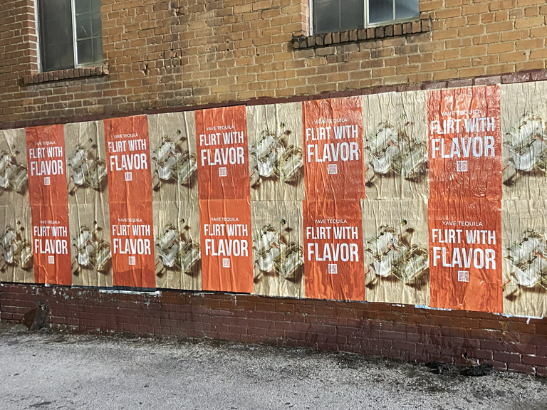
The street is a tough creative medium. Viewing windows are measured in seconds. Lighting is unpredictable. Competing visual noise is constant. Audiences are moving and often distracted. And unlike digital advertising, there’s no algorithm placing your creative in front of pre-qualified prospects: the street delivers your message to everyone passing by, and it’s the creative’s job to make that moment matter for the right people.
Art directors designing for urban poster campaigns face a specific creative challenge that’s distinct from almost every other medium: the work has to communicate instantly, read from distance, hold up in harsh outdoor conditions, and ideally generate enough surprise or visual interest to make someone stop, look, or pull out a phone. When it works, a great poster campaign in the right urban environment generates organic impressions far beyond those documented by the campaign plan. When it doesn’t, the budget is spent on wallpaper.
Here’s what the most effective urban poster campaigns share in terms of design approach, creative strategy, and technical execution: and what the current trends tell us about where street-level visual communication is going.
The Current Design Landscape in Urban Poster Campaigns
Urban poster aesthetics in 2026 are being shaped by several converging influences: the continued evolution of brand identity design toward more expressive, flexible visual systems; the influence of social media on what “photographable” means for street creative; and a genuine cultural moment in which bold, maximalist visual language is outperforming restrained minimalism in street environments after a decade of Helvetica-heavy corporate minimalism dominating the landscape.
The Return of High-Contrast Color Blocking
Strong, saturated color blocking: large fields of bold color with minimal modulation: is one of the most effective and currently trend-forward approaches to street poster design. In a visual environment full of photographic imagery and screen-influenced gradients, a poster that uses three flat colors at maximum saturation stands apart. It reads from distance. It photographs well against any background. And it creates the kind of immediate visual impression that the street environment demands.
Typography at Near-Abstract Scale
Typography as visual element rather than purely informational carrier is another dominant trend in effective urban poster work. Type set at a scale large enough that individual characters become abstract graphic forms: partially cropped, filling the entire composition: creates images that function as visual art rather than conventional advertising. This approach sacrifices some literal readability for visual impact, a trade-off that works well in high-awareness campaigns where the brand is already known to the audience.
Location-Aware and Context-Specific Creative
The most socially amplified poster campaigns of recent years have been ones that demonstrate obvious knowledge of their specific location: that reference the neighborhood, speak to local culture, or create a relationship between the creative and the specific wall or surface it occupies. This hyper-local approach requires coordination between the creative team and the placement team, but the organic social reach generated by creative that feels genuinely specific to a place is difficult to replicate through any other means.
Technical Specifications Art Directors Get Wrong
Creative direction for large-format street poster campaigns routinely fails at the technical execution stage because designers trained on digital and print media haven’t worked in the specific constraints of outdoor large-format production. Here’s where the problems typically occur.
Resolution and File Preparation
Large-format street posters are printed at lower effective DPI than conventional print pieces because they’re viewed from distance. A poster viewed at twenty feet doesn’t require 300 DPI at final size: it requires 150 DPI, or sometimes lower for extremely large formats. Files prepared at 300 DPI at final output size are technically correct but create file sizes that create production friction and often get unnecessarily downsampled anyway. Confirm specifications with your print vendor, but don’t assume that outdoor large-format follows the same standards as small-format print.
Color Mode and Profile
CMYK is the correct color mode for print output, and the specific CMYK profiles used by large-format outdoor printers can shift colors significantly from RGB screen appearance. Art directors designing for outdoor campaigns should work in the appropriate CMYK profile from the beginning rather than converting RGB files late in the process. That neon green that looks electric on screen may look muddy in print if the CMYK conversion isn’t managed correctly.
Safe Zones and Bleed
Street poster printing requires adequate bleed: typically a minimum of 0.25 inches, though some large-format vendors specify more. More importantly, critical creative elements including headlines, logos, and key visual moments must be positioned within safe zones that account for trimming variance. For wheatpaste campaigns specifically, where posters are applied to surfaces with potential alignment variation, keeping critical elements well within the central portion of the composition is essential.
Designing for Distance, Motion, and Light
The viewing conditions for urban street posters are radically different from studio or screen viewing conditions. Design that doesn’t account for these differences fails in execution even when it looks right in the mockup.
The Distance Test
Every street poster design should be tested at the distances from which it will actually be viewed. Step back twenty feet from your monitor. Step back forty feet. Can you read the headline? Can you identify the brand? Does the composition still hold together as a coherent image? If the answer to any of these is no, the design needs to be simplified or scaled up.
Motion Viewing
Audiences in vehicles or on transit passing a poster installation see it for approximately one to two seconds. The design has to communicate its essential message in that window. This usually means one dominant visual element and a headline that reads as a complete message independently of any supporting copy. Body copy visible from the street is largely decorative: it communicates brand investment and seriousness, but it’s rarely read by passing audiences.
Variable Light Conditions
Street posters have to work in direct afternoon sunlight, overcast morning light, and the lower-contrast conditions of dusk and evening. Designs that rely on subtle color differentiation between adjacent tones fail in high-brightness conditions where those distinctions collapse. High contrast between the primary and secondary elements of the composition is the technical solution: not just as a creative choice but as a functional requirement of outdoor viewing conditions.
Photography and Illustration in Urban Poster Campaigns
The choice between photographic, illustrative, and typographic creative approaches carries significant implications for outdoor performance and organic social amplification.
When Photography Works
Photographic creative in urban poster campaigns works best when the photography is large enough to be read as image rather than as detail, when contrast is high enough to survive outdoor light conditions, and when the subject matter has enough cultural resonance to create an immediate emotional response. Documentary photography and portraiture at scale can create extraordinary street presence.
When Illustration Outperforms Photography
Illustrative creative often outperforms photography in social amplification because it reads more clearly as “designed”: it communicates intentional creative effort in a way that photography sometimes doesn’t, even when the photography is exceptional. A hand-drawn illustration or a distinctive graphic style at poster scale is frequently the element that makes someone stop, look, and photograph a campaign installation for their own social feed.
Color Theory for Urban Outdoor Environments
Color behaves differently in outdoor urban environments than in any other advertising context. The combination of uncontrolled ambient light, distance viewing, motion viewing, and competition with the surrounding visual environment creates a set of color challenges that indoor or digital design work doesn’t prepare art directors for. Mastering outdoor color is one of the foundational competencies for effective urban poster campaign design.
Simultaneous Contrast and Urban Color Competition
Urban environments are visually chaotic. Streets, buildings, vehicles, foliage, other signage, and the sky create a constantly shifting color context that your campaign’s creative must stand out from. The principle of simultaneous contrast: colors look different depending on the colors that surround them: operates powerfully in this environment. A yellow poster that reads clearly against a red brick wall becomes visually muddy when placed next to a large yellow storefront. Location-specific color assessment is an underutilized tool in poster campaign design, and it requires actually visiting the locations where creative will be placed rather than designing for hypothetical surfaces.
Saturation and Distance
Color saturation decreases as viewing distance increases. What looks like a vivid, saturated red at three feet looks like a muted, muddy red at fifty feet: especially in bright sunlight, which bleaches color toward white. Outdoor creative needs to start with color saturation values that look slightly oversaturated in studio conditions, because those values will look correct in outdoor viewing conditions. Art directors who don’t account for this distance-saturation relationship consistently produce outdoor creative that underwhelms in the field.
Contrast Ratio as a Non-Negotiable Minimum
The minimum contrast ratio between text and background for adequate readability in outdoor viewing conditions is significantly higher than digital accessibility guidelines suggest. Text that passes WCAG digital contrast standards may fail completely as an outdoor creative element when viewed from twenty feet in harsh sunlight. Background-to-foreground contrast of at least 7:1 is a practical minimum for outdoor text legibility, and 10:1 or higher is preferable for headlines that need to read across a street from moving traffic.
Current Trend: The Revival of Hand-Made Aesthetic
One of the more surprising design trends in urban poster advertising over the past few years is the return of hand-made visual aesthetics in brand campaigns. After a decade dominated by clean digital perfection: precisely kerned type, flawless photography, mathematically perfect geometric forms: campaigns that deliberately reference hand-made visual traditions are generating strong organic response in the culturally-engaged urban audience that represents the core demographic for street-level brand campaigns.
Why Hand-Made Aesthetic Works in This Channel
The appeal of hand-made aesthetic in street advertising is partly contextual and partly psychological. Contextually, hand-made visual language has a long history in the street art and poster design traditions that define urban visual culture. Creative that references those traditions feels native to the street environment rather than imported from a corporate media world that the audience experiences as fundamentally separate from their cultural life. Psychologically, hand-made aesthetic signals genuine human effort and intention in a way that digitally-perfect execution sometimes doesn’t: which creates a perception of brand authenticity that resonates with audiences who are skeptical of polished commercial communication.
How Brands Are Applying This Trend
Effective application of hand-made aesthetic in brand advertising doesn’t mean literally doing everything by hand: it means incorporating visual elements that create the impression of human craft: hand-lettering within a professionally-typeset layout, risograph-style printing that creates deliberate color registration variations, screen-print textures that reference the material history of poster art, or illustration styles that carry the visible evidence of the artist’s hand. These elements can be executed digitally while producing the sensory associations of hand-made work: and that association is what creates the authentic street presence that brands in this space are working to achieve.
Designing for Multiple Formats Within a Single Campaign
Modern outdoor campaigns rarely deploy a single format. A comprehensive street-level campaign might include large-format poster placements, LED billboard truck creative, sidewalk stencils, and brand ambassador materials: all of which need to carry the same campaign identity while adapting to radically different format specifications and viewing contexts. Designing for this multi-format reality from the beginning of the campaign process is significantly more efficient than adapting single-format creative to other formats after the fact.
The Master Creative Concept
Multi-format campaigns need a master creative concept that is format-agnostic at its core: a visual identity or campaign idea that maintains its integrity when expressed at poster scale, LED truck scale, sidewalk scale, and in brand ambassador materials. This doesn’t mean a single static image that gets resized: it means a creative concept defined by a visual language, color palette, typographic approach, and core idea that can be expressed differently at different scales while remaining immediately recognizable as the same campaign.
Format-Specific Creative Execution
Within the master concept, each format requires format-specific creative development. The LED truck execution needs to work as a moving image viewed from a distance in traffic. The poster needs to read at pedestrian scale with appropriate dwell time. The stencil needs to be reducible to a single high-contrast graphic that works in both sunlight and rain. The ambassador materials need to be portable and legible at close range in a human-to-human interaction context. Each of these is a distinct creative challenge that benefits from being addressed explicitly in the design process rather than assumed to be solved by scaling the same artwork.
The Art Director’s Role in Campaign Success Beyond the Studio
Art directors who treat outdoor campaign design as a purely studio-based activity, delivering files and stepping away from the process, consistently produce work that performs below its potential in the field. The art directors who produce the most effective outdoor campaigns are the ones who stay engaged through the placement and installation phases, understand what happened in the field, and use that information to improve subsequent campaigns.
Site Visits Before Final Design Lock
The single highest-value thing an art director can do for an outdoor campaign is visit the actual locations where the creative will appear before finalizing the design. Photographs and location reports capture some of the relevant information, but they don’t replace the experience of standing at the location, understanding the sight lines, seeing the surrounding visual competition, assessing the light quality at different times of day, and developing an intuitive sense of what creative will and won’t read clearly in that specific environment. Art directors who build site visits into their workflow produce outdoor creative that is calibrated to real-world conditions rather than studio assumptions.
Reviewing Installation Documentation
Post-installation documentation photos are valuable creative feedback tools that most art directors never use. Seeing your creative applied to an actual surface in an actual environment reveals things that studio mockups never do: whether the scale is right, whether the colors hold in outdoor light, whether the composition reads as intended at the actual viewing distances, whether the surrounding environment complements or competes with the creative. Reviewing installation documentation and feeding that information back into the next design iteration is how outdoor creative gets better over time rather than repeating the same studio assumptions with each new campaign.
Coordinating with Placement and Installation Teams
The most important design conversation that often doesn’t happen is the one between the creative team and the placement and installation team. The surface conditions, environmental context, and visual competition at actual installation locations should influence creative decisions before design is locked. Our team at American Guerrilla Marketing works with creative and agency partners from the early campaign stages specifically to inform design with location realities.
Surface and Environment Briefings
Before creative is finalized, art directors should understand what surfaces the campaign will actually appear on: texture, color, size, surrounding visual environment, and any surface-specific constraints. A design that performs brilliantly on a smooth concrete wall fails on a textured brick surface if the design relies on fine detail. Getting those surface specifications into the creative brief early prevents expensive late-stage revisions.
Frequently Asked Questions About Urban Poster Campaign Design
What design trends are most effective for urban poster campaigns in 2026?
High-contrast color blocking, oversized typography at near-abstract scale, minimal text with maximum visual impact, and location-aware creative that references local context are the design approaches generating the strongest engagement in urban poster campaigns right now. Campaigns that look made for their specific street environment consistently outperform generic brand executions placed without creative adaptation.
What file specifications should art directors use for large-format street poster campaigns?
Large-format street posters are typically printed at 150-300 DPI at final output size, with files delivered in CMYK color space as high-resolution PDFs or TIFFs. Bleed should extend at least 0.25 inches on all sides. Text and critical elements should be kept within a safe zone 0.5 inches from the trim edge. Always confirm exact specifications with your print vendor based on final poster dimensions and surface conditions.
How should design account for outdoor viewing conditions?
Outdoor poster design must account for variable lighting (bright sun, overcast, dusk), viewing at distance (often 20-50 feet), motion viewing from passing vehicles, and the competitive visual environment of an urban street. High contrast between background and foreground, limited text, large type, and simple compositions all improve performance in outdoor viewing conditions.
What makes a poster campaign generate organic social media sharing?
Poster campaigns generate social sharing when the creative is visually surprising, culturally relevant, or technically impressive enough that encountering it feels like discovering something worth sharing. Scale, unexpected color, conceptual cleverness, or a creative idea that connects to something the audience already cares about: these are the elements that turn a poster sighting into an Instagram post that extends campaign reach far beyond in-person impressions.
How do AGM campaigns handle multi-piece or serialized poster creative?
AGM executes multi-piece poster campaigns where sequential or complementary creative elements are placed across a route to create a narrative experience for the audience moving through the city. This serialized approach rewards multiple impressions, creates a sense of discovery, and generates the kind of connected campaign presence that single-placement campaigns simply cannot produce across a market.
Frequently Asked Questions
What is posting design trends shaping urban aesthetics key insights for art directors?
American Guerrilla Marketing provides posting design trends shaping urban aesthetics key insights for art directors services across 50+ U.S. markets. Every campaign is planned, scouted, executed, and GPS-documented by our field teams. We work with regional brands and Fortune 500 companies on campaigns that require real street-level execution and documented proof of performance.
How does AGM approach art directors?
Our process starts with a market consultation to understand your goals, target audience, and budget. We then scout locations, handle any required permissions or permits, coordinate production and installation with our local crews, and provide a full GPS-tagged photo report after the campaign runs.
What markets does American Guerrilla Marketing cover for art directors?
We operate in 50+ U.S. markets including New York, Los Angeles, Chicago, Miami, Houston, Atlanta, Seattle, Denver, Boston, and dozens of secondary markets. Contact us to confirm availability and pricing for your specific market.
How much does a art directors campaign cost?
Campaign pricing depends on market, format, quantity, and duration. We work with budgets ranging from targeted single-market runs to national rollouts across multiple cities. Use our RFP Builder or contact us directly for a custom quote based on your specific campaign requirements.
How do I get started with art directors through AGM?
The fastest way to get started is to submit your campaign details through our RFP Builder at americanguerrillamarketing.com, or contact us directly at [email protected] or (646) 776-2770. Our team typically responds within one business day with availability and initial pricing.