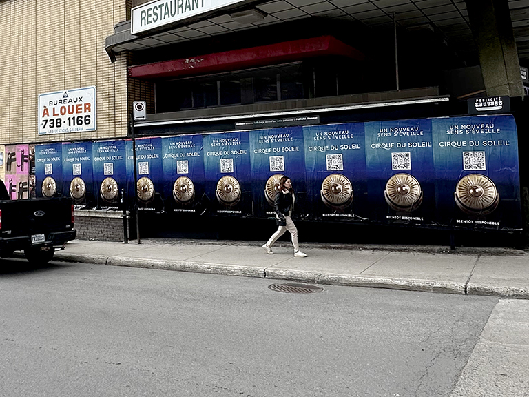
The difference between a poster campaign that runs for four weeks and a poster campaign that gets pulled in four days is usually not the design or the timing. It is the wall. A poor posting surface, one with bad adhesion, too much enforcement attention, or the wrong orientation to foot traffic, defeats even a well-produced campaign before it gets started. Wall quality assessment is the work that separates campaigns that run to completion from campaigns that spend money on posters that never get seen.
At American Guerrilla Marketing, based in Industry City, Brooklyn, NY, we scout and assess posting surfaces for every campaign we execute. Over hundreds of campaigns in dozens of cities, we have built a systematic framework for surface evaluation that informs location decisions before a single poster is printed. Call our team at (646) 776-2770 to discuss your campaign’s geographic scope and surface requirements.
This guide covers the complete wall quality assessment framework: surface material evaluation, visibility analysis, posting history assessment, enforcement environment, and how to build a ranked location list from first-pass scouting.
Surface Material: The Foundation of Adhesion
The first evaluation a scout makes is the substrate material. Not every wall holds a wheatpaste poster equally well. The adhesion quality of the surface determines how long the poster will stay in place, how well the wheatpaste penetrates to create a strong bond, and whether additional preparation steps are needed before posting.
Ideal Surfaces: Porous and Textured
Rough brick is the best wheatpaste substrate. The mortar joints and rough face of the brick create micro-surface area that the wheatpaste can penetrate and grip. A brick wall with an established layer of old poster paper is even better: the old paper provides additional adhesion surface and the wheatpaste soaks through the new poster into the existing layer, creating a multi-layer bond.
Rough concrete is the second-best category. Standard architectural concrete block, poured concrete with a broom or exposed aggregate finish, and concrete that has some surface weathering all perform well. Smooth trowel-finished concrete is less ideal but still workable with adequate wheatpaste concentration and application.
Painted wood is strong for wheatpaste adhesion when the paint is reasonably intact. Heavily peeling paint surfaces have the same problem as loose plaster: the wheatpaste may bond to the painted layer but not to the substrate underneath, and the whole assembly separates with the next rain or heavy humidity.
Poor Surfaces: Smooth and Non-Porous
Glass, polished metal, glazed tile, and very smooth painted concrete provide minimal mechanical adhesion for wheatpaste. Posters on these surfaces may appear solid immediately after application but begin to peel at the edges within 24-48 hours, particularly at the corners where adhesion is most stressed. These surfaces require either stronger adhesive systems than standard wheatpaste or should be excluded from the location list entirely.
Very smooth concrete that has been sealed or treated with a penetrating sealer is particularly problematic because the sealer fills the micro-surface porosity that wheatpaste depends on for adhesion. If a surface looks smooth and does not absorb water (a water droplet stays as a bead rather than absorbing), it is a poor wheatpaste candidate.
Posting History: What Old Posters Tell You
The most informative data point about a candidate wall is not the wall itself. It is the posting history visible on and around the wall. A surface with visible layers of accumulated poster paper, dried wheatpaste residue, and remnants of previous campaigns is telling you several things at once.
First, it tells you that the surface holds posters. The physical evidence of layers means adhesion has worked here repeatedly. If the surface were a poor adhesion candidate, the layers would not have accumulated.
Second, it tells you that the location is posting-tolerant. The property owner has not had the surface regularly cleaned. The enforcement environment has not flagged the location as a priority removal target. Previous campaigns have run without interruption. These are all positive indicators for new posting.
Third, the quality and recency of the top layer tells you about current competition and posting velocity. A location where the most recent poster is current and intact suggests moderate competition. A location where fresh posters are appearing and covering each other rapidly suggests a high-competition environment that requires frequent monitoring and restocking.
What Cleaned Surfaces Signal
A surface that has been recently and thoroughly cleaned, bare wall visible where you would expect accumulated posting, is a warning sign. Recent cleaning indicates that someone is actively managing the surface against posting. This may be the property owner, it may be a building management company, or it may be a city enforcement response to a complaint. The risk of posting on a recently cleaned surface is significantly higher than posting on an established location.
Not all cleaned surfaces are high-risk. Some building owners clean periodically but do not actively monitor or enforce. The distinction between a one-time clean and an active enforcement posture requires additional scouting, ideally including checking the surface again a week later to see whether new posting has accumulated and remained or been removed again.
Visibility Analysis: Who Can See It and When
A poster is only valuable if it is visible to the target audience. Visibility analysis covers three dimensions: the primary pedestrian approach angle, the distance from which the poster is legible, and the hours of the day and days of the week when the target audience is present.
Approach Angle
The optimal poster placement is on a surface that is perpendicular to the primary direction of pedestrian movement. A person walking north along a block should be able to see the poster face-on as they approach from the south. Posters placed at acute angles to the pedestrian path, on building faces that run parallel to movement rather than perpendicular to it, have dramatically reduced effective visibility.
We assess the primary pedestrian movement direction for every candidate surface during the scout. In most cases, the building orientation provides this information. But irregular block geometry, one-way traffic patterns, and transit entrance locations all affect actual pedestrian flow in ways that are not obvious from a map. The foot assessment is essential.
Legibility Distance
The poster design determines the minimum legibility distance. A large, bold, text-minimal design may be legible from 30 feet. A design with fine typography and complex imagery may only be fully legible from 5 feet. The candidate surface needs to have enough clear pedestrian approach at the legibility distance for the specific design to be effective.
A poster on a narrow sidewalk where pedestrians pass within 3 feet may be extremely legible even with fine detail. The same design on a surface set back 20 feet from the pedestrian path with nothing drawing the eye to cross that distance will underperform significantly.
Time-of-Day and Day-of-Week Patterns
The target audience’s presence at the candidate location is time-dependent. A surface on a commuter route has high morning and evening value and low midday value on weekdays. A surface on a weekend retail corridor has high Saturday and Sunday value and low weekday value. A surface near a venue has high value on event days and low value otherwise.
Scouts assess time-of-day patterns by visiting candidate locations at the times when the target audience is expected to be present, not at whatever time is convenient. A 9am scout of a location that peaks at 7pm will miss the audience dynamic that makes or breaks the placement.
Enforcement Environment: Reading the Risk
Every posting location exists in a regulatory and enforcement environment. Understanding that environment is part of the quality assessment. Posting in a low-enforcement neighborhood where no active removal is occurring produces very different results than posting in a high-enforcement zone where the city is actively responding to complaints.
High-Enforcement Indicators
Freshly cleaned surfaces with no posting accumulation are the strongest indicator of active enforcement. Multiple clean surfaces in a row on a block that should be a posting environment is a strong signal that the area is being actively managed. Visible “No Posting” signage with phone numbers for enforcement reporting is another indicator.
Commercial districts with Business Improvement Districts (BIDs) are typically higher-enforcement than residential or mixed-use areas without organized commercial management. BIDs often maintain contracts with cleaning services that prioritize graffiti and posting removal. Posting in a BID zone has a shorter effective lifespan than equivalent posting outside the BID geography.
Low-Enforcement Indicators
Accumulated posting without removal, consistent layer depth across multiple surfaces on a block, and surfaces where new posting is visible alongside older posting that has not been disturbed all indicate a low-enforcement environment. These are the environments where campaign longevity is highest and restock costs are lowest.
Building the Ranked Location List
After the surface assessment, each candidate location receives a score across the evaluation dimensions: adhesion quality, posting history, visibility score, enforcement risk, and audience match. The scoring produces a ranked list that guides both the initial placement selection and the prioritization of restock resources during the campaign.
High-scoring locations receive the heaviest initial posting, the most frequent monitoring, and the first restock allocation when resources are constrained. Low-scoring locations that are retained for geographic coverage rather than quality receive lighter service and are dropped first if the campaign needs to narrow its scope.
This systematic approach to wall quality replaces the instinct-based, whatever-looks-good approach that produces inconsistent results. It creates a documented, reproducible process that improves with each campaign as the historical data builds.
Connecting Surface Quality to Campaign Performance
Wall quality assessment is the foundation of a performing wheatpaste poster campaign. The location list built from rigorous assessment is the asset that determines whether the campaign delivers its projected impressions and longevity.
Our guerrilla marketing services team connects wall quality assessment to the broader campaign architecture. The surfaces selected for wheatpaste inform where sidewalk stencils are deployed as ground-level complements. The highest-quality locations anchor the geographic zones where brand ambassador teams are stationed for direct engagement.
Every posting location in our campaigns is GPS-documented with before and after photography. The wall quality assessment becomes part of the campaign’s performance record, and the longitudinal data from repeated campaigns in the same market builds a progressively refined location library that improves the quality of every subsequent program.
Frequently Asked Questions
What makes a wall good for poster placement?
A good poster wall has high foot traffic from the target audience, a porous or textured surface that allows wheatpaste or adhesive to bond, sufficient size for the intended poster format, an established posting history that indicates the location is tolerant, and a visibility angle that allows the poster to be seen from the primary pedestrian approach.
What surface materials work best for wheatpaste posters?
Rough brick, painted wood, rough concrete, and surfaces with an existing layer of old posters are the best wheatpaste substrates. Smooth glass, polished metal, and very smooth concrete provide minimal adhesion and cause posters to peel quickly.
How do you tell if a wall has a good posting history?
Evidence of a good posting history includes remnants of previous posters, layered paper buildup on the surface, and the absence of fresh cleaning marks. A wall with visible layers of old posters is a wall where the property owner has tolerated posting and where new posts will blend into an established posting environment.
What sightline angle is optimal for poster placement?
The optimal sightline is perpendicular to the primary direction of pedestrian movement, meaning a person walking past can see the full poster face-on for several steps. Posters placed at acute angles to foot traffic have reduced effective visibility because the viewing angle is too oblique for clear reading.
How high on the wall should a poster be placed?
Posters placed at 5-7 feet from the ground, starting at eye level, have the best visibility and the greatest longevity because they are above casual reaching height for cover posting. Posters placed below 4 feet are quickly covered by other posters in competitive environments.
What disqualifies a wall from being a poster location?
Surfaces with active enforcement, surfaces on clearly occupied retail or residential frontages, surfaces with regular commercial cleaning schedules, structurally damaged or actively deteriorating surfaces, and surfaces in high-enforcement districts where risk significantly outweighs visibility value.