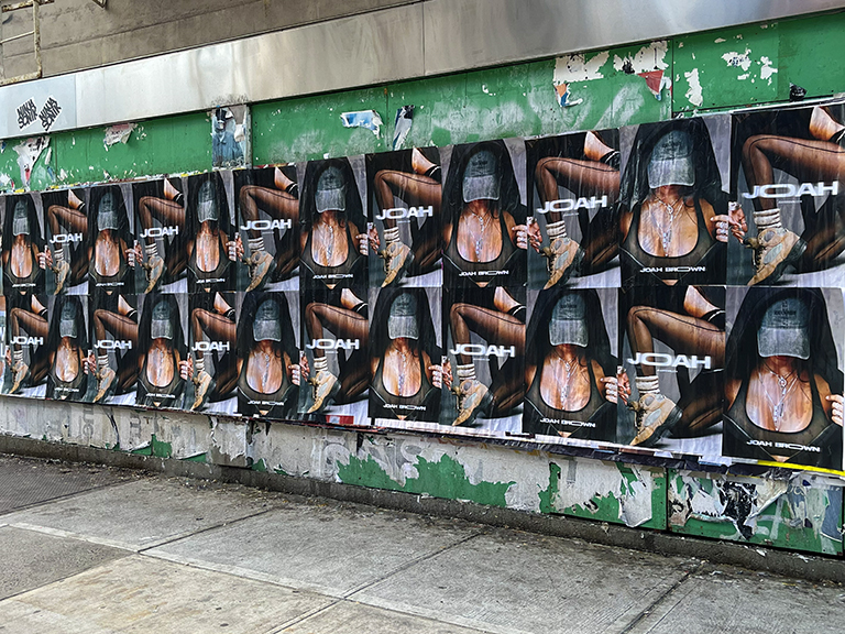
Posting design for maximum street impact is a discipline distinct from print or digital graphic design. A poster that looks polished on a screen or in a print comp frequently fails in the outdoor environment, losing legibility in direct sunlight, disappearing into surrounding visual noise, or simply not reading at the distances and angles at which pedestrians actually encounter it. American Guerrilla Marketing has designed and installed campaigns on Bedford Avenue in Williamsburg, Melrose Avenue in Los Angeles, 18th Street in Chicago’s Pilsen, and across 50+ other markets. The design principles that drive recall and engagement at street level are specific, learnable, and consistently underestimated by agencies approaching outdoor for the first time.
This guide breaks down the five essential posting design principles for street impact, explains what research on outdoor visual cognition supports about each one, and gives specific technical recommendations drawn from campaigns where the design decisions produced measurable differences in engagement and recall.
Why Outdoor Posting Design Is Different from Print and Digital
Poster design for indoor or digital contexts assumes a controlled viewing environment: consistent lighting, a known viewing distance, a stationary viewer with conscious attention. Outdoor design assumes none of those things. The viewer is moving, the lighting changes by hour and weather, the viewing distance varies from 5 feet to 50 feet, and the viewer has not chosen to look at the poster, attention must be captured before it can be held.
This creates a design brief that is fundamentally about visual dominance. The poster must win the attention competition against everything else in the viewer’s visual field, other posters, storefronts, signage, and moving pedestrians. Designs that are merely attractive rarely win that competition. Designs that are visually dominant, bold, high-contrast, immediately readable at distance, consistently do.
Principle 1: Visual Clarity and Immediate Readability
The single most important quality in a street posting design is that its primary message is understood in under 2 seconds at a distance of 20 feet. Everything else in the design is secondary to this requirement.
In practice, immediate readability requires: a single dominant visual element that communicates the brand or the core message without requiring the viewer to read text; minimum body copy (we recommend 7 words or fewer for any text outside of a URL or handle); and type set large enough that it would look almost absurdly large on a desk monitor. If a client’s art director says the type “looks too big,” it’s probably approximately the right size for outdoor scale.
We’ve A/B tested single-headline-and-image designs against multi-message designs in the same market and posting location. The single-message design consistently outperforms in spontaneous recall by a significant margin, typically 2–3x when measured through post-campaign intercept surveys in the posting area.
Principle 2: Contrast as a Non-Negotiable Structural Element
High contrast between your primary visual and the background is not a design preference in outdoor posting, it is a technical requirement for visibility across different lighting conditions. A poster with a 4.5:1 contrast ratio (the minimum for digital accessibility) is inadequate for outdoor use. We aim for 7:1 or higher in primary design elements.
The outdoor environment includes direct sunlight that washes out color, overcast conditions that flatten contrast, shadow from adjacent buildings that create uneven illumination, and evening conditions where ambient light may be the only source. Designs that rely on subtle color differentiation or low-contrast gradients fail under most of these conditions. The most reliably visible combinations at street level: black text on white or yellow, white text on black or deep blue, brand-primary-color on high-contrast background.
Matte-coated paper stock reduces glare under direct sunlight relative to gloss, a consideration worth discussing with your production team for campaigns in markets with intense sun exposure. AGM uses gloss as our standard but can specify matte for specific markets and surfaces.
Principle 3: Typography That Commands Attention
Font selection for outdoor posting should prioritize legibility over personality. This is a rule that many brand teams resist, especially when a brand’s identity uses a distinctive or decorative typeface. The reality is that decorative typefaces that communicate brand personality at arm’s length frequently become illegible at 20 feet under imperfect lighting.
Our typographic recommendations for outdoor posting:
- Use bold or black weight, not regular or light. Thin letterforms disappear against textured surfaces and in low light. Bold weights maintain legibility across conditions.
- Sans-serif for body copy; serif or display for a single dominant headline. Extended text in serif typefaces is harder to read at distance than sans-serif. A display serif headline as the single dominant text element works well, just not for body copy.
- Letter spacing for all-caps text. All-caps text in outdoor posting benefits from 5–10% added letter spacing, which improves readability at distance by preventing letterform collisions that create visual confusion.
- Minimum headline size: 150pt equivalent at final print scale. For a 24×36″ poster at 300 DPI, this means a headline that occupies at least 20–25% of the poster height. Anything smaller risks becoming unreadable beyond 15 feet.
Principle 4: Color Theory for the Street Environment
Color in outdoor posting serves two functions: brand communication and attention capture. These functions sometimes align and sometimes conflict. When they conflict, when the brand’s identity colors are low-contrast or visually similar to their likely outdoor environment, the attention-capture function should take priority.
Warm colors (red, orange, yellow) activate the brain’s arousal system and are processed as more urgent than cool colors. In environments with a lot of cool-blue or neutral-grey tones (common in urban commercial districts), a warm-color dominant design stands out structurally. The reverse is also true: in high-saturated-warm environments (brick-heavy neighborhoods like Brooklyn or Chicago neighborhoods), a cool-color design can read as distinctive precisely because it contrasts the dominant environmental palette.
We color-test every posting design in the context of its specific deployment environment before finalizing the campaign. A design reviewed in an abstract layout may look very different when composited into a reference photo of the actual wall where it will be installed.
Principle 5: Image Quality and Visual Impact
Photography and illustration in outdoor posting must be high-resolution (300 DPI at final print size minimum) and visually arresting at distance. The most effective images for street posting share a quality: they contain a single, immediately identifiable subject that reads clearly even when the poster is viewed from a moving position or imperfect angle.
Lifestyle photography with multiple figures or complex backgrounds frequently loses clarity at scale. Product photography on a simple, high-contrast background often works better outdoors than it does in a curated digital context. We recommend requesting a test print at a portion of the final size before committing a large campaign budget to a design that hasn’t been evaluated at outdoor scale.
Planning a Posting Campaign for Maximum Street Impact
Design quality alone doesn’t produce street impact. Campaign planning, where you post, in what concentration, over what time period, determines how the design performs in the real world.
Density Over Distribution
A common mistake is spreading campaign posters too thinly across too large an area. The frequency effect, the same person seeing the same campaign multiple times, is what builds brand recall. A pedestrian who sees your poster on their commute Monday, Tuesday, and Wednesday is significantly more likely to remember the brand than a pedestrian who sees it once. This requires enough density in a defined geography that the campaign is visible from multiple points on regular routes.
In our Williamsburg campaigns, a 100-piece deployment concentrated between the Bedford Avenue L train stop and the north end of Bedford delivers this frequency for the target demographic. The same 100 pieces spread across all of Brooklyn would be nearly invisible in any single neighborhood.
Campaign Duration
Wheat paste posters in good conditions last 3–6 weeks. We recommend campaign windows of at least 2 weeks for brand-building objectives, which allows sufficient exposure frequency to build recall. For event promotion or product launches with specific date triggers, a 2-week pre-event window is our standard recommendation.
Refresh Cycles
For campaigns running longer than 4 weeks, a refresh deployment, reinstalling posters that have been damaged, overpasted, or removed, maintains campaign presence and can also introduce updated creative to sustain audience engagement. We’ve run campaigns that combined a launch creative in weeks 1–2 with a follow-up creative in weeks 3–4 that created a two-chapter narrative visible on the same surfaces over the course of the campaign.
What Bad Operators Get Wrong in Posting Design
The most damaging failure we see is design finalized without considering the specific surfaces and environments where installation will happen. A design that looks strong in an abstract presentation can be completely overwhelmed by a visually complex surrounding environment or disappear against a brick surface that absorbs its color palette. AGM’s design review process includes environment simulation for every campaign.
The second failure is resolution. We regularly receive client-supplied files at 72 DPI that were designed for digital display. At outdoor print scale, 72 DPI files produce visibly pixelated output that makes a premium brand look unprofessional. The minimum for outdoor printing is 300 DPI at final print size, not at screen size.
Contact us at americanguerrillamarketing.com/contact to discuss your posting design and campaign planning needs.
Frequently Asked Questions
Master Posting Design for Maximum Street Impact generates better results when placement, timing, creative, and local execution all work together. These questions cover the details brands usually need before launch, during rollout, and while evaluating performance.
For Master Posting Design for Maximum Street Impact, the strongest campaigns usually come from tight geographic targeting, message discipline, and enough repetition to be remembered. Market conditions, neighborhood flow, event calendars, commuter behavior, and production logistics all change how the tactic performs, so the planning details matter as much as the idea.
What file format should I provide for wheat paste poster printing?
High-resolution PDF or TIFF at 300 DPI minimum, final print dimensions, CMYK color mode. RGB files will be converted for print and may shift in color. AGM’s production team will review and confirm all specifications before going to press.
How large should wheat paste posters be for maximum street impact?
The minimum effective single-sheet size is 24″×36″. Our highest-impact campaigns use stacked formats, two or three sheets vertically, creating a poster presence 4–6 feet tall, visible from a full block away. Larger is almost always better for brand campaigns in high-traffic environments.
Can I use my existing brand creative for a wheat paste campaign?
Sometimes, with modifications. Digital and print creative rarely translate directly to outdoor posting without adjustments, typically to contrast, type size, composition, and sometimes color. AGM reviews all client-supplied creative for outdoor suitability before production and recommends modifications where necessary.
How does AGM handle design for outdoor campaigns?
AGM offers full creative development for outdoor posting campaigns, from brief to final print-ready file. We can also adapt existing brand creative for outdoor environments. Contact us to discuss your creative needs and timeline.
Does color or paper choice affect how long a poster lasts?
Yes. Gloss-coated stock provides better weather resistance than uncoated paper. UV-resistant inks slow fading from sun exposure. In high-UV markets (Los Angeles, Miami, Southwest US), we recommend lamination over the printed surface for campaigns running longer than 3 weeks. Master Posting Design for Maximum Street Impact becomes much stronger when the article moves past surface level advice and into route logic, timing, crew decisions, and what buyers should expect before launch. That is where most campaigns win or lose. Good ideas are common. Clean execution in the right place at the right time is not. In practice, the first move is narrowing the audience into a physical map. That means identifying the streets, retail corridors, campus edges, transit entrances, event approaches, or nightlife clusters where attention piles up. Once that map is clear, the next step is deciding which format fits the movement pattern. Posters work best where people have a second to read. Snipes work when repetition matters. Stencils and decals are strongest where pedestrians slow down, wait, or make a decision about where to go next. Teams that skip that planning step usually spend money on visibility without building enough repetition to create recall. Teams that plan carefully can get more from the same budget because they are buying concentration, not just volume. That is the real difference between activity and impact. Every market has its own map of useful surfaces and high value foot traffic. In downtown cores, the best routes are usually the blocks between transit stops and the place people are actually trying to reach. Around campuses, it is the edge streets, dorm approaches, coffee runs, late night food corridors, and the walk between parking and class. Around events, it is the window from arrival through line formation, then the exit path where people are still talking about what they just saw. That is why local detail matters so much. A good plan names corners, not just cities. It names venue approaches, not just districts. It defines morning traffic, lunch traffic, post game traffic, and late night traffic as separate moments because they behave differently. When brands treat all movement as one audience, the campaign gets blunt. When they map those flows correctly, the same media spend starts to feel much larger. AGM usually builds this out with a route first, then layers creative on top of it. That order protects the campaign from a common mistake: falling in love with the visual before making sure the audience can actually encounter it often enough to remember it. When a page like this feels light, the missing pieces are almost always the same. Add named locations, examples of which formats fit those locations, the quantity needed to make the campaign visible, and the operational limits that buyers should know before launch. Add a realistic budget section. Add a stronger FAQ that answers the practical objections a client will raise on the phone. Those additions do not pad the page. They make it useful. That is also where trust is built. Readers can tell when a page only gestures at a topic. They can also tell when the writer understands the field side of the job. Specifics about route density, production timing, weather risk, crew count, proof photos, QR tracking, and refresh windows make the content stronger because they come from real execution questions. If a brand is using this topic to compare partners, those specifics matter even more. They make it easier to judge whether a vendor is selling a real plan or just a good sounding idea. Pricing depends on format, timing, print specs, route length, and how many placements a campaign needs to make a real impression. For street level media, brands usually do better when they fund enough placements to own a specific route instead of buying a thin layer across too much ground. A small run can look busy in a deck and still disappear on the street. AGM uses fixed pricing for several core services. 24×36 wheatpaste posters are $4,500 for 100 posters and $5,500 for 200 posters. 48×72 wheatpaste posters are $10,500 for 100 posters and $13,500 for 200 posters. Standard 9×12 snipes are $4,500 for 400 or $5,500 for 800. 11×14 jumbo snipes are $6,500 for 400 or $7,500 for 800. Sidewalk stencils are $2,855 for 5, $3,231 for 10, $3,989 for 20, $6,982 for 50, and $11,999 for 100. Sidewalk decals are $2,904 for 5, $3,404 for 10, $4,998 for 20, $8,709 for 50, and $14,466 for 100. LED trucks are $250 to $300 per hour with an 8 hour minimum. If the project needs a custom mix, AGM usually points brands to the RFP Builder so scope, city count, and production details line up before pricing is locked. That matters because the wrong quantity is often more expensive than the right format. A cheap campaign that is too small to be seen is not efficient. It is just forgettable.
How do I know if this topic is worth turning into a real campaign?
Start with audience location, not creative ideas. If you can name the blocks, venues, campus gates, stations, or event windows where attention is concentrated, the campaign can usually be built into something measurable. If the audience is vague, the spend drifts and results get fuzzy fast.
What usually makes a street campaign feel too small?
The most common issue is spread. Brands buy a handful of placements across too many neighborhoods instead of owning one route. A tighter footprint with stronger repetition beats a scattered footprint almost every time, especially for event promotion, launches, and local service awareness.
Should the message focus on awareness or action?
That depends on the traffic environment. Fast moving traffic calls for a short awareness message with one visual anchor. Slow pedestrian traffic can support a QR code, a stronger offer, and more direct response copy. The format should match the pace of the audience, not the other way around.
How long should a campaign stay up?
For event driven pushes, the best window is often the 7 to 14 days before the date. For evergreen brand building, two to four weeks works better because repetition does the heavy lifting. Weather, removals, and local conditions still matter, so timing should always be part of the plan.
What should be tracked besides impressions?
Use QR scans, coupon redemptions, landing page traffic, geofenced audience lift, survey responses, and direct field photos. Street work is easier to defend when the campaign is built with proof from day one instead of trying to backfill measurement after the fact.
Related Pages and Articles