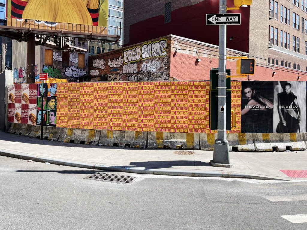
Transit-Adjacent Poster Placements: How to Scout Stations, Stops, and Corridors starts with matching the right streets, surfaces, audience, and campaign timing. Transit stops are foot traffic factories. In cities with functional transit systems, every subway station entrance, every busy bus stop, and every transit transfer node concentrates hundreds or thousands of pedestrians into a small geographic zone at predictable times, in a way that no amount of neighborhood commercial activity can replicate with the same consistency. The approach corridors that feed these nodes — the blocks that pedestrians walk to reach transit every day, on the same routes, at the same times — are among the most reliable poster campaign locations in any urban market.
Transit-adjacent scouting is its own discipline within the broader location scouting process. It requires understanding how pedestrian flow works in and out of transit nodes, how the approach corridors distribute that flow, which walls within those corridors have the sight lines to capture transiting pedestrians, and what the trade-offs are between transit-adjacent placement (high volume, low engagement) and neighborhood placement (lower volume, higher engagement per impression).
This guide covers transit-adjacent scouting in depth: how to identify the approach corridors that generate the most value, how to evaluate walls within those corridors, how transit context shapes campaign selection, and how transit proximity interacts with other location variables to determine placement value.
How Transit Nodes Generate Pedestrian Corridors
Every transit station entrance is a bottleneck where pedestrian traffic concentrates and then disperses. The concentration happens at the entrance itself — everyone passes through this single point. The dispersal happens on the approach corridors — people walk away from the entrance on whatever route takes them toward their destination.
The approach corridors are where poster campaign placements live. The station entrance itself typically has limited poster-placement opportunity (transit authority infrastructure, restricted surfaces, high official signage density). The blocks radiating from the entrance — along the main pedestrian approach routes — are where organic foot traffic is high, wall surfaces exist, and placement opportunity is real.
Mapping Approach Corridors from a Station
For each transit station in your target neighborhood, map the primary approach corridors: the streets that most pedestrians walk to reach the station from the neighborhood. In a gridded city like New York, this is often the two or three streets adjacent to the station entrance that run toward the densely populated or commercially active areas the station serves. In cities with less regular grids, approach corridors may be more varied but are identifiable by tracing the pedestrian path from major residential or commercial blocks to the station entrance.
The primary approach corridors — the routes most people use most of the time — are your highest-priority scouting targets. Secondary corridors generate lower volume but may have better wall surfaces or less competitive campaign activity.
In NYC, the L train’s Bedford Avenue station in Williamsburg (the western terminus of the L in Brooklyn) is one of the busiest station entrances in Brooklyn, with daily ridership estimated at 20,000-25,000+ riders. The approach corridors along North 7th Street, Driggs Avenue, and Bedford Avenue north and south of the entrance collectively handle a significant fraction of that volume. Walls on these corridors are among Williamsburg’s highest-impression placements.
Transit Adjacency Quality Assessment
Not every wall near a transit station has equivalent transit adjacency value. The quality of transit adjacency depends on how many pedestrians actually walk past that wall on transit-related journeys.
Distance from Station Entrance
The highest-concentration zone is within a block of the station entrance — this is where virtually all transit-related pedestrian traffic passes. Beyond 3-4 blocks, the concentration disperses as pedestrians reach their destinations and the traffic profile transitions from transit-approach to general neighborhood. The transit adjacency premium diminishes with distance; walls more than 5-7 minutes’ walk from the station are standard neighborhood locations, not transit-adjacent locations in any meaningful sense.
Direction of Maximum Flow
Transit traffic is predominantly directional at peak hours: morning flow runs toward the station (residents leaving for work), evening flow runs away from it (returning home). A wall that faces the primary approach direction at morning commute time gets maximum transit impression during morning peak but lower transit impression during evening return. Understanding the directional flow and matching it to campaign timing objectives shapes which approach corridors and which wall orientations within those corridors are most valuable.
NYC Transit-Adjacent Scouting: Key Station Corridors
New York’s subway system makes transit-adjacent scouting particularly valuable. The concentrated nature of subway ridership creates some of the highest per-block pedestrian volumes in any US city. Key scouting corridors by creative neighborhood:
L Train Corridor in Williamsburg and Bushwick
The L train’s Williamsburg stations — Bedford Avenue, Lorimer Street, Grand Street, Morgan Avenue — each generate significant approach corridor traffic in the blocks surrounding their entrances. The Morgan Avenue station, which serves Bushwick’s creative core, has strong approach flow along Flushing Avenue, Johnson Avenue, and the cross streets between them toward the Wyckoff Avenue bar and restaurant district. These blocks have both high transit-generated foot traffic and excellent surface inventory — a combination that makes them priority scouting targets for any Bushwick campaign.
J/M/Z Corridor in Williamsburg and Bushwick
The Myrtle-Broadway J/M/Z station at the Williamsburg-Bushwick boundary is a major transit node for both neighborhoods. The approach corridors from this station toward the interior of Bushwick — along Myrtle Avenue and Broadway — have transit-generated foot traffic supplemented by heavy local commercial corridor foot traffic. Walls along these approaches get double-benefit from both traffic sources.
Chicago Transit-Adjacent Scouting
Chicago’s L rail system creates transit adjacency opportunities throughout the creative neighborhoods. The Blue Line’s Damen station (serving Wicker Park) and Logan Square station generate strong approach corridor traffic in the blocks surrounding each entrance. The Damen station approach along Milwaukee Avenue and the Damen-North Avenue intersection area is one of Chicago’s strongest transit-adjacent poster campaign zones.
Transit Adjacency in Transit-Light Cities
In car-dependent cities like Los Angeles, transit adjacency operates differently. LA’s Metro rail system serves some creative neighborhoods — the Gold Line’s Little Tokyo/Arts District station, the Red Line’s Wilshire/Vermont and Vermont/Santa Monica stations near Silver Lake — but transit ridership levels are much lower than in NYC or Chicago, and the pedestrian concentration effect around stations is proportionally smaller.
In LA, bus stop adjacency often matters more than rail station adjacency for poster campaign placements. Heavily used bus lines along major commercial corridors (Sunset Boulevard, Venice Boulevard, Fairfax) generate significant bus stop dwell time that creates high-quality impression opportunities for placements within line of sight of stop positions. Scout for bus stop adjacency in LA with the same methodology you’d use for transit station approaches in NYC — identify the stop locations, map the walking zone around them, and evaluate walls within the primary sight line of the stop.
Transit-Adjacent Scouting in Practice: Market-by-Market Field Notes
AGM’s scouts have mapped transit-adjacent placement opportunities across every major US market and several international cities. The specific patterns differ market by market in ways that affect how you prioritize transit adjacency relative to other scouting criteria.
New York City: The Gold Standard for Transit Adjacency
NYC’s subway system generates the most reliable and consistent pedestrian concentrations of any transit network in the US. Specific station approaches worth knowing: the L train exits at Bedford Avenue in Williamsburg produce the highest-quality transit-adjacent foot traffic in Brooklyn — the sidewalk on Bedford between the station entrance and the first block north and south is consistently above 500 pedestrians per hour during commute windows. Metropolitan Avenue a few blocks east has good foot traffic anchored by the Metropolitan G stop. In Bushwick, the Myrtle-Wyckoff L/M station at Wyckoff Avenue creates a pedestrian concentration that extends 2-3 blocks in all directions — the approach blocks on Wyckoff toward Myrtle and toward Halsey are both strong scouting targets.
On the Lower East Side, the Delancey Street station exits at Essex Street and Delancey generate significant foot traffic that flows onto Orchard Street and Ludlow Street — both strong wheatpaste campaign corridors. Understanding which exit produces which pedestrian flow direction is the key scout intelligence at subway-adjacent locations. The exit closest to a target wall matters as much as the station itself.
Chicago: The L-Anchored Creative Corridors
Chicago’s Blue Line is the creative market’s primary transit spine. The Damen station at Milwaukee Avenue in Wicker Park is Chicago’s equivalent of Bedford Avenue — the station exit produces consistent pedestrian flow onto Milwaukee that extends from Division Street north to North Avenue. Scouting the Milwaukee Avenue corridor should start from the Damen station exit and extend in both directions, noting where foot traffic attenuates as the station’s concentration effect dissipates.
Logan Square’s Blue Line station at the Logan Square intersection produces a different traffic pattern — more radial, spreading from the station in multiple directions along Milwaukee, Logan Boulevard, and Kedzie. The walls near the station within a 2-minute walk in each direction are the highest-traffic transit-adjacent locations in this neighborhood. Pilsen’s access from the Pink Line at 18th Street means the corridor approach from the 18th Street station east and west on 18th Street is the primary transit-adjacent scouting zone in that neighborhood.
London: Tube-Anchored Campaign Corridors
London’s Tube produces exceptionally concentrated pedestrian flows at station exits — the volume of commuters through major stations is high and the exit flow is directed through specific street channels. For Shoreditch campaigns, the Shoreditch High Street Overground station exit flows directly onto Shoreditch High Street and Brick Lane — both primary campaign corridors. Old Street station on the Northern/Circle Line produces flow onto City Road and Old Street toward the creative cluster east of the station. In Brixton, the Victoria Line station at Brixton feeds directly into the Brixton Market zone on Coldharbour Lane and Atlantic Road — both high-value placement corridors with strong transit-adjacent exposure.
Scouting the Approach Zone, Not Just the Wall
Transit-adjacent scouting requires understanding the full pedestrian approach zone, not just the wall immediately adjacent to the station. From years of scouting across 40+ markets, we’ve learned that the 2-minute walk zone around transit stations consistently outperforms the immediate station perimeter for campaign performance — close enough to capture the pedestrian concentration, far enough that the immediate station area clutter (commercial signage, transit authority infrastructure, street furniture) isn’t competing with the placement for visual attention. The 2-4 minute walk zone — roughly 500-1,000 feet from the station exit — is the optimal band for transit-adjacent placements that combine high foot traffic with clean visual territory.
Transit-adjacent placement foot traffic benchmarks from AGM field scouting: Bedford Ave L train (Williamsburg) — 500-800 pedestrians/hour peak commute windows. Myrtle-Wyckoff L/M station approach (Bushwick) — 400-600/hour peak. Damen Blue Line approach Milwaukee Ave (Chicago) — 400-600/hour peak. Shoreditch High Street Overground exit approach — 500-700/hour peak Saturday afternoon. Brixton Victoria Line exit (Coldharbour Lane) — 600-800/hour peak Saturday. All measured within 3-minute walk zone of station exits.
The case for transit-adjacent placements is ultimately a case for consistent, predictable foot traffic. Most poster campaign placements have some variability in their traffic levels — busy weekends, slow weekdays, event-driven spikes and post-event drops. Transit-adjacent locations are the most consistent performers in any market because transit ridership follows reliable patterns day after day. Commuters walk the same route from the station exit to their destination every morning and evening. That repeat exposure creates the frequency that builds brand memory over a campaign’s run — and it’s predictable enough to model accurately during campaign planning rather than discovered after installation. We’ve scouted enough transit-adjacent locations across 40+ markets to confirm that when you need reliability in addition to volume, transit-adjacent placements are the strongest single location category in any market that has meaningful transit ridership.
One caution with transit-adjacent walls: the immediate station mouth is not automatically the best placement. Too close to the entrance and the wall competes with wayfinding signs, buses, kiosks, and people checking phones as they exit. The stronger play is usually the first clean stretch of wall after the pedestrian flow has settled into a walking rhythm and the sight line opens up.
That is why our scouts pace the 2-4 minute walk band so carefully. It is often where you get the best combination of station-generated traffic, readable approach distance, and cleaner visual context. In markets like Williamsburg, Wicker Park, and Brixton, those bands consistently outperform the cluttered first 30 seconds outside the station.
The same logic applies to bus-heavy markets. The strongest bus-adjacent walls are usually just beyond the stop, where the rider’s eye line settles and the wall gets a clean read instead of fighting the shelter, route signage, and vehicle movement.
Readability beats raw proximity every time.
That small difference in placement position changes campaign performance more than most first-time scouts expect.
Why Some Busy Areas Still Underperform
Traffic review should answer more than whether a street feels busy. For transit-adjacent poster placements, the stronger question is whether the audience has a reason to notice the surface at the exact moment the poster is in view. Some blocks are full of movement but almost no attention because people are crossing fast, turning corners, or focusing on transit timing rather than the wall. Other blocks have slightly less volume but better pause points, clearer sightlines, and more repeat exposure, which often makes them the better buy.
That is why scouts who measure route quality usually note queue lines, corner turns, station exits, bike flow, late-night spillout, and how the wall reads from both directions of travel. Those details make the recommendation more credible because they explain not just where the people are, but why the placement should actually work.
Final Route Review Before the Campaign Goes Live
Before a team locks transit-adjacent poster placements, the final review should force every recommended location to answer the same set of questions. Does the audience fit the campaign goal, does the wall read clearly from the direction people actually travel, does the timing window match when the crowd is there, and does the route still make sense once crew movement and documentation time are accounted for? That last review is where weak locations usually fall away. It is also where stronger routes become easier to defend because every stop has a specific reason for being there.
That review should also account for what happens after installation. Some locations look strong on scout day but create unnecessary maintenance, replacement, or reporting friction once the campaign is active. Others are easier to service, easier to document, and more likely to stay visually clean for the full run. When those operational details are weighed alongside visibility, the final plan gets better. It stops being a list of interesting walls and becomes a route that the client can approve with confidence and the field team can execute without improvising half the job in real time.
Frequently Asked Questions
What makes transit-adjacent placements valuable for poster campaigns?
Transit adjacency concentrates large volumes of pedestrian traffic into predictable, repeatable patterns. Commuters using the same transit stops and approach corridors daily create high repeat-exposure opportunities. The concentration of foot traffic at transit entry and exit points is often higher per square foot of sidewalk than anywhere else in a city.
How close to a transit station should you scout for placements?
The primary high-value zone is within a 3-4 block radius of the station entrance, along the main pedestrian approach routes. A 5-7 minute walking radius captures the majority of station-related pedestrian traffic on the approach corridors. Beyond that, the density advantage of transit adjacency diminishes and you’re back to standard neighborhood foot traffic assessment.
Are transit station approach corridors the same in every city?
No. The approach corridor profile depends on the station’s location and surrounding street grid. Stations in commercial neighborhoods have approach corridors through retail and restaurant strips. Stations in residential neighborhoods have approach corridors through quieter streets. Stations at major intersections have multi-directional approach patterns that distribute traffic across more corridors.
How do bus stop adjacencies compare to subway station adjacencies?
Bus stops generate localized dwell time — people waiting for the bus are stationary and have more time to view nearby campaign materials than pedestrians in transit. The audience volume at individual bus stops is much lower than at major subway stations, but the engagement quality per impression is higher due to extended dwell time. Bus-adjacent placements work best within 20-30 feet of the stop.
Does transit adjacency help with any type of campaign, or mainly specific types?
Transit adjacency primarily benefits campaigns that need reach and frequency — awareness campaigns, event promotions, brand launches. It’s less effective for campaigns requiring high engagement or demographic precision, since transit audiences are diverse and in low-engagement transit mode. For precision-targeted campaigns, transit adjacency should be supplemented with placement in the target demographic’s neighborhood environment.