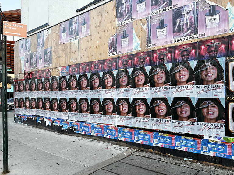
Getting the format wrong is one of the most preventable mistakes in any wheatpaste campaign — and it’s a mistake that’s easier to make when you’re working across a time zone and managing print production in a city you’re not physically in. A file submitted at the wrong resolution or in the wrong color mode is a problem you discover when the photos come back from the overnight crew, not before.
This guide covers the format decisions that actually matter for Mexico City wheatpaste campaigns: sizes that work on CDMX walls, paper stocks that hold up on those surfaces, file specifications that Mexico City print shops need, and design considerations that translate to the specific visual environment of the city’s streets.
Standard Sizes for Mexico City Campaigns
Mexico City’s print industry operates across a mix of metric and imperial sizing conventions, with significant US influence in the advertising print sector. The formats most commonly used for wheatpaste campaigns:
| Format Name |
Dimensions (inches) |
Dimensions (cm) |
Best Use |
| Standard poster |
24×36 |
61×91 |
Most campaigns — the default format |
| Large portrait |
36×48 |
91×122 |
Artist/subject photos, high-impact placement |
| Extra large |
48×72 |
122×183 |
Major releases, premium wall sites |
| European A1 |
23.4×33.1 |
59×84 |
Film distributors using European assets |
| Movie one-sheet equivalent |
27×40 |
69×102 |
Film campaigns using standard one-sheet art |
| 4-sheet grid (assembled) |
~96×48 assembled |
~244×122 assembled |
Billboard-scale installations, major releases |
Paper Stock: What Bonds and What Doesn’t
This is where campaigns frequently go wrong when brands with no prior wheatpaste experience make their own print specifications. The paper stock for a wheatpaste campaign is not the same as the paper for a gallery print, a trade show display, or a retail poster. Those applications use coated or glossy stocks that look great and hold ink with high fidelity. Those materials are among the worst possible choices for wheatpasting.
Why coated stock fails on CDMX walls: Paste adhesion requires the paper to absorb some of the moisture from the adhesive and develop a bond through that moisture exchange. Coated and glossy papers have sealed surfaces that don’t absorb moisture — paste slides around on them rather than bonding, the paper curls as it dries, and the finished installation lifts and peels much more quickly than on absorbent stock.
What actually works:
- Uncoated newsprint (60-80 gsm): The classic wheatpaste surface. Absorbs paste readily, bonds quickly, holds well on rough masonry, and is the most cost-effective option for large print runs. The tradeoff is lower ink density and some show-through from the paste sealing coat — this is normal and expected.
- Uncoated offset paper (80-100 gsm): Slightly heavier than newsprint, with better ink density and slightly less show-through. A small cost premium over newsprint for a noticeably crisper print result. Recommended for campaigns with photography or gradient-heavy design elements.
- Uncoated bond paper (90-120 gsm): Heavier still, handles more carefully, more expensive per sheet. Used for premium campaigns or oversized formats where the additional weight helps the poster lie flat during application.
A note on rainy season: Mexico City’s rainy season runs roughly May through September, with afternoon/evening storms common. In rainy conditions, even well-bonded uncoated paper can be compromised by water exposure before the paste fully cures. Operators who work through the rainy season select wall locations with overhead protection — building overhangs, covered corridors, north-facing walls away from direct rain exposure.
File Specifications for Mexico City Print Shops
Mexico City’s professional print shops that handle campaign work are fully equipped for digital pre-press at commercial standards. The specifications they need are the same as any professional print facility anywhere:
- File format: PDF (preferred) or TIFF. InDesign package files or working PSD files can be submitted to shops that have Adobesuite, but a flattened PDF or TIFF eliminates font and link dependency issues.
- Color mode: CMYK. RGB files will be converted during pre-press, but color shift is inevitable. For brand-critical colors, provide Pantone Coated references alongside the CMYK breakdown. This is especially important for brand logos and identity elements where exact color matching matters.
- Resolution: Minimum 150 DPI at final output size. 300 DPI preferred for any photographic content. For posterize-style or flat graphic designs with no photography, 150 DPI is adequate. If the design contains photography at lower resolution, the result will show pixelation at poster scale.
- Bleed: 0.25 inch (6mm) bleed on all sides. This allows for minor variation in cutting without leaving white edges. For formats printed edge-to-edge, this is essential.
- Fonts: All fonts outlined or embedded in the file. Missing fonts default to system substitutes, which will change your typography completely.
The two most common file problems that delay production: RGB color mode (easy fix but requires a pre-press conversation about color) and insufficient resolution on photographic elements (often not fixable without going back to the original image file). Catch both before submitting.
Design Principles for Mexico City Walls
The street visual environment of Mexico City — particularly in zones like Centro Histórico and Doctores — is extremely dense. Murals, commercial signage, other posters, graffiti, shop displays, and street vendor layouts create a layered visual field. Your poster needs to cut through that field to register.
Design principles that consistently work in CDMX street environments:
High contrast: Black on white, white on black, or strong complementary color contrast. Mid-tone designs with subtle color differences don’t read well at distance in busy visual environments. If your brand guidelines allow for it, maximizing contrast in the campaign version of your artwork pays off on the street.
Large, legible type: The key message — artist name, film title, album name, brand name — should be readable from 10+ meters. At 24×36 inches, text set at 100pt or larger is readable at that distance. Smaller body text, fine details, and complex information become unreadable at street distances and on textured surfaces.
Minimal information hierarchy: Street posters work best with one primary visual message and one or two secondary elements. A concert poster that tries to communicate: artist name, album title, tour date, venue, ticket price, website URL, streaming platform, and social handle will communicate nothing effectively because no element dominates. Ruthlessly reduce to what matters.
Image over text when possible: A strong, recognizable image — artist face, film still, product shot — anchors the poster visually and communicates faster than text. The text supplements what the image establishes. In a city with a strong visual street art tradition like Mexico City, image-led posters tend to perform better than text-heavy designs.
Multi-Sheet Grid Installations: When and How
Multi-sheet grids are used for major releases that want billboard-scale impact at specific high-value locations. They’re not appropriate for every campaign or every location — but when the conditions are right, a 4-sheet or 6-sheet installation on a large blank wall in Roma Norte or Centro Histórico creates a street presence that’s visible from a block away.
The operational requirements for multi-sheet grids:
- The target wall must have sufficient unobstructed surface area — a typical 4-sheet grid at 24×36 standard size covers approximately 48×72 inches assembled, so the wall needs to be at least that large plus margin
- Experienced crew is needed for sheet alignment — sheets applied crooked or misregistered undermine the visual impact entirely
- Surfaces need to be flat and consistent — rough, uneven walls that work fine for single-sheet posting can cause alignment problems for multi-sheet grids
Format Selection by Campaign Type and Colonia
For Roma Norte and Condesa campaigns, the 24×36-inch format (portrait orientation) is the most versatile. This size works on the side walls of mixed-use buildings, on commercial storefronts with appropriate blank sections, and on construction hoardings. It’s visible from a pedestrian at normal walking distance — close enough that text at 2-inch type can be read, far enough that it registers as a billboard rather than a flyer.
The 18×24-inch format is useful for campaigns that need to place in tighter locations — doorway-adjacent walls, short blank sections between storefront windows, or secondary placements supplementing a primary large-format campaign. It’s also appropriate for dense tiling: an 18×24 grid of 4 or 6 posters can create a visual presence equivalent to a single large-format placement, but with the flexibility to build around obstacles on the wall surface.
Large format — 36×48 or 48×72 — works where the wall supports it. Roma Norte has several blank building side walls that can accommodate these sizes. From our experience running campaigns in Mexico City, large-format placements in Roma Norte generate disproportionate social media pickup compared to their proportion of the campaign — a single large poster on a prominent wall on Álvaro Obregón will appear in more user photographs than 10 standard-size posters on residential side streets.
AGM’s field team has run print production for CDMX campaigns at local Mexico City print vendors for multiple years. Current (2026) production pricing for 200 sheets of 24×36-inch campaign stock runs approximately $280 to $450 USD including delivery to the operator. Local production eliminates international shipping delays and typically allows tighter turnaround than shipping printed material from the US.
Print Production in Mexico City: What to Know
Mexico City has a well-developed commercial print industry, and production quality for wheatpaste campaign stock is reliable at the vendors our operators use. The standard stock for CDMX wheatpaste campaigns is uncoated newsprint or a slightly heavier uncoated sheet in the 50 to 70 gram per square meter range. This weight holds paste adhesion well, conforms to wall surface irregularities during application, and allows the paste to saturate the paper adequately for a strong bond.
Coated stocks — glossy or semi-gloss — are a problem for wheatpaste application. Paste doesn’t bond as well to coated surfaces, and the poster is more likely to peel or wrinkle during application. We consistently advise clients against using coated stock for wheatpaste campaigns regardless of how the finished poster looks in the digital proof. What looks premium on screen becomes a logistics problem on the wall.
Color output from Mexico City’s commercial print vendors is generally accurate for standard CMYK process printing. If a campaign has Pantone-matched brand colors that must be maintained, we recommend requesting a physical proof before the full run, since the Pantone-to-CMYK conversion on local equipment can vary from vendor to vendor. For campaigns where exact color fidelity is non-negotiable, we also have the option of shipping a reference print from a US color-calibrated vendor and using it as the press standard for the local print run.
Turnaround for a standard CDMX print run is 48 to 72 hours from file receipt. Rush runs (24 hours) are possible at most vendors but carry a 25 to 40% premium. We recommend building 72 hours of print buffer into campaign timelines to avoid paying rush premiums unnecessarily. Files should be submitted as high-resolution PDFs (300 DPI minimum at final print size, CMYK color mode, bleed and trim marks included) for clean output without operator intervention at the vendor.
Multi-Sheet Grids: When to Use Them
A multi-sheet poster grid — where a single large image is printed across several individual sheets that are pasted in a grid pattern on the wall — creates the visual impact of a large-format placement on a wall that wouldn’t support a single large-format sheet. This technique is common in New York and Los Angeles street campaigns, and it transfers directly to Mexico City’s building stock.
The practical minimum for a meaningful multi-sheet grid in CDMX is a 2×3 configuration (2 sheets wide, 3 sheets tall) using 24×36-inch sheets — creating a total display area of 48×108 inches. This is a genuinely large format that commands attention from pedestrian distance. A 3×4 configuration using the same sheet size creates a 72×144-inch display that approaches billboard scale.
Multi-sheet grids require more skilled application than single-sheet placements. Sheet alignment across the grid is critical — even a few centimeters of misalignment at each seam creates a visual distraction that disrupts the image read. Our CDMX operators who execute multi-sheet campaigns practice the alignment sequence before each execution night, and the crew for a multi-sheet campaign typically includes one additional person whose sole role is checking alignment as sheets go up.
The right walls for multi-sheet grids in Mexico City are large, flat, blank surfaces without obstructions — no windows, drainpipes, protruding architectural elements, or utility boxes in the field. These surfaces exist in every colonia but need to be specifically scouted and preapproved for this application. Our operator wall inventory database notes which locations support multi-sheet formats, saving the scouting time on campaigns where this format is specified.
How to Pick a Format That Works on Real CDMX Walls
The pages that rank for poster format terms usually combine design and operations. That is what buyers need. A poster size is not just an aesthetic choice. In Mexico City it affects where the piece can go, how fast it installs, how it reads on the street, and what the print bill looks like.
Some campaigns benefit from one dependable standard size because it simplifies printing and routing. Others need a mixed-format approach so the operator can use both compact surfaces and bigger walls efficiently. The useful question is not just what the most common format is. It is what format best fits the campaign objective and route conditions.
- Choose size based on route type, wall availability, and viewing distance instead of defaulting to one house standard.
- Use paper and ink specs that bond well and stay legible overnight.
- Design for modularity if the campaign may shift between smaller walls and larger hero surfaces.
- Confirm bleed, resolution, and file setup before sending art to a local printer.
A search-aligned article on this topic should make creative approval easier. If the reader can leave knowing what size family to print and what production mistakes to avoid, the page is matching intent.
The bottom line for planners is simple: treat best poster formats for wheatpasting in mexico city as a campaign decision with tradeoffs, not as a generic city talking point. The campaigns that usually perform best in CDMX define the audience, route logic, reporting standard, and creative threshold before the first sheet goes to print.
That is also why the best briefs stay specific about neighborhoods, install timing, and proof of posting. In Mexico City, clarity before execution usually matters more than chasing a bigger poster count after the fact.
Frequently Asked Questions
What is the best poster size for wheatpasting in Mexico City?
The most common and most versatile format for Mexico City wheatpaste campaigns is 24×36 inches (approximately 61x91cm). It’s large enough to read clearly from across the street, fits on most available wall surfaces, and is the standard size that Mexico City print shops produce efficiently. Larger formats (36×48 and above) work well for high-impact placements where the wall dimensions support them.
What paper stock should be used for Mexico City wheatpaste campaigns?
What file format and resolution should I submit for Mexico City wheatpaste printing?
Submit PDF or TIFF files. CMYK color mode, minimum 150 DPI at output size (300 DPI preferred for photography-heavy designs), 0.25 inch bleed on all sides, all fonts outlined or embedded. RGB files can be converted but color shift is possible — provide Pantone references for brand-critical colors.
Can I use a multi-sheet poster grid format for Mexico City wheatpaste campaigns?
Does poster design need to be different for Mexico City compared to US markets?
The fundamental principles are the same: high contrast, bold type, readable at distance. Mexico City-specific adaptations include using Spanish-language copy if targeting the local market, ensuring opening dates and venue names reflect the Mexican market context, and considering that CDMX walls are visually busier on average — designs that cut through high visual noise perform better.