
June 17, 2026
Why events fit this format: sidewalk stencils work best when there is a known destination, a tight time window, and a crowd already moving through the area. Events give you all three.
If there is one place sidewalk stencil advertising makes immediate sense, it’s events. The audience is already traveling toward a time-sensitive destination. Attention is already heightened. The physical path into the experience is often as important as the experience itself. That is exactly where sidewalk media becomes useful instead of ornamental.
For concerts, festivals, pop-ups, nightlife programs, and branded activations, the goal is rarely to deliver a full story. The goal is to create a visible trail, raise anticipation, and make the event feel larger than its actual footprint. Sidewalk stencils are good at that because they turn the journey into part of the campaign.
Event marketing is about compression. The audience is concentrated. The timing is compressed. The attention window is compressed. A medium that lives directly in the path of the audience and performs best during a short window is naturally aligned with that kind of work.
This is especially true when the venue itself isn’t perfectly visible or when multiple entrances, afterparties, sponsor zones, or check-in points create route friction. A few well-placed sidewalk stencils can reduce confusion and increase brand presence at the same time.
Concert campaigns benefit from sidewalk stencils because nightlife audiences are already highly mobile and highly visual. A route from transit exits to a venue, from parking clusters to an afterparty, or from one nightlife corridor into another can be turned into brand-bearing direction rather than simple wayfinding. That makes the event feel more alive before anyone enters the door.
Music also has the right cultural fit for the medium. The ground-level, in-the-street quality of sidewalk messaging doesn’t feel out of place. It feels like part of the event ecosystem.
Festivals and conventions often have the opposite problem of nightlife. They aren’t mysterious enough; they are complicated. Multiple gates, multiple halls, sponsor villages, side programming, and overflow traffic create wayfinding problems that brands can help solve while also gaining visibility.
In these cases, the best sidewalk stencil campaigns don’t over-brand every step. They blend navigation and sponsorship. They help people get somewhere and make the sponsoring name easier to remember because it was tied to the movement.
Pop-ups are often built in borrowed or temporary spaces that need more street energy around them than the location naturally has. Sidewalk stencils help create that sense of pull. They can announce the activation from nearby intersections, pull people off stronger corridors, or reinforce the idea that something is happening just ahead.
For brand activations, they work best when they are one layer inside a bigger field operation, sampling, signage, projection, staffing, or on-site content capture. The sidewalk doesn’t need to carry the whole brand activation. It just needs to help the activation extend beyond its own walls.
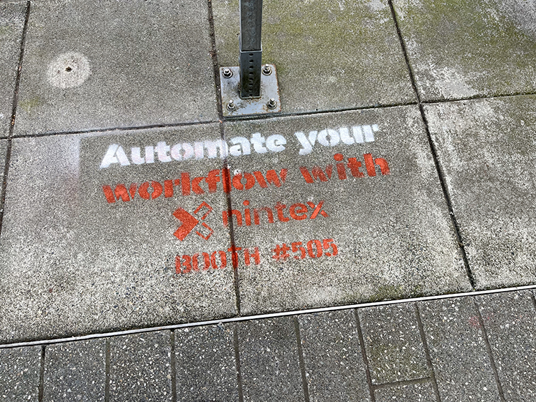
Short copy wins. Arrows, dates, venue names, sponsor names, “this way,” “tonight,” “2 blocks,” “enter here,” simple iconography, and compact branding all outperform long copy. The audience is walking, not reading a brochure. The strongest event stencil campaigns understand that every extra word is a chance to lose comprehension.
Timing should work backward from peak arrival. For a Friday night show, the cleanest visibility should exist on Friday night. For a weekend festival, freshness should align with the first major crowd wave. Installing too early wastes the strongest part of the format on hours that don’t matter.
This is one reason event buyers like sidewalk stencils: they can feel immediate. They don’t look like infrastructure. They look like the city is participating in the moment.
The most common mistake is treating an event route like a generic awareness campaign. The second is over-copying the pavement. The third is placing the media too far from the event footprint to influence real movement. Another mistake is using stencils when the route needs a longer hold than the medium naturally wants to give.
Event street media works when it behaves like event media, urgent, route-aware, and close to the moment. It fails when people ask it to behave like a permanent sign system.
If the event runs for a longer period, if the ground graphics need to stay sharp through days of traffic, or if sponsor standards demand a more polished finish, decals may be the better choice. Official AGM sidewalk decal pricing starts at $2,904 for 5. Stencils are strongest for short, lively windows. Decals are stronger for controlled, longer, more uniform campaigns.
For brands running concerts, festivals, pop-ups, and activations, the right answer is often not whether sidewalk media works. It’s which sidewalk medium fits the event best. AGM’s event stencil campaigns are built around that choice from the start.
In a real sidewalk stencil advertising for events concerts, festivals, pop-ups, and brand activations campaign, in practice, this kind of content should help a brand decide where the tactic belongs inside a larger campaign, not treat it like an isolated object. In a real sidewalk stencil advertising. In a real sidewalk stencil advertising. In a real sidewalk stencil advertising.
In a real sidewalk stencil advertising. In a real sidewalk stencil advertising.
These live internal links connect the post to AGM service pages and adjacent campaign formats that a reader would naturally want next.
A cleaner version of Sidewalk Stencil Advertising for Events: Concerts, Festivals, Pop-Ups, and Brand Activations starts with one business objective that can be described in a sentence. That objective might be walk-ins, event attendance, trial, signups, retail support, or launch awareness, but it needs to be specific enough that the rest of the campaign can organize itself around it. When the objective is vague, the route plan gets fuzzy, the creative tries to do too many jobs at once, and the post-campaign review turns into guesswork.
Once the objective is specific, the rest of the planning process becomes easier to evaluate. The team can judge whether the market is concentrated enough, whether the format is doing the right kind of work, and whether the response path is realistic for the audience being targeted. That discipline usually creates better performance than simply making the campaign louder.
Street-level campaigns perform differently depending on density, route flow, timing, and neighborhood behavior. A tactic that works beautifully in a high-footfall district can feel wasted in a market where the audience is too dispersed or where the timing window is poorly matched to the campaign. That is why market selection should be treated like a strategic choice, not just a backdrop for the creative.
Good planning usually narrows the map before it widens the budget. By choosing the strongest routes, pinch points, venue zones, or commuter corridors first, the team gives the campaign a better chance to create repetition and recall. That kind of focus often matters more than adding extra territory that the media cannot realistically dominate.
A campaign route is not just a list of placements. It is the sequence in which the audience encounters the message and the environment around each encounter. Strong route logic accounts for where people start, where they pause, what else competes for their attention, and whether the creative has enough time to register. When those factors line up, the audience experiences the campaign as a coordinated presence rather than a random scattering of media.
That same route logic also helps with reporting. Instead of treating the campaign as one vague visibility effort, the brand can compare how different segments of the route performed. That makes it easier to adjust geography, timing, staffing, and media mix the next time the campaign goes live.
Creative for street campaigns has to communicate faster than most digital creative because the audience is often moving. The message needs to read quickly, the hierarchy needs to be obvious, and the visual needs to hold up against the clutter of the surrounding environment. Campaigns that work in a mockup but ignore those realities usually lose their edge once they are out in the real world.
That does not mean public-space creative has to be boring. It means the concept has to respect the way people actually encounter it. Cleaner copy, stronger contrast, and one clear next step usually outperform crowded layouts that ask too much from a passerby in two seconds.
A strong campaign gives the audience a next move that matches the objective. If the goal is attendance, the response path should help people register or show up. If the goal is store traffic, the message should support that behavior directly. If the goal is lead capture, the handoff needs to be light enough that a person can complete it while standing, walking, or deciding quickly in a noisy environment.
The response path also makes the campaign easier to measure. QR codes, short URLs, market-specific offers, event prompts, and other simple mechanics can create usable signals without overcomplicating the creative. The key is choosing one path that belongs to the campaign instead of adding several competing asks.
Execution quality can change the result even when the concept is solid. Production timing, field coordination, installation logic, documentation, maintenance expectations, and removal planning all shape whether the campaign feels intentional or sloppy. A good strategy can still underperform if the operation behind it is rushed or loosely managed.
That is why operational planning should happen alongside the creative, not after it. When the build, route, and documentation plans are aligned early, the team can avoid unnecessary surprises and protect the parts of the campaign that actually create value in market.
Not every street campaign should be judged by the same scoreboard. Some are built for traffic, some for trial, some for visibility, and some for awareness that supports a larger launch. The useful question is not whether every campaign creates the same metric, but whether the campaign created the metric that was appropriate for its job.
That perspective gives the brand a much better post-campaign review. It becomes possible to compare response behavior, route strength, timing windows, and creative performance instead of flattening everything into one simplistic success measure. Better measurement usually leads to better planning on the next round.
Documentation is more than proof that the work went live. It is the record that lets the team learn from the campaign after the field work is over. Good documentation captures route coverage, timestamps, placement condition, local context, response behavior, and any surprises that changed the execution once the work met the street.
That kind of record is especially useful when the campaign needs to be repeated or expanded. It helps future planners see which decisions were strong, which ones need to be revised, and which parts of the market created the best return relative to effort and spend.
The best campaigns usually begin with a brief that is narrow enough to force decisions. It should define the audience, market, timing, objective, response path, and the practical limits of the tactic. When those basics are clear, the campaign team is less likely to waste money on the wrong placements, the wrong message length, or a response mechanic that does not fit the setting.
A better brief also improves collaboration. Designers, field teams, project managers, and clients are working from the same plan instead of separate assumptions. That alignment often matters more than one extra production flourish because it keeps the whole campaign pointed at the same outcome.
Many campaigns weaken themselves by trying to cover too much ground too quickly. A scattered rollout can look ambitious, but it often leaves the audience with only a brief impression instead of the repeated contact that makes street media effective. Stronger planning usually chooses focus over sprawl and repetition over thin coverage.
That does not mean thinking small. It means concentrating enough visibility in the right places that the campaign has a chance to feel dominant for the audience that matters most. Once that works, expansion decisions become smarter because they are built on evidence rather than optimism.
The value of a campaign should not end when the photos are delivered. A good launch should leave the brand knowing more about which routes converted, which visuals held attention, which timing windows mattered, and what type of public interaction actually moved people to act. Those lessons are what make the next campaign better than the first one.
When a post helps readers think in those terms, it becomes more useful than a simple list of ideas. It becomes a planning asset that can guide budget allocation, field execution, creative revisions, and future market choices with much more confidence.
From a site structure standpoint, the article becomes more useful when it is connected to the service pages and adjacent campaign formats that explain the tactics in more operational detail. That gives readers a clear next step and helps search engines understand that the post belongs inside a broader cluster of related campaign knowledge.
A clean internal linking structure also reduces the chance that the draft becomes an orphan after publication. When each article points to live service hubs and related format pages, the site builds a stronger topical network and gives both users and crawlers a more coherent path through the content.
Before a campaign goes live, it helps to pressure-test the plan against simple questions: is the market concentrated enough, is the message readable at speed, is the route realistic, is the handoff obvious, and will the documentation be good enough to learn from afterward? Those questions sound basic, but they usually surface the weak points that are easiest to fix before spend is committed.
That last round of pressure-testing also helps separate a campaign that merely sounds exciting from one that is actually prepared for the market it is entering. In practice, that discipline is what keeps creative energy tied to a workable execution plan.
A useful article should help a reader make a better decision after the reading is over, not just leave them with more examples in their head. In practice that means clarifying which market conditions make sense, which route assumptions need to be tested, and what kind of campaign objective should govern the tactic before any budget is locked in. The clearer those planning questions become, the more useful the article becomes to a real team.
That broader planning value also helps the post earn its place inside the site. When a draft gives readers a realistic framework for choosing tactics, geography, timing, and response mechanics, it naturally supports the surrounding service pages instead of floating as an isolated content asset.
Most preventable campaign mistakes appear before fabrication or fieldwork ever start. They show up in overlong copy, muddy objectives, weak route concentration, or a response path that does not match what the audience can realistically do in the moment. Tightening those decisions early usually improves results more than adding another visual flourish late in the process.
That is why stronger planners spend time simplifying before launch. They cut what is not helping, strengthen what must be noticed immediately, and make sure the public-facing message fits the environment it is entering. Cleaner execution almost always feels more premium than busier execution.
Because events already create concentrated pedestrian movement and a tight timing window. Sidewalk stencils use that movement to create repeated visibility, direction, and atmosphere close to the destination.
Yes. They fit the cultural tone of music and nightlife well and can help guide people from transit exits, parking areas, and nightlife corridors toward venues or afterparties.
Short directional and brand-forward copy works best: arrows, venue names, dates, sponsor names, and simple cues like “this way” or “2 blocks.” Long copy usually fails at foot speed.
As close as practical to the key arrival window. The value of the format comes from freshness, so the best installs are timed to the moment the crowd actually matters.
When the graphics need to hold longer, look more uniform, or survive several days of heavy traffic with a more polished finish. Decals are better for longer and more controlled event windows.
American Guerrilla Marketing builds sidewalk stencil and sidewalk decal campaigns for concerts, festivals, pop-ups, and branded activations nationwide.
Justin Phillips is the founder of American Guerrilla Marketing, a...
About the AuthorReady to Run Your Campaign?
Call us or email us. We’ll tell you exactly what we can do in your market and what it costs.
American Guerrilla Marketing — Los Angeles
Street-level campaigns in Los Angeles and nationwide. Wheatpasting, LED trucks, street teams, and more.
(646) 776-2770
June 17, 2026
June 17, 2026
June 17, 2026
June 17, 2026
June 17, 2026