
January 12, 2026 Wild Wheat Paste Posting Posting and Wheatpasting
A wheatpasted poster behaves differently than a billboard. It does not sit above the street, it lives on it. Paper meets brick, plywood, and construction fencing at the same height as people’s faces and phones. That physical closeness is why wheat paste posting can feel so loud in a busy city and strangely quiet just a few blocks away.
In high-traffic areas, the street itself becomes the distribution system. Every commute, bar hop, school run, and lunchtime loop pulls new eyes past the same surfaces. When placement is intentional, wild posting starts to stack up into something bigger than “one poster on one wall.” It becomes a repeating visual cue woven into daily movement.
High foot traffic marketing is often described as “more impressions,” and that is true, but it is not the full story. Foot traffic in cities has rhythm. It surges, compresses, pauses, and repeats. Wheat paste posting thrives when it is placed inside that rhythm, where people naturally slow down or pass through again and again.
A poster on a quiet side street might get a clean view, yet it rarely gets repeated exposure. In a bustling corridor, people do not just see a message once. They see it Monday morning, again Tuesday night, again on Saturday after brunch, and again when a friend points it out.
After a paragraph like that, the advantages sound simple:
That repeat cycle is where pedestrian exposure advertising becomes powerful. It is less like a one-time announcement and more like a chorus that keeps returning.
The best city poster placement is not always where people move fastest. It is where motion briefly turns into waiting. Think about the spots where you can feel the street “bunch up.” Those are dwell zones, and they are prime real estate for wheatpasting campaigns.
A few classic dwell triggers show up in almost every major city:
When pedestrians stop, even for ten seconds, their scanning behavior changes. They look around. They read more. They notice layering and texture. Wheatpaste is perfect for this because it holds detail well at close range, and it rewards a second glance. A sharp headline hits immediately, and the smaller information, a date, a URL, a QR code, lands during that extra second.
This is also why a wall that seems “too close” to the sidewalk can outperform a wall that seems “more visible” from across the street. Wheatpaste wins at human distance.
Commuters create repetition at scale. A commuter route is not just one crowd, it is the same crowd returning on a schedule. That matters because recall is built through frequency, not a single perfect view.
Picture a typical downtown morning: people exit a station, funnel onto a narrow sidewalk, then split at the next intersection toward office buildings. If a campaign hits the station-adjacent corridor, then repeats again at the intersection where the crowd divides, the poster becomes a sequence, almost like wayfinding. The message does not need a long read. It needs to show up again before the first sighting fades.
This is where outdoor brand visibility starts to feel inevitable. When the same creative appears at eye level along a path someone walks five days a week, it becomes familiar fast. That familiarity is often the difference between “I saw something” and “I know what that is.”
Transit corridors are a special kind of busy. They mix speed and pauses: fast walking on the approach, then slowing at stairs, turnstiles, and corners. They also mix audiences. Office workers, students, tourists, and service staff share the same passageways, often within the same hour.
In places like Times Square, pedestrian volumes can reach the hundreds of thousands in a day, which shows the ceiling of what high-traffic environments can offer. Even outside headline neighborhoods, station areas act like magnets because they pull people to specific exits and corners. A single well-chosen wall can catch an incoming stream in the morning and an outgoing stream at night.
Good wild posting in transit areas respects sightlines. Posters placed too low get blocked by bodies. Posters placed too high lose readability. The sweet spot is where the average person’s gaze naturally lands while walking, waiting, or checking a phone.
Nightlife is not only high volume. It is high interaction. People stroll, not march. They look around. They are already in “what’s going on tonight?” mode, which is exactly the mindset many posters want.
In bar districts and entertainment strips, poster saturation strategy can work incredibly well because the street is walked in loops. People bounce from one venue to the next, cross the same corner multiple times, and wait outside doors. A cluster on a construction fence near a popular intersection can become the backdrop for photos all weekend.
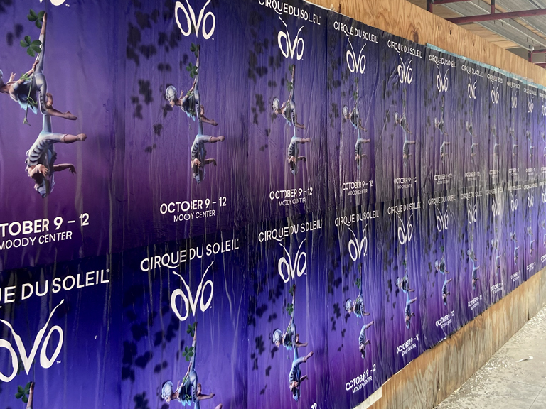
Nightlife also adds a second layer: the social echo. A strong paste-up gets photographed, sent in group chats, posted to stories, and re-shared with a location tag. That is not an accident. It happens when the poster feels native to wild posting culture, visually bold, slightly gritty, and confident enough to sit among layers of other paper.
In urban guerrilla marketing, the myth is that it is all instinct. Walk around, find a wall, put up paper, hope for the best. That approach wastes money and prints.
American Guerrilla Marketing approaches wheatpaste posting like street-level media planning. The “wall” is not the unit. The unit is exposure, shaped by foot traffic patterns, dwell time, and repetition. The team looks at how pedestrians actually move: where they funnel, where they pause, what they face while waiting, and what they pass again on the return trip.
After a paragraph like that, the criteria become concrete:
That planning mindset is what separates “posting” from a real wheatpasting campaign. It is also why high-traffic areas reward professionals. Busy streets punish random placement because there is too much visual noise. Intentional placement cuts through it.
High-traffic environments are not all the same. One block can be a sprint; the next block can be a slow crawl. Mapping a city for street poster visibility means matching creative and density to the way people use that area.
Here is a grounded framework that often shows up in strong high foot traffic marketing plans:
| Urban area type | Pedestrian rhythm | What creates dwell time | What tends to work |
|---|---|---|---|
| Transit exits and transfer corridors | Fast approach, then pause | Stairs, turnstiles, bus bays, crosswalk waits | Bold headline, minimal copy, repeated placements nearby |
| Commuter arterials (downtown grids) | Repeating daily waves | Coffee lines, lunchtime queues, building entry bottlenecks | Frequency across a route, consistent creative, directional feeling |
| Nightlife zones | Slow movement, social wandering | Venue lines, rideshare pickup clusters, sidewalk patios | Dense clusters, high contrast art, photo-friendly compositions |
| Campus-adjacent corridors | Peaks between classes, late-night spillover | Quads, dining halls, corner stores | Timed drops, refreshes, playful or culture-aware messaging |
| Event perimeters | Sudden surges before and after | Gates, security lines, merch stands | Short-run saturation, clear date and call-to-action |
This is the compounding principle in table form: visibility grows when placement matches behavior.
Wheatpaste longevity is rarely measured in months. Weather, cleaning cycles, construction turnover, and competing posters all take their share. In some neighborhoods, a fresh wall gets layered within days. In others, the paper holds for weeks, especially on sheltered surfaces.
That short lifespan is not a flaw. It is a design constraint. In a high-traffic area, even a brief run can be enough because the exposure rate is so high. A poster that lives for ten days near a major station can outperform a poster that lives for sixty days on a low-volume street.
Placement also affects longevity in a practical way. Under an awning, paper lasts longer. In direct sun and wind, it fails faster. On a surface that gets power-washed, it disappears overnight. Knowing these patterns is part of professional execution, not trivia.
One reason wild posting works in cities is cultural. People expect paper. In many neighborhoods, layered posters are part of the visual identity, like murals, stickers, and tags. That expectation changes how advertising is received. A paste-up can feel like an announcement from the street itself, even when it is supporting a brand.
This matters because poster saturation strategy depends on permission from the eye. If density feels out of place, people tune it out or resent it. If density feels like the neighborhood’s normal language, it reads as energy. The wall becomes a collage, and the campaign becomes part of that collage with intention.
When a campaign respects the local visual grammar, it earns a longer look. People are more likely to photograph it. They might even protect it from being torn down, the way they protect street art that feels meaningful. That is not guaranteed, yet it happens more often when the work looks like it belongs.
Imagine a commuter leaving a station. They see one large paste-up at the exit. Two blocks later, they cross at a long light and face a second placement on a plywood barrier. That night, they head to dinner and pass the same intersection from the opposite direction, now noticing the color and tagline again. On Saturday, they are in a nightlife zone and spot the campaign clustered near a popular corner, snapped by someone taking a photo.
That is the compounding effect: not one perfect moment, but many ordinary moments that add up.
American Guerrilla Marketing plans for that accumulation. The goal is not to win a single glance. The goal is to place the message where the city naturally repeats itself, so the poster becomes familiar before the audience realizes it happened.
High-traffic areas can tempt brands to do too much: too many words, too many ideas, too many variations fighting each other. The street is not a quiet gallery. It is a moving environment, and the best wheatpasting campaigns respect that with clarity and repetition.
A smart plan pairs bold creative with smart walls, then uses time and density to build recall. Transit corridors, commuter paths, and nightlife zones each offer a different kind of attention. When walls are chosen through observation and foot traffic logic, not guesswork, wheat paste posting stops being a gamble and starts behaving like a real channel for outdoor brand visibility.
For a customized strategy tailored to your next event, reach out directly at [email protected].