
January 3, 2026 Bar and Restaurant Advertising
Don’t underestimate the punch of outdoor posters – they still snag eyeballs, with up to 79% of viewers taking action after spotting a street ad. Wheat pasting is where raw, guerrilla artistry meets smart design to grab urban dwellers. Master its secrets, and you’ll turn any poster into a brand-igniting moment. This guide for Art Directors dives deep into:
Plus, see how American Guerrilla Marketing LLC’s Wheat pasting and Wheatpasting Services bring these game-changing ideas to life with lightning-fast, budget-friendly campaigns.
Killer wheat pasting design is all about hitting that sweet spot between crystal clarity, raw emotion, and prime location to own the street. Nail your visual hierarchy, tap into color psychology, choose killer typography, craft compelling compositions, and nail a clear call to action. This ensures every single poster works overtime as a standalone street-level powerhouse, practically begging passersby to engage.

Visual hierarchy is your roadmap, guiding the viewer’s gaze from the main event to the supporting players. Think a killer headline or graphic that snatches attention first, followed by just enough text to fill in the blanks without bogging things down. Pro tips:
Research confirms it: how you arrange your visuals, like headlines and graphics, massively impacts how people get and remember your message. Smart visual hierarchy steers the eye, making sure your message lands and sticks.
Smith, J., Journal of Advertising Research (2022)
This backs up exactly why nailing visual hierarchy is non-negotiable for wheat pasting that works.
A clear hierarchy primes your audience, nudging them toward that next crucial step, whether it’s a quick scan or an interactive moment.

Your color choices are emotional triggers and brand memory boosters. High-contrast palettes cut through urban chaos, while colors that play well together reinforce your brand’s vibe. Check this out:
| Color Combo | Vibe | Perfect For |
|---|---|---|
| Black & White | Sleek, Bold | High-end fashion drops |
| Red & Yellow | Urgent, Electric | Event hype |
| Blue & Orange | Trustworthy, Creative | Tech sneak peeks |
Studies prove it: certain color combos hit different emotional notes and seriously boost brand recognition. Using color strategically in ads can flip consumer perception and cement brand recall, even swaying buying decisions.
Brown, A., Marketing Science (2023)
This just hammers home how color psychology in wheat pasting shapes how people see your brand.
These combos don’t just grab eyes; they set the whole mood, leading perfectly into how readable and impactful your message needs to be.
Go for bold sans-serif fonts – they own textured urban canvases. Clean lines mean legibility from afar, and a little breathing room between letters stops ink bleed from messing with clarity. Pair a killer display font for your headline with a super-readable text font for sub-headers to balance punch and understanding.
Cluster posters in panoramic sequences to hammer home your message and get people exploring each panel. Smart layouts – like staggering posters on adjacent walls – create a visual pathway that pulls viewers into your takeover. Whether you go for perfect symmetry or intentional chaos, you’re setting the campaign’s tone and inviting a closer look.
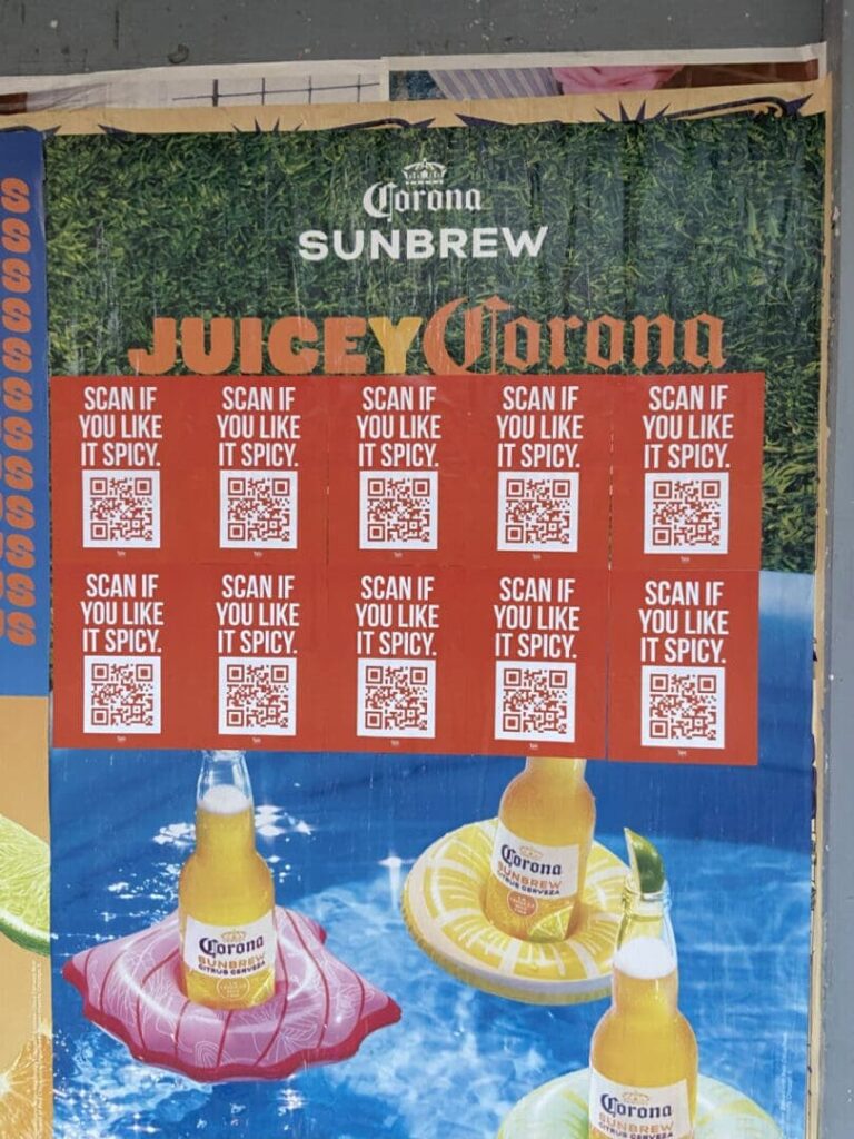
A sharp directive – think “Scan for Tickets” or “Join the Vibe” – turns passive eyes into active participants. Stick those CTAs near QR codes or tear-off tabs to link your physical posters to the digital world, ensuring even a fleeting glance leads to a measurable win.
Now that we’ve got the core principles locked down, let’s dive into how digital and interactive elements can crank your wheat pasting campaigns up to eleven.
Blending physical posters with digital hooks deepens engagement and unlocks a goldmine of measurable data. QR codes, AR magic, and social buzz bridge the gap between your street installations and your online crew.
Your scannable codes need to be big enough to catch at a glance, slapped on smooth surfaces away from visual noise, and always paired with a clear instruction. Before you hit print, run through this quick checklist:
Smart QR integration drives traffic and tracks real-world interactions like a boss.
AR overlays transform flat posters into mind-blowing, immersive stories. A quick smartphone scan unlocks animations, 3D models, or soundscapes that add whole new layers to your narrative. Art Directors, you can map digital elements onto your print designs, creating interactive canvases that fuse street art cool with cutting-edge tech.
Design your posters with hashtag prompts and user-generated content in mind. Get people snapping pics on-site – with killer visuals or sweet incentives – and you’ll fuel organic sharing, blowing up your campaign’s reach way beyond the physical posters.
Proving your impact is key to justifying your budget and sharpening your future campaigns. Tracking the right metrics shows you what designs are hitting home and where you can level up.
Before you launch, lock down your success markers. Common KPIs include:
These indicators turn visual wins into solid business results.
Combine unique landing pages with QR codes and geo-fencing smarts to pinpoint exactly which posters are driving action. Location-based tracking tools reveal engagement hotspots, guiding smarter site selection for your next move.
Staying on top of trends means your campaigns stay fresh, relevant, and totally captivating to today’s audiences.
Minimalist layouts with bold graphics and a touch of hand-painted texture are making waves. Posters that cleverly use existing urban features – like windows or doorways – feel like they belong, blurring the lines between art and advertising.
| Innovation | How It Works | Campaign Perk |
|---|---|---|
| Smart Materials | Color-shifting ink | Dynamic, reacts to weather |
| Interactive Displays | Touch-activated | On-site user engagement |
| AR Integration | 3D overlays | Deeper storytelling |
These breakthroughs are pushing Art Directors to see posters not just as ads, but as living, breathing media.
Eco-friendly papers, soy-based inks, and responsible adhesives slash your environmental footprint and connect with conscious consumers. Smart placement, done right with property owners, keeps urban spaces looking sharp and builds community goodwill.
Peeking at real campaigns reveals the smart design choices that actually drive results.
Brand X rolled out a series of staggered posters, each featuring a single icon that grew larger with each placement.
These moves boosted site visits by a massive 30 percent in the first week.
Event Y nailed it by combining panoramic layouts with killer headline typography:
The campaign snagged 2,000 user-scanned coupons in just days.
These strategic design insights? They point straight to the expertise of American Guerrilla Marketing LLC. Get the lowdown on our company’s mission and creative crew and get ready to blow up your next wheat pasting activation.
Ready to paste the city? Let’s map your wheat pasting hits today—email [email protected].