January 1, 2026 Wild Wheat Paste Posting Posting and Wheatpasting

When you inject smart design into your large-format street posters, wild posting campaigns can skyrocket brand recall by a staggering 55 percent. For Art Directors tasked with crafting killer outdoor visuals, the real challenge is nailing readability, hierarchy, and emotional punch in the chaotic urban jungle. This guide drops actionable design secrets, dives into how aesthetic choices fuel guerrilla marketing wins, quantifies the hard numbers, lays out street poster pro tips, and dissects real-world triumphs. We’ll also show you how American Guerilla Marketing LLC’s specialized wild posting activations crank up campaign execution without stealing the spotlight from your core design genius.
Killer wild posting design is all about snagging attention instantly with a potent mix of contrast, hierarchy, simplicity, and context. High contrast between your background and foreground elements guarantees your message cuts through, no matter the lighting. A crystal-clear visual hierarchy guides the eye exactly where you want it, from the headline to the call to action. For Art Directors, syncing these principles with American Guerilla Marketing LLC’s next-level guerrilla marketing services ensures your design and placement work in perfect sync to dominate the urban landscape.
Here are the game-changing principles:
These four pillars are your launchpad for picking the killer typography, color palettes, and layouts that follow.
Making street posters that stick in people’s minds is a blend of killer design, razor-sharp messaging, and top-notch printing. Hit ’em hard with bold colors and powerful visuals, but don’t cram too much in.
Image Square Printing, Street Poster: How to Create Eye-Catching Street Poster Prints,
This source spills the beans on creating street posters that grab eyeballs, perfectly backing up our deep dive into wild posting design principles.

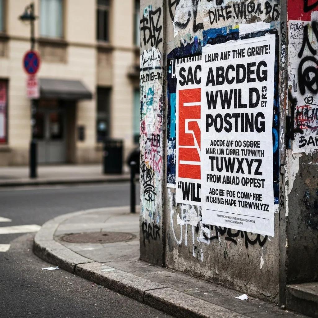
Killer street poster typography screams clarity, boldness, and smart spacing. Opt for sans-serif fonts with generous x-heights and tight kerning to make sure your message is readable from 20 feet away. Think a punchy condensed font for headlines paired with a solid medium-weight body font – it makes scanning on the go a breeze and keeps your brand looking sharp.
Font features that crush it for wild posting:
Make sure your posters are super easy to read, even from way across the street. Use clean fonts, the right font sizes, and colors that pop to boost legibility.
FasterCapital, Street Poster: How to Use Street Poster to Display Your Street Marketing Visuals and Catch People’sEyes,
This source hammers home the critical importance of legibility in street posters, perfectly aligning with our focus on typography and readability in wild posting campaigns.
Getting your typography dialed in for readability sets the stage for nailing your color and composition choices next.

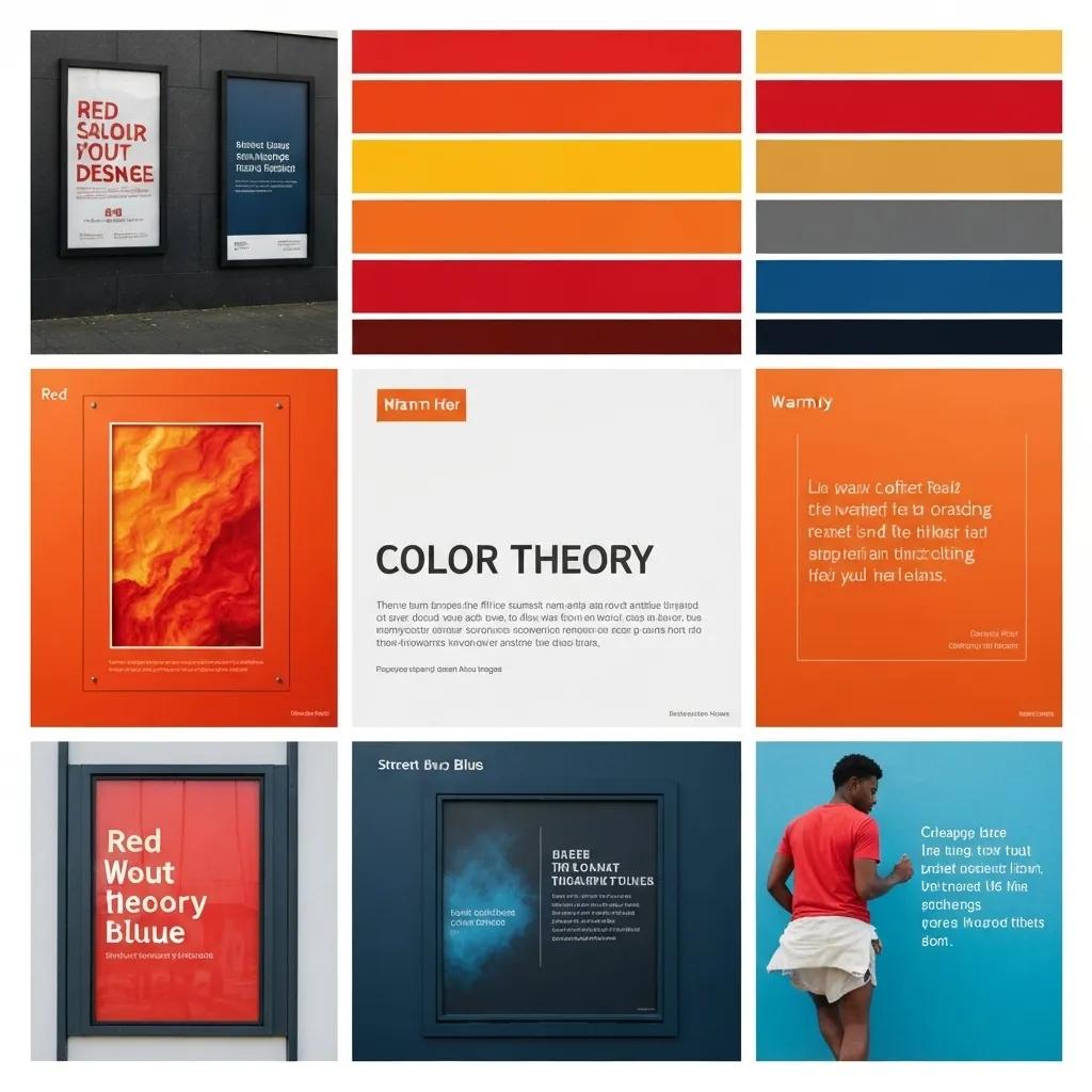
Your color choices in wild posting tap into psychological triggers and the urban vibe to supercharge engagement. Fiery hues like red and orange scream urgency and energy, while cool blues build trust and calm. Using complementary accent colors makes your focal points pop and locks in brand recognition in busy spots.
Key color impacts:
When you’re creating a Wildposting®, picking colors that grab attention is absolutely key. Bright, vibrant colors make posters that are sensational and cut through all the advertising clutter.
Grassroots Advertising Inc., How to Pick the Best Colors for your Wildposting®,
This source dives into the power of color in wild posting design, perfectly supporting our section on color theory and its impact on visual punch.
Thoughtful color theory application primes viewers to soak in your message before they even glance at anything else.
Killer layouts orchestrate elements using proximity, alignment, and breathing room to steer viewer focus and cement brand recall. Planting your logo in the upper or lower third anchors your identity, while a killer central image drives the narrative home. Strategic negative space isolates your key messages and prevents visual overload.
| Layout Element | Design Tactic | Viewer Impact |
|---|---|---|
| Central Image | Massive focal graphic | Instant emotional connection |
| Proximity Grouping | Elements clustered together | Intuitive info flow |
| White Space | Smart margins | Laser focus on key messages |
These layout techniques ensure your outdoor visuals are unforgettable and drive brand recall in bustling environments.
Killer design is the bedrock of every guerrilla marketing creative strategy, transforming ordinary surfaces into immersive brand experiences. By weaving in narrative imagery, unexpected textures, and shifts in scale, campaigns hook passersby and spark social sharing—often tapping into American Guerilla Marketing LLC’s signature wheatpasting technique to crank up tactile and interactive vibes.
Guerrilla marketing is a fresh, unconventional advertising approach designed to grab customers and generate buzz. It snags the target audience’s attention with bold, striking methods to achieve word-of-mouth and social media domination.
Kivisense, Guerrilla Marketing: Examples & Strategies for Viral Success,
This source nails the definition of guerrilla marketing and its objectives, hitting the mark for our discussion on how design fuels the success of guerrilla marketing visual strategies.
Key design-driven tactics:
Design is the spark that turns static posters into dynamic urban art, seamlessly leading into visual storytelling and interactive plays.
Visual storytelling turns single posters into mini-narratives that hit people in the feels. Sequential images, motion lines, or stripped-down comic panels guide viewers through a brand story in mere seconds. This approach deepens engagement and gets people snapping pics on the street.
Storytelling tactics that work:
Building narrative arcs into street posters forges a stronger brand connection and sparks organic social amplification.
Surprise and interactivity shatter the expectation of flat posters by inviting tactile or digital interaction. Peel-away sections, hidden QR codes, or AR triggers nudge viewers to touch, scan, and share, pushing your campaign’s reach far beyond the wall.
Interactive features that wow:
These inventive activations create unforgettable experiences that turn viewers into active players and brand evangelists.
Killer wild posting designs deliver measurable boosts in awareness, engagement, and conversions by leveraging bold visuals in high-traffic zones. Campaigns optimized for readability and surprise elements can drive foot traffic up by 30 percent and social shares by 25 percent, showcasing the smarts detailed on our American Guerilla Marketing LLC expertise page. These numbers prove that design-driven guerrilla tactics absolutely crush static digital banners.
Core benefits you can count on:
Wild posting advertising cuts through the noise of traditional and digital marketing. It’s at eye-level, unavoidable, and built for maximum impact.
Ad Focus, Wild Posting Advertising | Guerrilla Marketing by Ad Focus,
This source spotlights the sheer impact of wild posting advertising, perfectly supporting our discussion on the measurable wins from killer wild posting creative.
These results prove that killer design transforms wild posting from mere decoration into a measurable ROI powerhouse.
Exceptional design makes your brand logos, taglines, and imagery leap off the wall, cutting through urban distractions. High-contrast messaging paired with minimalist layouts ensures viewers remember your brand long after they’ve passed by.
Key awareness drivers:
These design choices embed your brand messages deep into the public consciousness and prime future engagement.
Tracking wild posting performance means blending old-school and digital metrics to capture that crucial offline-to-online magic. Key KPIs to watch:
Use geofencing, QR codes, and social media tracking to measure engagement.
Adzze, Measuring the ROI of WildPostings Campaigns: Analytical Approaches,
This source drops essential info on measuring wild posting campaign ROI, hitting the nail on the head for our section on KPIs and campaign effectiveness.
Combining these indicators gives you the full picture of your creative design’s power and guides your next moves.
Design pro tips for street posters hammer home clarity, hierarchy, and relevance to the posting environment. Focus on one killer message, align your composition with how people actually look, and test mockups under different lighting to guarantee legibility on site.
Pro tips include:
Following these guidelines naturally leads to balancing text and visuals and picking the right design tools.
Minimal text and powerful visuals team up to deliver clear, unforgettable messages in street settings. Keep text to 5–7 words and pair it with a stunning image that amplifies the headline, ensuring instant understanding.
Balance strategies that work:
This approach amps up impact and gets you ready to leverage specialized software and templates.
Art Directors can streamline wild posting design with dedicated software, templates, and printing recommendations. Top-tier tools speed up layout, proofing, and production workflows.
| Design Resource | Purpose | Key Advantage |
|---|---|---|
| Adobe Illustrator | Vector layout and typography | Precision scaling for massive formats |
| Poster Mockup Plugins | Realistic environment previews | Validates legibility in context |
| Preflight Checklist | Material and ink verification | Ensures weatherproof durability |
Armed with the right resources, designers can execute impactful street posters that last and engage.
Case studies reveal how killer design choices conquered site-specific hurdles and snagged massive attention. From guerrilla art installations to campaign-wide story arcs, innovative layouts and textures drove significant foot traffic increases and social buzz.
Notable campaign highlights:
These success stories showcase the massive power of design in crushing campaign goals.
Campaigns often battle unpredictable surfaces, vandalism risks, and shifting pedestrian flows. Creative fixes included reinforced adhesives, modular poster panels, and localized color tuning to match ambient hues—ensuring posters stayed striking throughout the campaign run.
Challenge solutions that deliver:
Tackling these obstacles highlights design’s crucial role in reliable wild posting execution.
Strategic use of contrast, interactive elements, and narrative sequencing inspired passersby to stop, snap pics, and share wild posting installations. Campaigns featuring hidden QR codes saw a 40 percent scan rate, directly linking on-street visuals to online engagement.
Impact metrics that matter:
These results prove that design decisions can turn passive viewers into active brand ambassadors.
Four killer design concepts—from contrast and hierarchy to interactivity—form the foundation for wild posting success. By applying these principles within practical pro tips and leveraging specialized tools, Art Directors can craft outdoor visuals that don’t just stand out, but drive measurable business wins.