January 1, 2026 Wild Wheat Paste Posting Posting and Wheatpasting


In the blink of an eye, an outdoor ad either sticks with people or vanishes into the background. That’s why it’s crucial for Art Directors to nail the visuals if they want brands to be remembered. This guide dives into the essentials: core design ideas, cutting-edge digital out-of-home (DOOH) tech, bold guerrilla and experiential stunts, smart planning for maximum return, and killer examples. We’ll show you how to hook passersby by blending simple design, color smarts, killer fonts, 3D and AR magic, wild posting power from American Guerrilla Marketing LLC, pinpoint audience targeting, green initiatives, and what’s next—all to build unforgettable outdoor campaigns.
The bedrock of awesome outdoor visuals is all about making things crystal clear, creating strong contrasts, and guiding the eye. This means getting your message across instantly and making people want to connect. By using plenty of white space, making key elements pop, and keeping your branding consistent, you’ll make sure your ad sticks in people’s minds, even when they only have a second to see it.
Simplicity cuts out the noise, zeroing in on one core message so it sinks in fast, even when people are just zipping by.
Here’s why keeping it simple is a game-changer:
Studies show that stripping down visuals in ads really boosts how well people remember the message and the brand. When designs aren’t cluttered, folks can process the info quicker, leading to a better grasp and recall of what you’re trying to say.
Brown, A., Journal of Advertising Research (2022)
This research backs up why simplicity is a must-have for killer outdoor ads. And once you’ve got that clean slate, you can get strategic with your colors.

Color psychology plays on how different hues make us feel and guides our eyes, making ads pop and forging deeper emotional ties.
Check out how key colors can sway feelings and grab attention:
| Hue | Emotional Response | Visual Impact |
|---|---|---|
| Red | Urgency | Grabs attention fast |
| Blue | Trust | Calming and engaging |
| Yellow | Optimism | Super visible |
Using these color tricks ensures your brand makes a splash at first glance and sets the stage for killer typography.
Research into color psychology proves that specific colors trigger distinct emotions and influence how consumers act. For instance, red can create a sense of urgency, while blue often signals trust. These insights are gold for understanding how color choices amp up the effectiveness of outdoor advertising.
Smith, J., Color Marketing Group (2023)
This citation hammers home the point about color psychology and why it’s vital for creating outdoor visuals that truly resonate.
For outdoor ads, typography means using bold, clean sans-serif fonts and getting the size just right so they’re readable from afar and reinforce your brand’s vibe.
Here are the top tips for outdoor type:
Sharp typography plays perfectly with the motion and interactive elements of DOOH.
DOOH best practices involve using dynamic content, real-time updates, and messages that fit the moment to grab today’s audiences with visuals that matter. By tapping into programmatic feeds and motion graphics, you can turn static billboards into interactive brand playgrounds.
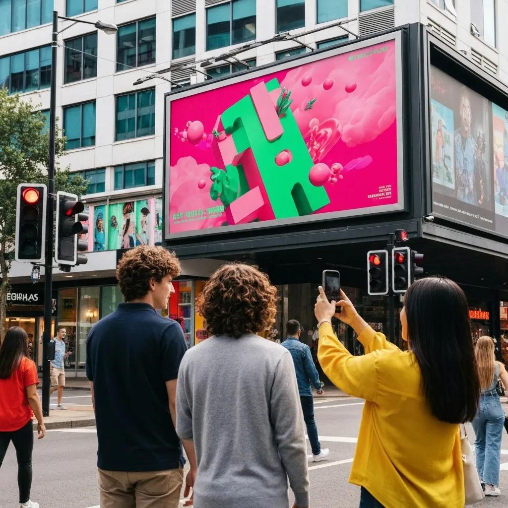
3D billboards and anamorphic illusions create a sense of depth and intrigue, making ads unforgettable and sparking social media buzz.
The main perks include:
This power to pull people in naturally leads to AR-driven experiences.
AR layers digital magic onto real-world setups, extending the interaction beyond the billboard and inviting people to explore.
Popular AR tricks include:
These immersive layers get people ready for some seriously unconventional guerrilla tactics.

Guerrilla and experiential tactics use surprise placements and hands-on installations to catch people off guard and get them talking. American Guerrilla Marketing LLC uses wild posting campaigns to deliver textured wheatpasted art and immersive pop-up moments that cut through the usual advertising noise.
Wheatpasting involves slapping large posters onto city surfaces, blending the raw vibe of street art with brand messages.
Here’s the drill for a wheatpasting campaign:
This raw artistic approach flows perfectly into pop-up events and mural projects.
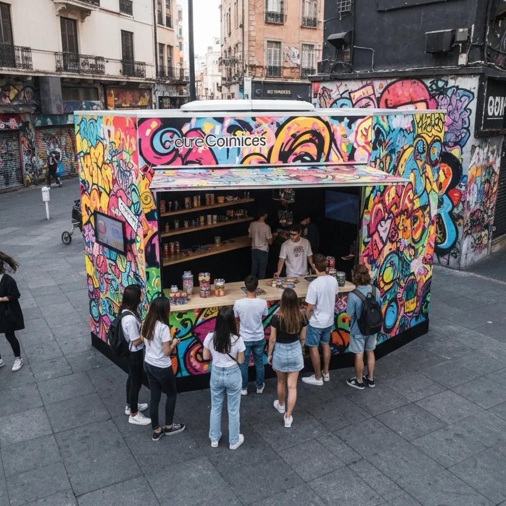
Pop-up installations and street art create immersive spaces that invite people to explore, snap photos, and share on social media.
| Installation Type | Interactive Element | Audience Effect |
|---|---|---|
| Modular Pop-Up Booth | Live demos | Deeper brand connection |
| Interactive Mural | Projection mapping | Keeps people engaged longer |
| Performance Art | Live interactions | Boosts social media buzz |
These kinds of hands-on setups naturally lead into planning based on data and measuring results.
Strategic visual planning syncs up creative ideas with how audiences behave and what metrics matter, all to make your spending count and get the best results. Setting clear goals and testing different locations ensures your impact lasts and your budget is used wisely.
Audience-focused targeting uses info on who people are and where they hang out to put visuals right in front of your ideal customers.
Smart tactics include:
These insights feed straight into how you’ll track your campaign’s success.
Measuring outdoor campaign impact means looking at both hard numbers and what people say to figure out how well it’s doing.
Common ways to measure include:
Tracking these numbers helps guide your choices about sustainability and what to do next.
Sustainable outdoor design means using earth-friendly materials and energy-saving displays to cut down on environmental impact and show off your brand’s values.
Choosing green materials supports your brand’s ethics and lessens the environmental hit:
| Material | Environmental Benefit | Durability |
|---|---|---|
| Biodegradable Paste | Less waste from adhesives | Lasts a season |
| Recycled Vinyl | Saves resources | Resists weather |
| Solar-Powered LEDs | Cuts energy use | Works long-term |
Eco-friendly designs show you care about the planet and can keep your campaign going longer, all while reinforcing smart planning.
Famous campaigns and new tech show how creativity and innovation can boost audience engagement and get Art Directors ready for what’s coming next.
Iconic campaigns mix fresh ideas with clear messages to create buzz and get remembered:
These wins highlight the power of bold visual ideas and pave the way for the next wave of trends.
Emerging trends include AI creating dynamic content, super-local messages, fun gamified displays, and eco-friendly materials:
| Trend | Description | Impact |
|---|---|---|
| AI-Generated Content | Personalized creative in real-time | More relevant |
| Hyper-Localization | Messages tailored to specific neighborhoods | Better audience connection |
| Interactive Gamification | Game-like challenges on DOOH screens | Deeper engagement |
| Eco-Material Innovations | Biodegradable and reused materials | Shows stronger brand responsibility |
Jumping on these trends means your campaigns will grab audiences now and in the future.
Outdoor visuals that truly captivate are a smart mix of clear design, cool tech, unexpected stunts, data-smart targeting, and green practices. Art Directors can use these core ideas—boosted by American Guerrilla Marketing LLC’s wild posting magic—to build campaigns that engage and stick. Start using these creative strategies today to make your brand stand out and get the best return on your investment.